New A1 Pro: unlimited saves, priority submissions and more →

23 noisey landing page examples

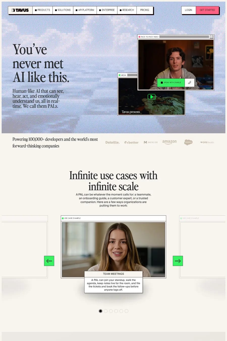
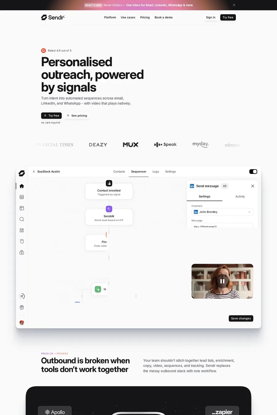
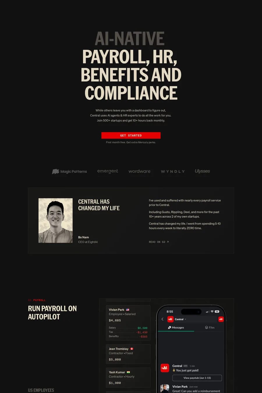
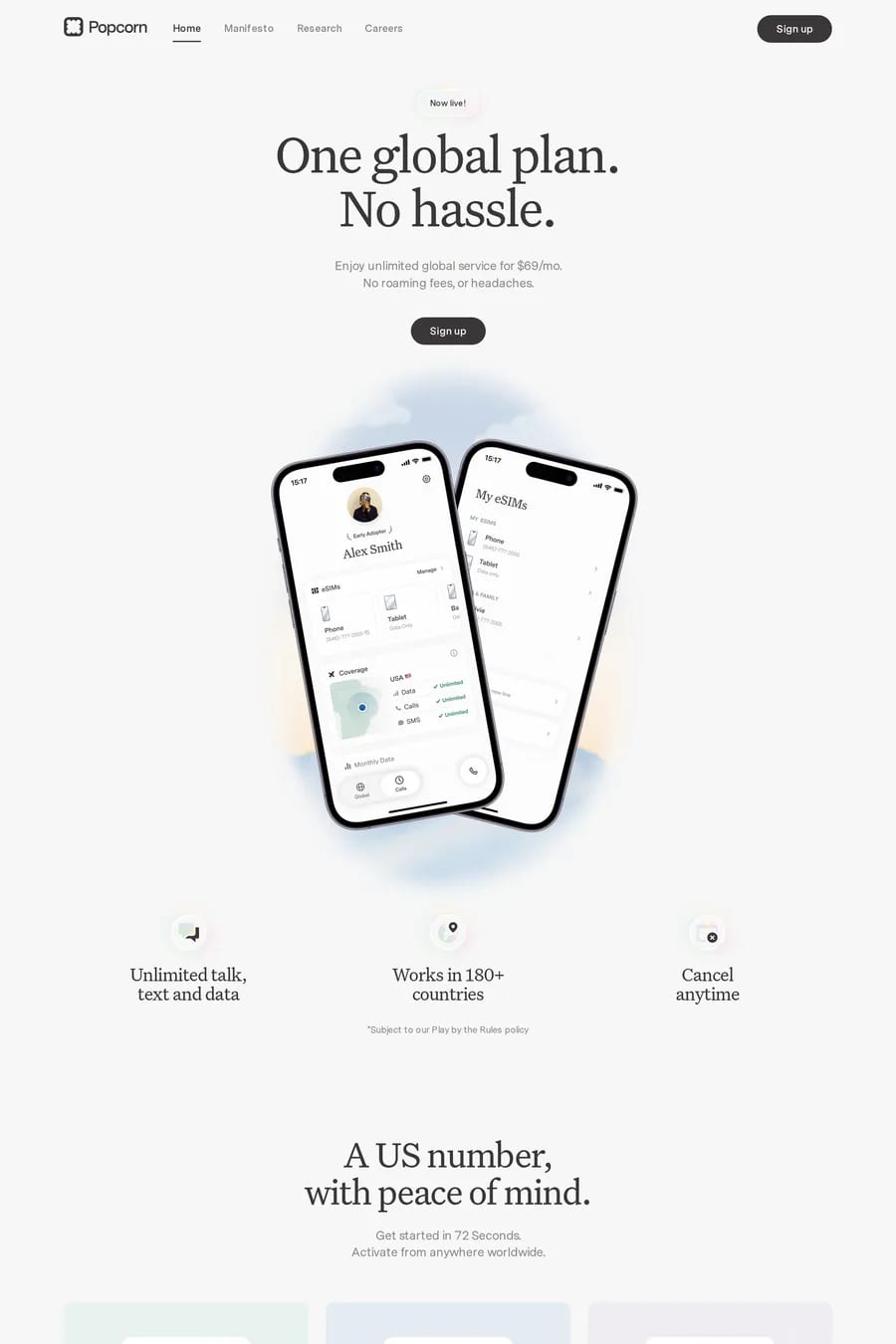
Noise and grain overlays are a defining trend in modern landing page design. The subtle texture adds warmth and tactility to digital surfaces, countering the coldness of flat, perfectly clean designs. These landing pages use noisey textures as a layer over colour, photography, or gradients to create depth. See also texture landing pages, blurred gradient landing pages, and dark landing pages.

Get the best noisey landing websites each week

Curated inspiration sent every Tuesday

Clarasight
Tavus
Sendr

Noisey landing FAQs

Partly as a reaction to the overly polished flat design era. Noise adds a sense of craft and materiality — it makes digital surfaces feel handmade and tangible. It also references print, photography, and analogue media in a way that feels culturally resonant.

CSS noise using SVG filters is lightweight and performant. A semi-transparent PNG noise overlay is simpler to implement. For animated noise, canvas-based approaches work but require more careful performance management.

Notable examples include Clarasight, Tavus, Sendr, MonoDesk and Cartesia Sonic-3. These are just a few of the 23 noisey landing websites in this collection, each selected for strong visual design and execution.

Popular platforms in this collection include Next.js, Webflow, Framer and SvelteKit. Each brings different strengths for building noisey landing experiences.

Frequently used typefaces include Inter, Geist, Geist Mono and Suisse. Typography plays a key role in defining the noisey aesthetic across these landing websites.

23 Best Noisey Landing Page Examples (2026) · A1