
Updated
Curated inspiration sent every Tuesday
Unsubscribe at any time
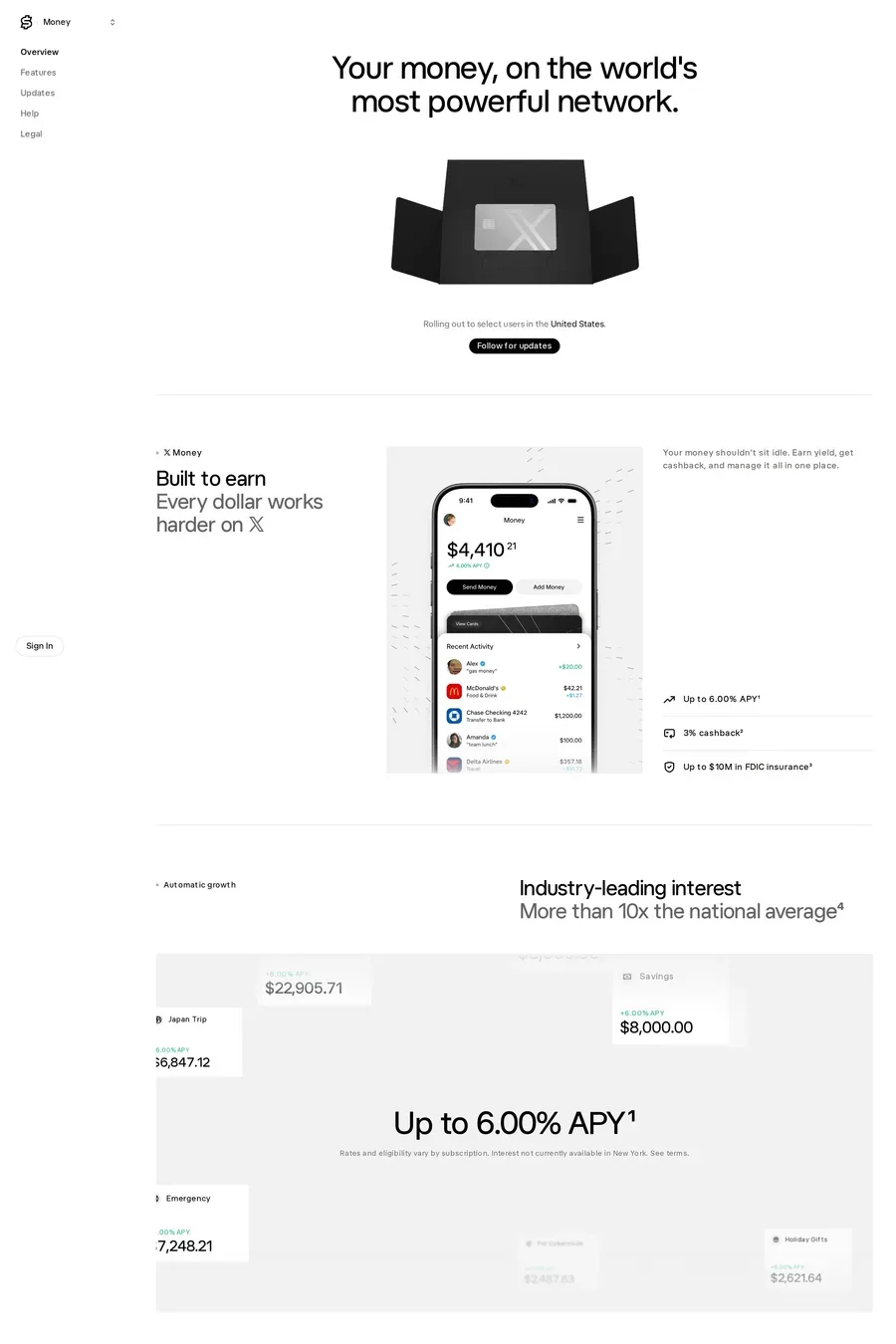

Specifics, placed calmly. Regulatory status with the licence number. Where money is held and who insures it. A security page that a technical person could read. Named founders, named investors, named customers. And plain language — the sites here that feel trustworthy explain fees in a sentence, not a table you have to decode. Over-claiming (“bank-grade security” with no detail) has the opposite effect.
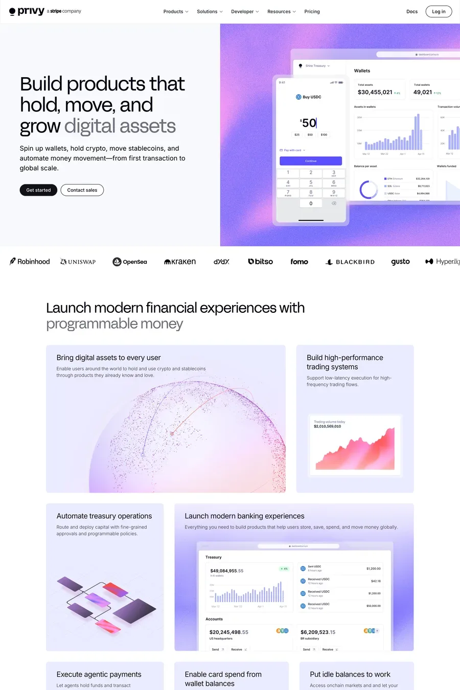
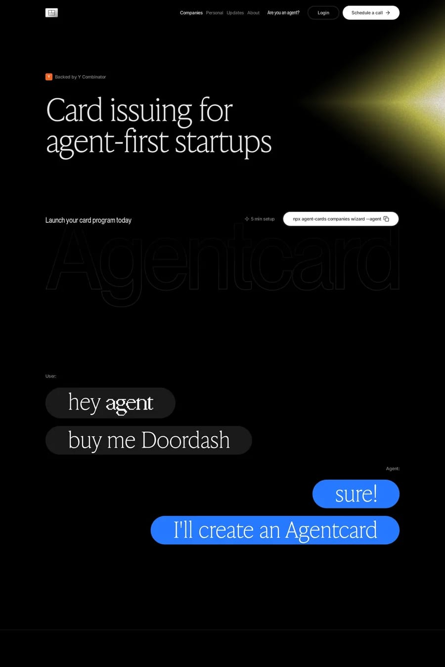
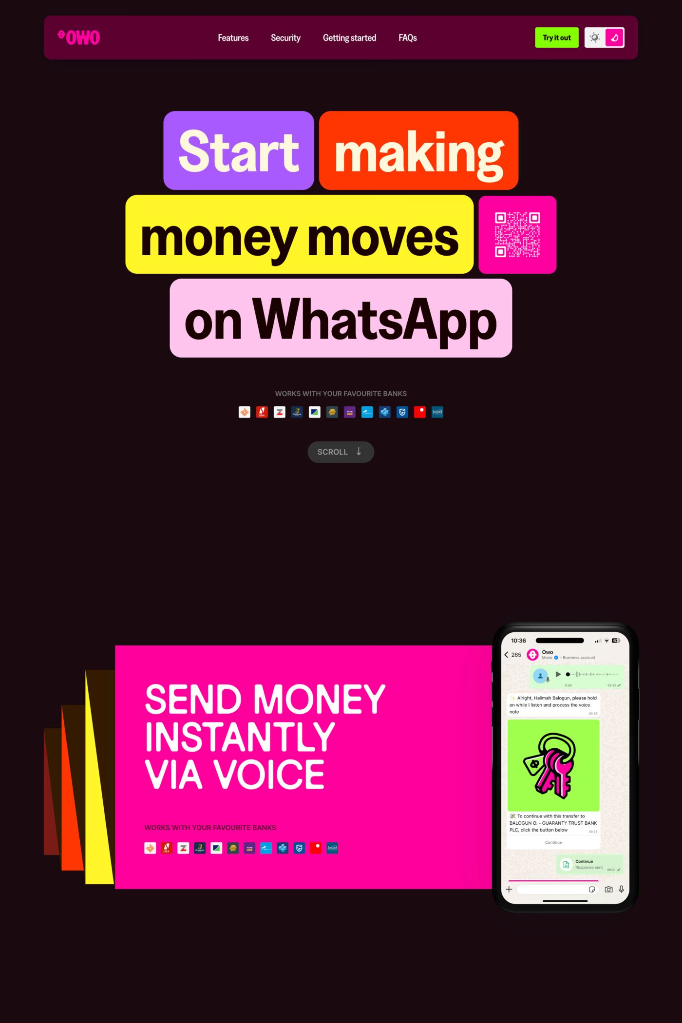
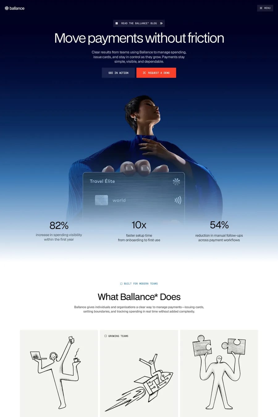
It depends on who’s buying. B2B finance, payments infrastructure and anything sold to developers has gone dark and technical. Consumer finance — cards, savings, budgeting — has gone light, warm and often illustrated, because it wants to feel human rather than institutional. Match the product’s own UI and the audience’s expectations, not the trend.
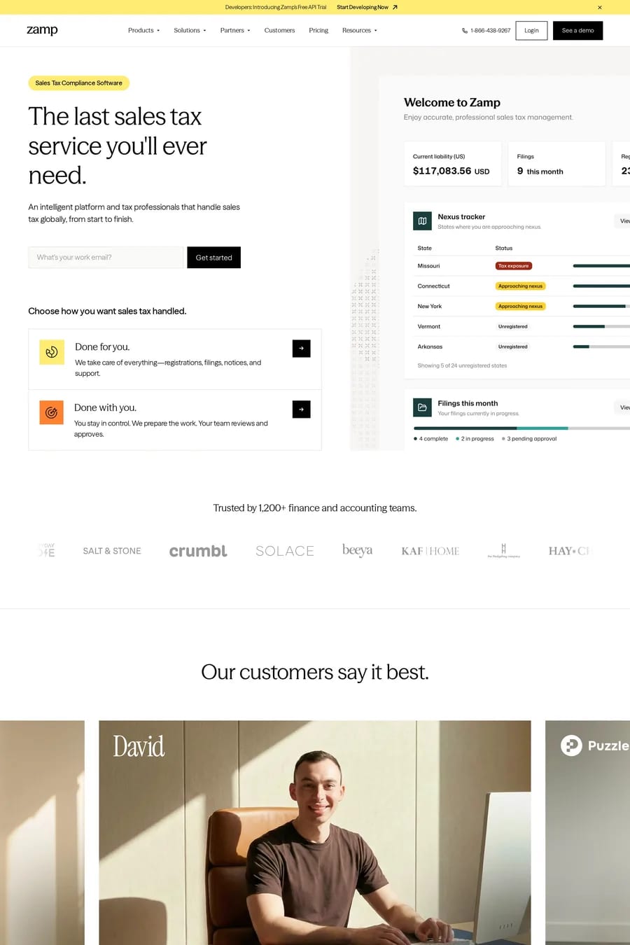
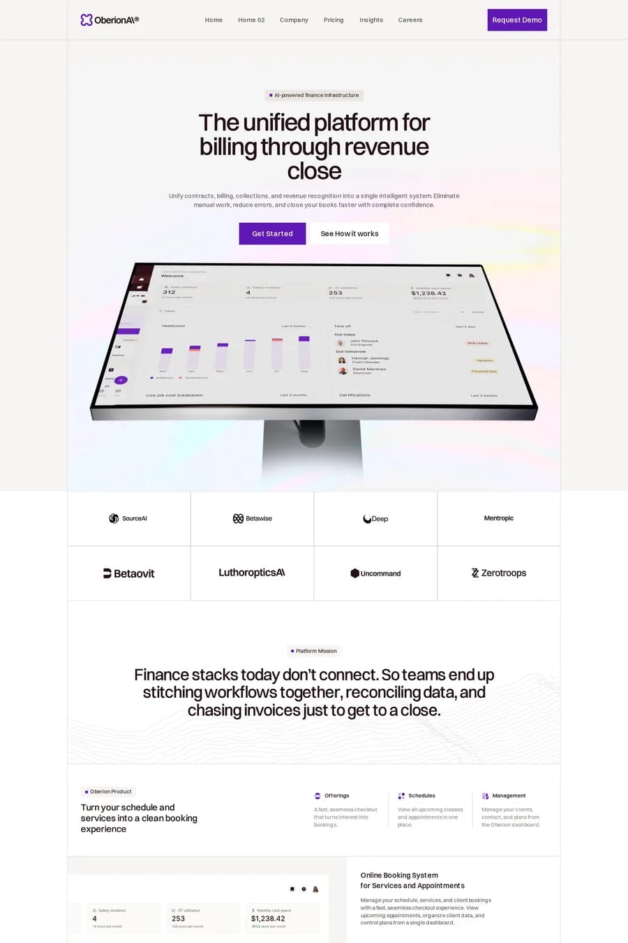
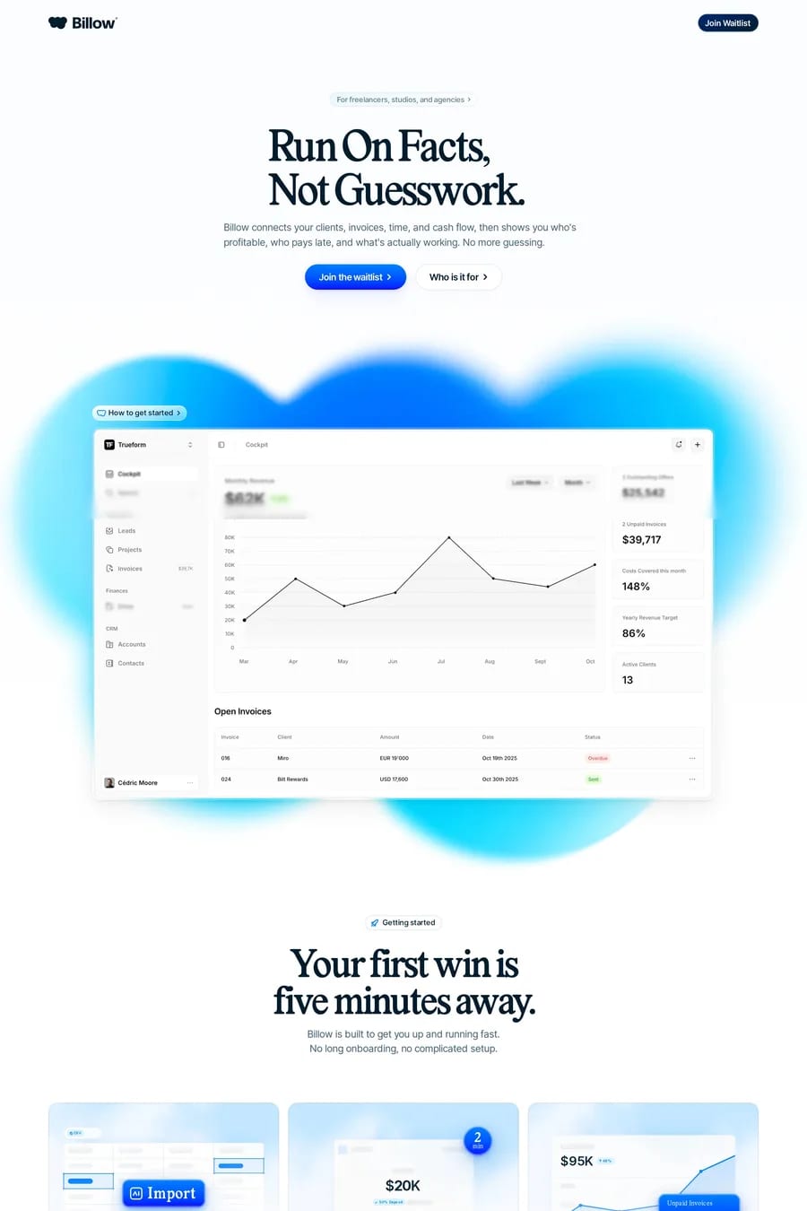
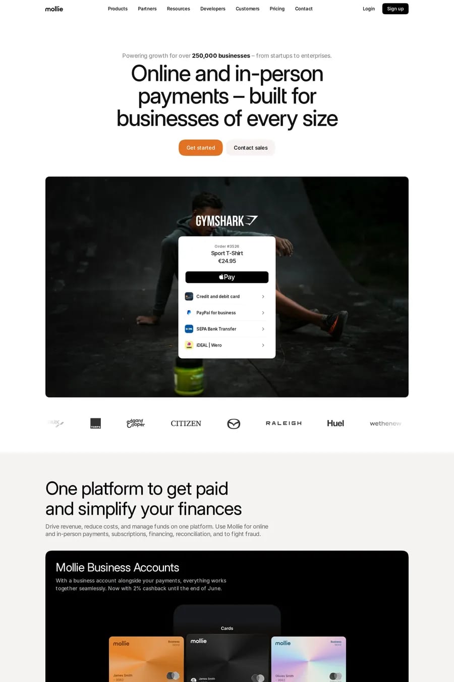
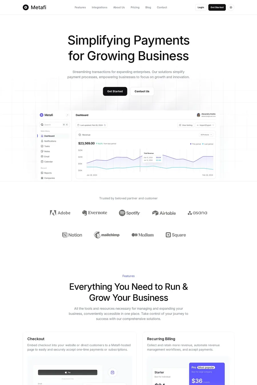
The product, doing the thing, with a number. A screenshot or short recording of the real dashboard or card. A headline with a concrete claim — a fee, a speed, a limit. One button. The sites here that convert are the ones where the visitor understands the offer and the cost before they scroll. Save the story and the mission for further down.
They keep it present but quiet. Regulatory disclosures in the footer on every page, a dedicated legal section, and risk warnings where the regulator requires them — next to the claim, in readable type, not hidden. Good finance sites treat compliance copy as part of the design rather than an afterthought bolted on by legal.
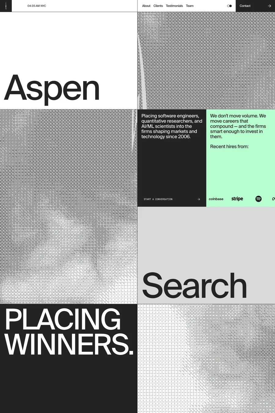
Sans-serifs for the product side — clean, neutral, a little geometric. Most of the sites here use one; browse the sans-serif finance collection. Serifs are coming back for wealth management, private banking and anything that wants to feel established. Tabular figures are non-negotiable anywhere numbers line up.