
Updated
Curated inspiration sent every Tuesday
Unsubscribe at any time

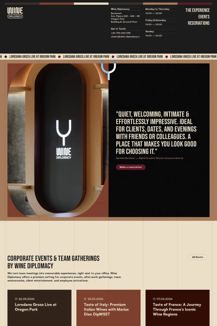
Warmth, tradition and craft. Wine and burgundy read as expensive and established — hotels, restaurants, fashion houses. Oxblood reads as editorial. Brick and rust read as handmade. None of them read as urgent, which is the difference from bright red. Dark red is a colour for brands that want to feel like they’ve been around a while.
Cream and warm off-white for backgrounds and type. Gold or ochre for accents. Dusty pink or terracotta for a tonal palette. Dark green if you want a richer, more traditional pairing — it’s a classic. Avoid cool greys and pure white, which make dark red look muddy. Most of the sites here keep the palette warm throughout.
Yes, with light type. Cream or warm white text on burgundy passes contrast comfortably for headings and body text. Dark red text on a light background also works well for headings and reads as a softer alternative to black. Dark red on black or on dark grey fails — there isn’t enough contrast in either direction.
Food and drink, especially wine, coffee and restaurants. Hospitality. Fashion and beauty at the premium end. Craft and furniture makers. Publishing and editorial. It’s rare in software, which makes it a way to stand out if the product can carry a warmer tone.
Serifs, most of the time. The colour already says traditional and a good serif agrees with it — look at how the sites here pair burgundy with a high-contrast display serif. A grotesque sans-serif can work if you want tension between a traditional colour and a modern voice, but keep it to one family. Browse the fonts collection to see what the sites here use.