Updated
Curated inspiration sent every Tuesday
Unsubscribe at any time
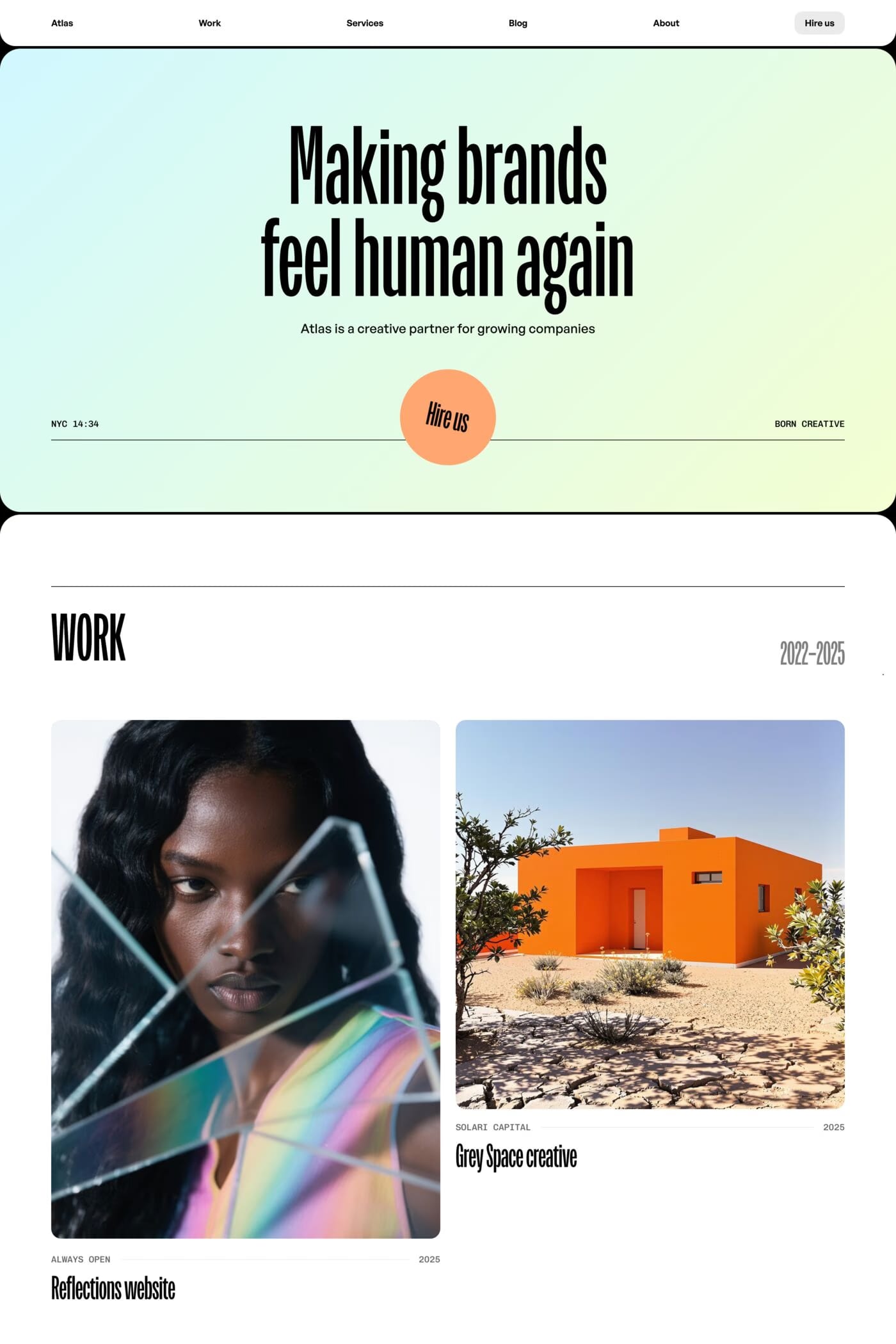


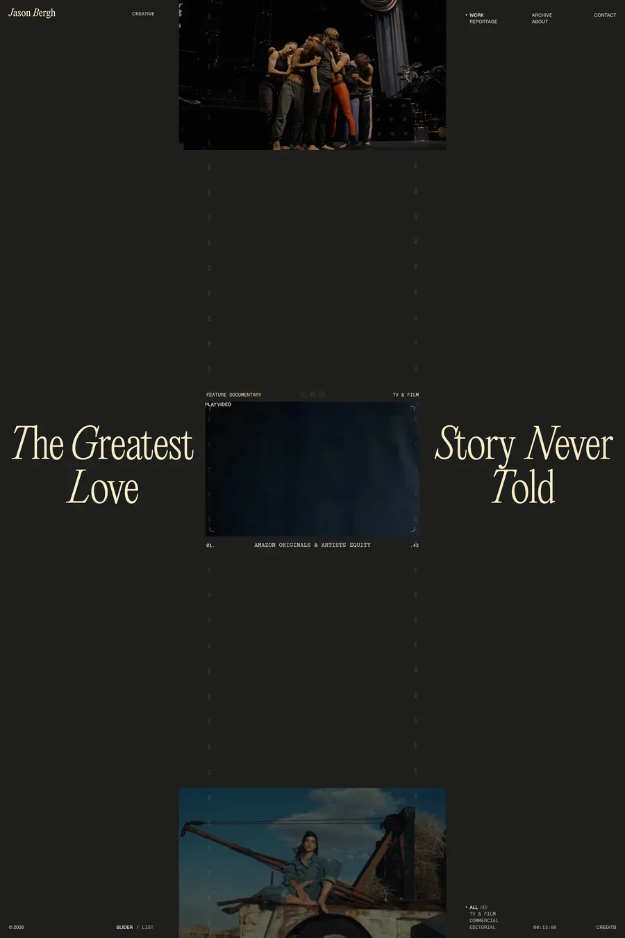
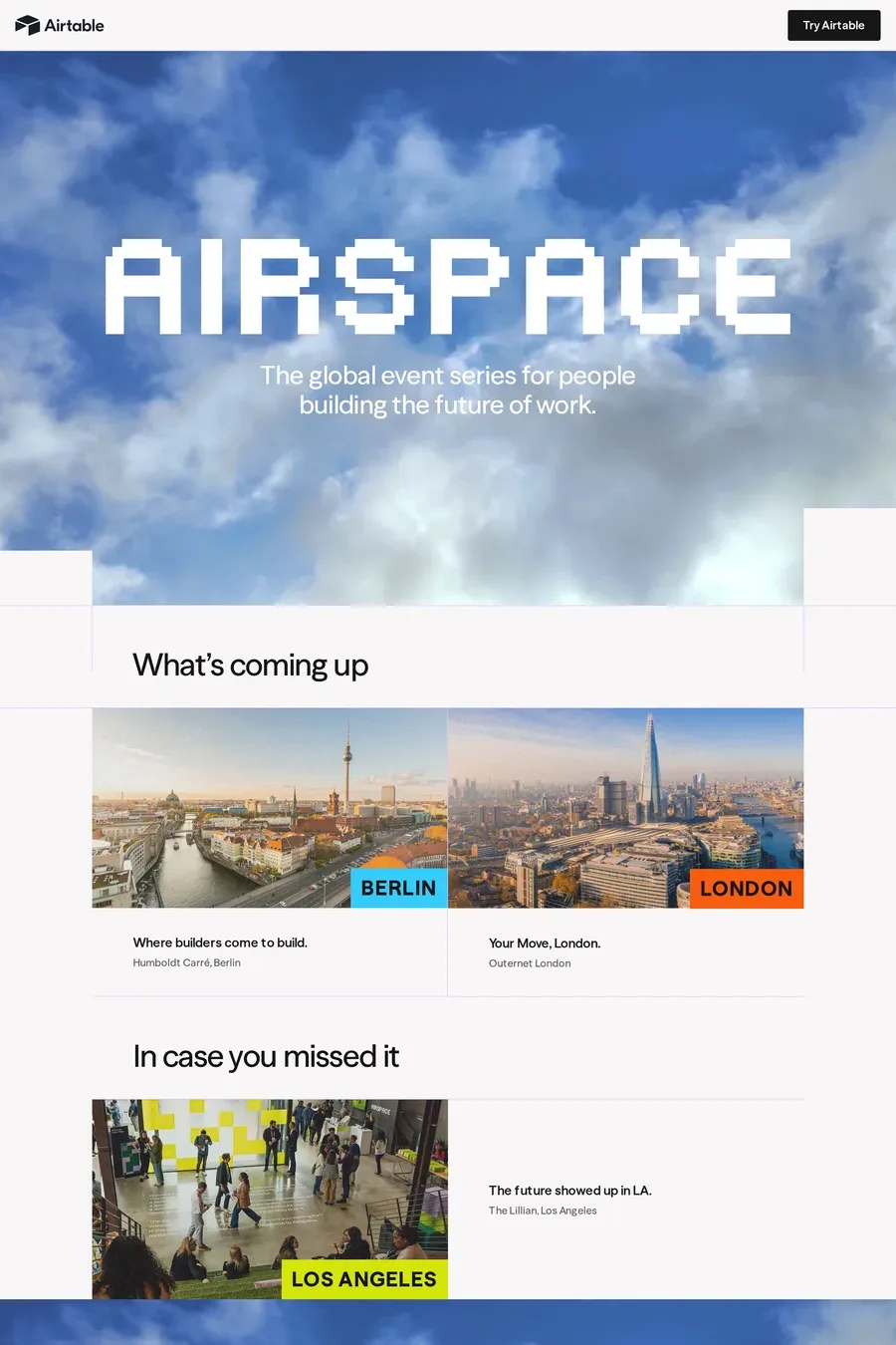
A grid with room to breathe, or a single column at full width. Two or three columns on desktop, one on mobile, and gaps wide enough that images don’t touch. Keep the images at a consistent aspect ratio within a grid, or use a masonry layout that respects each image’s own ratio. Avoid carousels — visitors don’t click through them, and search engines don’t see past the first slide.
Serve the right size for the screen with srcset and sizes. Use AVIF with a WebP fallback — both are far smaller than JPEG at the same quality. Lazy-load everything below the fold. Show a tiny blurred version while the full image loads so the layout doesn’t jump. And cap your full-size images around 2000px wide; nobody needs the 6000px original in a browser.
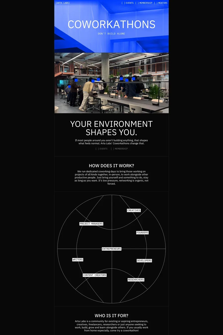
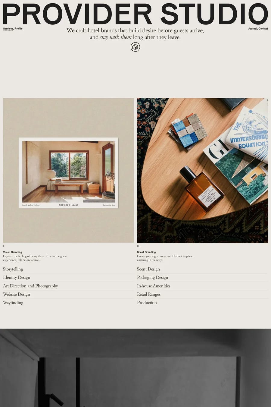
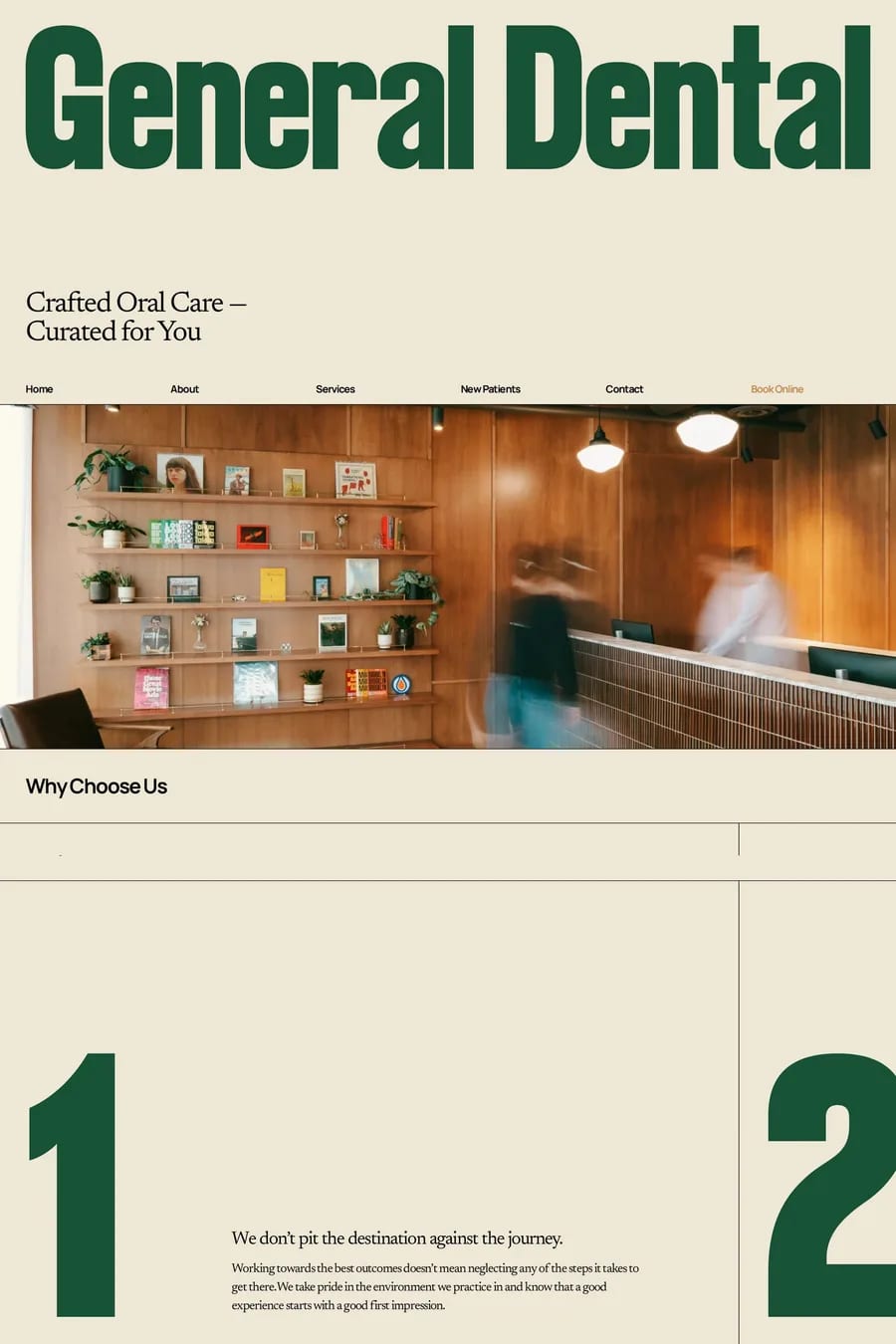
Quiet type. One family, usually a neutral sans-serif or a restrained serif, in two sizes and a neutral colour. The sites here rarely use more than a name, a caption and a nav. If the type is competing with the images for attention, it’s too loud.
Yes for galleries, if it’s fast and keyboard-friendly. Arrow keys to move, Escape to close, and the URL should update so a single image can be shared. Skip the lightbox for editorial or landing pages where the image is part of the layout — clicking to enlarge breaks the flow.
Fewer than you think. 20 to 40 strong images beat 200 mixed ones. Visitors form an opinion in the first grid, so lead with the best work. Group by project or series rather than dumping everything in one grid, and cut anything you’d have to explain.