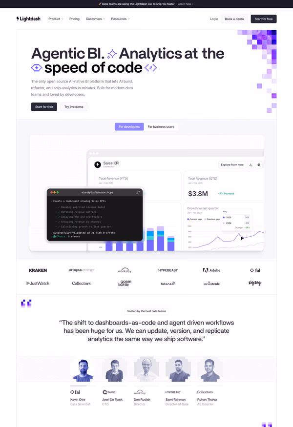
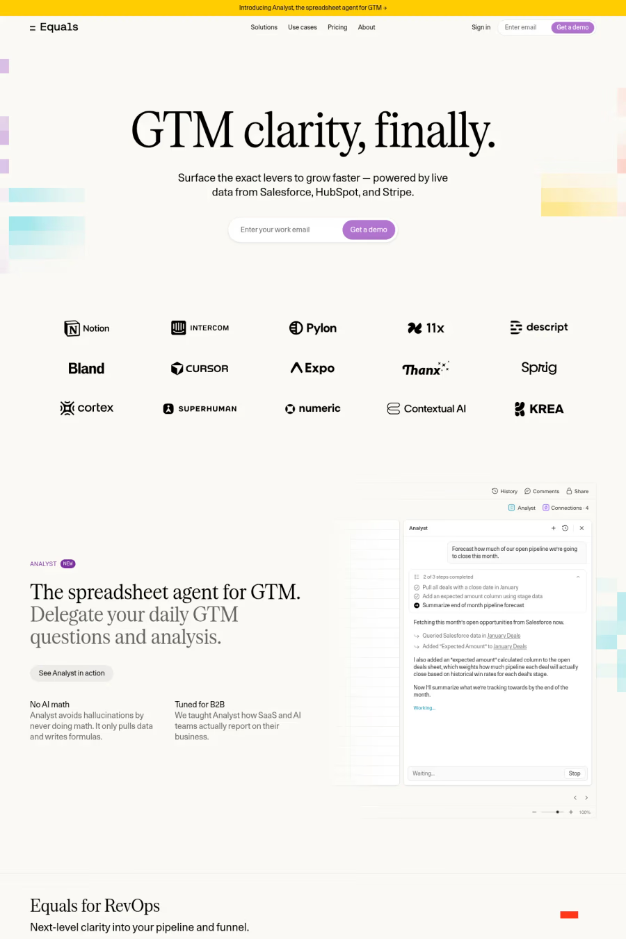
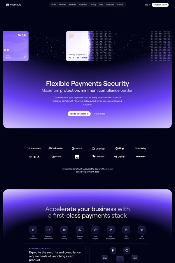
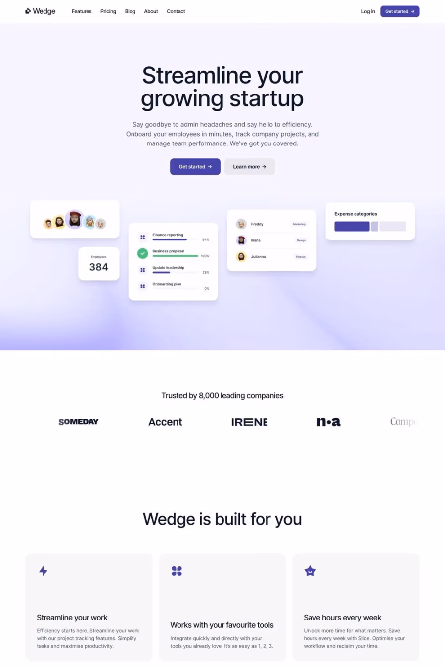
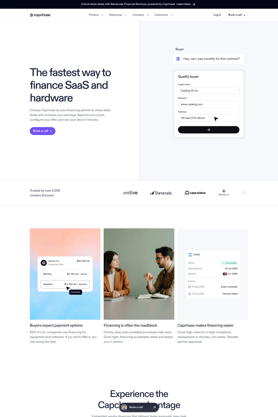
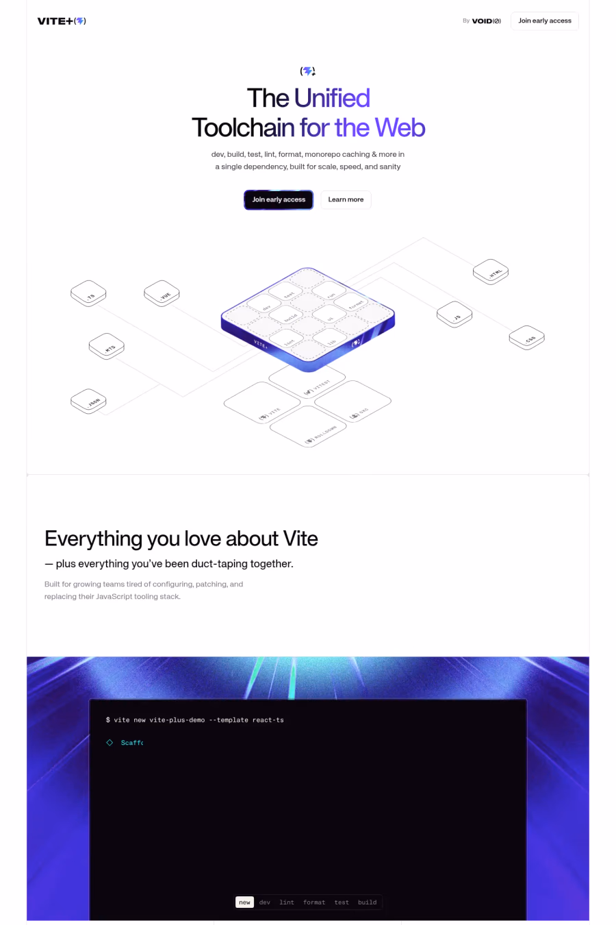
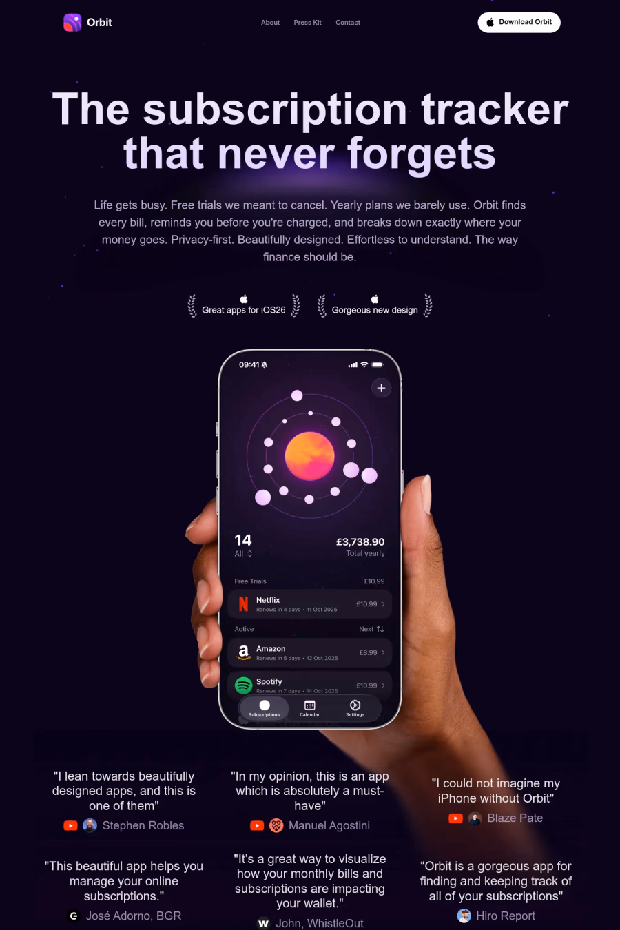
Purple communicates creativity, imagination, and premium quality in web design. Historically associated with royalty and mysticism, it is now widely adopted by tech companies, creative platforms, and luxury brands seeking to differentiate from the dominant blues and greys of the web.
Curated inspiration sent every Tuesday
Unsubscribe at any time

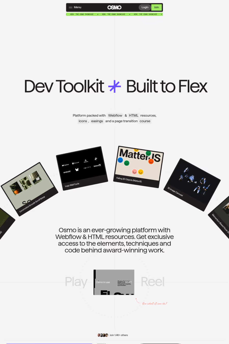
Purple fills the gap between blue's trustworthiness and red's energy, suggesting innovation and creative thinking. Companies in AI, blockchain, and developer tools have adopted purple to signal that they are pushing boundaries while remaining credible. It also stands out in app stores and search results dominated by blue logos.
Purple can be difficult to calibrate for accessibility, as many mid-range purples lack sufficient contrast against both light and dark backgrounds. Screen rendering varies significantly across devices, so testing is essential. Designers should also avoid using too many purple shades together, which can make a site feel gaudy.