
Updated
Curated inspiration sent every Tuesday
Unsubscribe at any time

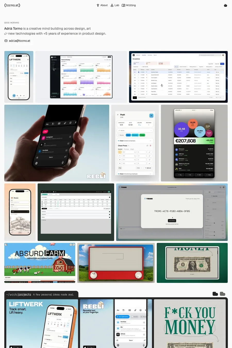
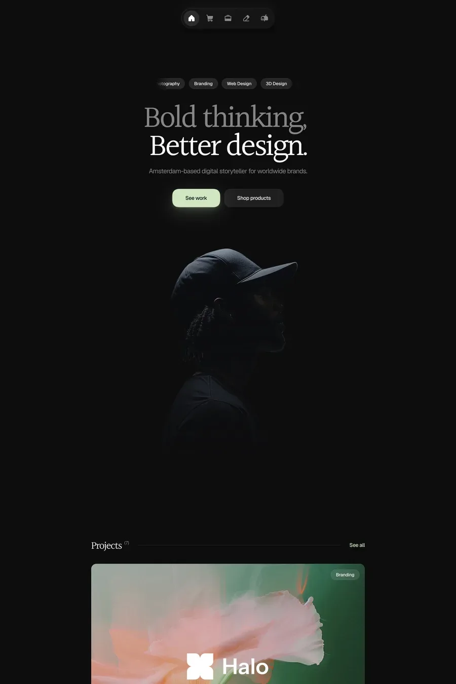
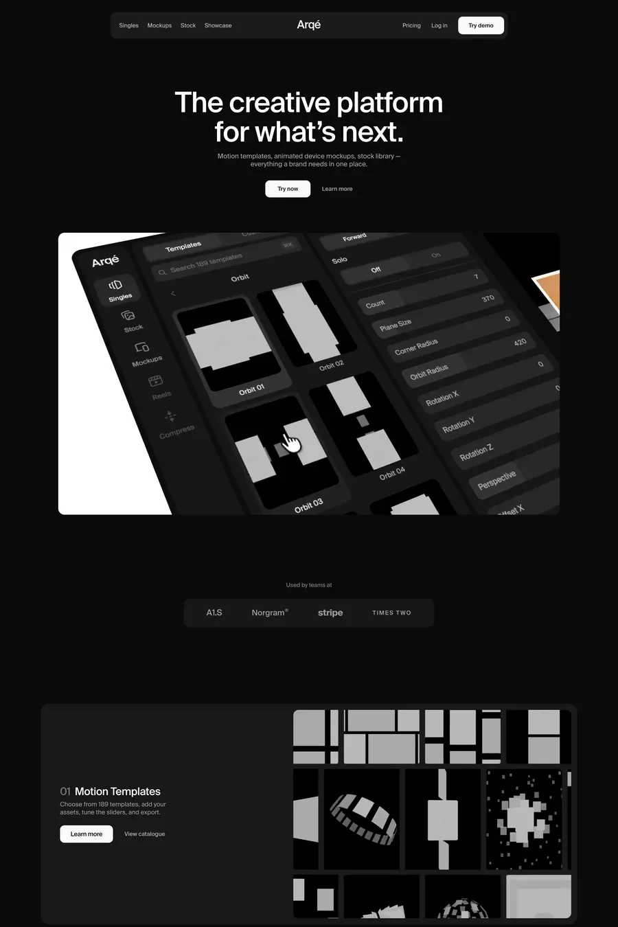
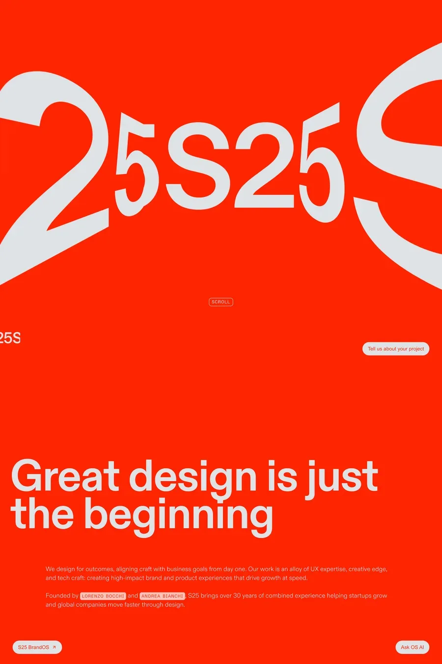
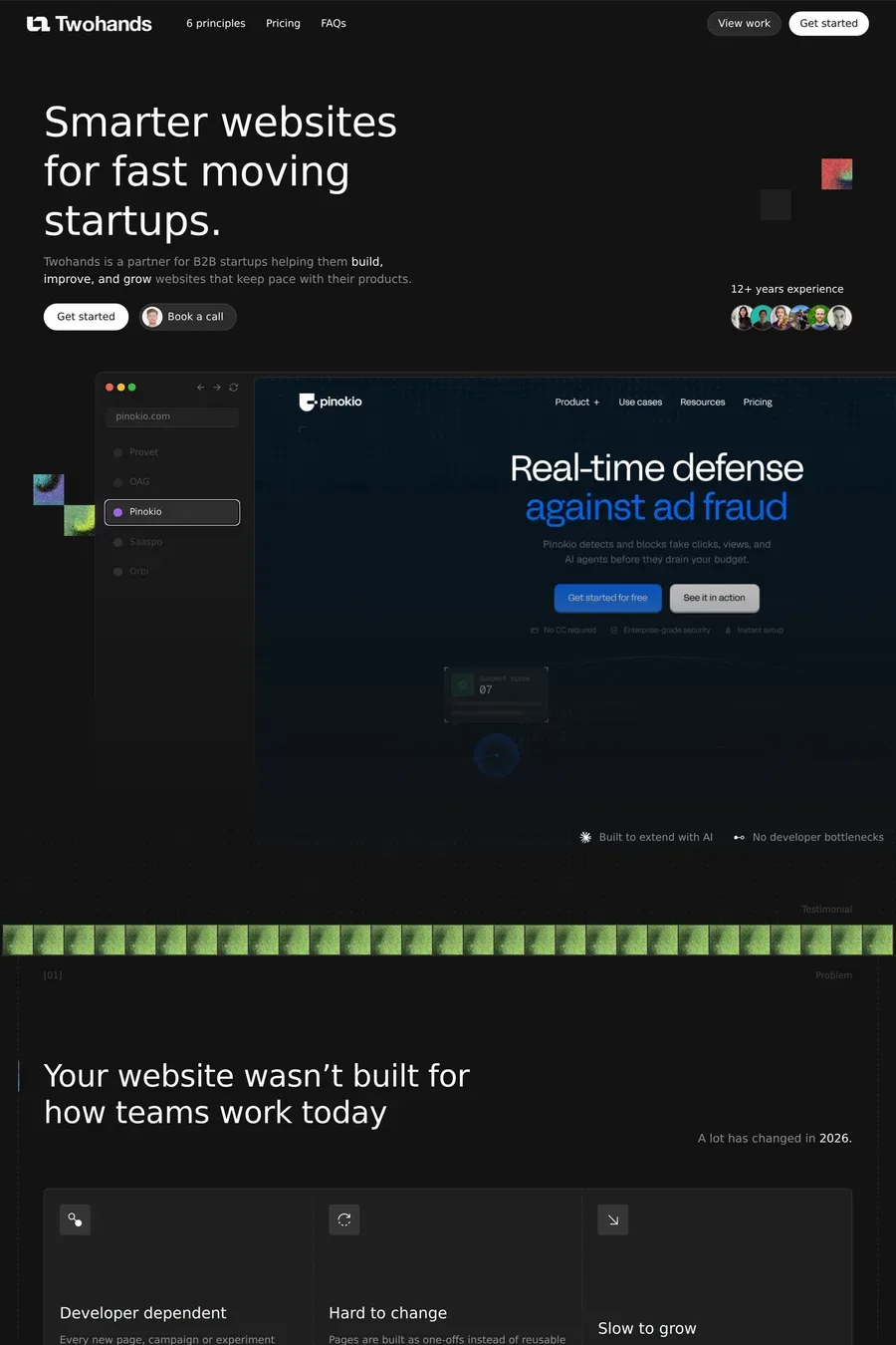
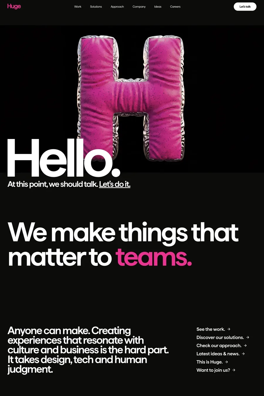
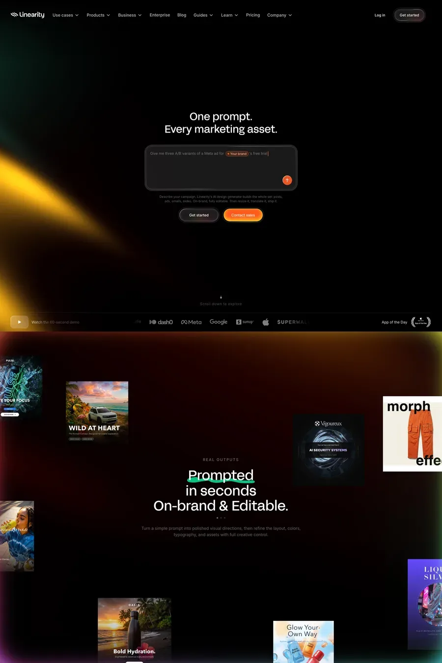
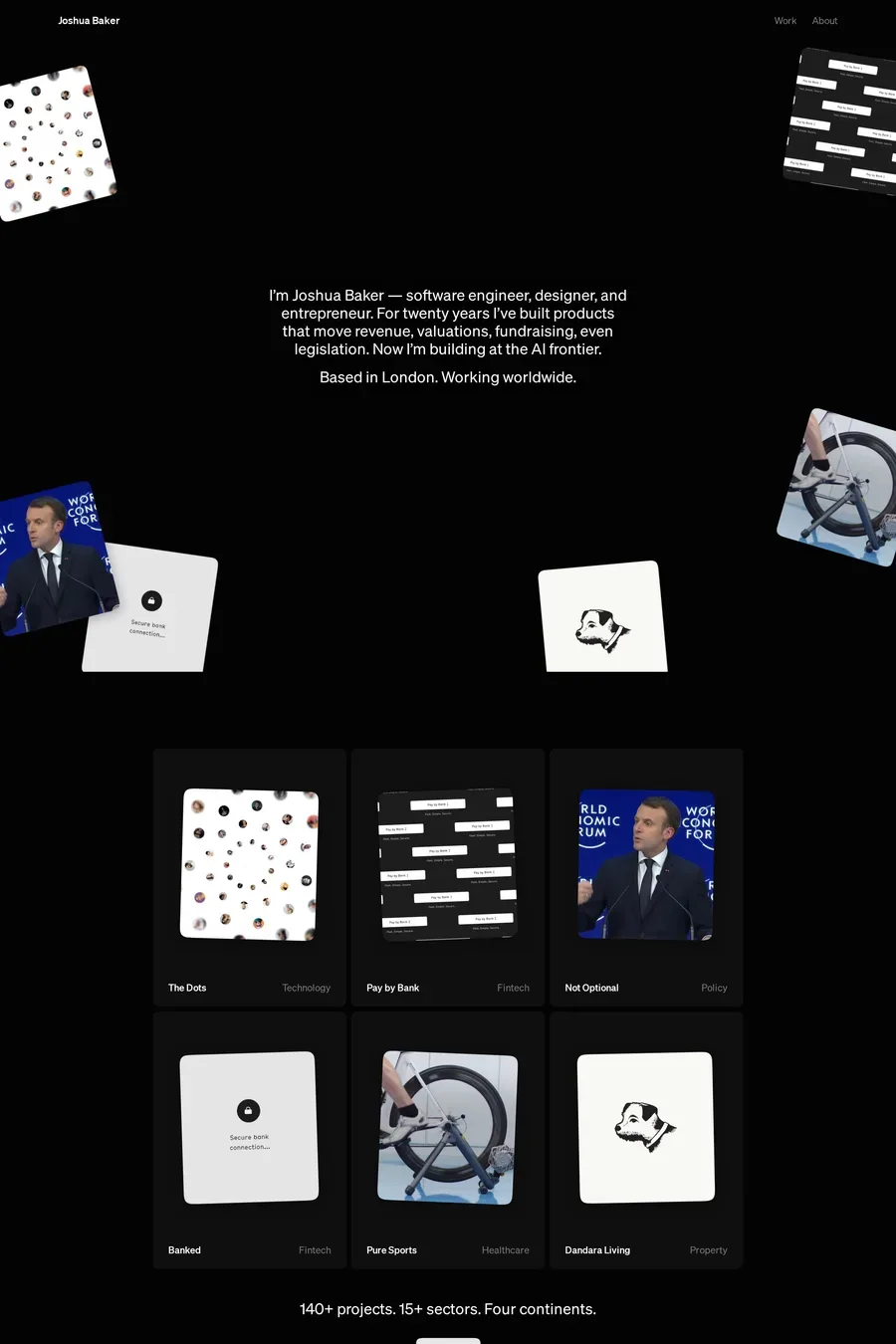
The work, first and fast. Then evidence of craft on the page itself — because the site is the portfolio. Then a voice that separates the studio from the other 400 in this category. The good sites here get you to a case study in one click, load the images in under a second, and say something about how they think in a sentence rather than a manifesto.
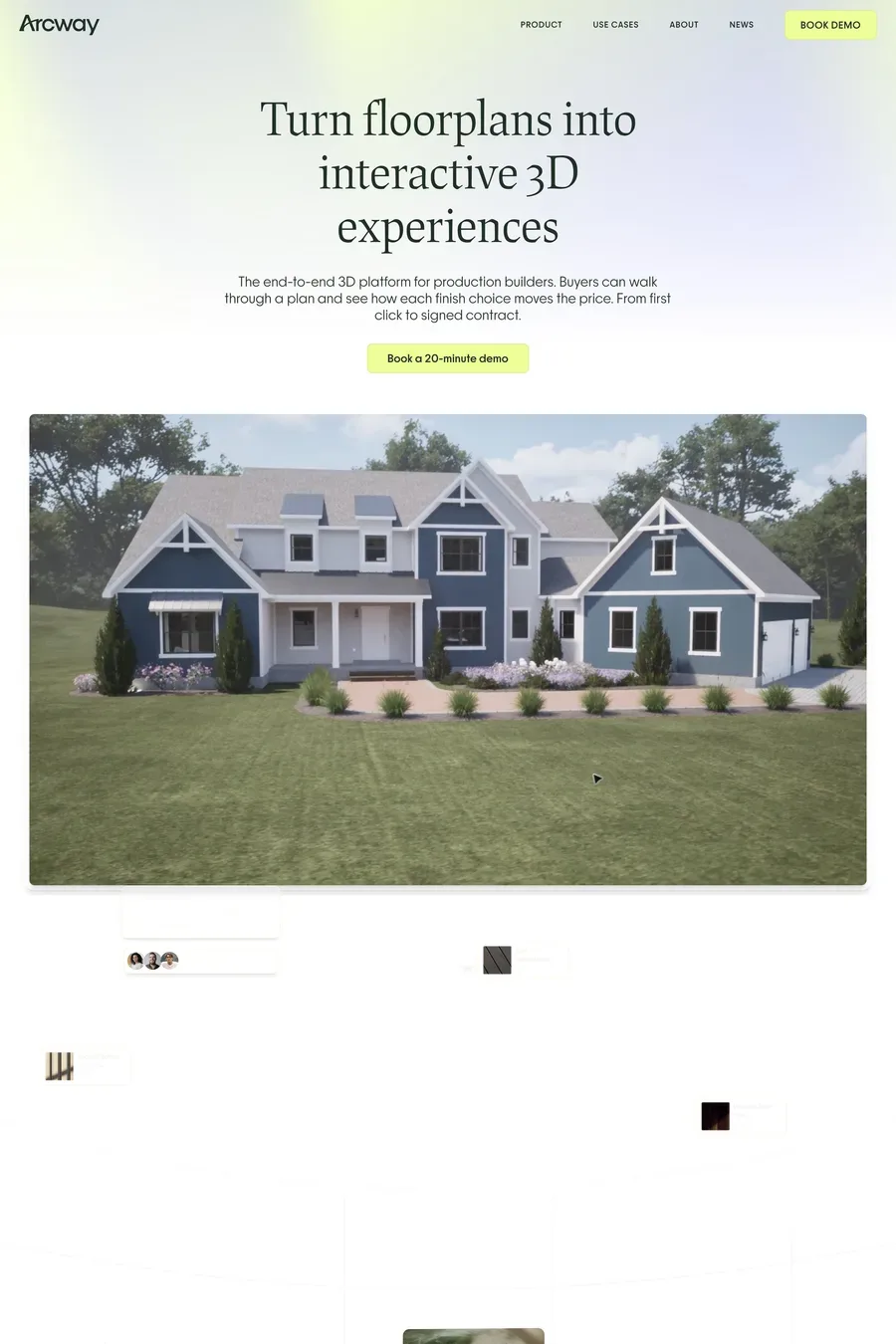
Problem, what you did, what changed. One paragraph each. Then the work at full size — real screens, real print, cropped to detail, not a mockup of a laptop on a wooden desk. Show process only if it’s interesting. The case studies on the sites here that work are short, visual and end with a result someone could measure.
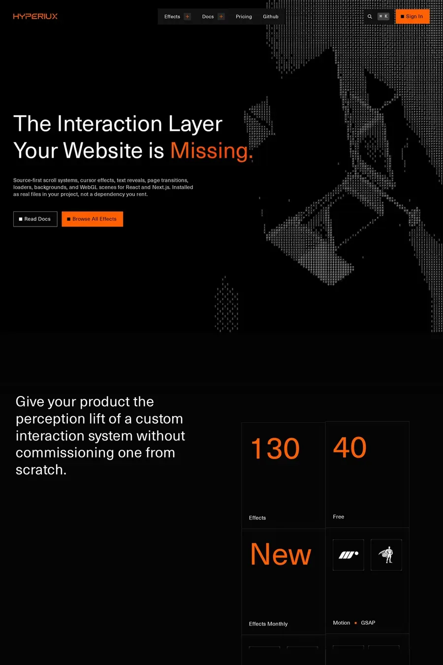
Enough to show craft, not enough to slow the visitor down. Page transitions, hover states and a considered reveal or two. Look at the animated design collection for how the good ones do it. Design buyers are impatient; a site that makes them wait to see the work is showing off at their expense.
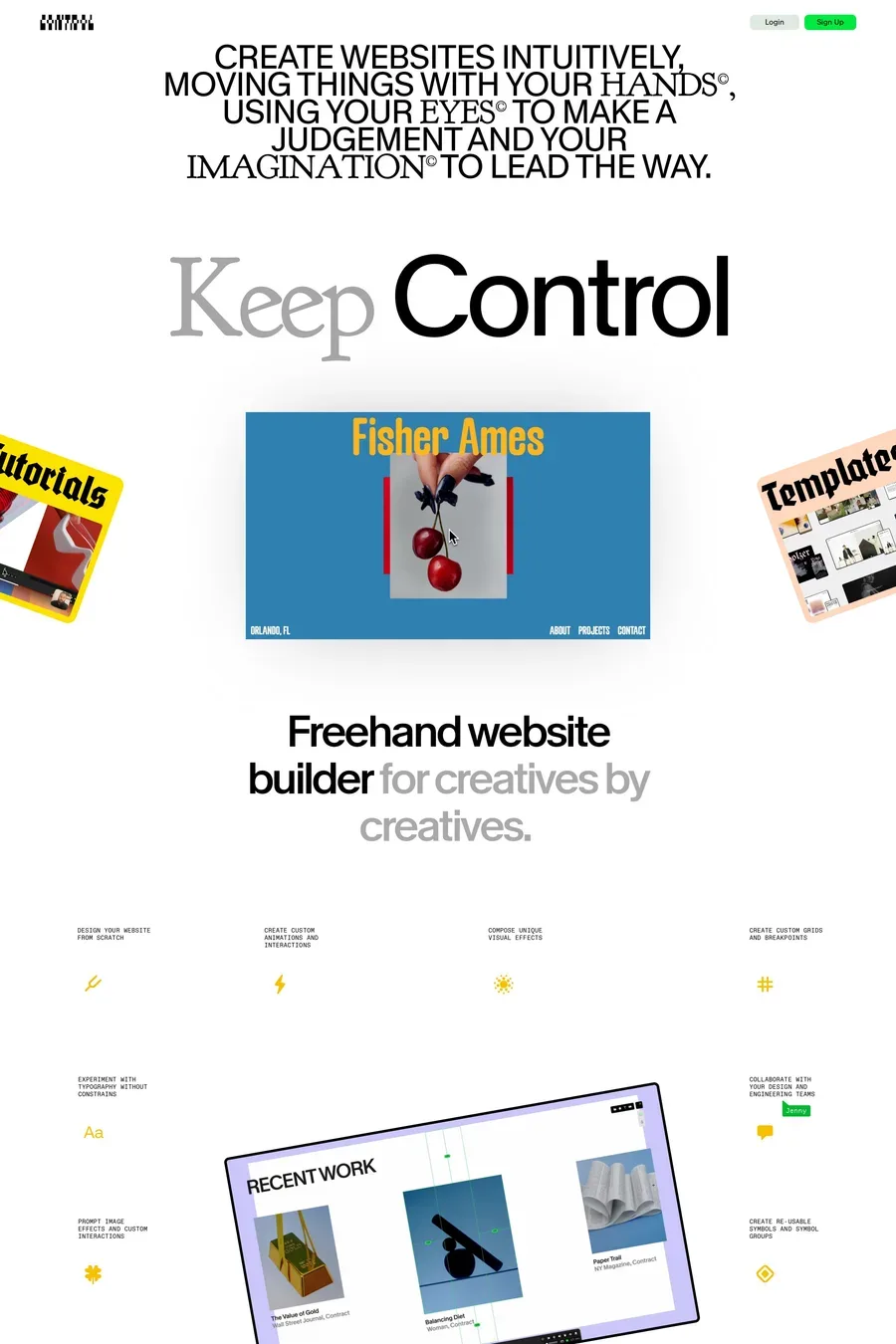
Framer has become the default for freelancers and small studios — it’s fast to build in and the output looks designed. Webflow for studios that need a CMS and client handover. Next.js for studios with developers who want full control. Squarespace and Cargo for portfolios that are mostly images. The platform shows less than you’d think; the sites here on all four look good.
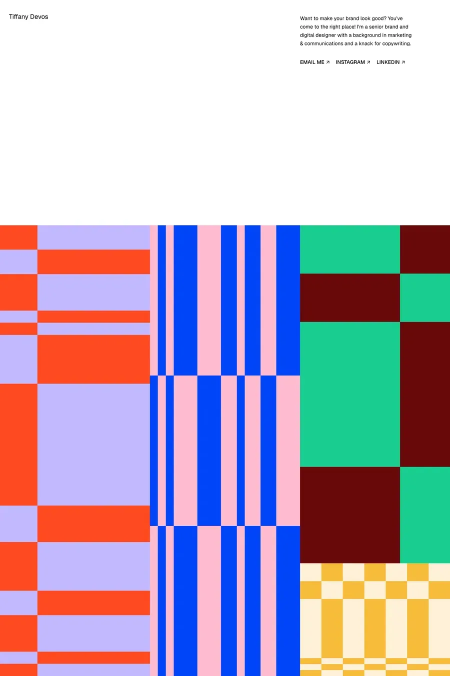
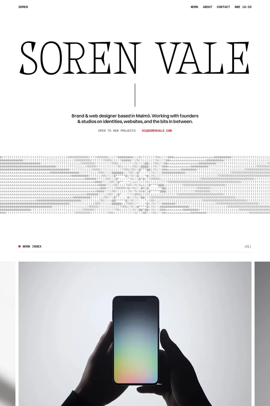
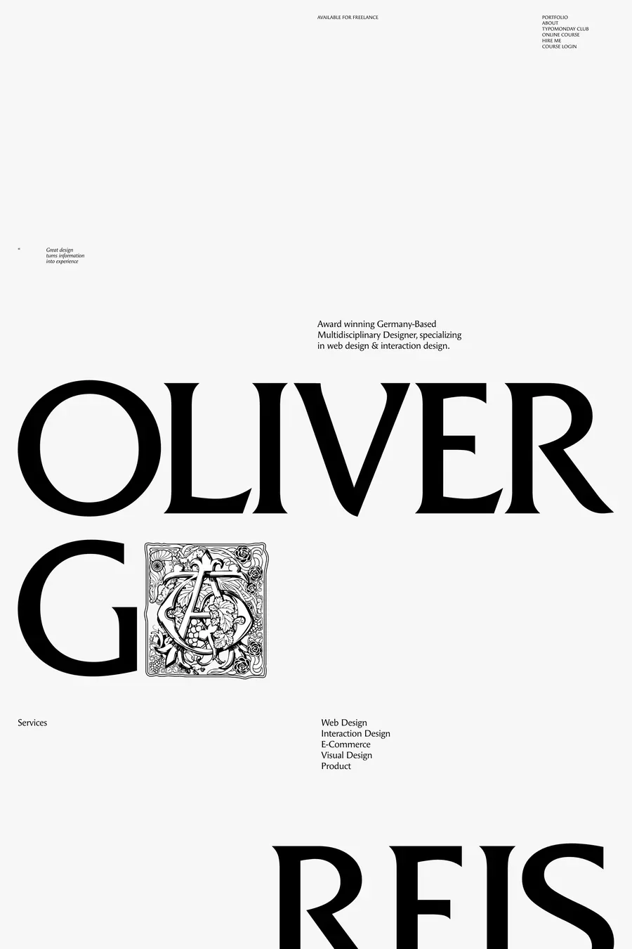
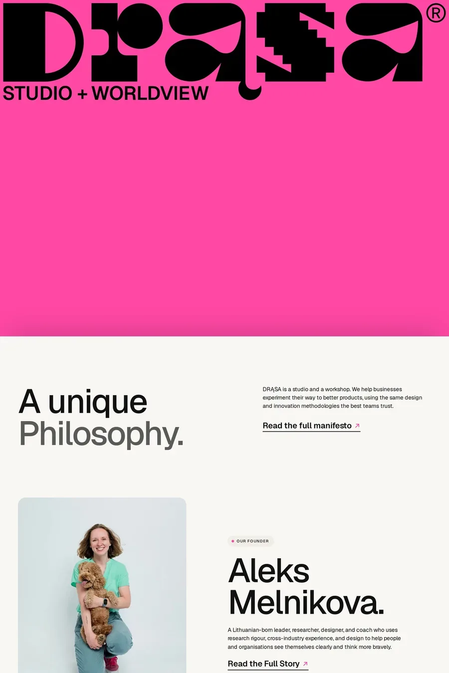
A point of view. Most design sites look like each other because they use the same three typefaces, the same grid and the same reveal animation. The ones here that are memorable chose a typeface with character, a colour nobody else in the category uses, or a way of writing that sounds like a person. Pick one of those and commit.