
Updated
Curated inspiration sent every Tuesday
Unsubscribe at any time


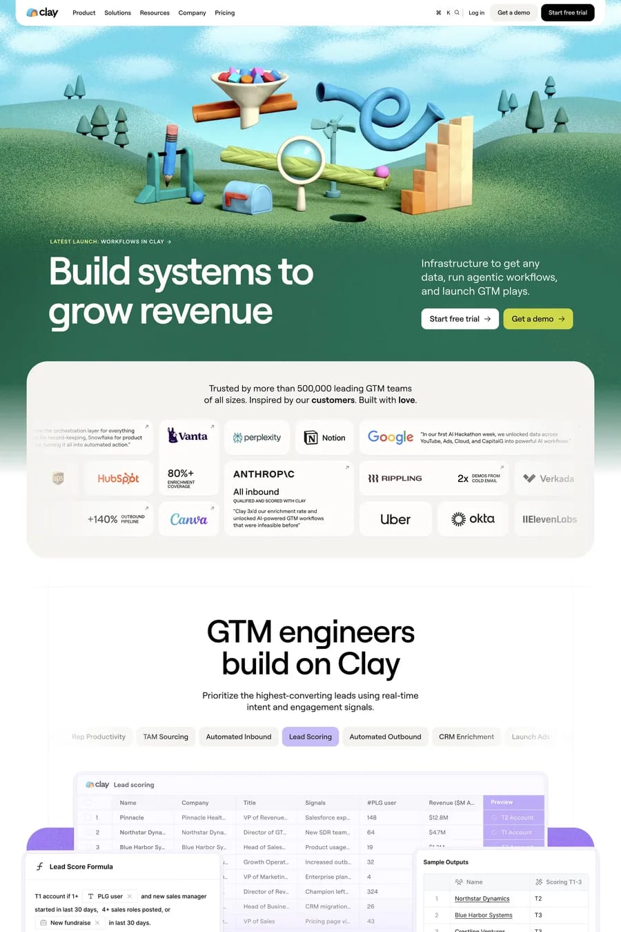
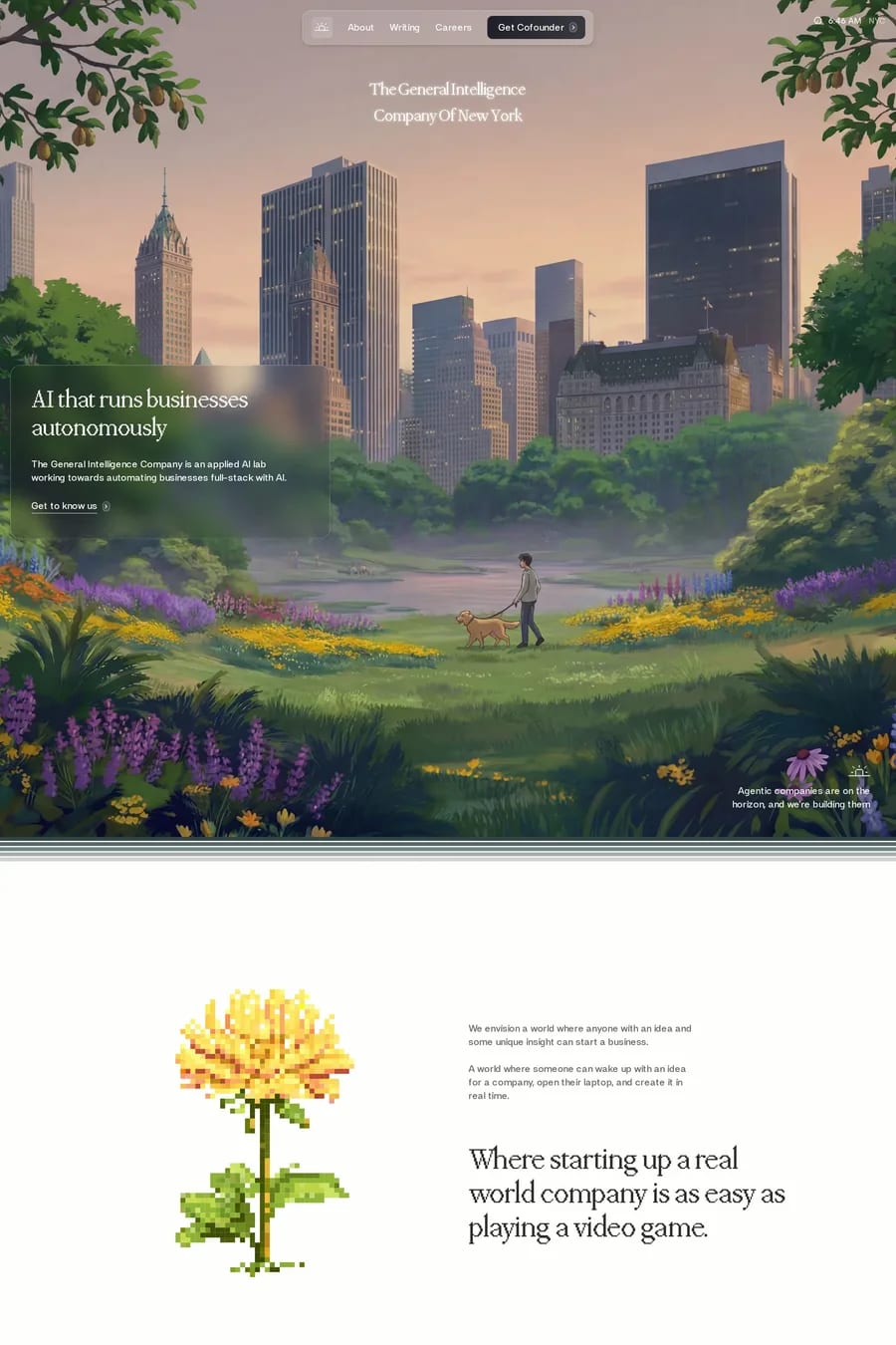
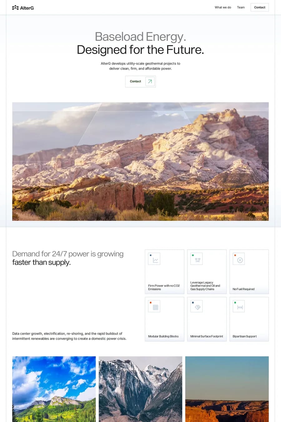
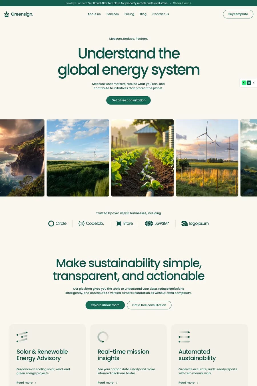
Growth, health, nature and money, depending on the shade. Dark greens read as established and financial. Sage and muted greens read as calm and natural — the wellness default. Bright and lime greens read as energetic and technical. The association is strong enough that green is a shortcut: a wellness brand in green needs less explaining than one in purple.
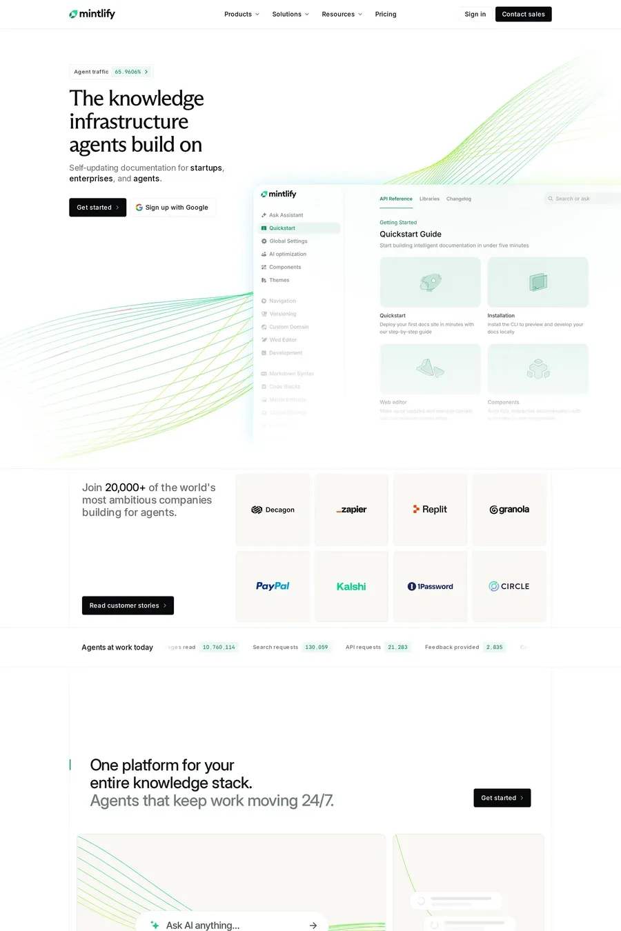
Match the shade to the feeling. Forest or bottle green for finance, law and anything that needs to feel permanent. Sage for wellness, food and lifestyle. Lime or acid green as an accent on a dark software site. Avoid pure, saturated mid-green as a main colour — it’s the colour of a “go” button and an old-school bank, and it’s hard to make feel modern.
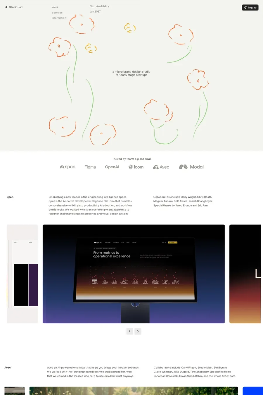
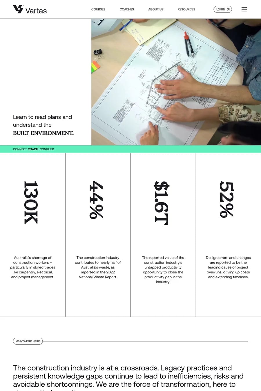
Warm neutrals first: cream, sand, off-white. They soften green and keep it from looking clinical. Near-black for type. For accents, orange and coral work because they sit opposite green; so does a pale pink against sage. Green with blue is harder — the two blend into teal and lose definition. Look at how the sites in this collection keep green to one or two roles rather than the whole palette.
Dark green on a light background, yes. Light or mid green on white, no — it fails contrast for body text. On a dark background, lime and bright green work well for headings and links but tire quickly as body copy. Most sites here use green for headings, buttons and accents, and keep body text in a neutral.