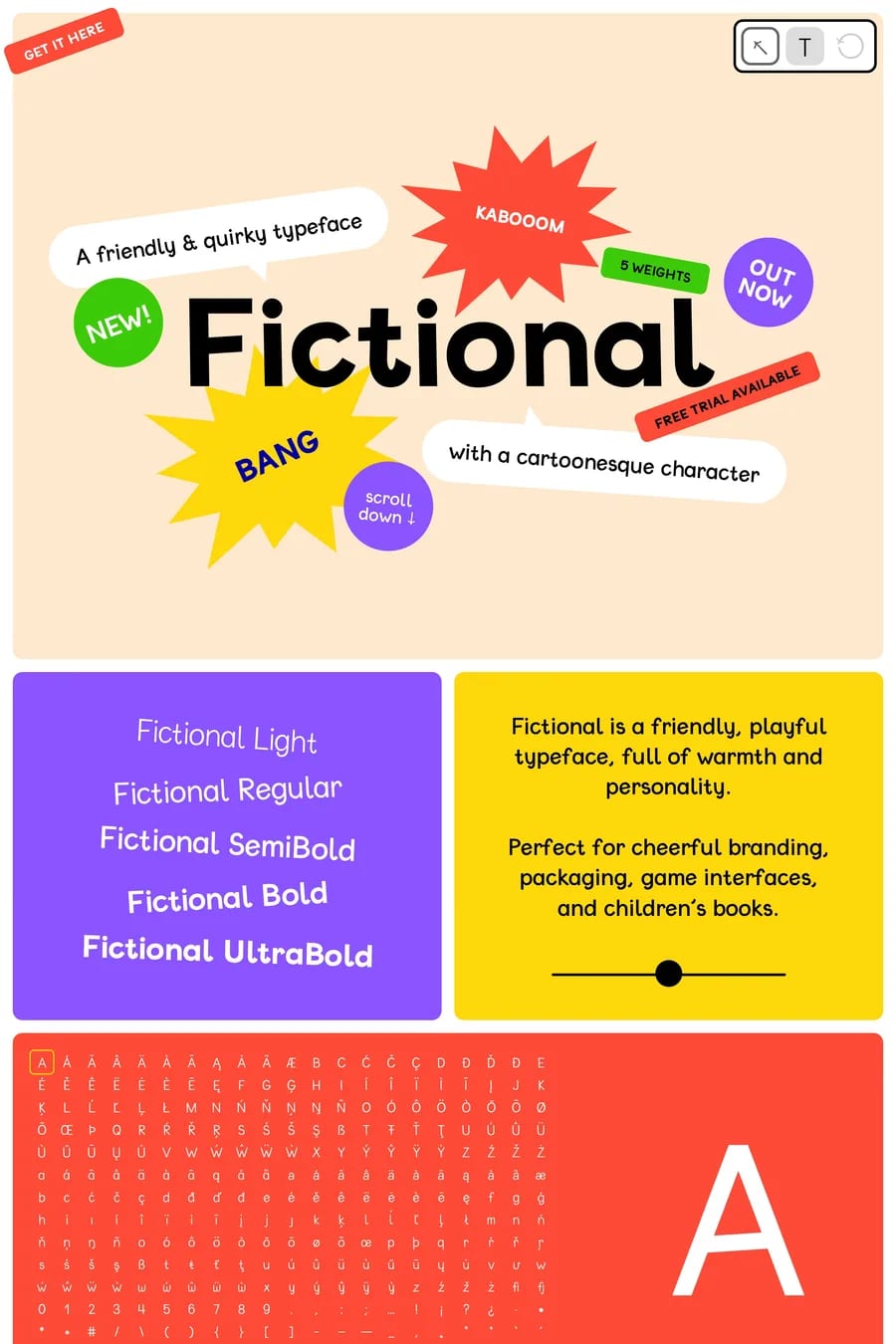
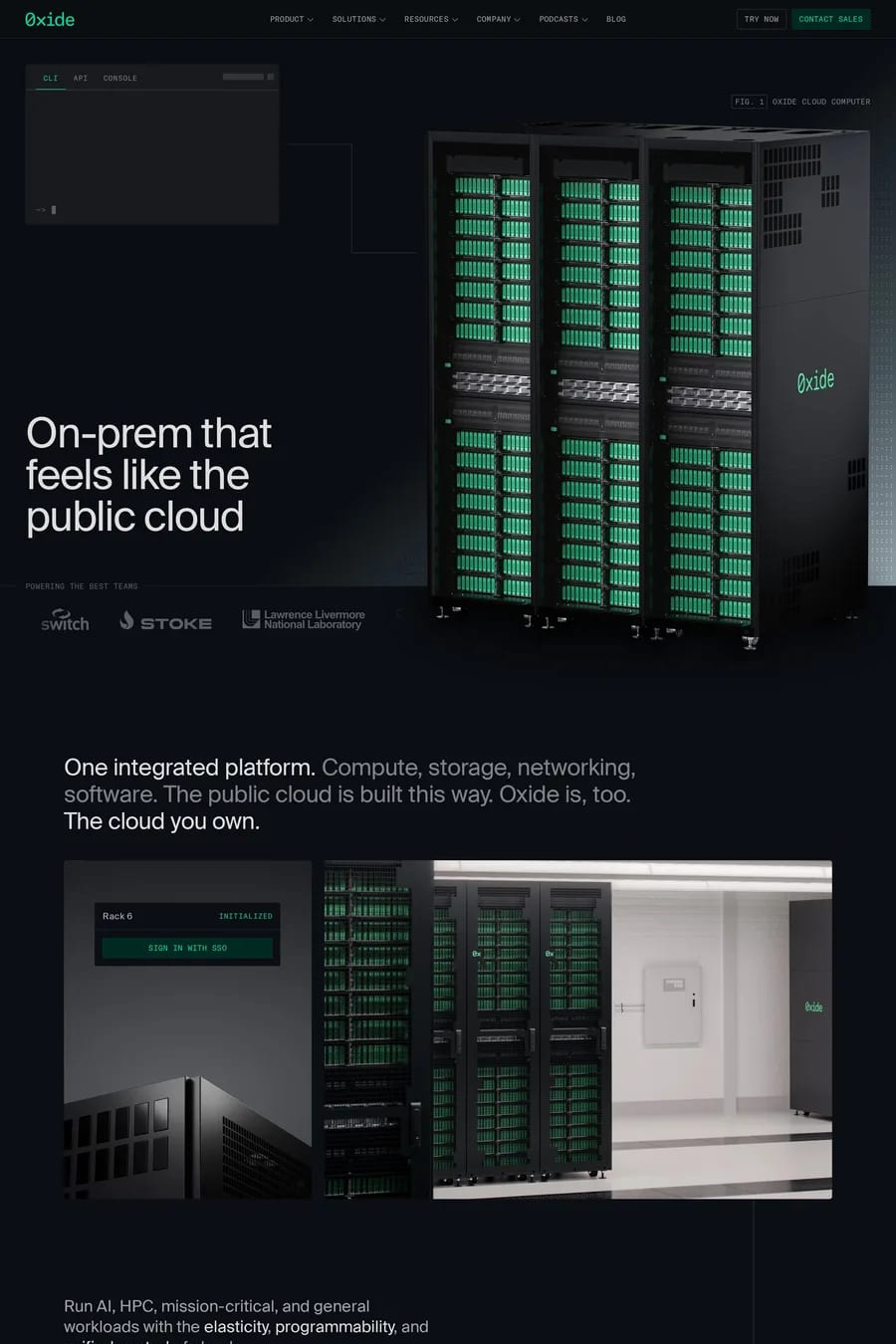
Green is the colour people pick when they want to say growth, health or money without saying it. The sites here cover all three. Canopy and AlterG use it for wellness. Clay and The General Intelligence Company use it as a sharp accent on a neutral page. Finance brands use dark green because banks have used it for a century and it still reads as safe. The shade does the work. Forest and bottle green feel established and expensive. Sage and eucalyptus feel calm and are everywhere in wellness and lifestyle right now. Lime and acid green feel fast and technical, which is why so many software sites use them as the single accent on a dark ground. Mid greens — the pure, saturated ones — are the hardest to use, because they read as “go” or as a traffic light. What to look for in the good examples: green is usually paired with a warm neutral, cream or sand, rather than pure white, which stops it feeling clinical. It rarely covers the whole page; it’s a background for one section, or the accent, or the illustration palette. And the type is almost always dark green or near-black on a green ground, not white, which loses contrast fast. See colourful landing pages, the health category and the finance category for where green shows up most. For the classic pairing, browse green and white websites.