Updated
Curated inspiration sent every Tuesday
Unsubscribe at any time

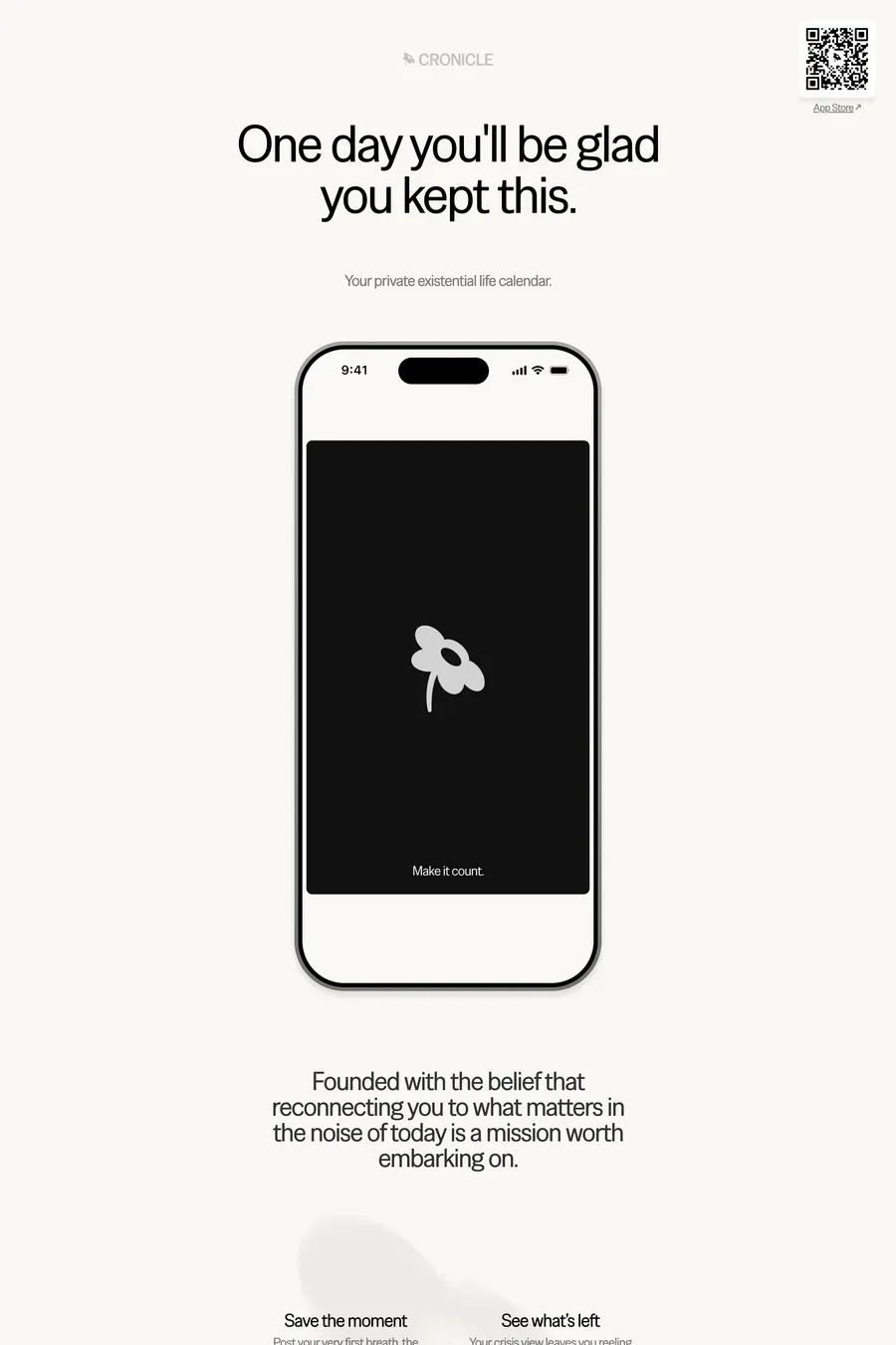
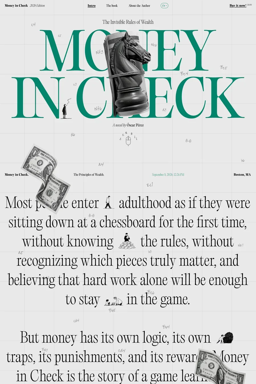
Off-white for the page, pure white for cards and surfaces that sit on top. A page at #fafafa or a warm #f8f6f2 is easier on the eyes than #ffffff and gives you a level above the background to work with. Most of the sites here do this. Pure white for the whole page can look harsh, especially with black type at full weight.
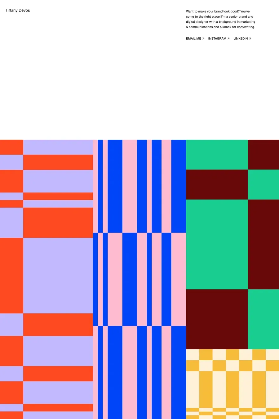
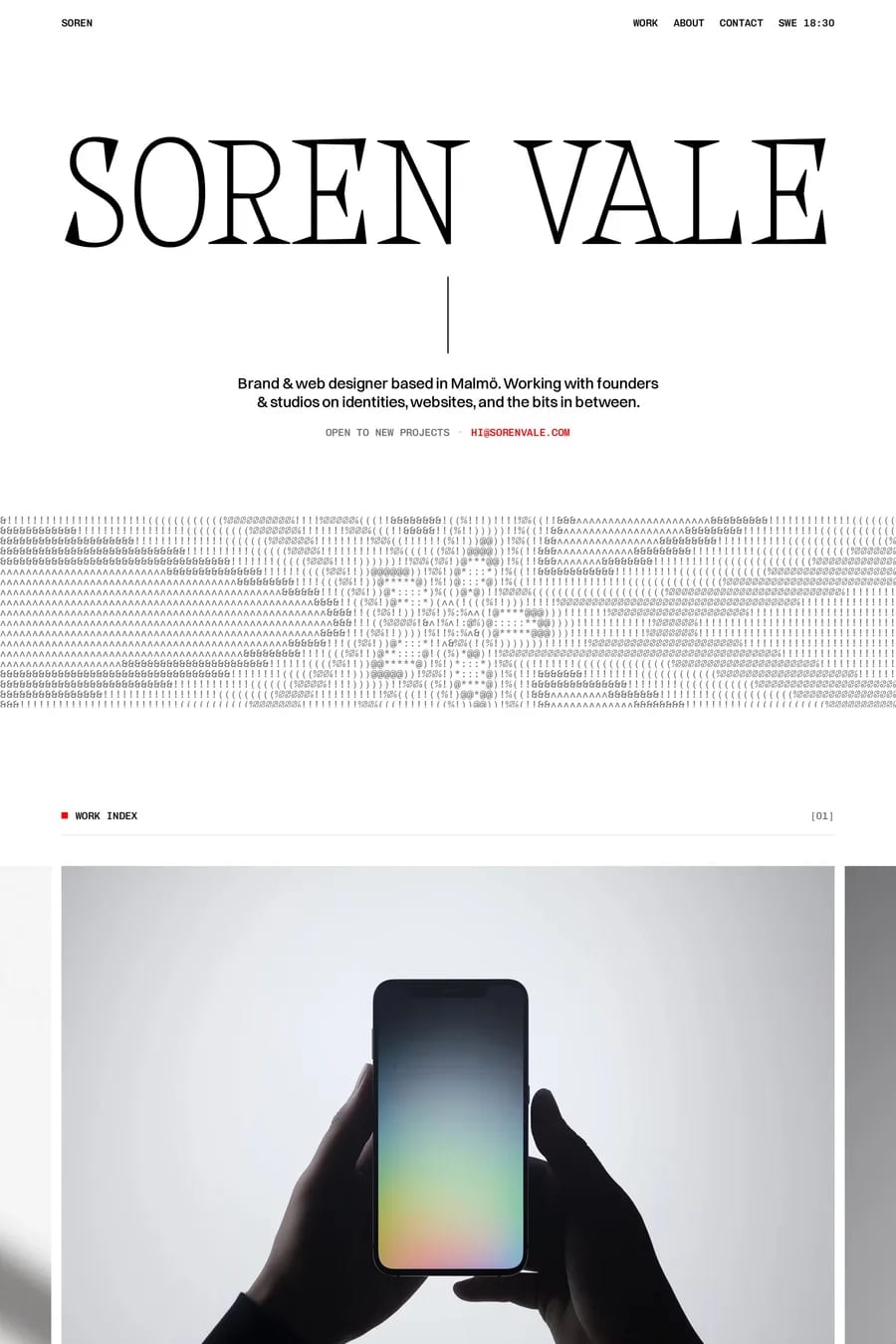
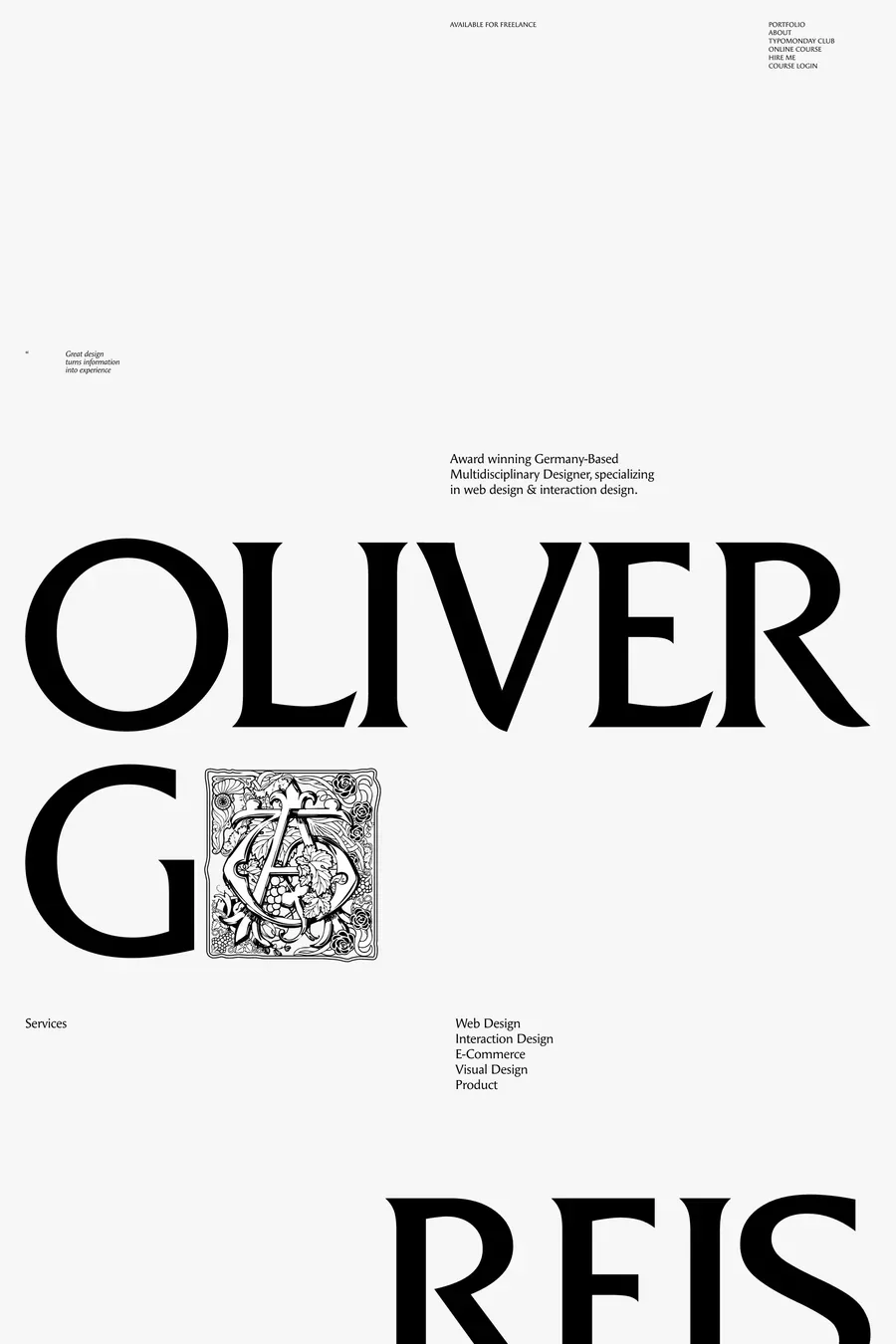
Typography first. A big heading in a considered typeface at the right weight does more than any colour. Then spacing — generous and consistent. Then a single accent used sparingly. Then details: hairline borders, a subtle grid, one good photograph. The difference between a plain site and a designed one on white is almost entirely type and space.
Not pure black. A near-black around #111 to #1a1a1a for headings, a dark grey around #333 to #444 for body text, and a mid grey for secondary. This reduces the harshness of black on white and gives you a hierarchy from tone alone. Check contrast: body text needs at least 4.5:1 against the background, which rules out light greys for anything you need people to read.
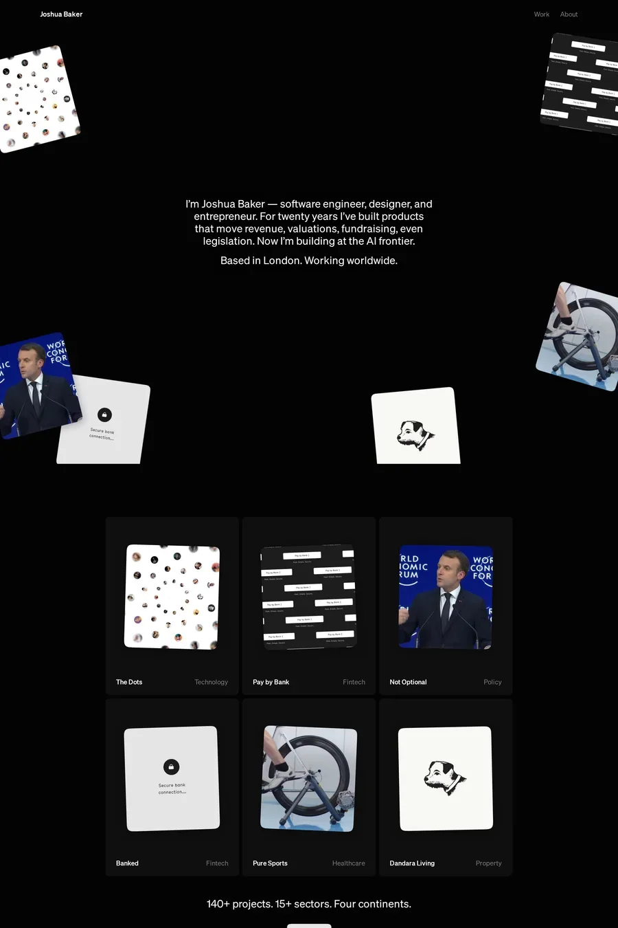
Almost all of them. Software and SaaS, because screenshots sit well on white. Portfolios and studios, because it’s a gallery wall. Health, finance and anything that wants to feel trustworthy. Fashion and beauty, where white means clean. It’s the default, which is the challenge: on white, you have to earn attention with the content.
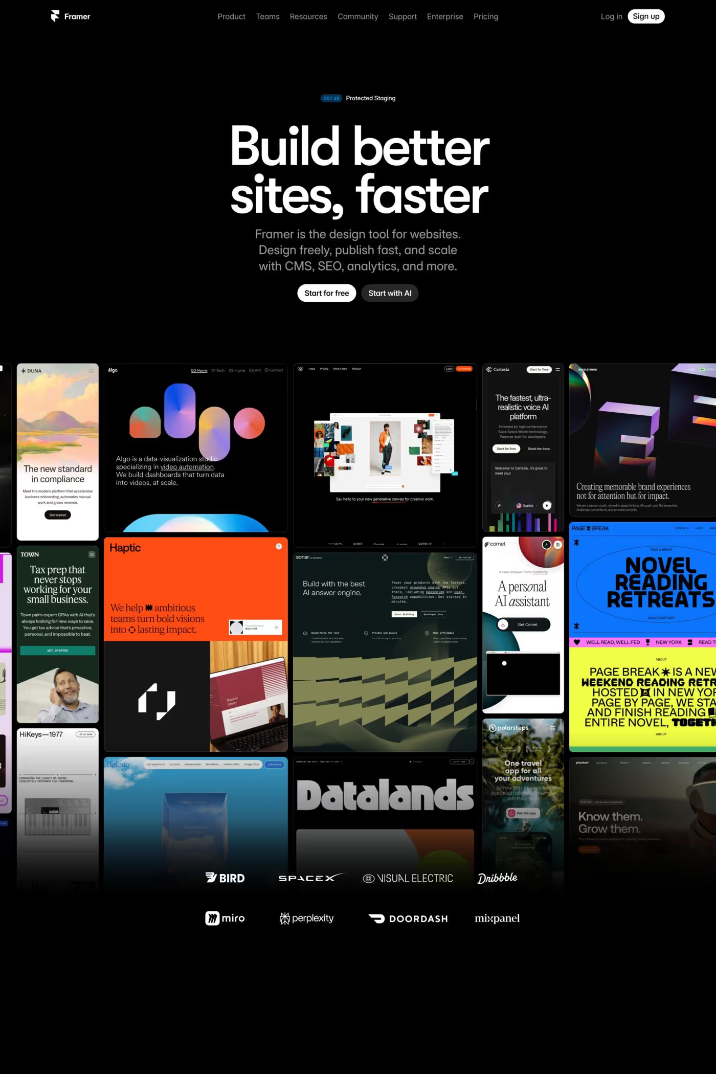
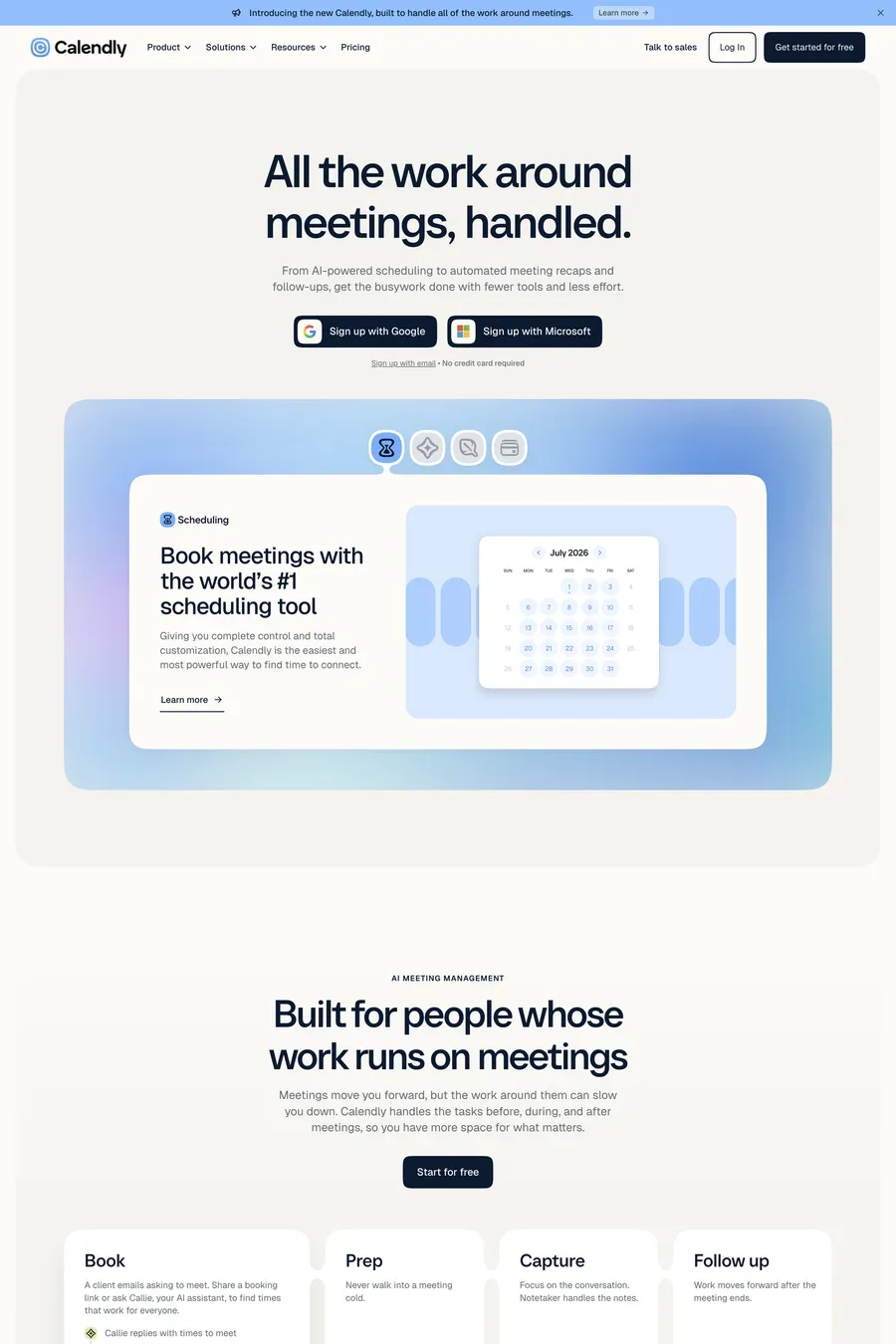
White if the product is light-mode, or if the audience is broad and the site is mostly reading. Dark if the product is dark-mode, or if the brand wants to feel technical. Plenty of software sites in this collection are white and look sharper for it — dark has become so common for software that white now stands out. Whatever you choose, design the marketing site to match the product’s UI.