
Updated
Curated inspiration sent every Tuesday
Unsubscribe at any time

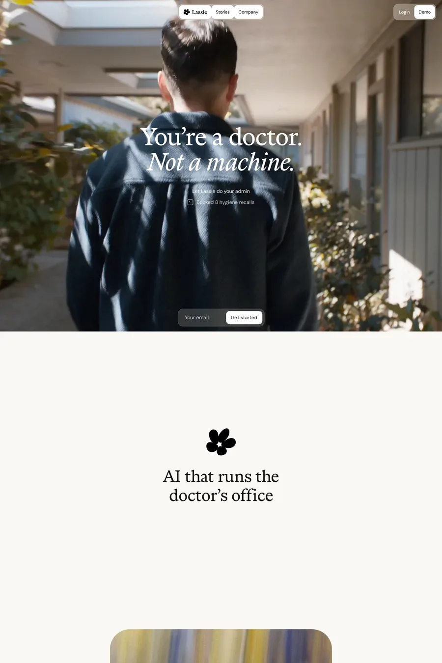
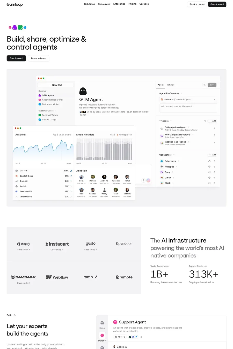
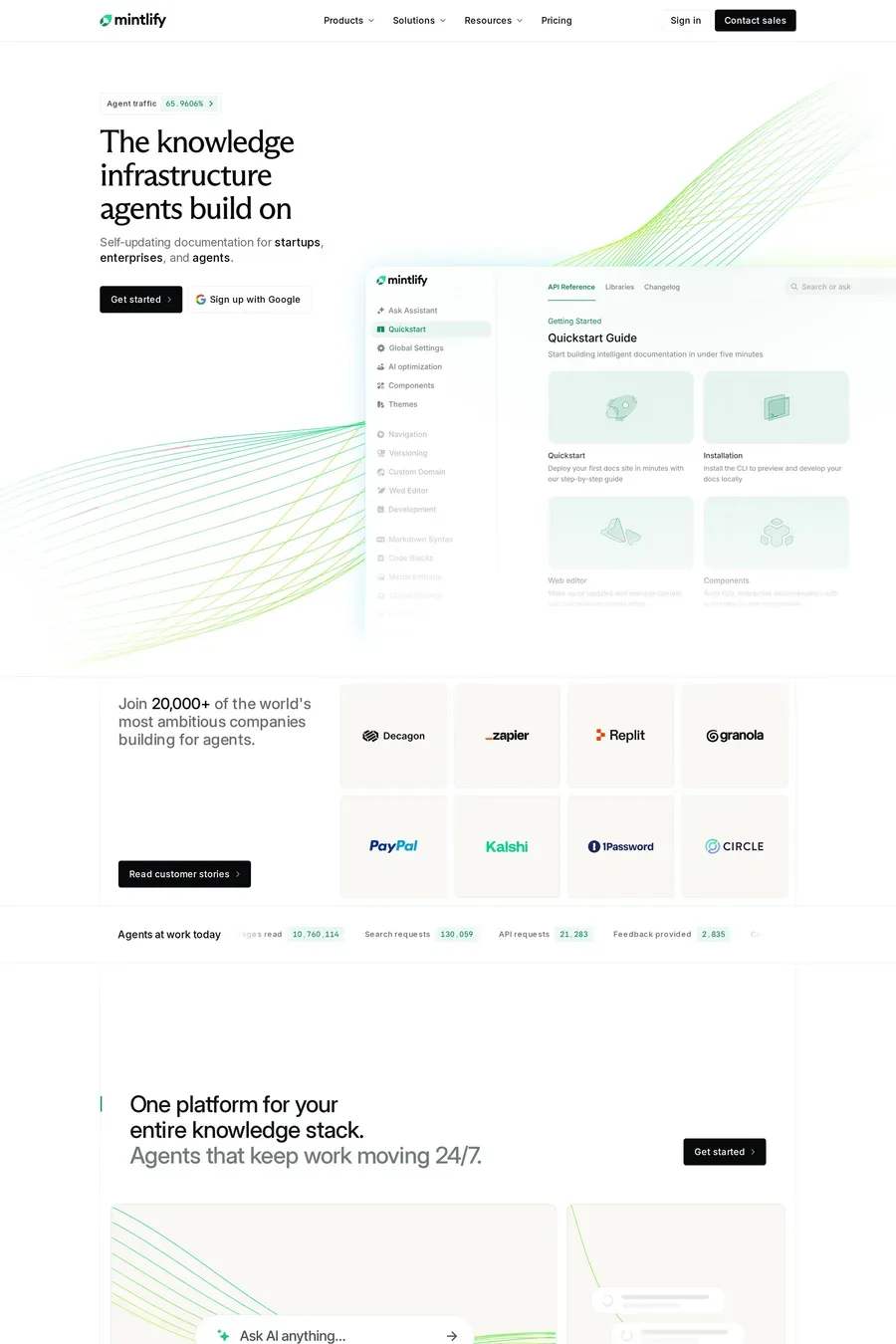
They show the product doing its job within the first screen. A short recording or an interactive demo of a real input and a real output. Then proof: customer names, a benchmark, a security or privacy page linked from the nav. Then clear pricing. The look — dark, gradients, glow — is secondary. The sites that convert are the ones where you understand what the thing does in five seconds.
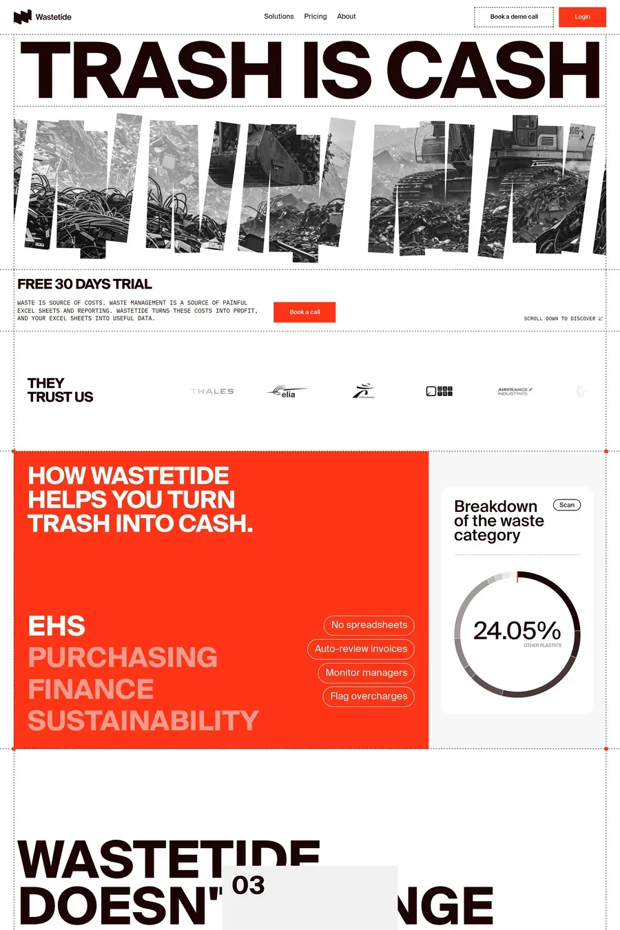
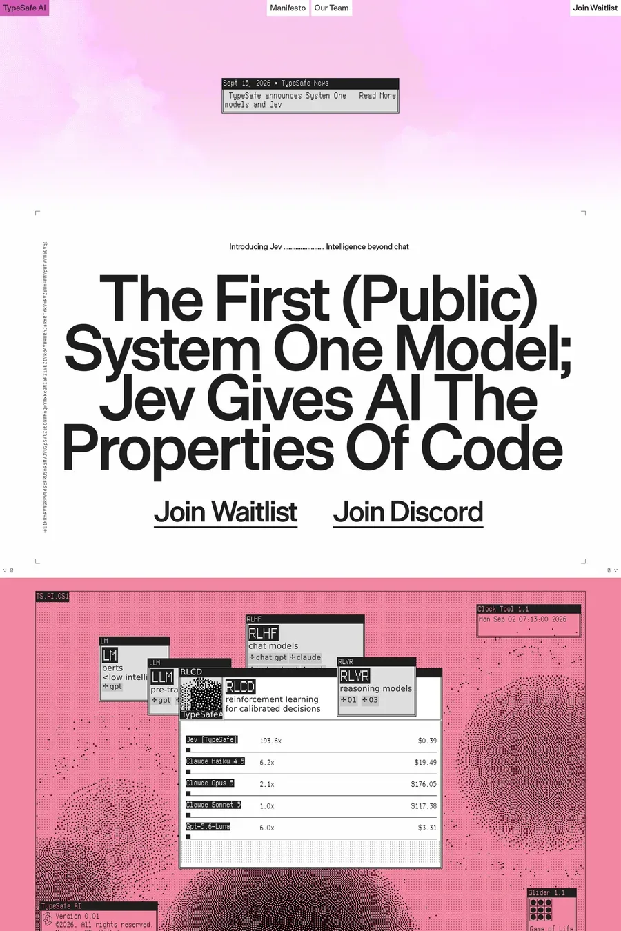
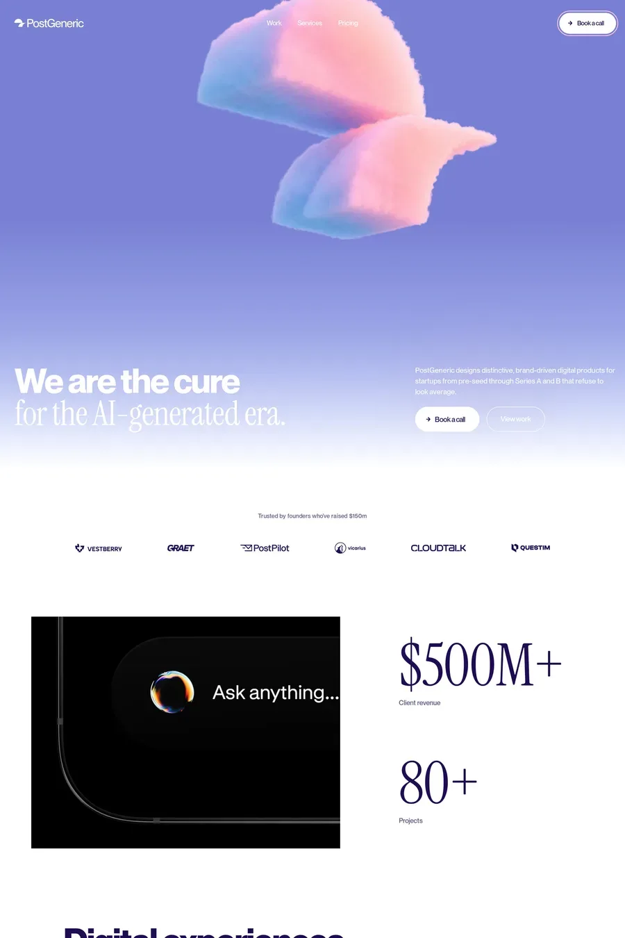
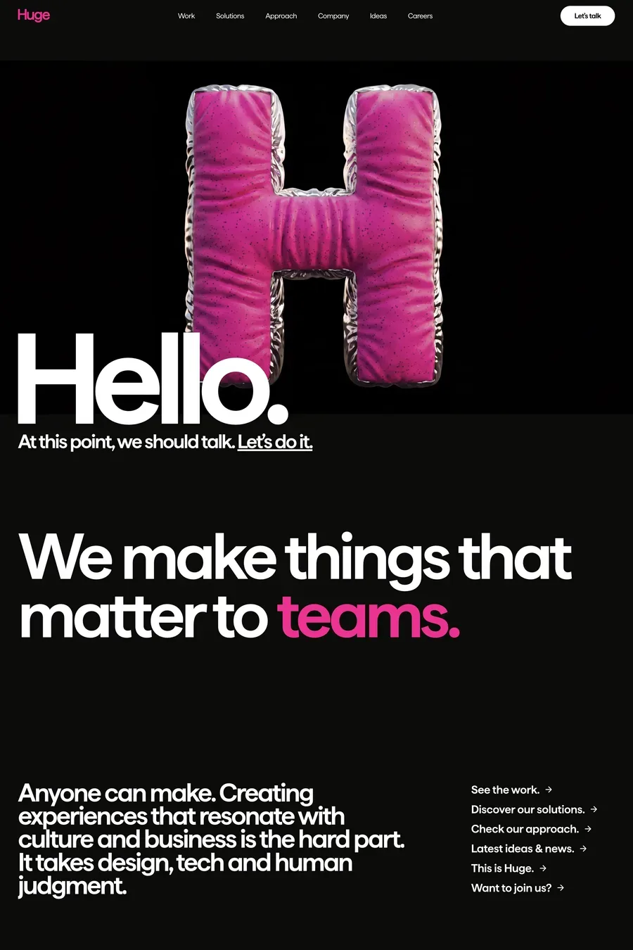
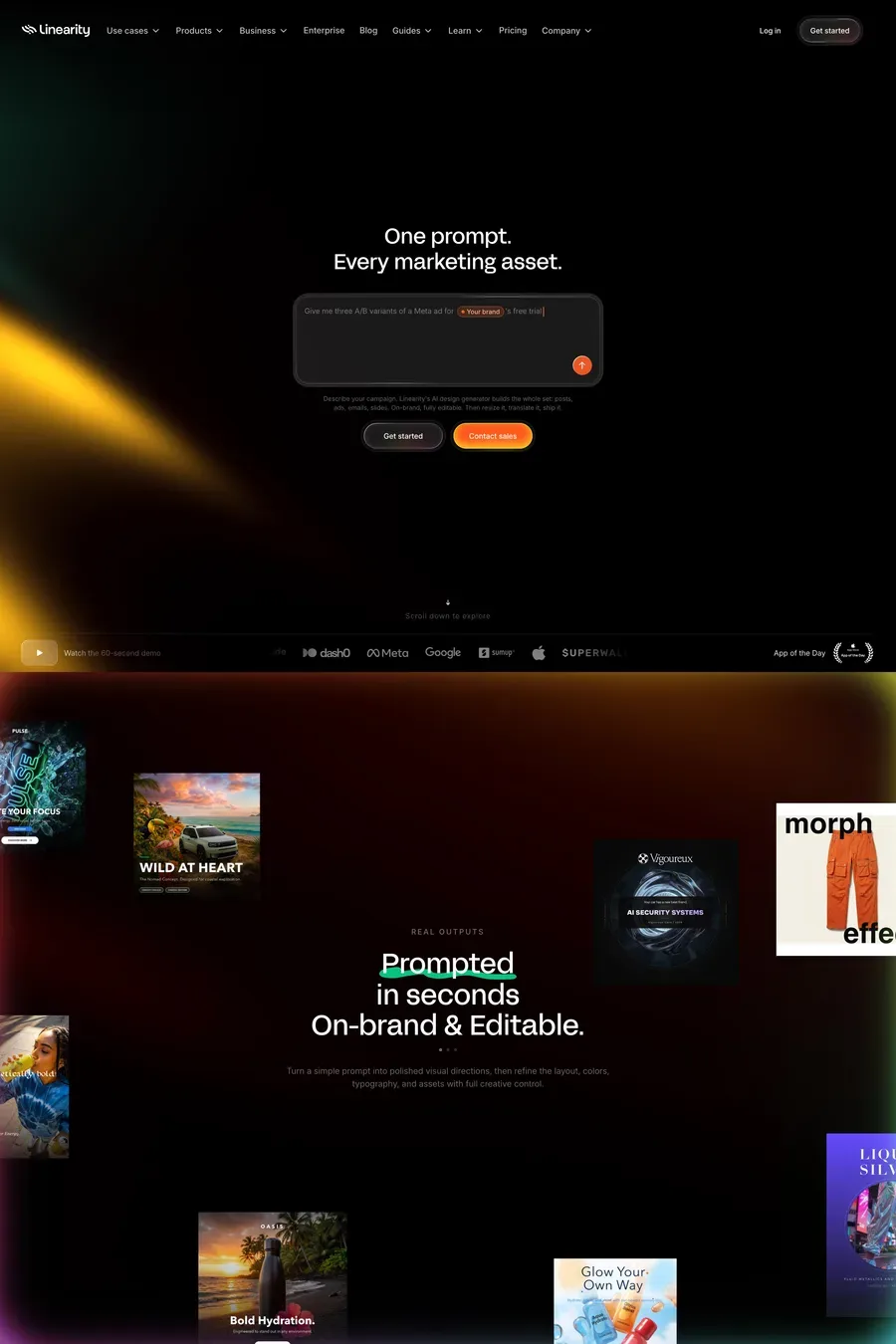
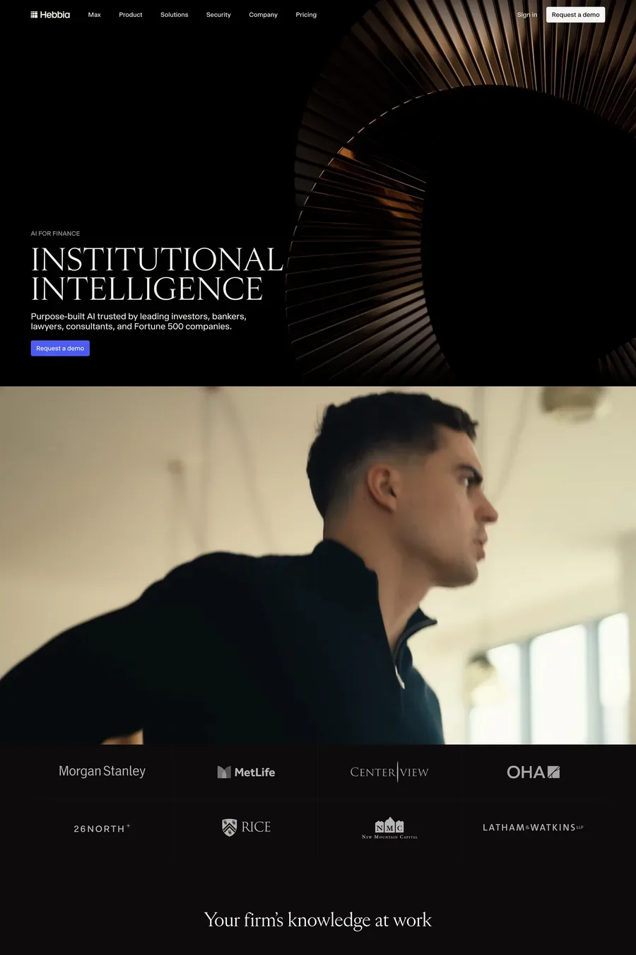
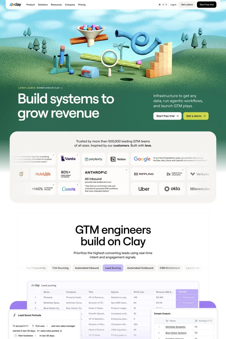
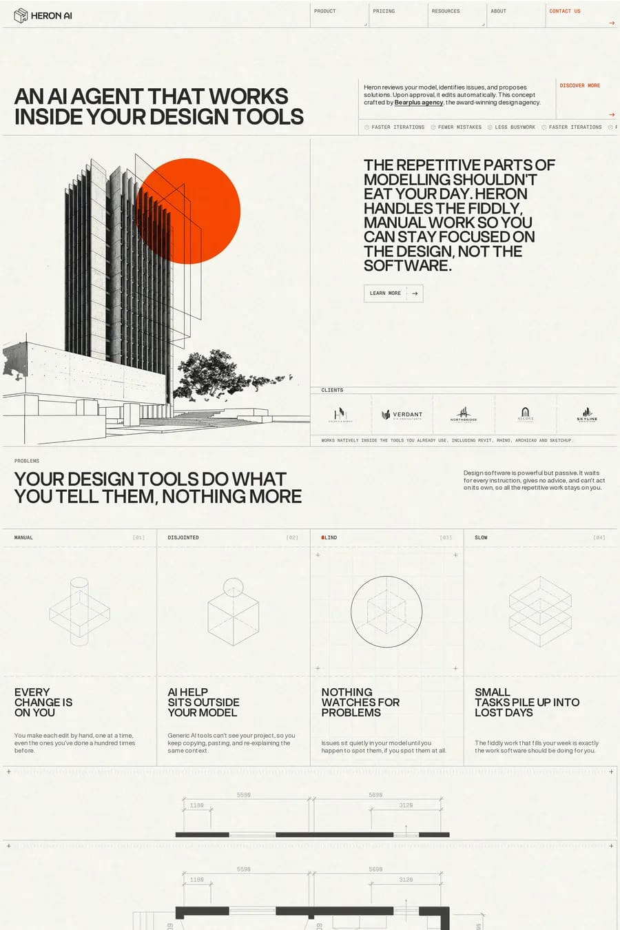
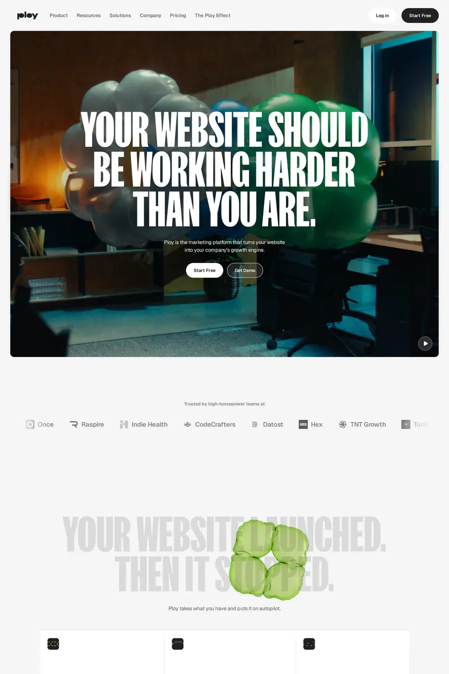
They were built at the same time, by teams copying the same few references, on the same tools. Dark mode with a gradient glow became the shorthand for “AI product” in 2023 and hasn’t moved on. It’s also a real constraint: AI products are often abstract, and a glow is easier than explaining. The sites in this collection that stand out either went light, went typographic, or replaced the glow with a real demo.
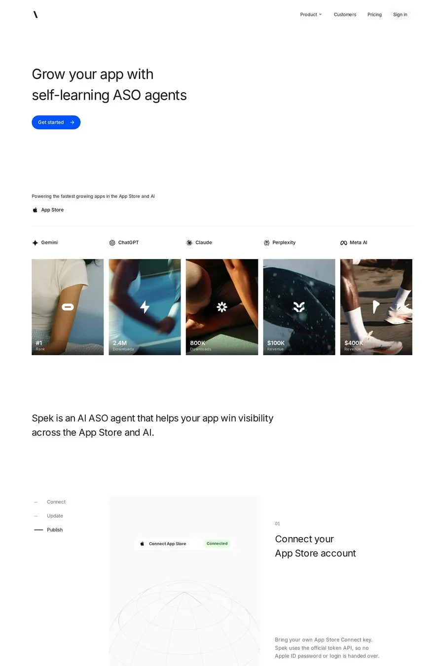
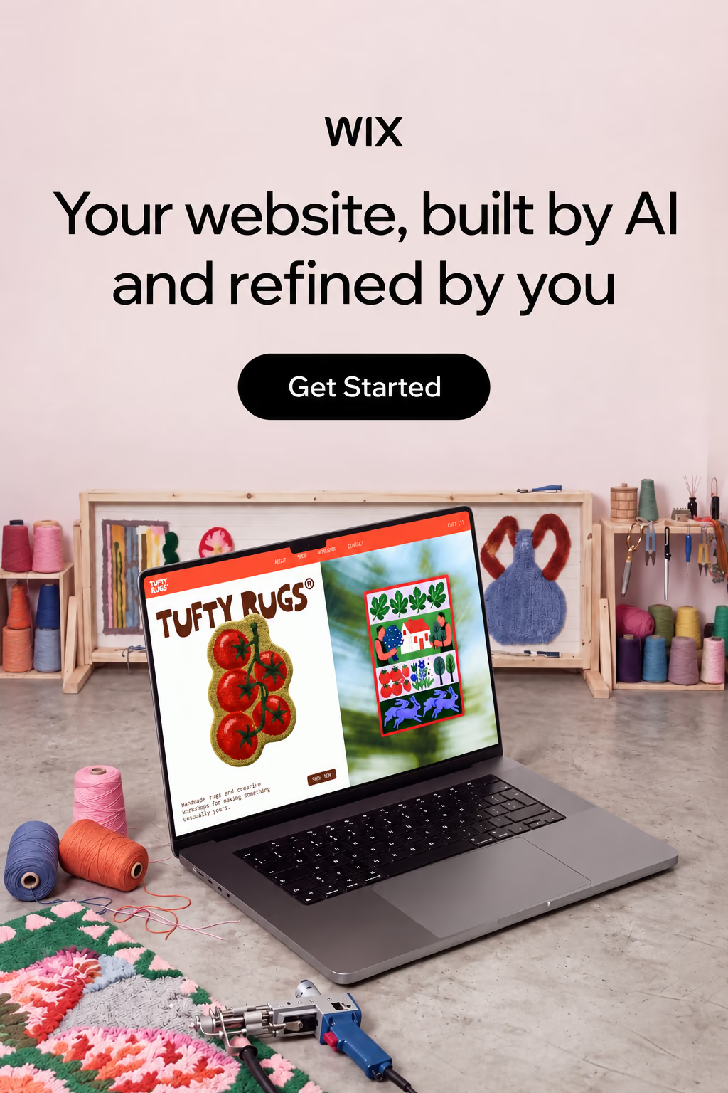
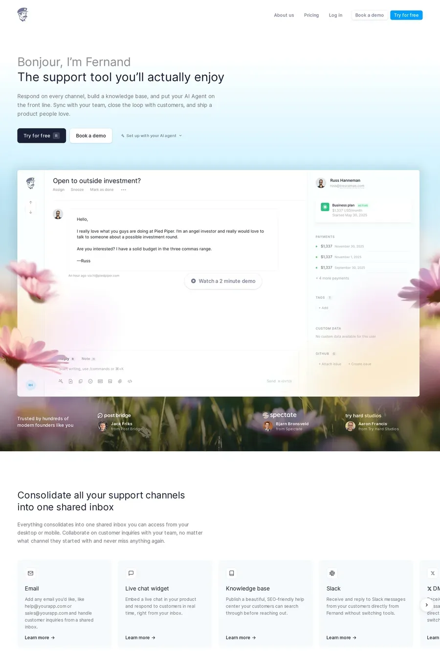
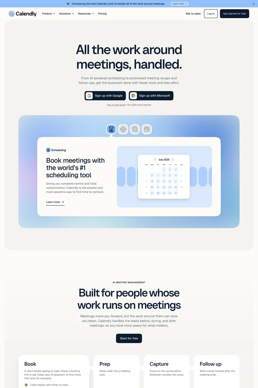
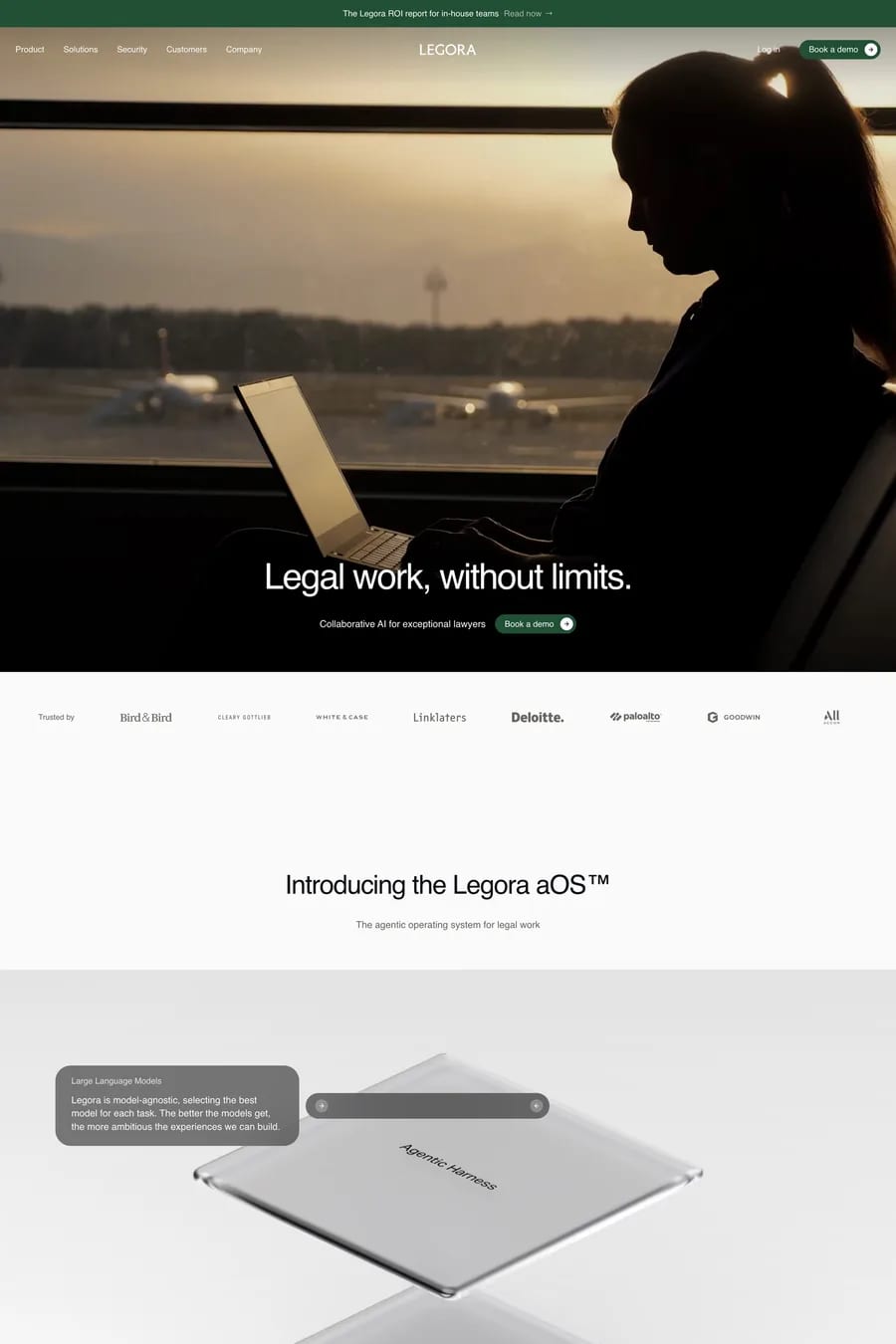
Dark is the category default and still reads as technical. Light is now the way to stand out, and it suits products aimed at non-technical buyers — marketing teams, lawyers, doctors. Pick based on the audience and the product’s own UI. Whichever you choose, the site should match what people see after they sign up.
Specifics. Named customers over anonymous logos. A benchmark with the method shown. A security page that says where data goes and whether it trains the model. Named founders with real backgrounds. Honest limits — what the product doesn’t do. AI buyers have been burned by demos that didn’t match the product, so the sites here that do well are the ones that under-promise on the page.
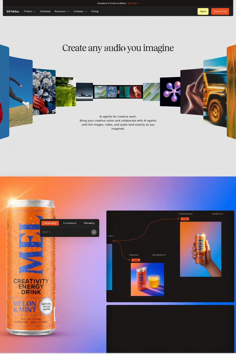
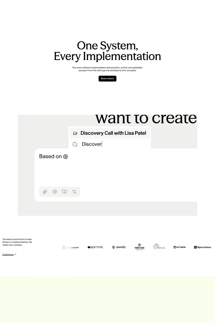
One real task, start to finish, in under ten seconds. Input, processing, output. Cropped tight, no cursor wandering, no fake speed-up. If the product takes longer than that, show the result and let the visitor infer the wait. Interactive demos are better still if they’re honest — a playground with a real model behind it beats any recording.