Atlas Studio
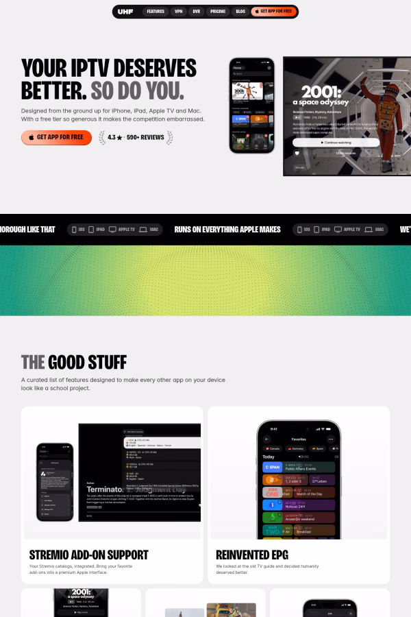
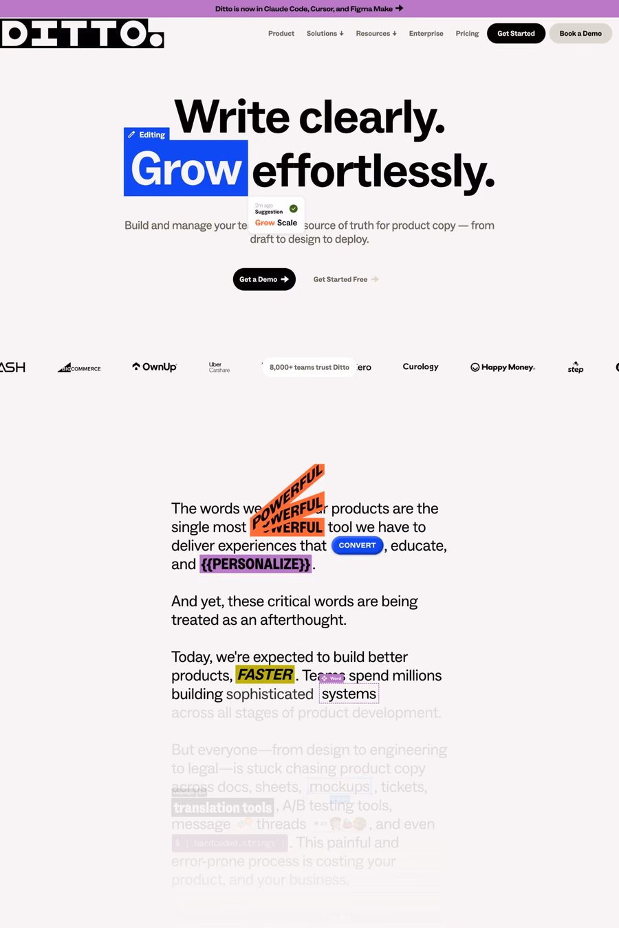
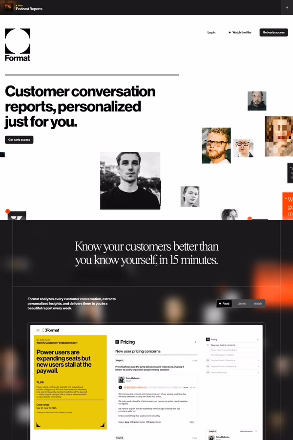
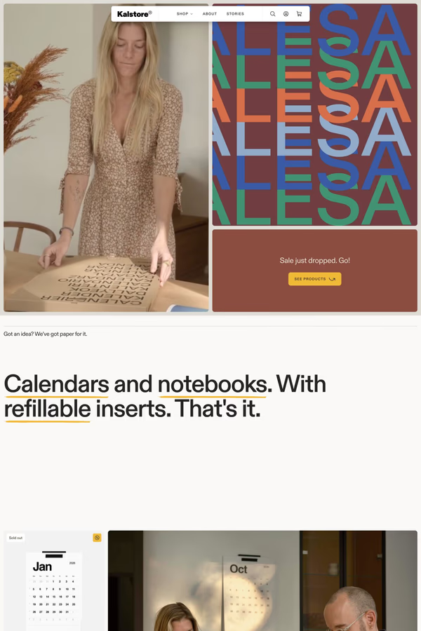
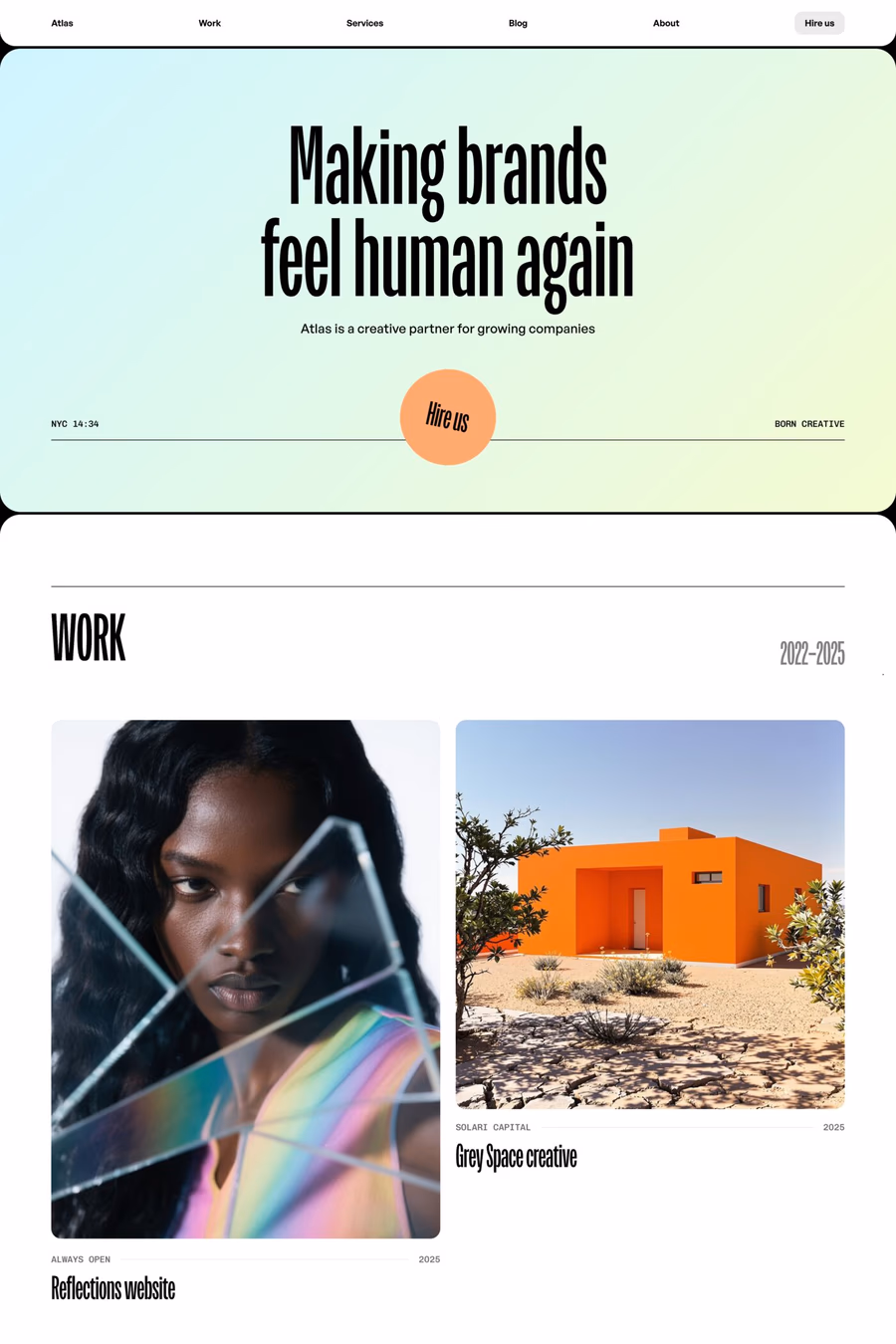
GetBig type design makes oversized typography the centrepiece of the layout, often filling the entire viewport with letterforms. These sites treat text as a visual element in its own right, using scale, weight, and spacing to create immediate impact and bold brand statements.
Curated inspiration sent every Tuesday
Unsubscribe at any time

Success with big type requires careful attention to viewport-relative sizing (clamp, vw units), optical kerning at large scales, and restrained use of supporting elements. The typography itself needs to carry the design, so font choice is absolutely critical.
Display and headline fonts with strong character — such as condensed grotesks, high-contrast didones, or expressive variable fonts — work best at massive scales. The key is choosing typefaces designed to be seen large, as body text fonts often look awkward when blown up.