
Updated
Curated inspiration sent every Tuesday
Unsubscribe at any time
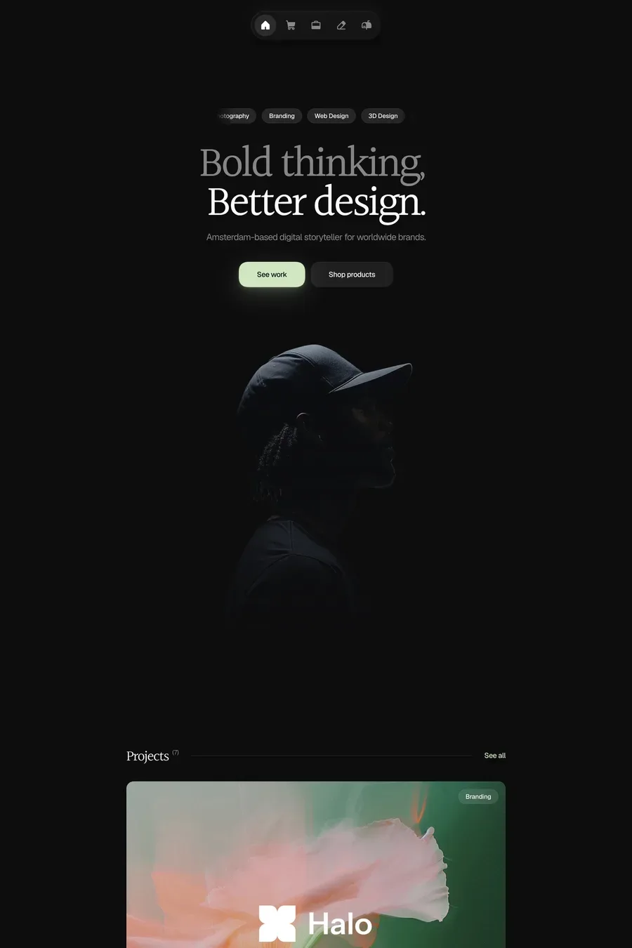
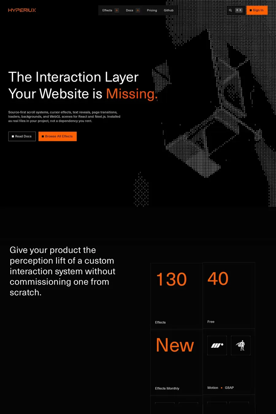
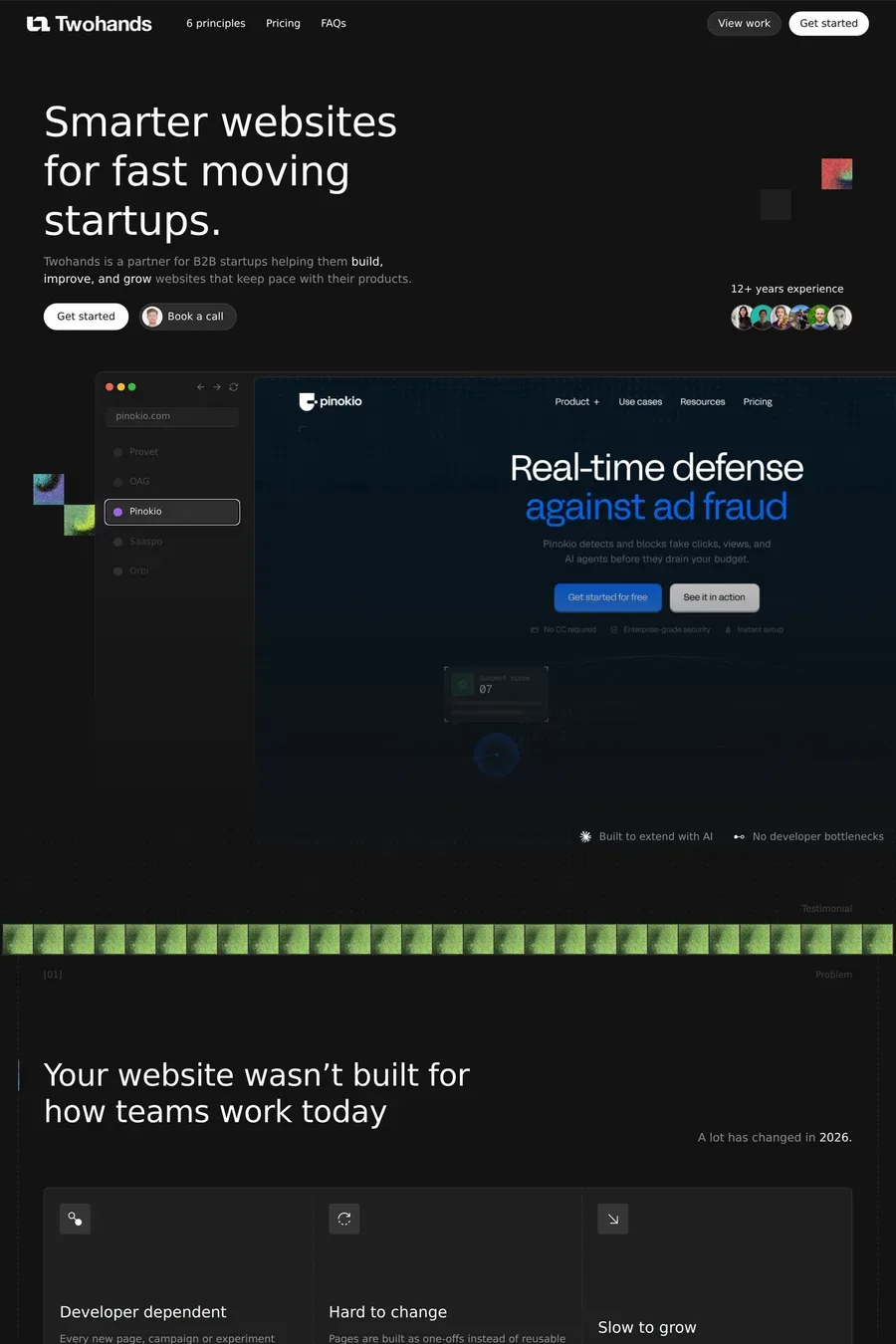
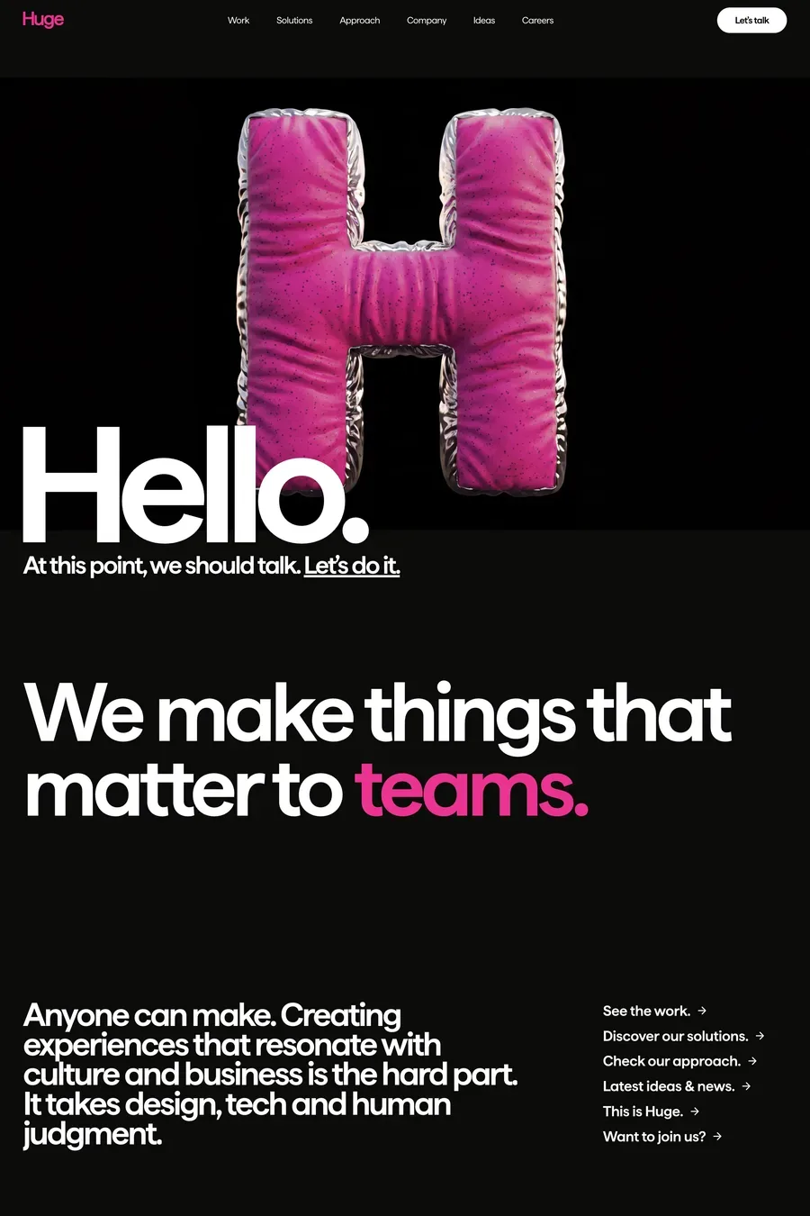
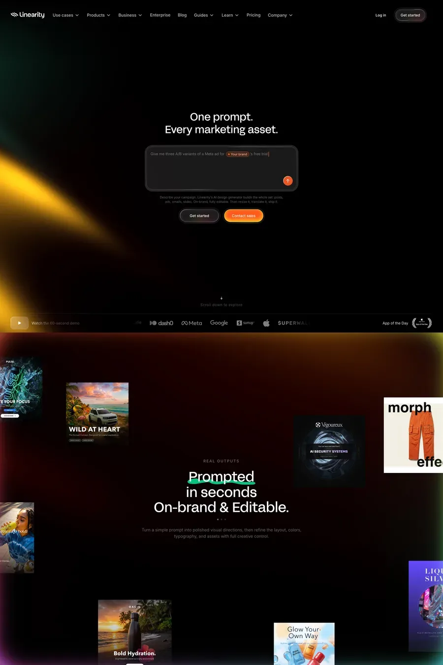
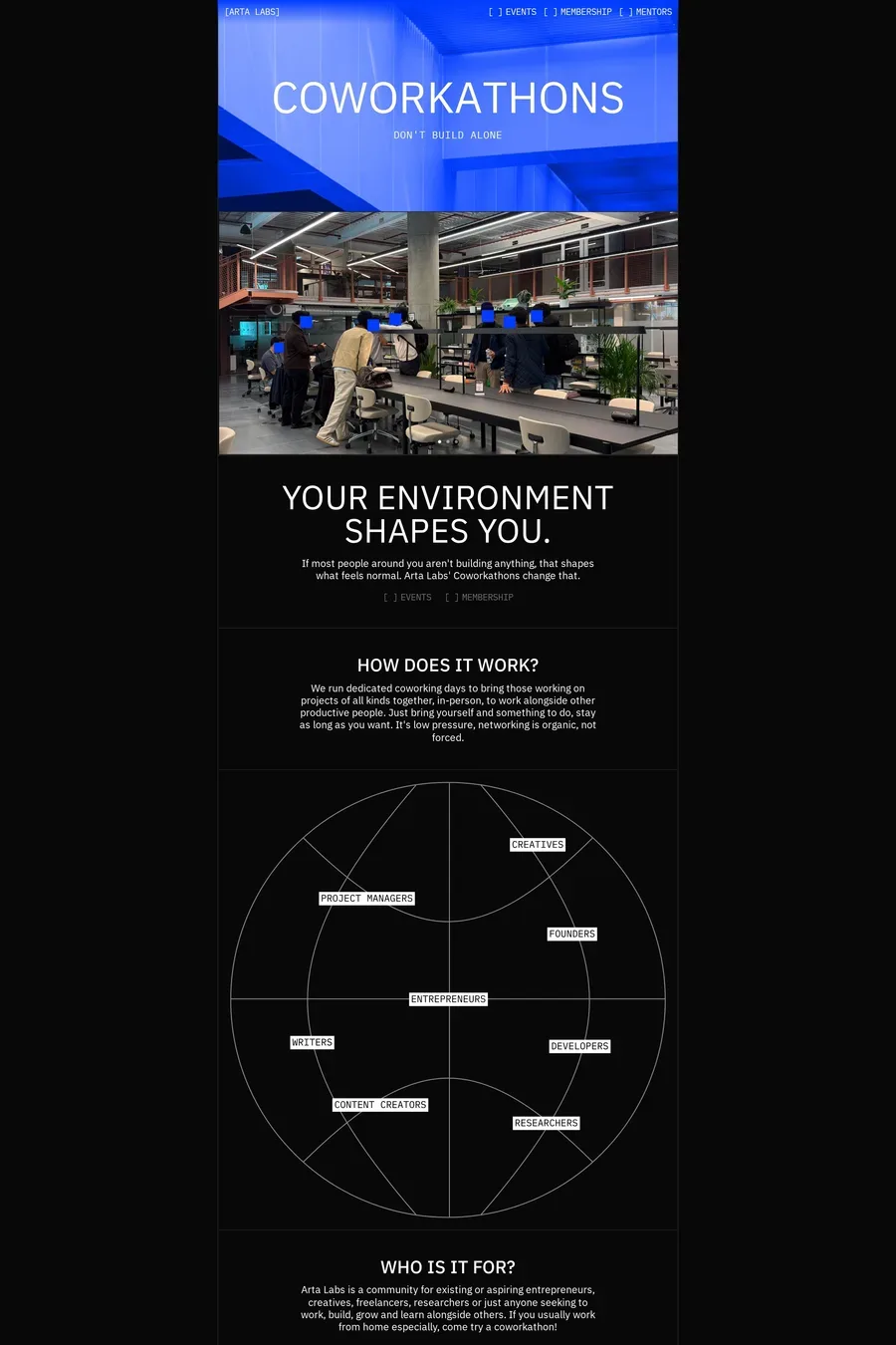
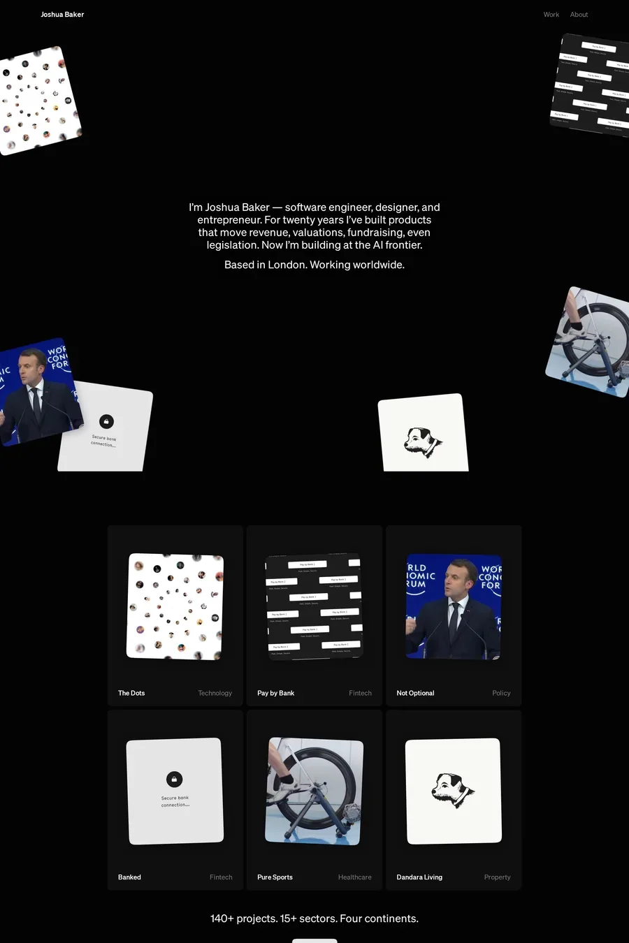
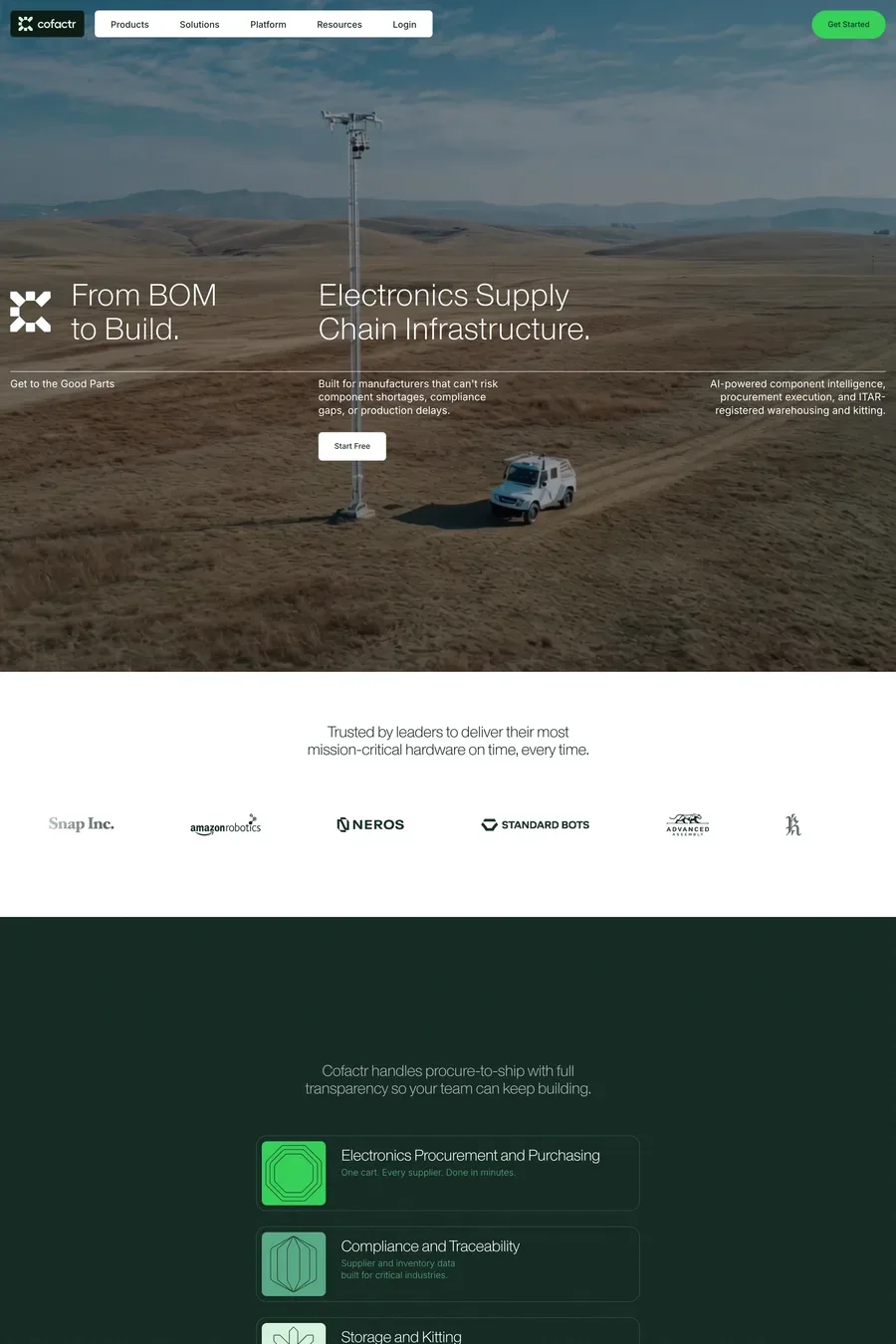
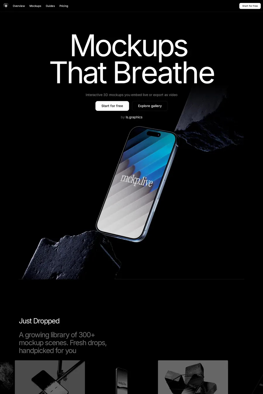
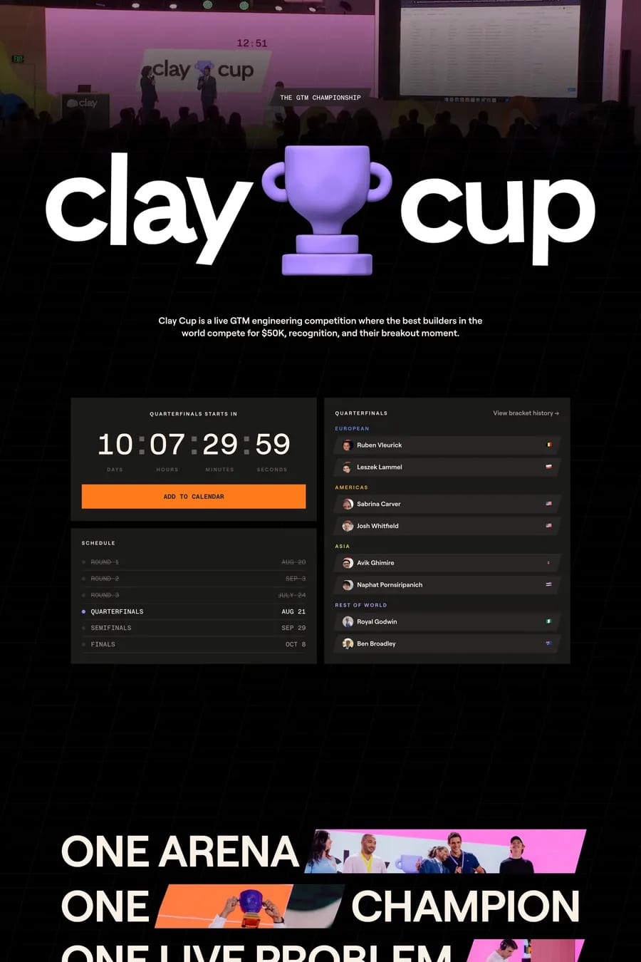
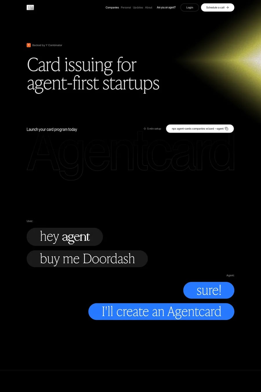
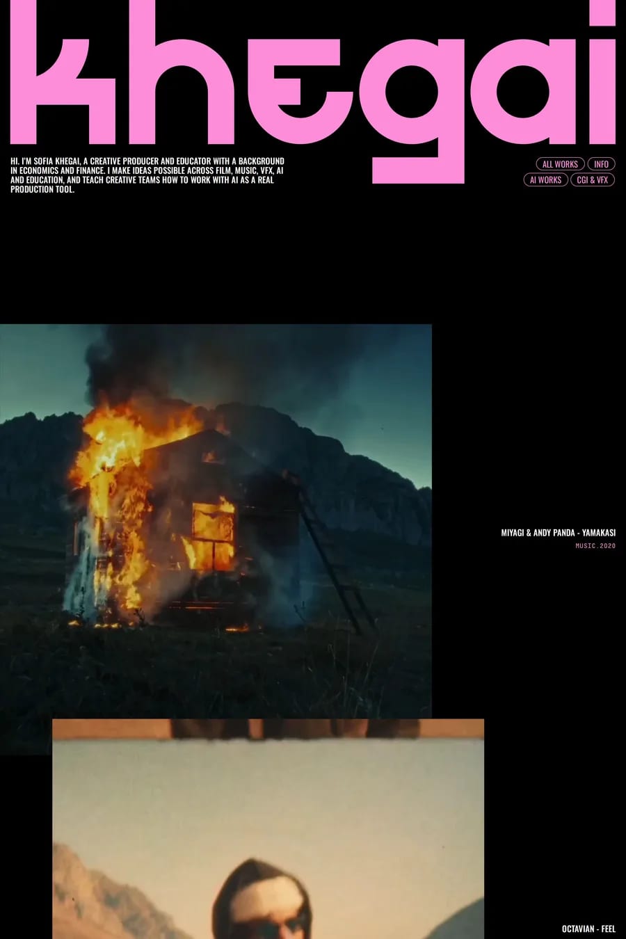
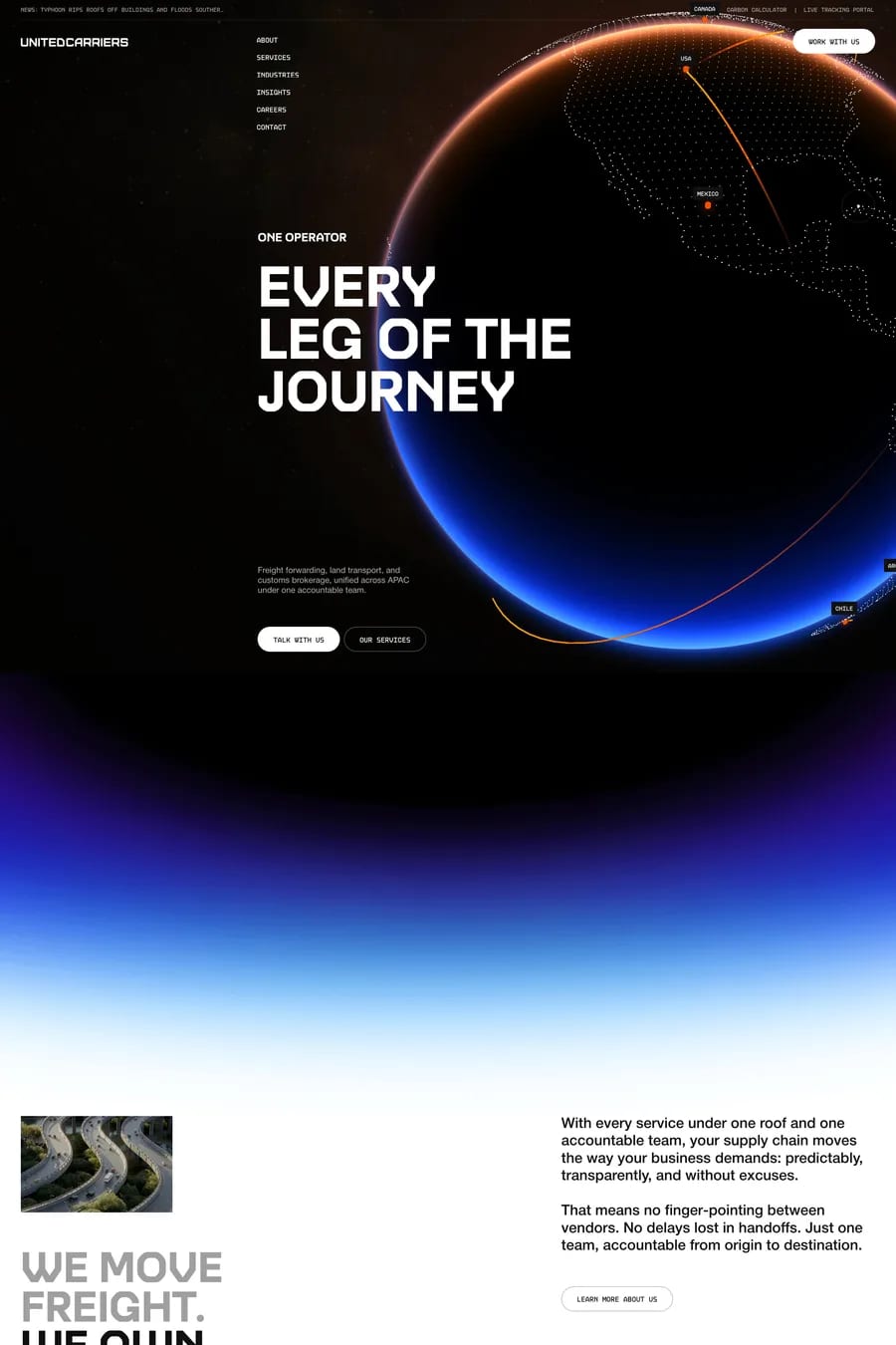
Dark grey, almost always. Pure #000 makes light text halate — it looks like it’s glowing — and it flattens the page because nothing can be darker than the background. Most sites here sit between #0a0a0a and #141414, often with a slight colour tint. Save pure black for OLED-focused apps or for a deliberate high-contrast look.
Not pure white. An off-white around #e6e6e6 to #f0f0f0 for headings, a step darker for body text, and a mid grey for secondary text. Use a medium font weight for body copy — regular and light weights look thinner on dark backgrounds than they do on light. Check contrast ratios as you would on a light site; dark mode doesn’t get a pass.
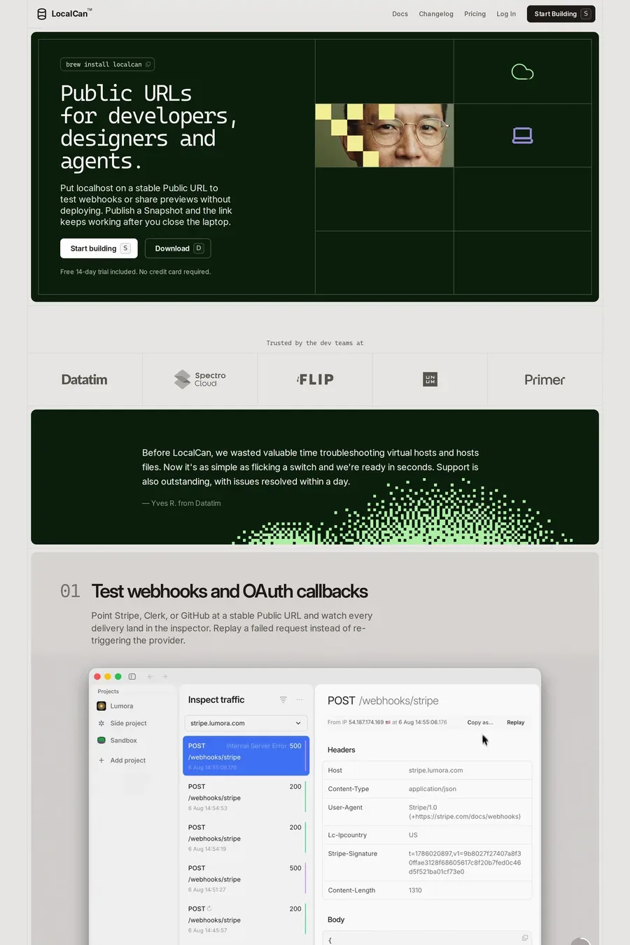
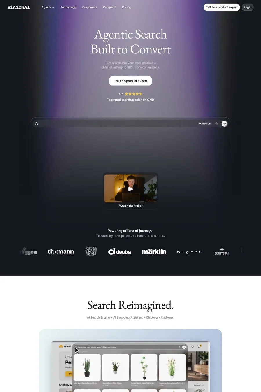
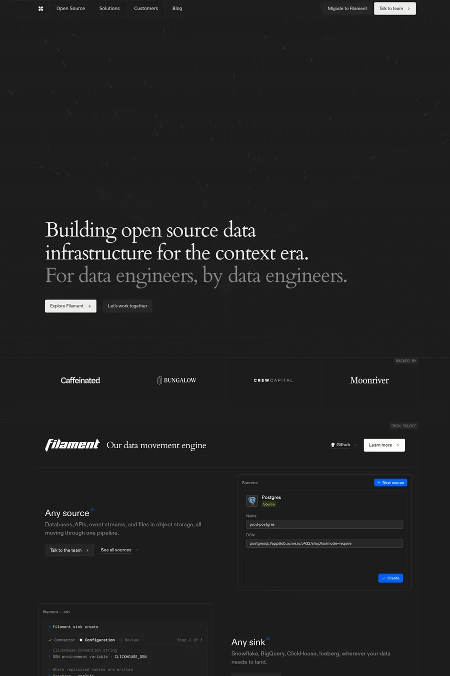
Layer tones. Background, card, raised card, each one a few percent lighter. Add a 1px border at low opacity rather than a shadow — shadows barely show on dark backgrounds. A subtle gradient or a soft radial glow behind the hero gives the page a light source. Look at how the software sites in this collection stack surfaces; it’s rarely more than three levels.
For an app, yes — people work in bright rooms. For a marketing site, only if the brand needs it. Maintaining two themes doubles the design work and most dark-first brands don’t bother. If you do both, design them separately. A light theme that’s just the dark one inverted always looks wrong.
Partly convention — terminals and code editors are dark, so the audience is used to it. Partly signalling: dark reads as serious and technical. And partly practical: UI screenshots from dark-mode products sit better on a dark page. It’s become the category default, which is also the argument against it if you want to stand out.