New A1 Pro: unlimited saves, priority submissions and more →

118 dark landing page examples

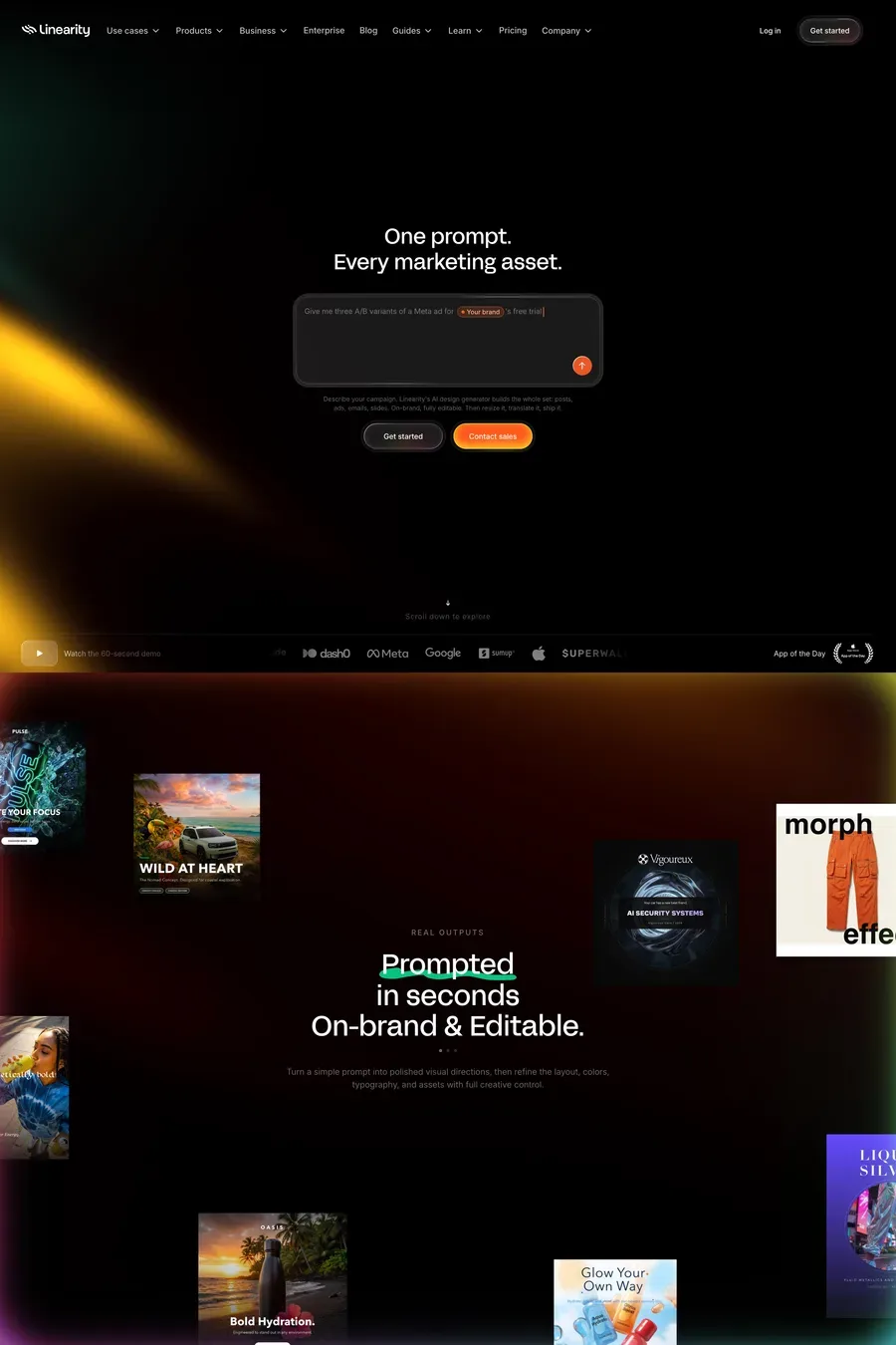
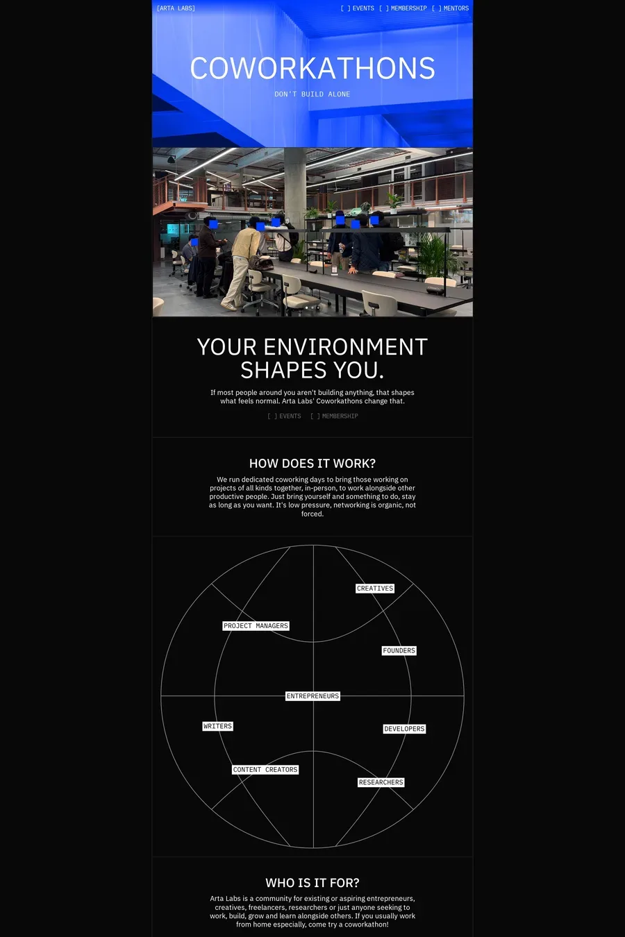
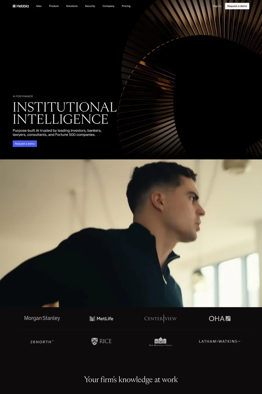
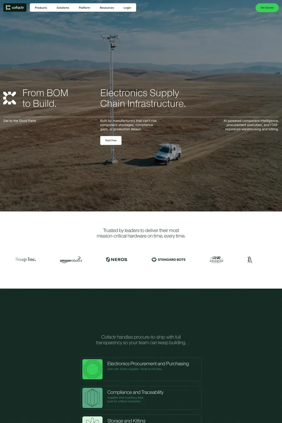
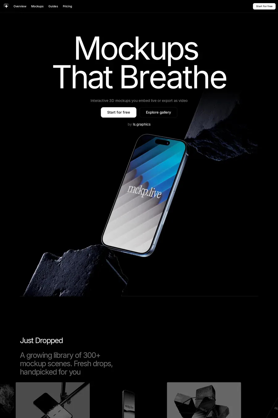
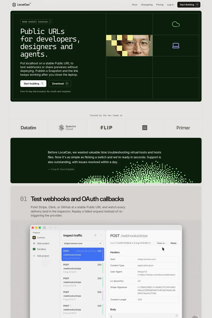
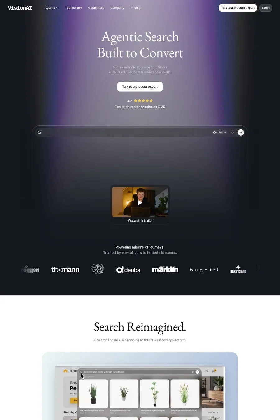
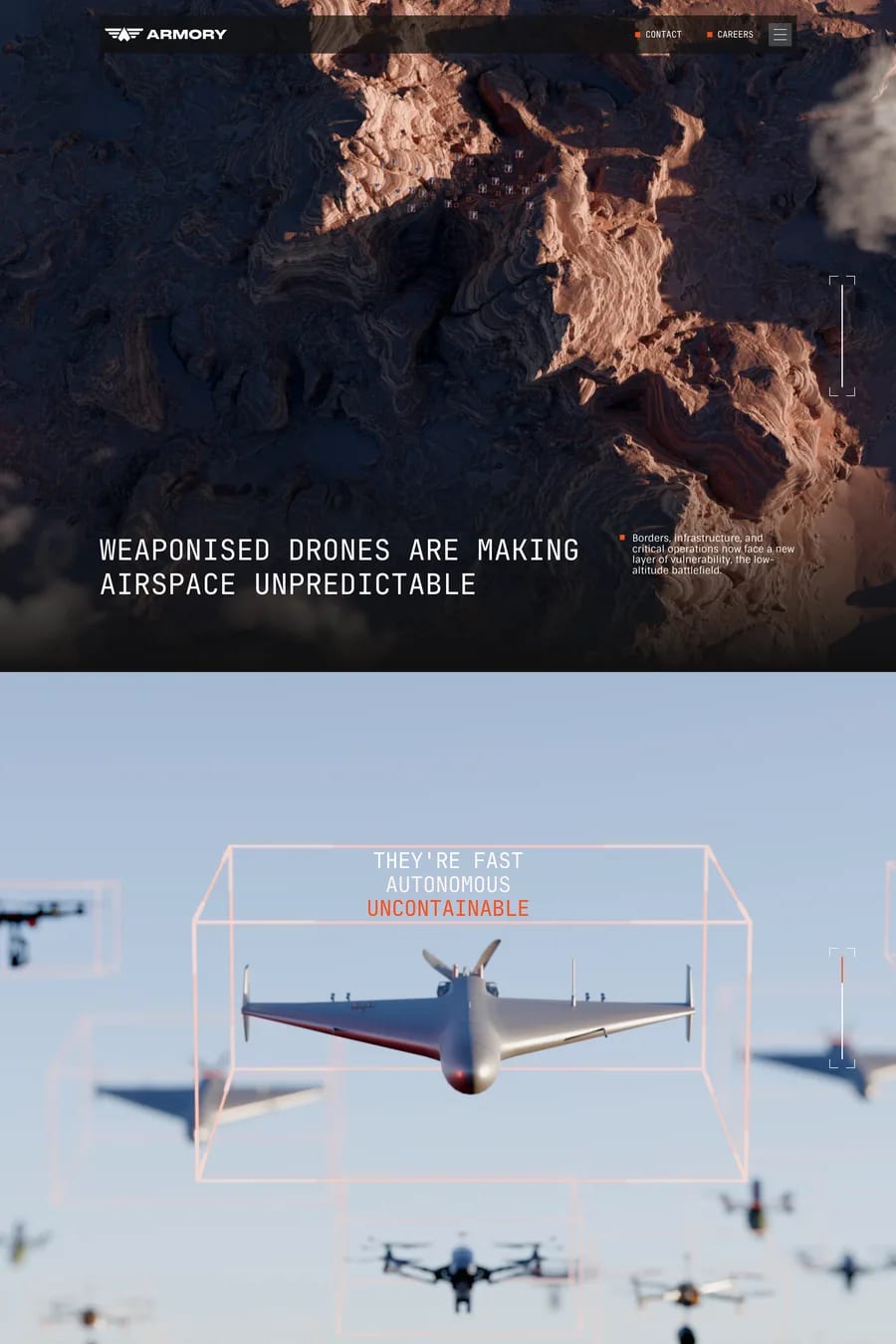
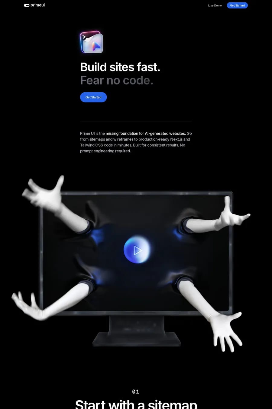
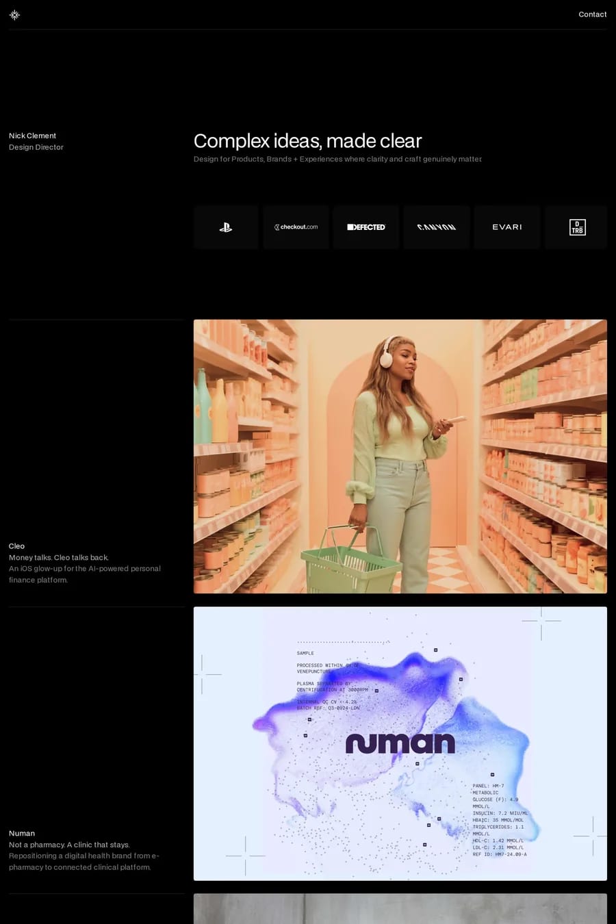
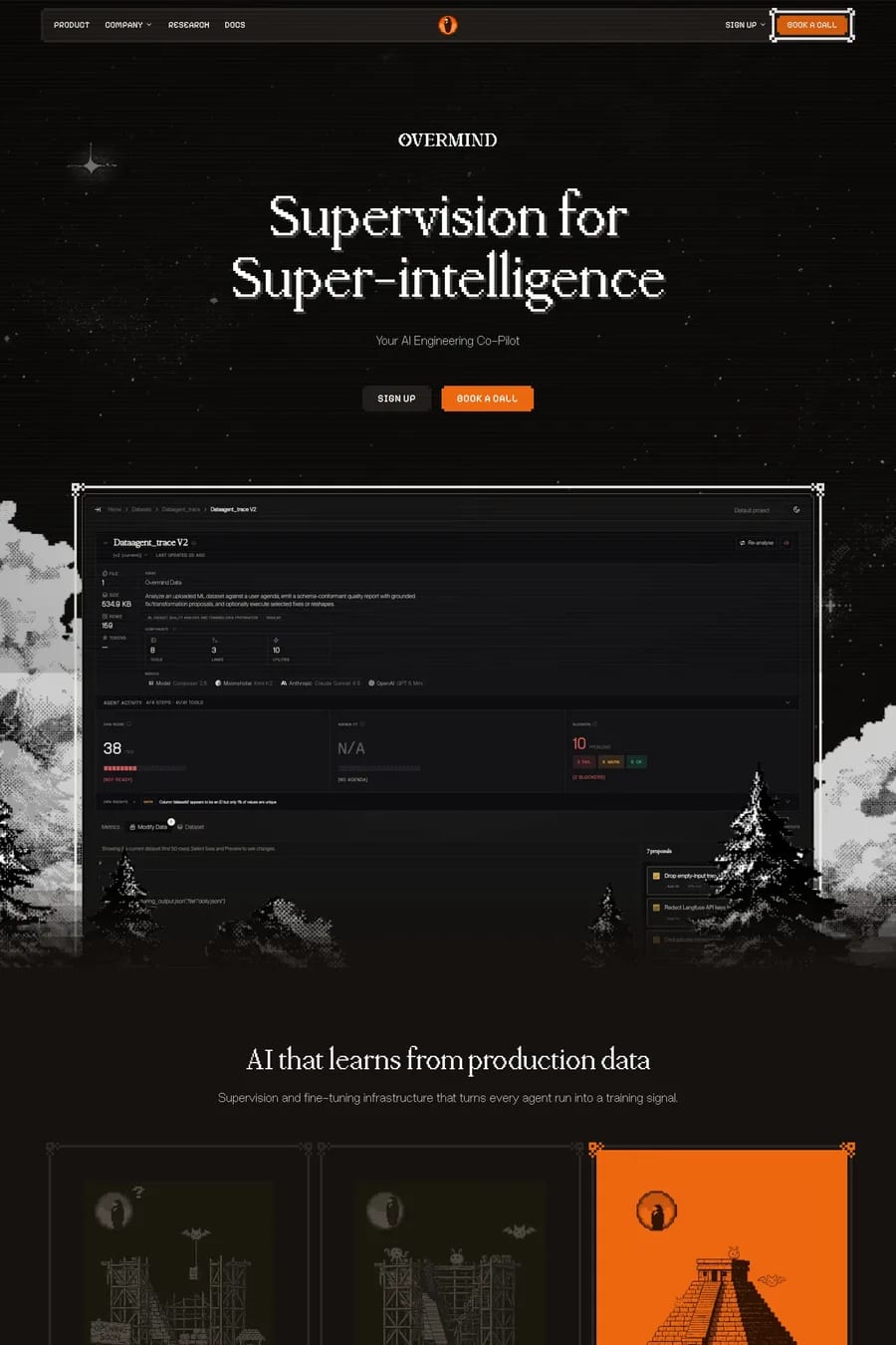
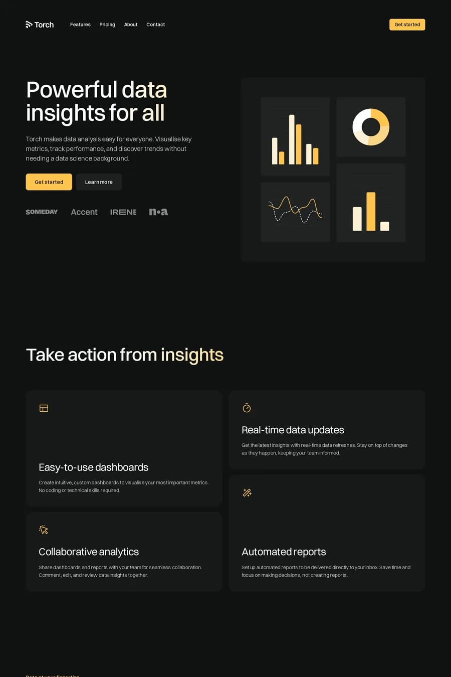
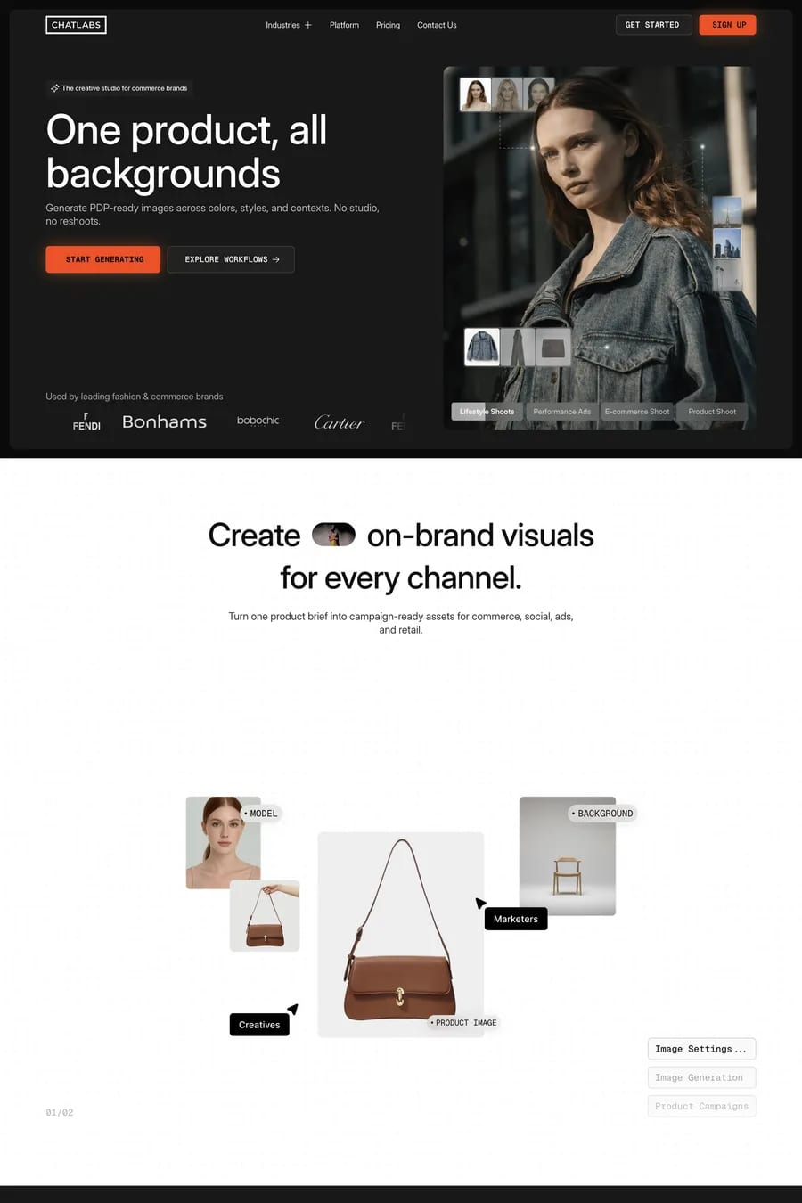
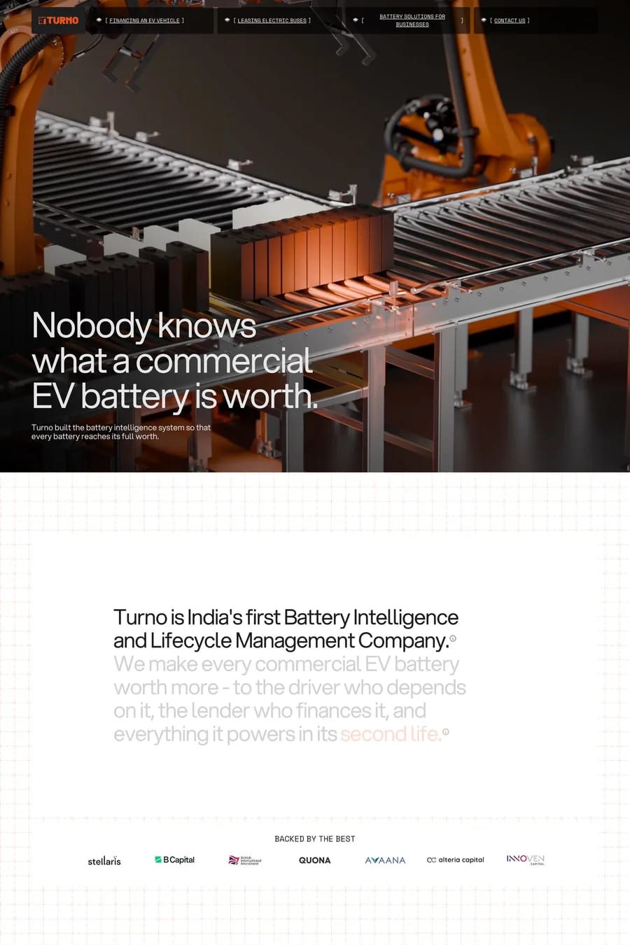
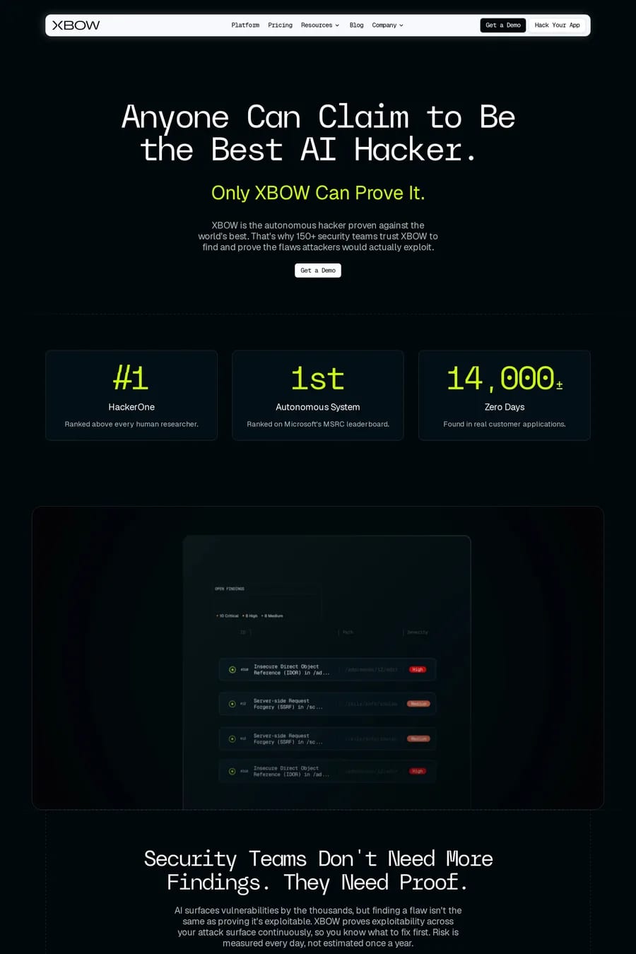
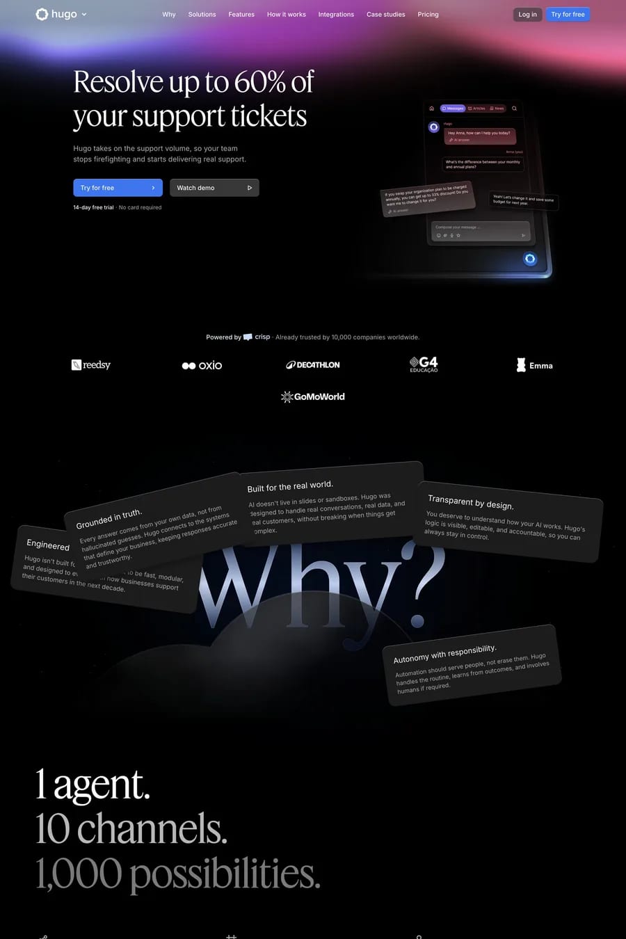
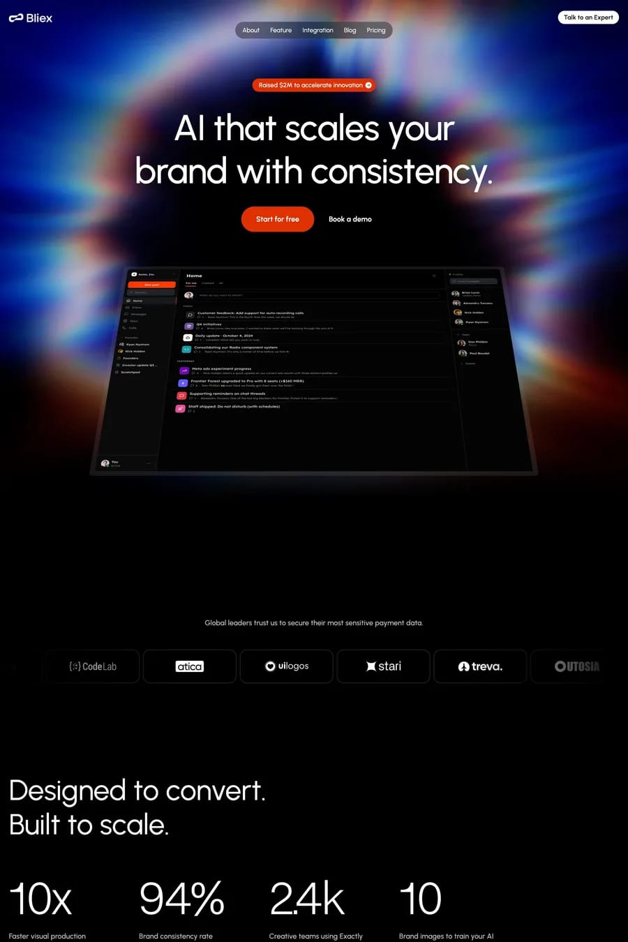
Dark mode landing pages create dramatic visual impact and reduce eye strain for visitors. Particularly popular with developer tools, gaming products, and creative platforms, dark backgrounds make accent colours pop and create an immediate sense of premium quality. These examples showcase how brands use dark themes to differentiate in markets dominated by white backgrounds. See also dark design portfolios, dark AI sites, and dark software products.

Get the best dark landing websites each week

Curated inspiration sent every Tuesday

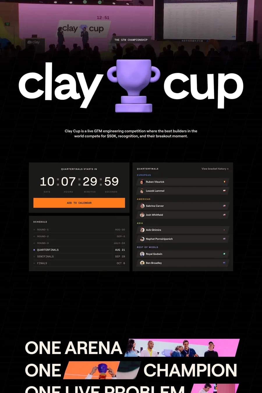
Clay Cup
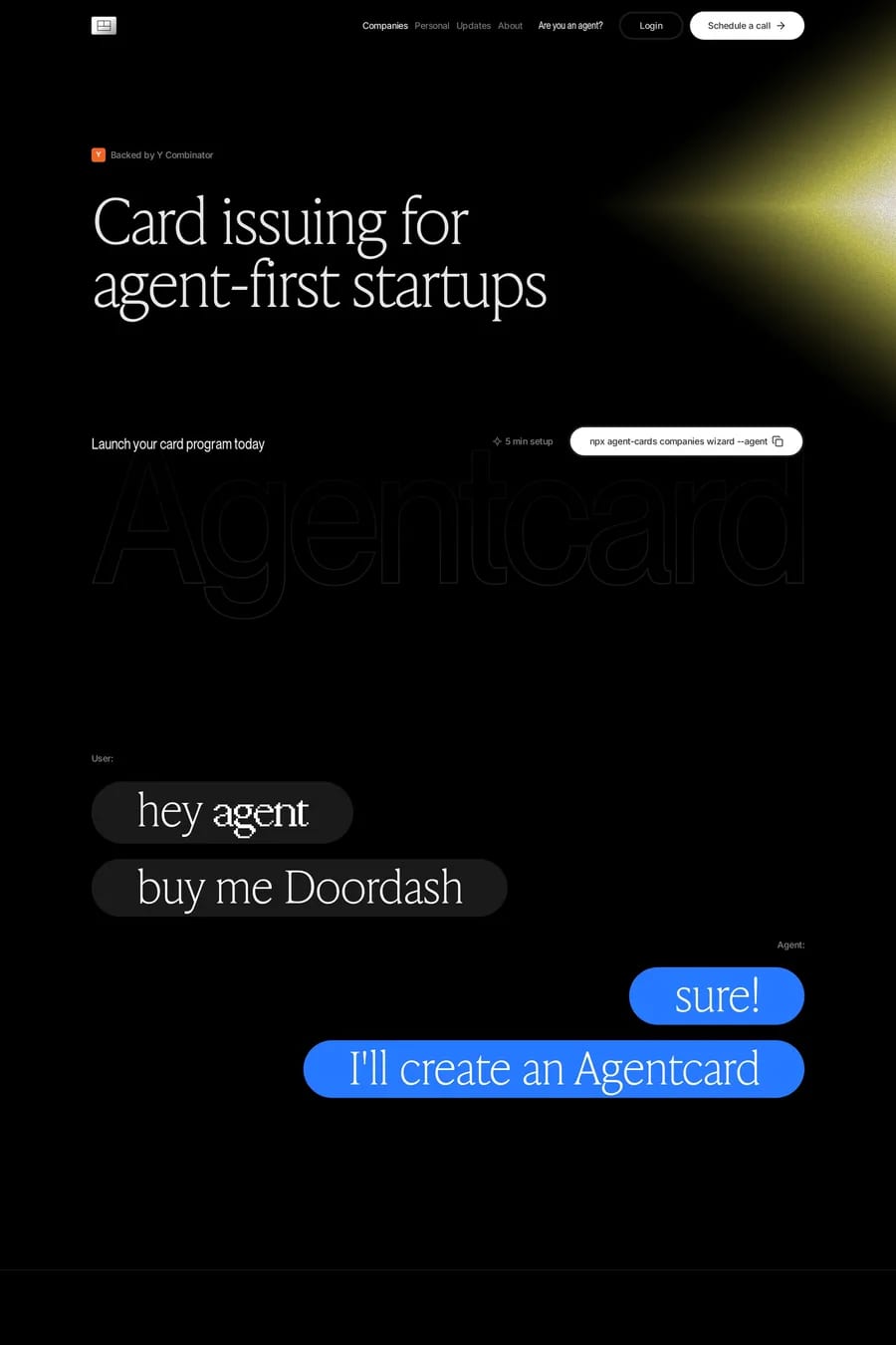
Agentcard
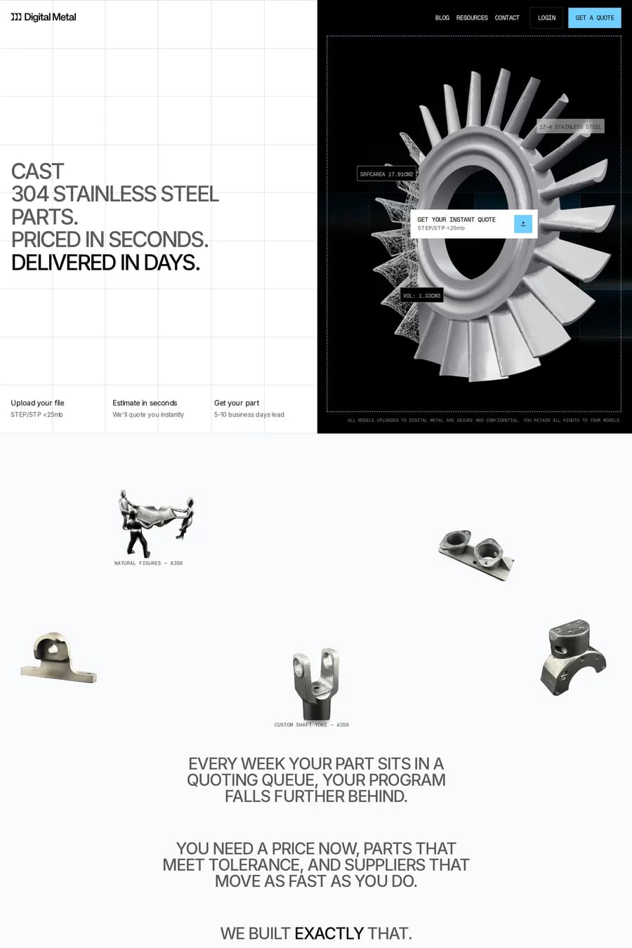
Digital Metal

Dark landing FAQs

Dark designs work well for products targeting developers, gamers, or creative professionals who prefer dark interfaces. They're also effective for brands wanting to convey premium positioning or dramatic visual impact.

Maintaining sufficient contrast for accessibility, avoiding pure black backgrounds that can feel harsh, and ensuring all UI elements remain visible. Images and videos may need treatment to integrate with dark surroundings.

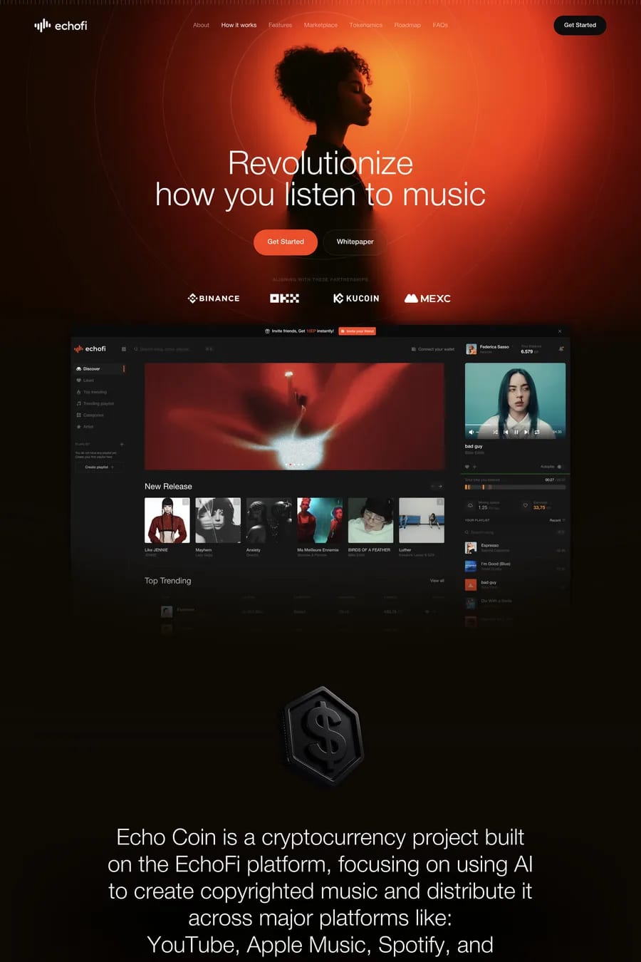
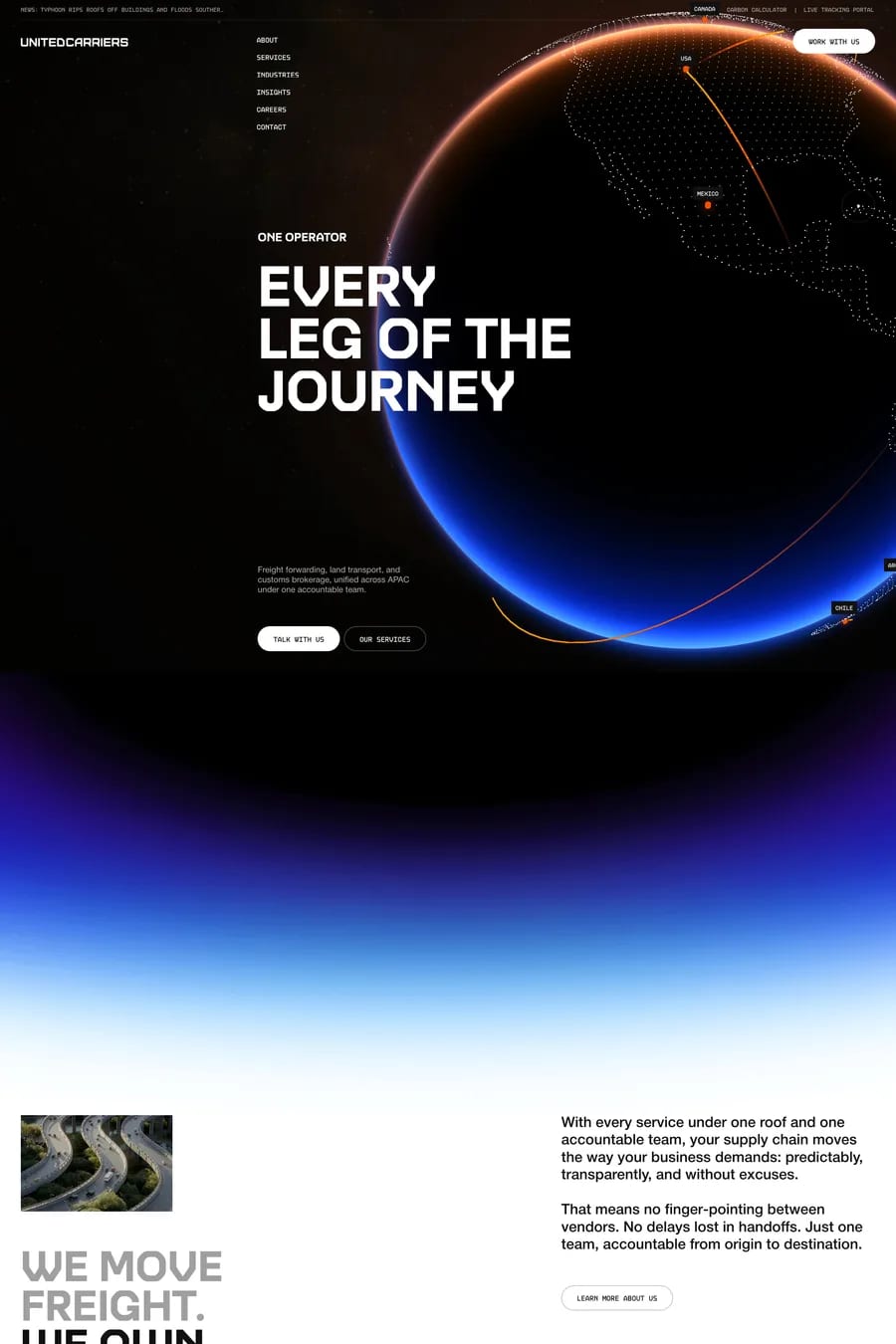
Notable examples include Clay Cup, Agentcard, Digital Metal, Echofi and United Carriers. These are just a few of the 118 dark landing websites in this collection, each selected for strong visual design and execution.

Popular platforms in this collection include Webflow, Next.js, Framer and Nuxt. Each brings different strengths for building dark landing experiences.

Frequently used typefaces include Inter, Geist Mono, JetBrains Mono and Geist. Typography plays a key role in defining the dark aesthetic across these landing websites.

118 Best Dark Landing Page Examples (2026) · A1