
Updated
Curated inspiration sent every Tuesday
Unsubscribe at any time
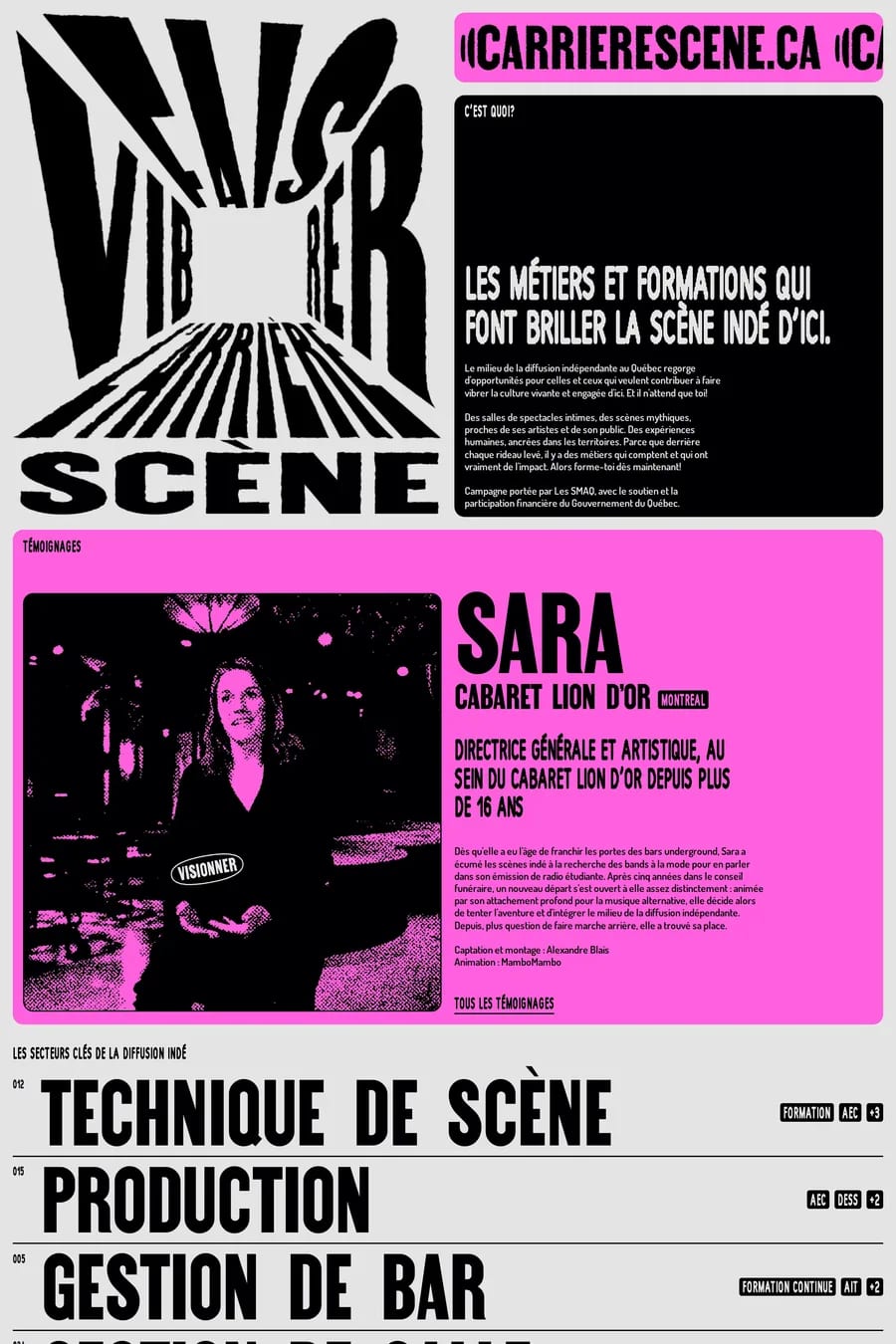
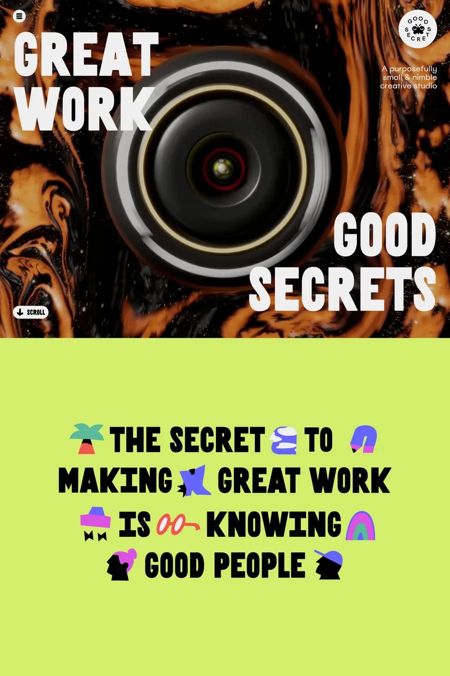
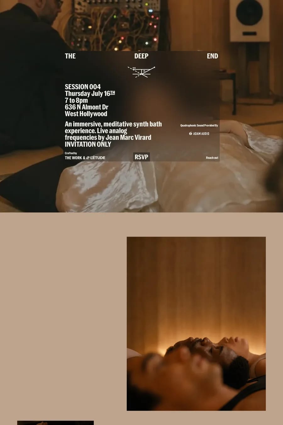
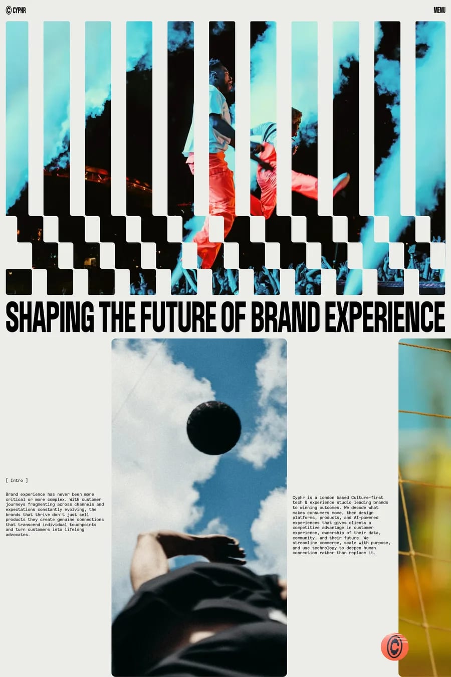
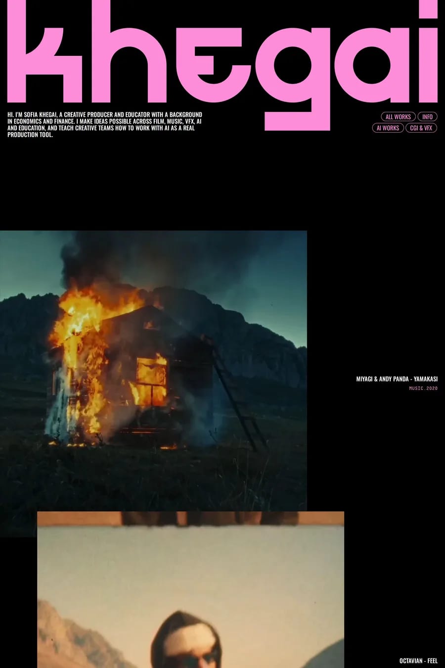
The page taking on the character of the content. Full-viewport video or a WebGL scene that reflects the film, album or event. Type at a scale that feels like a poster. Motion timed to the mood — slow and heavy for a drama, fast and sharp for a club night. Sound, if the visitor opts in. The sites here that work feel like an extension of the thing they’re promoting rather than a page about it.
Show something immediately and load the heavy parts after. A poster image before the video. A still frame before the WebGL scene. Text and the ticket link in the HTML so they’re there in the first second. Compress video hard and serve it from a CDN. Lazy-load everything below the fold. And test on a phone on 4G, because that’s where most of the audience is.
The action with a date on it. Buy tickets, watch the trailer, pre-order, stream now. Fixed in the nav and repeated at the end of every section. The sites here that get this right make the button impossible to miss without breaking the atmosphere. Everything else — cast, tracklist, venue — is second.
Only if the visitor turns it on. Browsers block autoplay with audio anyway, and nobody wants a site to start playing in an open-plan office. A visible sound toggle, off by default, works well for music and film sites and adds a lot when someone chooses it. Never make anything depend on the audio being heard.
WebGL through Three.js for scenes, GSAP for timeline animation, Lottie or Rive for illustrated motion, and a lot of custom code. Many are built by specialist studios on Next.js or vanilla frameworks rather than site builders, because the effects need control a builder can’t give. Simpler event and music sites do fine on Framer or Webflow.