Midlands
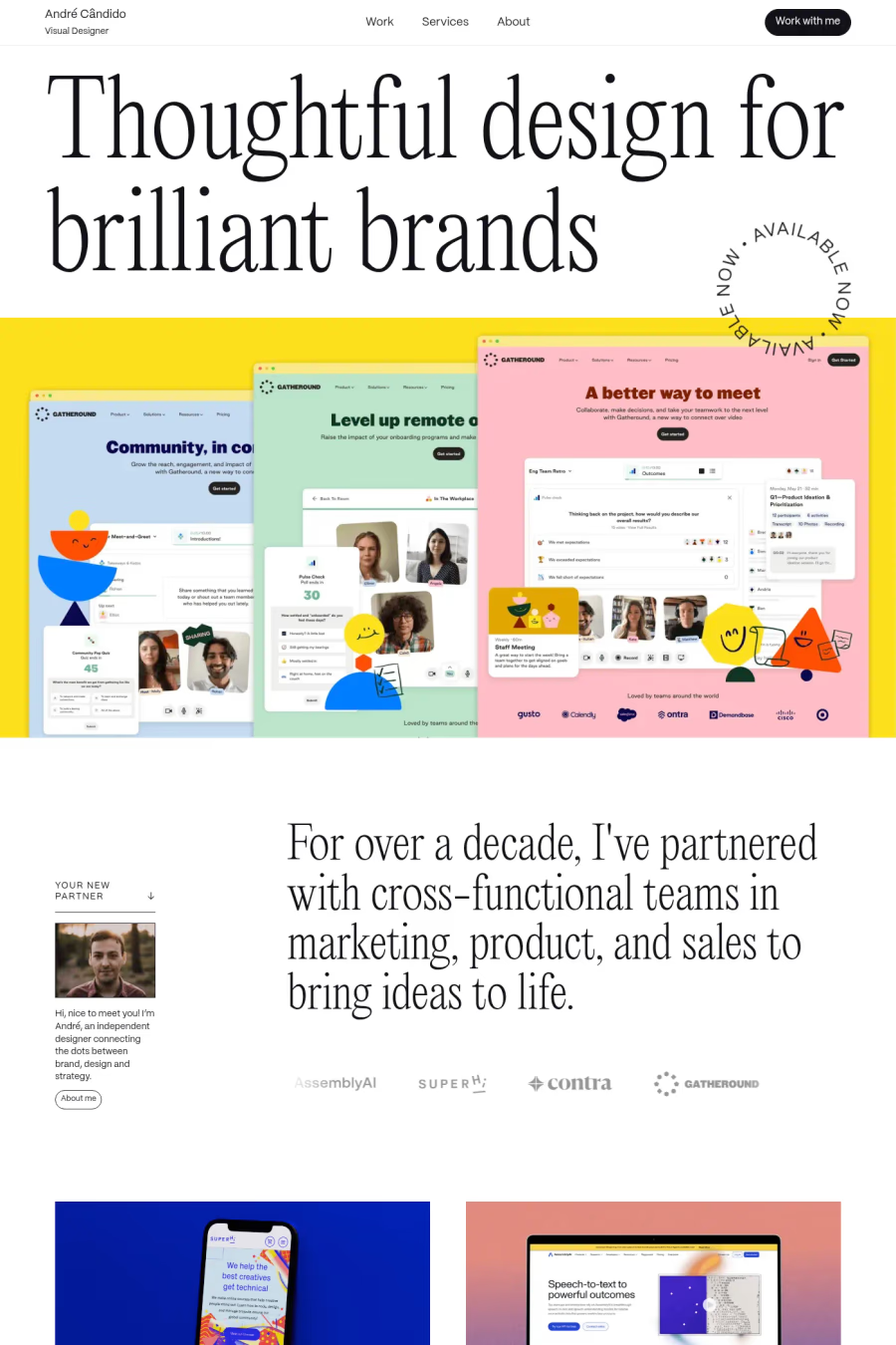
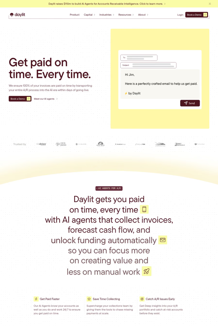
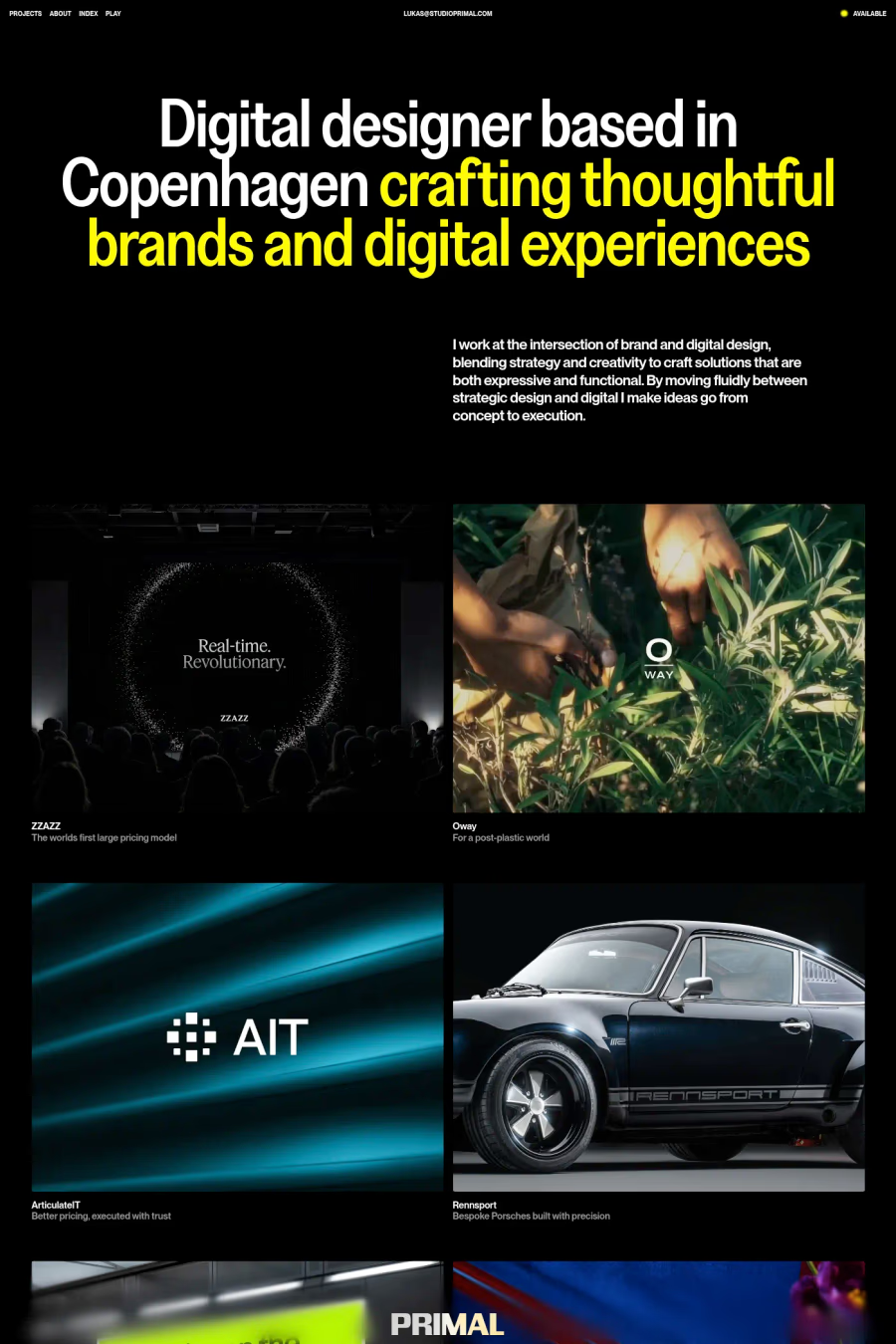
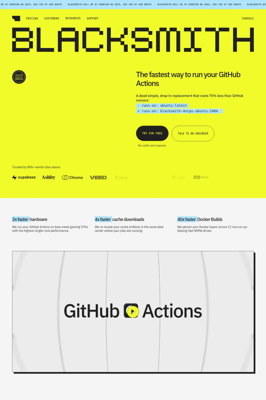
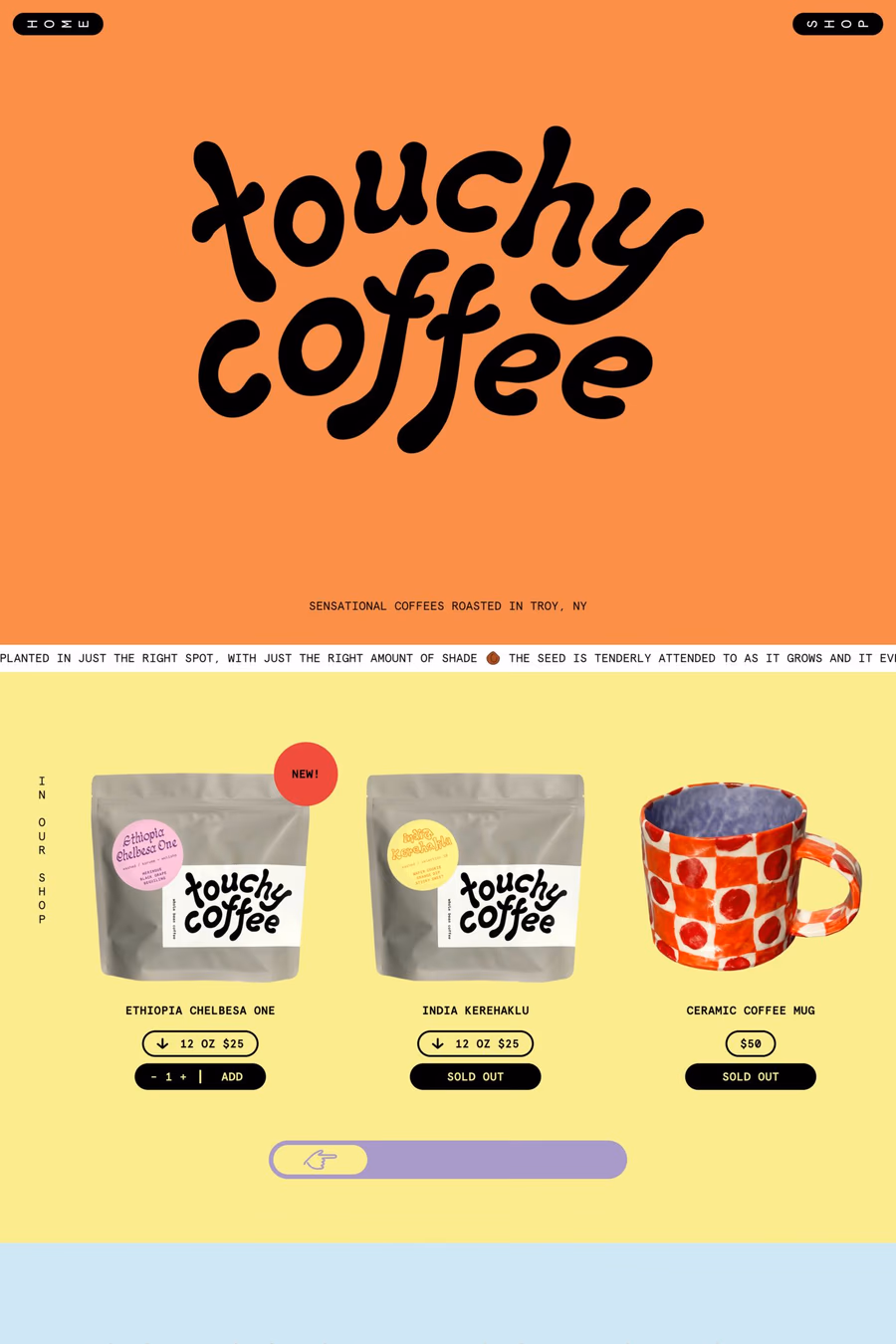
GetYellow is the most luminous colour in the spectrum, bringing optimism, energy, and instant visibility to web design. It is an inherently attention-grabbing colour that creates cheerful, confident interfaces when used thoughtfully.
Curated inspiration sent every Tuesday
Unsubscribe at any time

Yellow's brightness makes it the most difficult colour for text readability, particularly against white backgrounds where it effectively disappears. Designers must use darkened or amber tones for any text in yellow, and ensure that yellow backgrounds are paired with dark, high-contrast text to remain accessible.
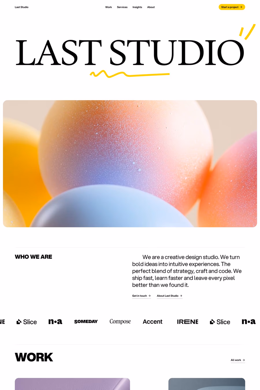
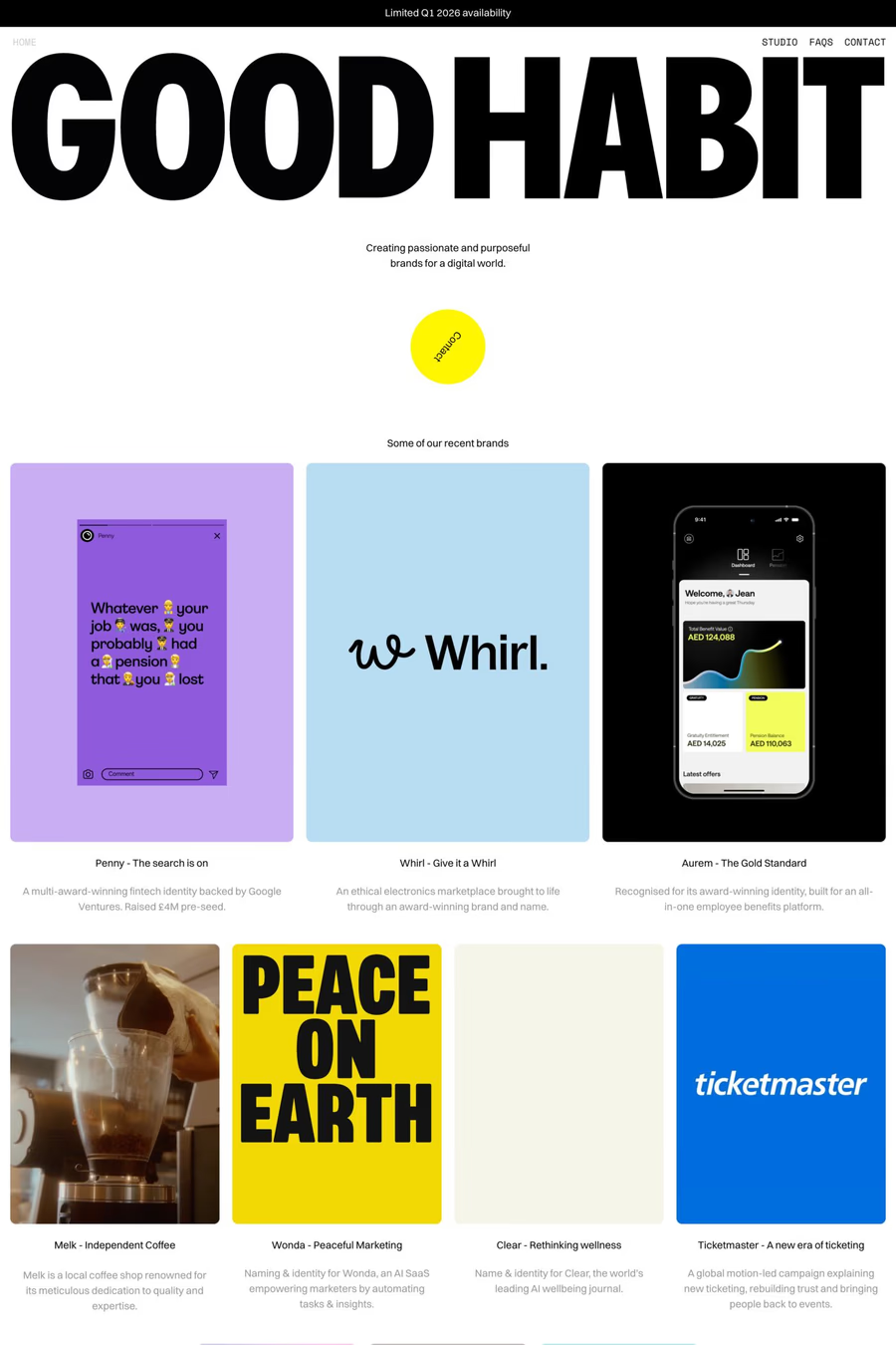
Yellow works best as a bold background colour paired with black text for maximum impact, as seen in many standout portfolio and creative agency sites. As an accent, it excels at highlighting key information and interactive elements. Muted mustard tones offer a more sophisticated, less energetic alternative to bright yellow.