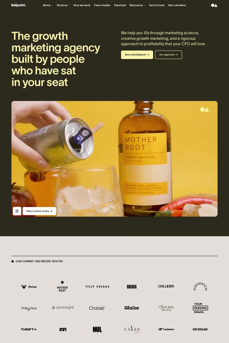
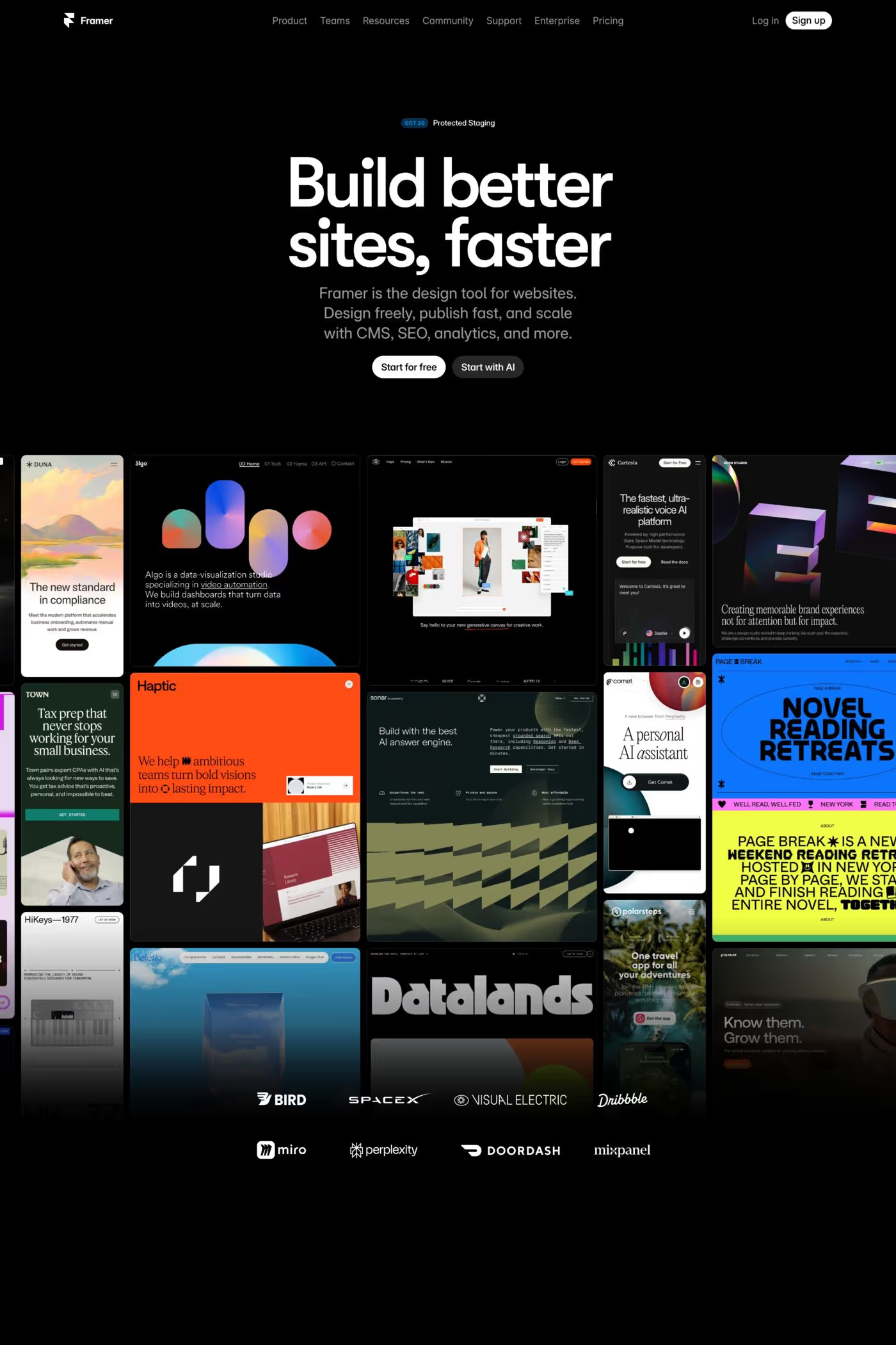
Yellow is the loudest colour on the page and the one designers are most nervous about. The sites here — Clay, Localcan, Primer School, Buzz — show the two ways it works. As a full-bleed ground with black type, where it becomes the identity. Or as a small, sharp accent on a neutral or dark page, where it does the job of a highlighter. Almost nothing in between. The problem with yellow is legibility. Yellow text on white disappears. Yellow text on black glows. So the good examples never set body text in yellow. They use it as a background, as a button, as a block behind a word, or as an illustration colour, and they keep the type in near-black. The shade matters too. Pure lemon yellow is the hardest to use — it’s the colour of warning tape. Mustard and ochre feel warmer and more editorial. A slightly greenish yellow feels technical, which is why it’s showing up on developer tools. What to look for: black type at a heavy weight on a yellow ground, generous space so the colour doesn’t become tiring, and photography that’s been graded warm to match. Yellow with cool imagery always looks like two different sites. See colourful landing pages, fun design sites and the colourful style collection.