
Updated
Curated inspiration sent every Tuesday
Unsubscribe at any time
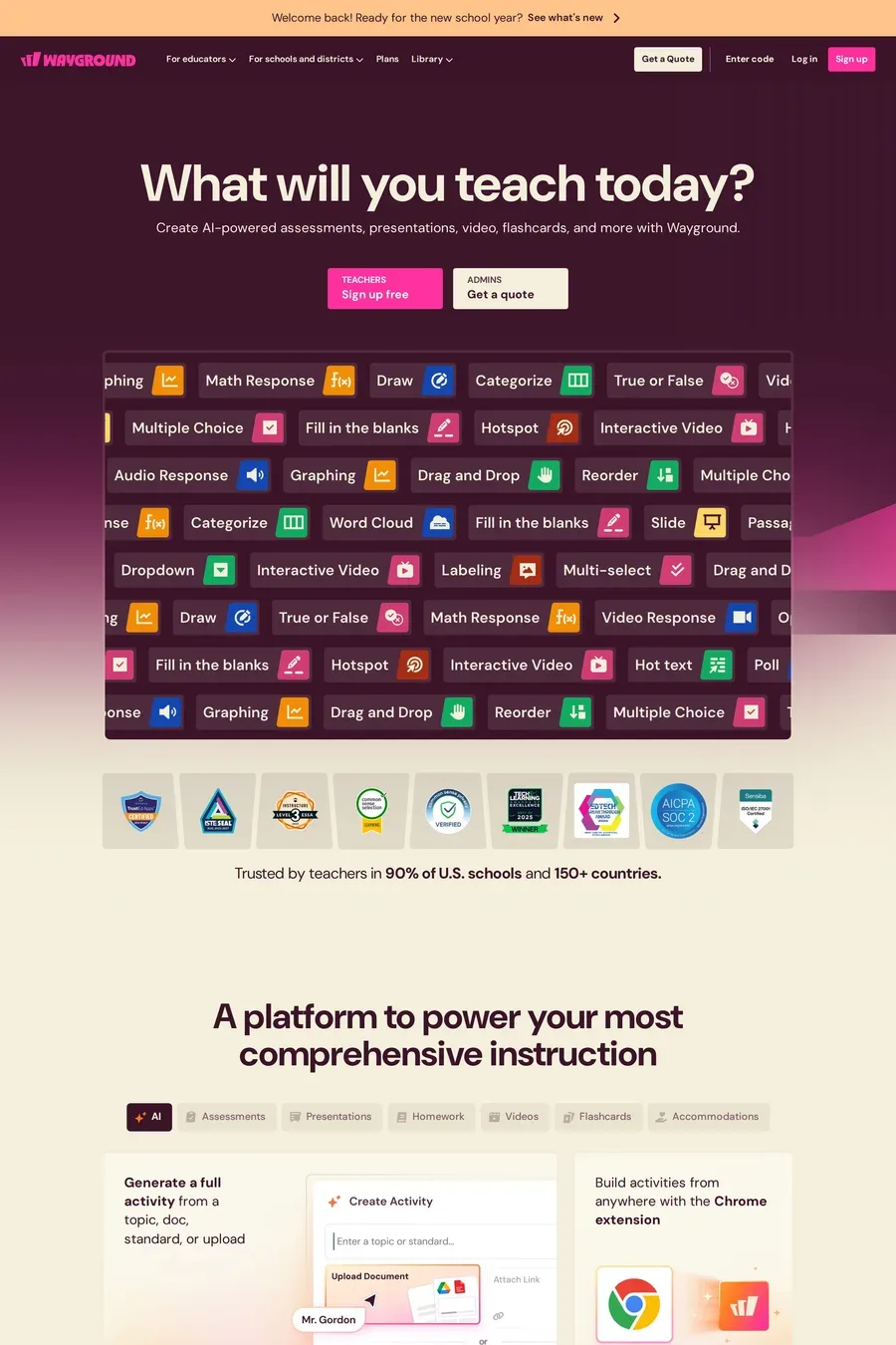
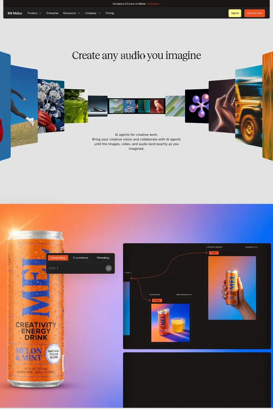
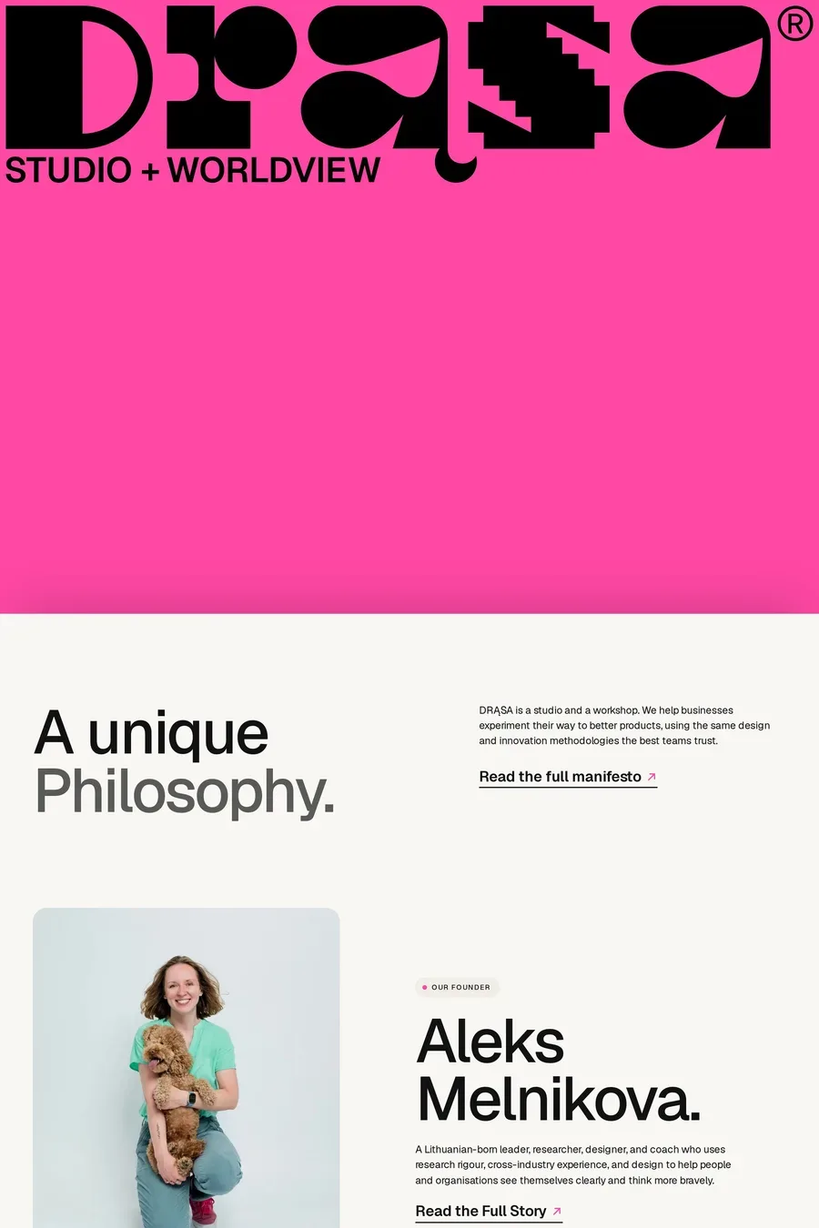
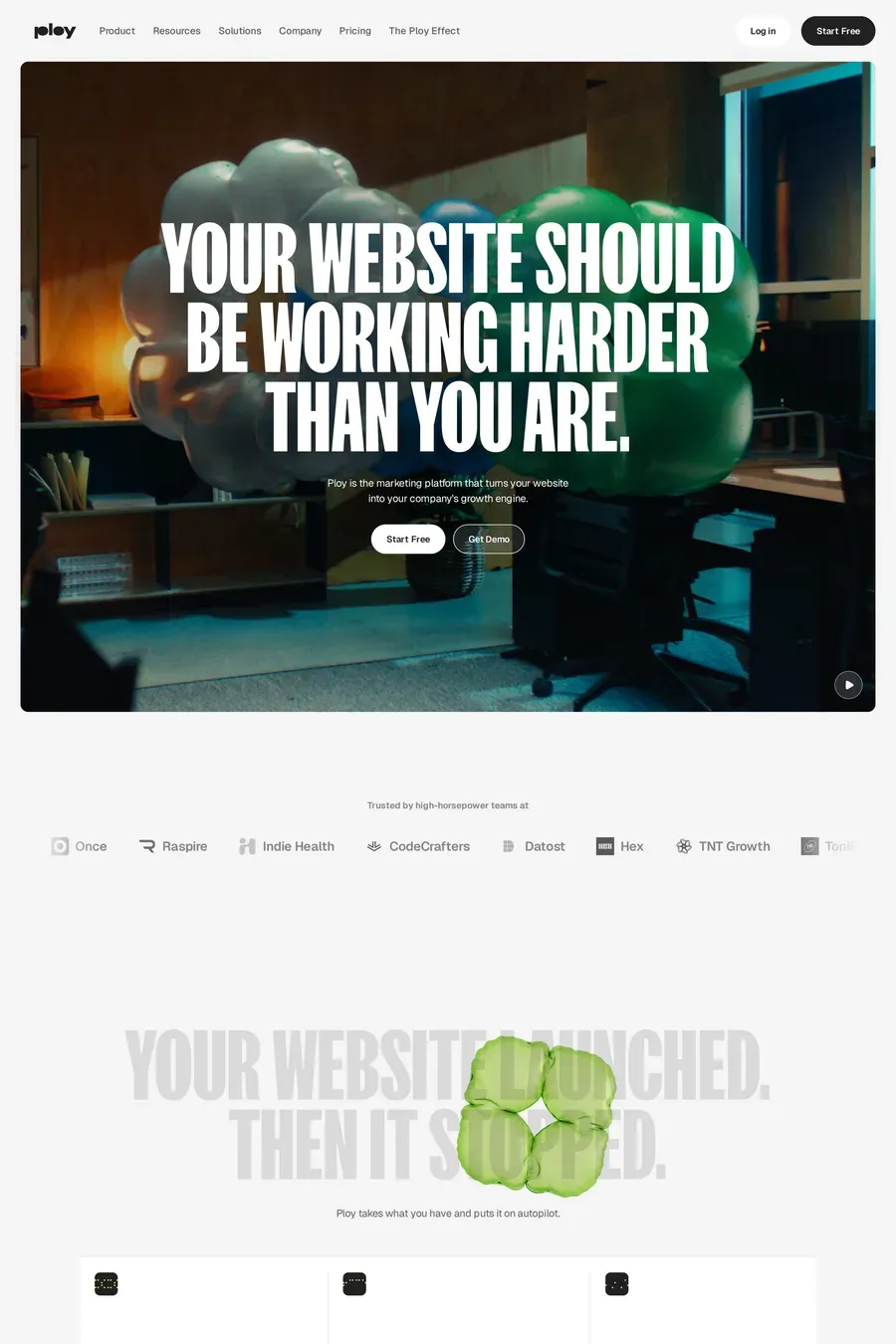
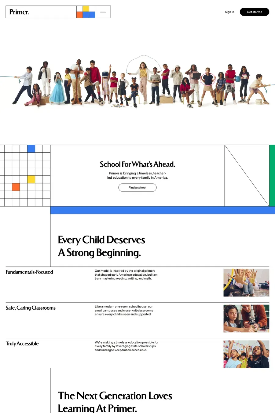
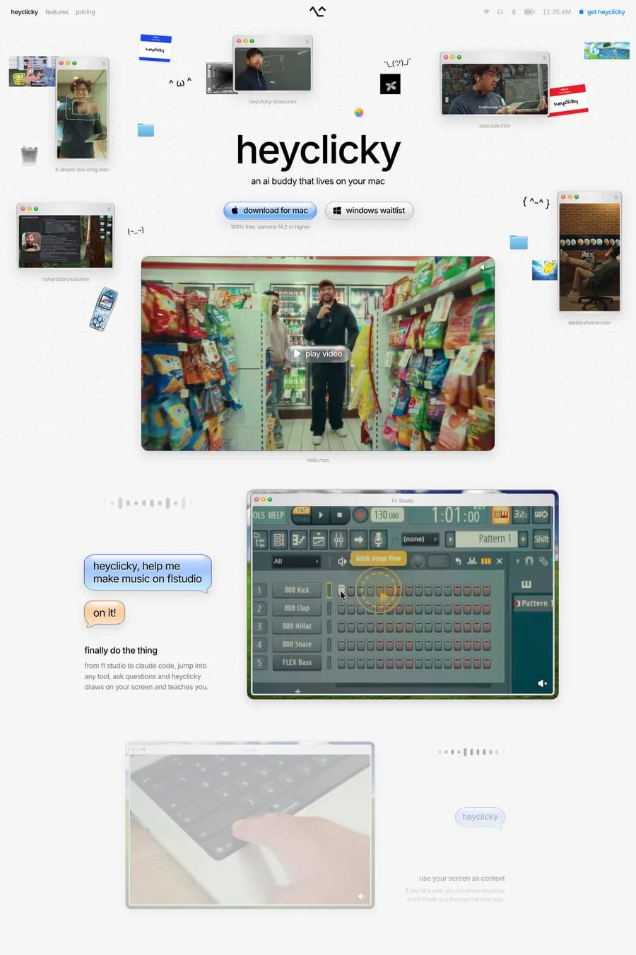
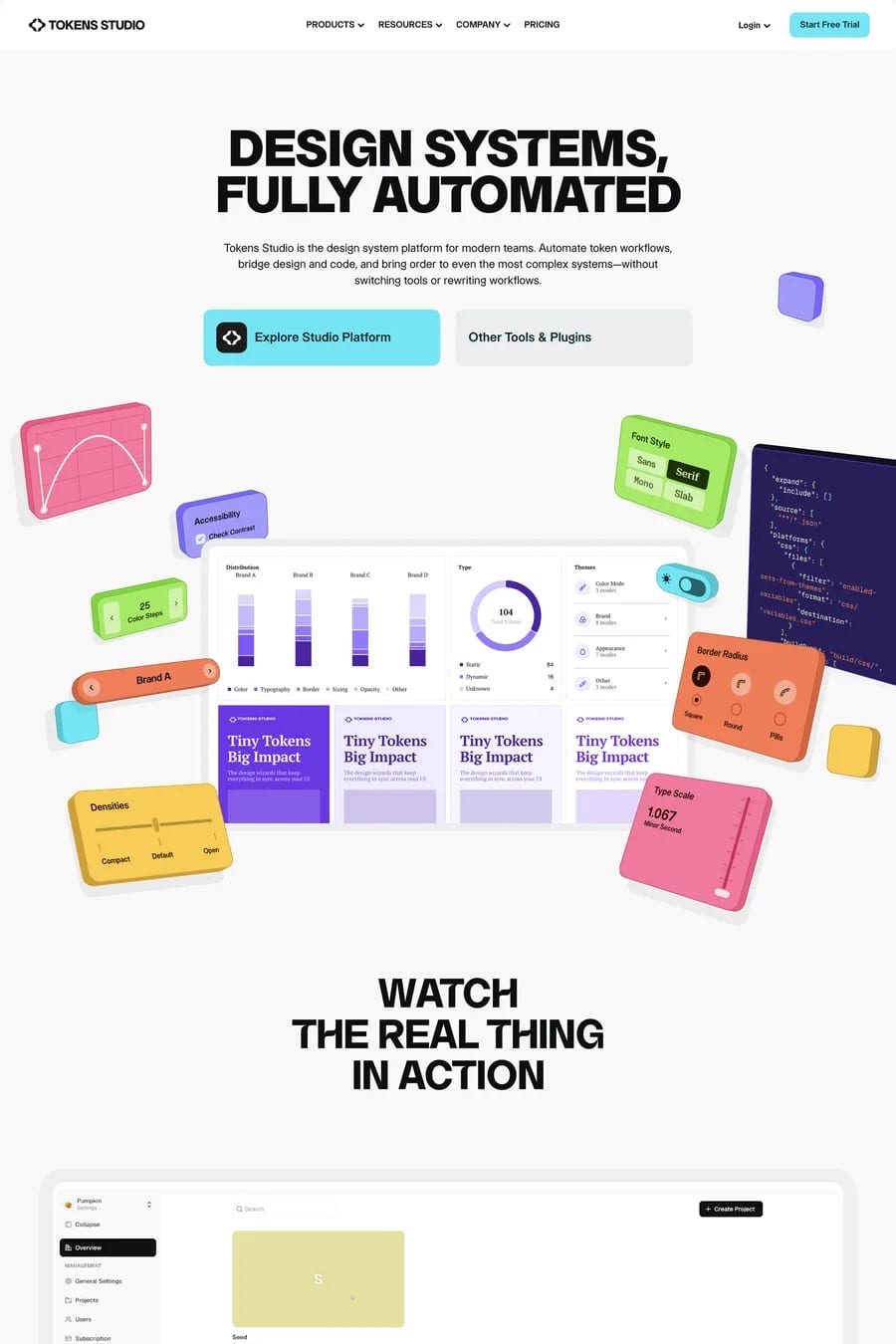
Successful colourful design relies on a considered palette with defined relationships — complementary, triadic, or split-complementary schemes keep things cohesive. Assigning specific colours to specific roles (navigation, sections, CTAs) creates order within the vibrancy.
It can, if contrast ratios between text and background colours are not carefully checked. Colourful sites need extra attention to WCAG contrast requirements, particularly where vibrant mid-tones are used as backgrounds for body text.