Updated
Curated inspiration sent every Tuesday
Unsubscribe at any time
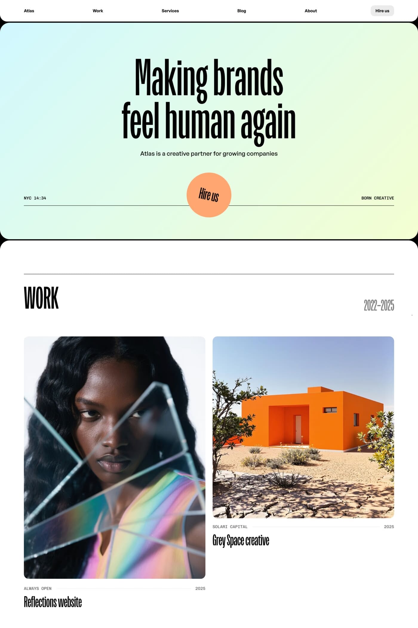
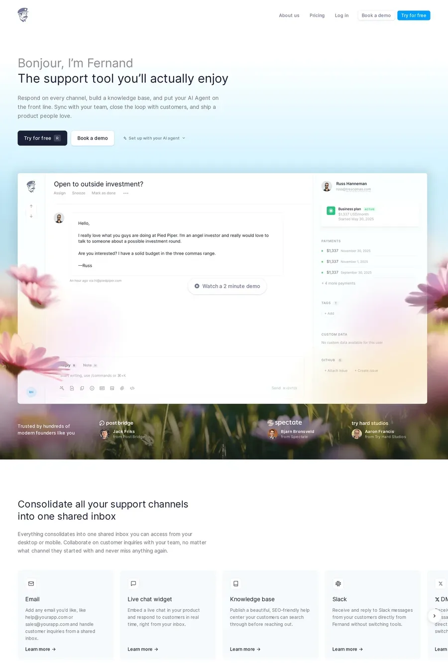
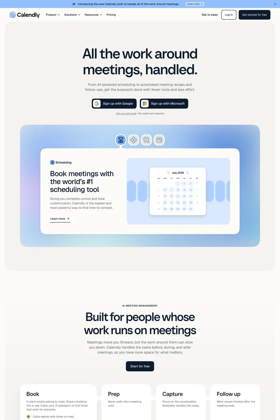
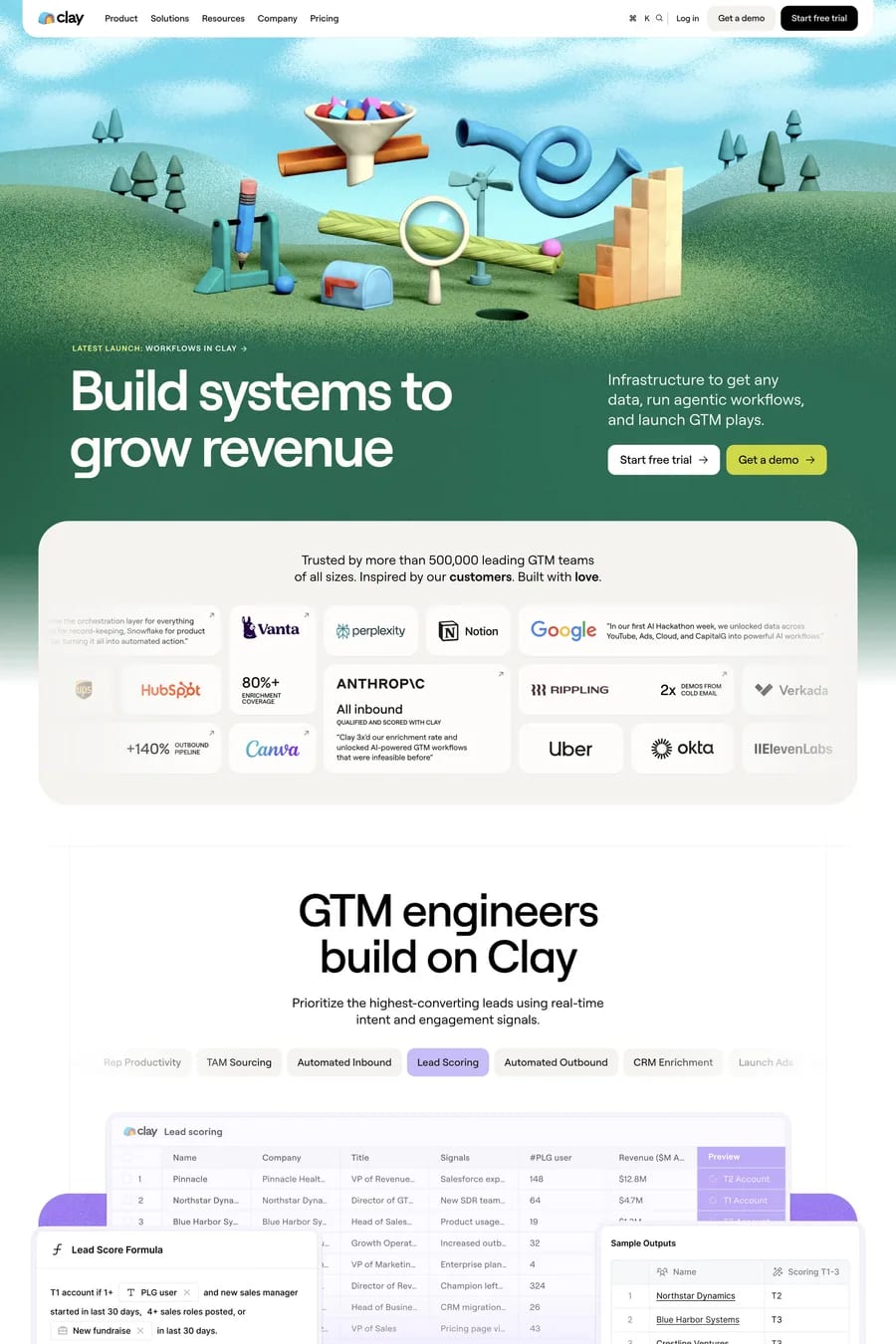
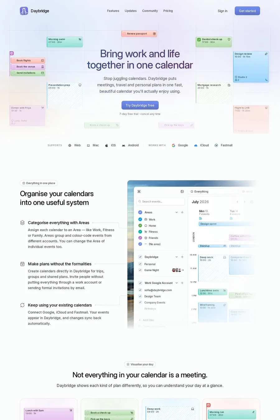
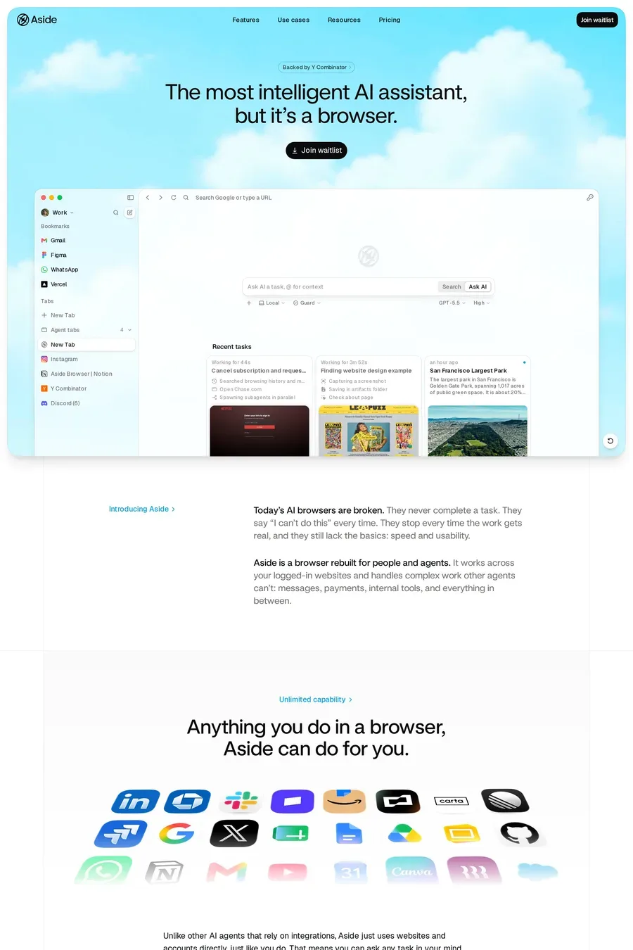
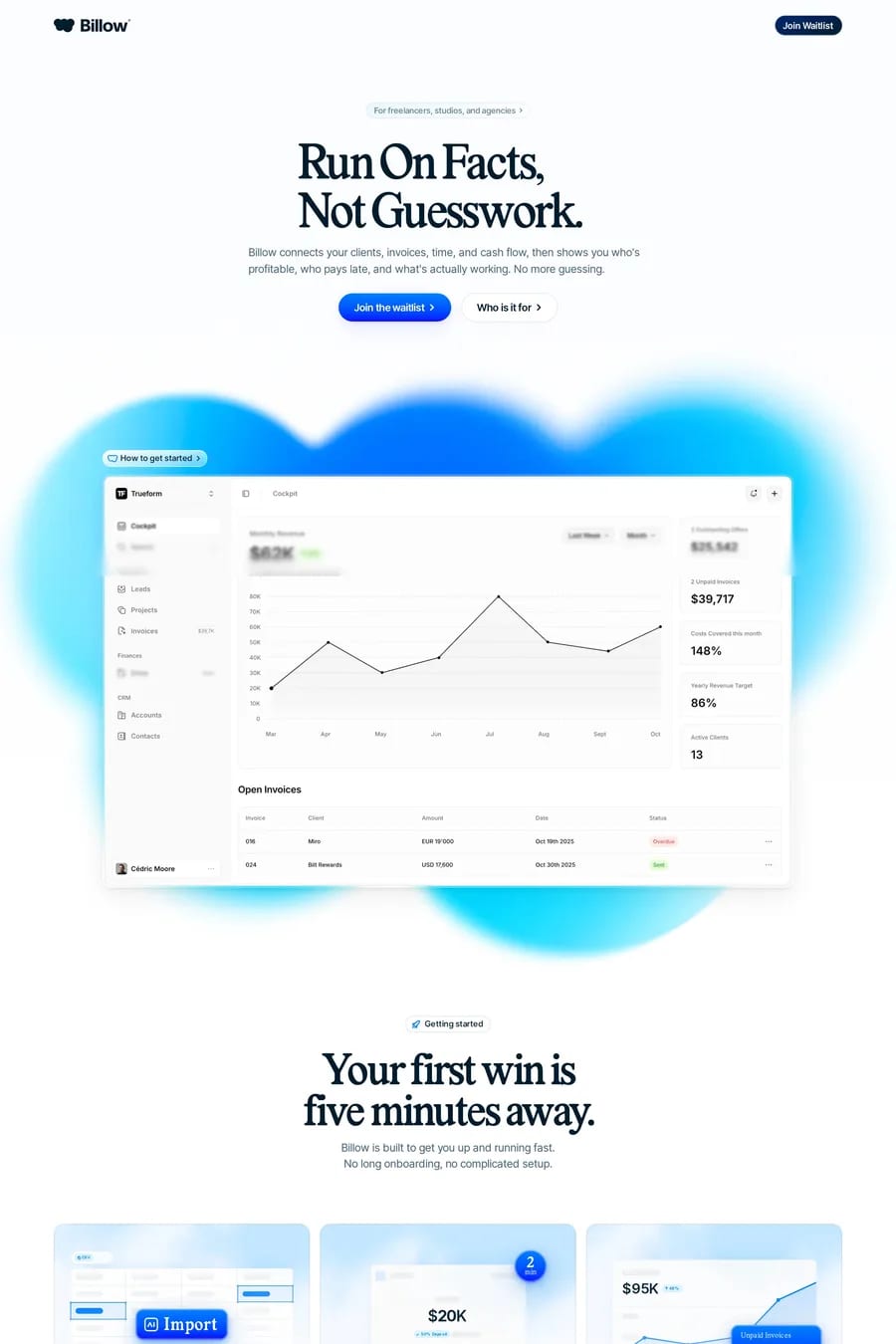
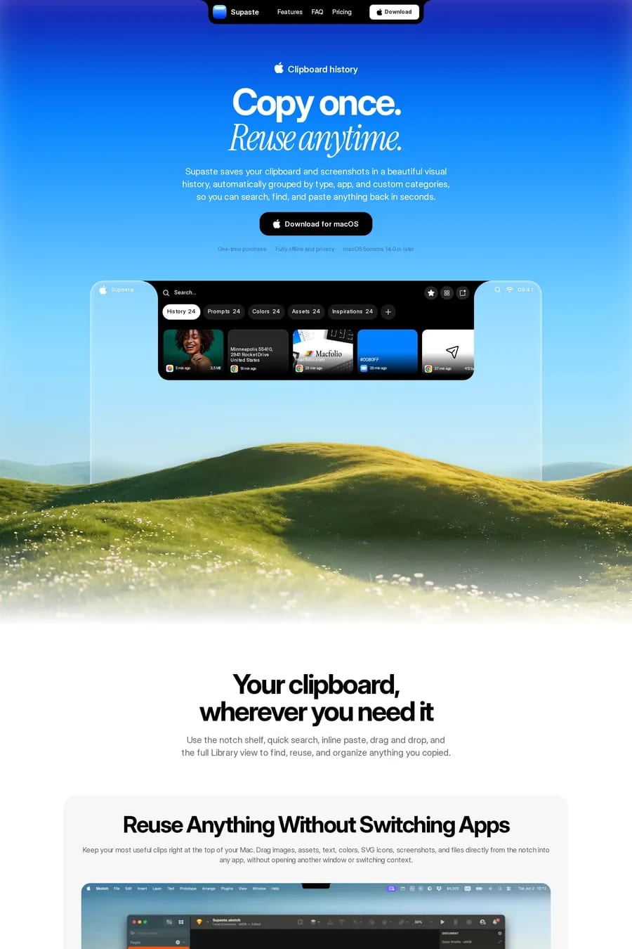
Calm, clarity and trust without the seriousness of dark blue. It’s the colour of sky and water, and it reads as open and friendly. That’s why health, wellness, productivity and consumer finance products use it: they want the reliability blue signals, but they don’t want to feel like a bank.
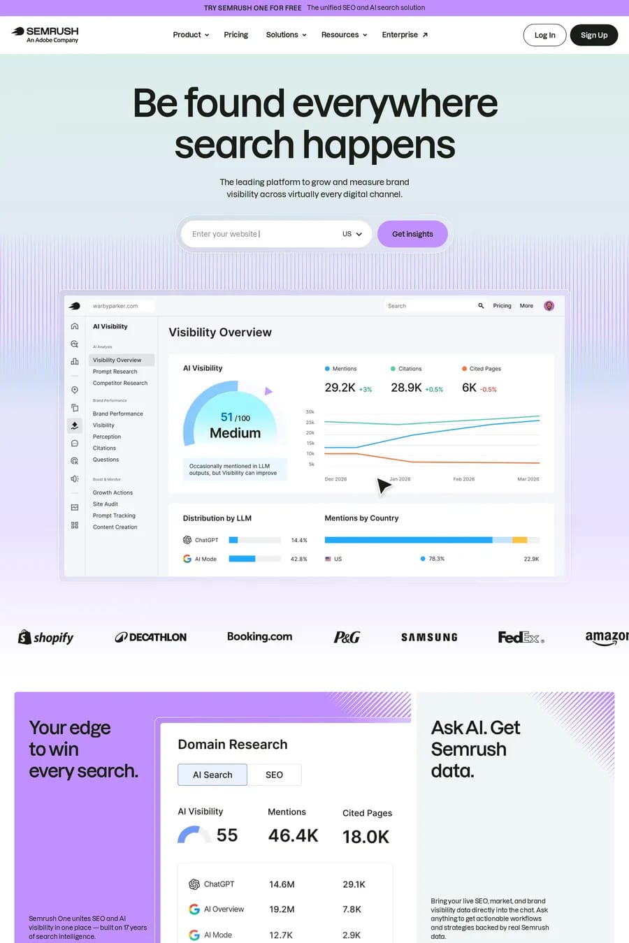
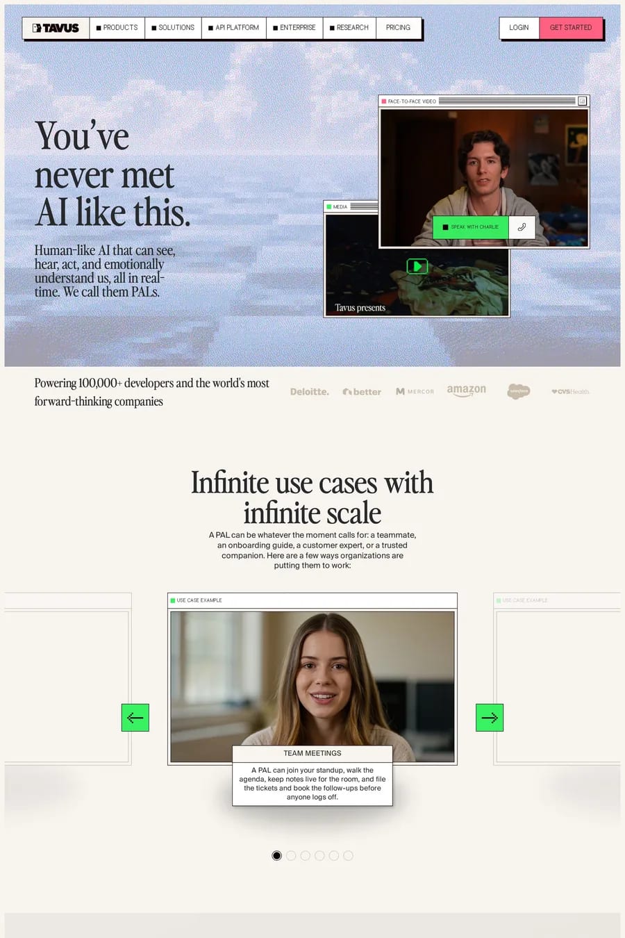
Navy or near-black for type and buttons — light blue needs a dark anchor. Warm neutrals like cream and sand to balance the coolness. Coral or soft orange as an accent, which sits opposite blue and pops without shouting. Pale blue with lavender or mint gives a pastel palette; it works, but keep the type dark or it turns soft.
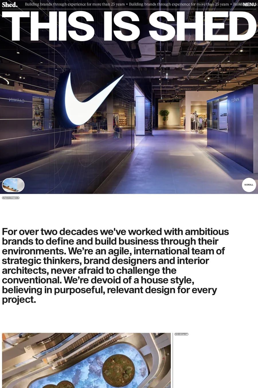
Not on white — it fails contrast at every size. On navy or black it works well for headings and links, and it’s a common accent on dark technical sites. For body text, keep it neutral. Use light blue as a background, a wash or a highlight, and let dark type do the reading.
Health and wellness, where it feels clean and calm. Productivity and consumer software. Fintech that wants to feel human. Travel and hospitality, for the sky-and-sea association. Kids and education. It’s rare in luxury and fashion, which want darker, richer colours.
Anchor it. Dark type at a solid weight, dark buttons, and at least one strong element on every screen. Use the blue in blocks rather than as a full-page wash. Add a warm neutral so the palette has temperature. And pick a blue with a little saturation — very pale blue on white disappears.