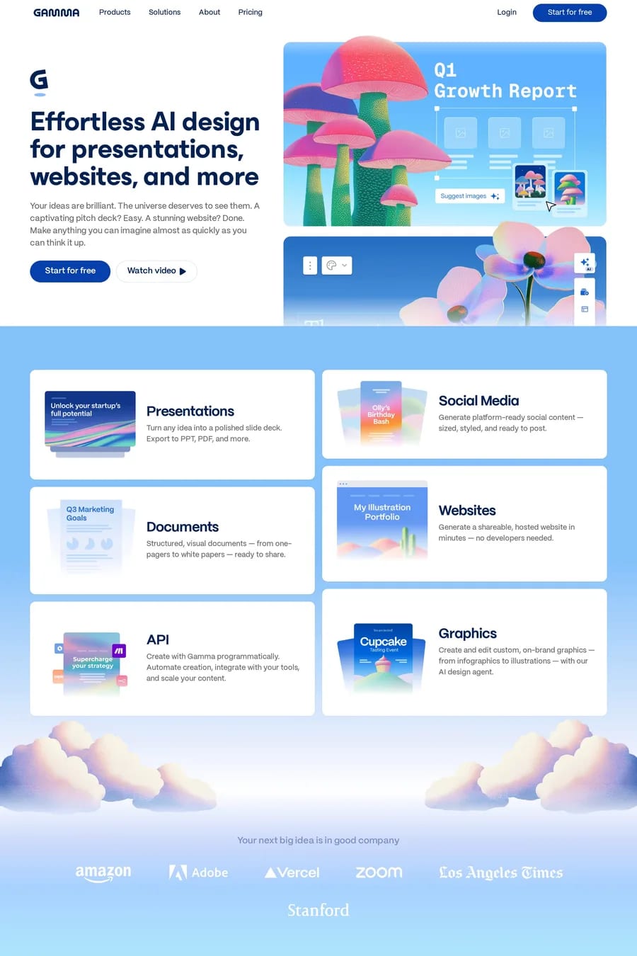
Light blue is the friendly end of the most trusted colour on the web. Sky, powder and baby blue keep the reliability of navy but drop the corporate weight, which is why the sites here — Daybridge, Aside, Kaiko, Round — use it for products that want to feel calm and approachable. It’s the colour of a lot of health, productivity and consumer fintech right now. The tell for a good light-blue site is what it’s paired with. On its own, pale blue can feel washed out. The strong examples anchor it with a dark navy or near-black for type and buttons, and usually a warm neutral — cream, sand — so the palette isn’t all cool. Photography and illustration get graded to match: soft, bright, a little desaturated. The second tell is how much of the page is blue. Most of these sites use it as a background for one or two sections, or as a wash behind a product screenshot, and leave the rest neutral. A whole page of pale blue reads as a template. And watch the contrast on type. Light blue is a background colour, not a text colour — on white it fails at every size. See pastel landing pages, clean software sites, the pastel style and the software category.