
Updated
Curated inspiration sent every Tuesday
Unsubscribe at any time
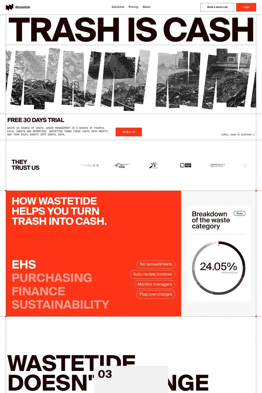
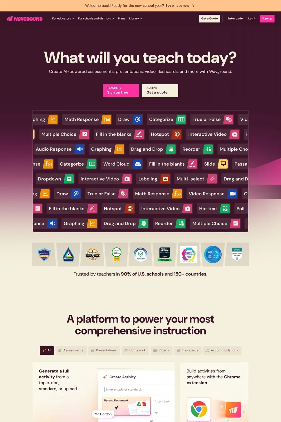
Control. On a normal animated site the page decides when things move — on load, on hover, on a timer. On a scroll-animated site the visitor decides. Progress is tied to scroll position, so scrolling back rewinds and scrolling fast skips ahead. That makes it better for explaining a sequence (how a product works, a before-and-after) and worse for anything the visitor needs to read at their own speed.
GSAP ScrollTrigger for anything with pinning, scrubbing or more than two steps — it’s what most of the sites in this collection run. Lenis if you want the smooth-scroll feel underneath it. For simple reveals (fade up as a section enters the viewport) use the Intersection Observer API or CSS scroll-driven animations. Both are free of library weight, and reveals are most of what people actually want.
Never override the wheel or touch input. Let the browser scroll normally and read the position to drive your animation. If you pin a section, keep it to one viewport height or so and make sure a fast scroll still gets through it. Test with a trackpad, a mouse wheel and a phone — they scroll at different speeds and a sequence tuned for one can feel broken on the others.
Yes, with caveats. Touch scrolling is momentum-based, so scrubbed animations can jump. Pinned sections on a small screen eat the whole viewport and hide context. Most of the good sites here simplify on mobile: fewer pinned scenes, shorter sequences, and some effects switched off entirely. Always honour prefers-reduced-motion.
When the page is for reading or doing. Documentation, pricing tables, checkout, dashboards — anywhere the visitor has a task. Scroll animation adds friction to tasks. It works for marketing pages, product launches and portfolios, where the visitor has time and the goal is to make them feel something about the product. If you can’t say what the animation explains, cut it.