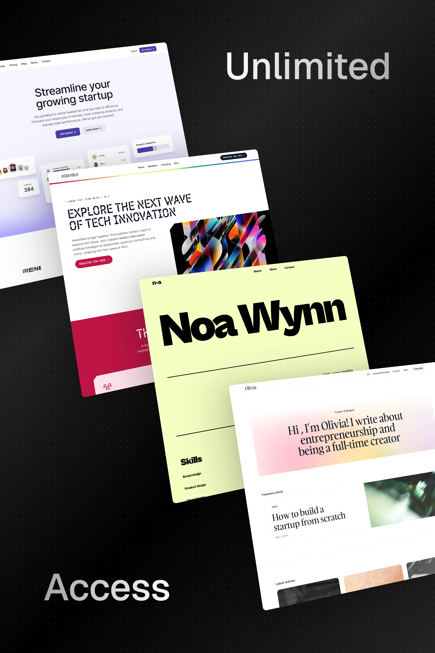
Readymag is built for designers who think about web pages the way print designers think about magazine spreads. Where most website builders enforce a top-to-bottom flow of stacked sections, Readymag treats each page as a freeform canvas — elements can be positioned anywhere, overlap, rotate, and behave with the kind of compositional freedom you’d expect from InDesign rather than from a web tool. That makes it the platform of choice for editorial designers, art directors, design schools, lookbooks, digital magazines, and any project where layout precision is the entire point of the brand. The best Readymag sites in this collection look more like printed publications that happen to live online than like websites that happen to be designed. Look at how the strongest examples handle typography. Readymag has unusually deep type controls — variable fonts, precise letter spacing, baseline grids, custom font upload — and the strongest sites use these to set type the way print designers set type, not the way web designers usually settle for. Look at how they handle motion. Readymag has a timeline-based animation system that makes scroll-triggered and time-based animation accessible without code, which is unusual for tools in this category. The trade-offs are real: Readymag is less suited for content-heavy sites with large databases, e-commerce, or anything that needs structured CMS-driven content. Performance can suffer on extremely complex pages because the freeform canvas requires more rendering work than rigid section layouts. SEO is acceptable but not optimised for highly competitive search categories. Readymag earns its place when *the layout is the brand* and conventional templates would dilute the work. Compare against Cargo for a similar editorial-leaning alternative, or look at Framer and Webflow for more conventional grid-based approaches.
Try out Readymag
Readymag is a no-code design tool for standout websites, editorials, and microsites with an intuitive drag-and-drop editor. Publish fast using flexible templates, animations, and embeds, with hosting ready for the web.
Curated inspiration sent every Tuesday
Unsubscribe at any time
Editorial designers, art directors, magazine and publication teams, fashion brands building lookbooks, design schools and student portfolios, exhibition and gallery sites, and any creative practice where layout precision matters more than scalability. Readymag attracts a self-selecting audience: people who already think compositionally about pages and find the rigid grid of most website builders limiting. It’s less appealing to designers who want sensible defaults and a fast path to a normal-looking website.
Freeform layout. Webflow and Framer are both grid-and-flex-based, which makes them excellent for "normal" web layouts but constrains anything that wants to escape the section-stack paradigm. Readymag treats each page as a design canvas — elements can sit anywhere, overlap freely, and behave like objects on a layout grid rather than children of a CSS box model. For editorial and experimental work, this is liberating. For standard marketing sites, it’s usually overkill.
Better than almost any other no-code tool. Readymag has variable font support, precise letter-spacing and tracking controls, custom font upload, baseline grids, and typographic settings that make sense to designers from a print background. The platform clearly takes type seriously, and many of the strongest Readymag sites in this collection are explicitly chosen because the typographic control was the deciding factor.
Limited CMS capabilities compared to Webflow or Framer; no native e-commerce; performance can degrade on extremely complex pages because the freeform canvas requires more rendering work; smaller community and template ecosystem than the larger platforms; and an SEO setup that’s functional but not optimised for highly competitive categories. Readymag is best understood as a specialised editorial tool rather than a general-purpose website builder, and choosing it for the wrong use case usually ends in frustration.
With a timeline-based animation tool that supports scroll-triggered sequences, time-based animations, and interactive transitions. It’s more powerful than most no-code tools in this category and approaches the capabilities of Framer for animation work, though Framer’s component-state model is more flexible for product-style interactions. Readymag’s animation feels more cinematic and editorial; Framer’s feels more product-focused.
Digital magazines, lookbooks, brand identity case studies, exhibition and gallery sites, art director portfolios, design school student showcases, manifesto pages, scrollytelling editorial features, and creative agency sites that lean editorial rather than corporate. The pattern is: visual-led, layout-precise, brand-expressive, and unconventional. If your reference material is a printed publication, Readymag is likely the right tool. If your reference is another website, it’s probably not.