Updated
Curated inspiration sent every Tuesday
Unsubscribe at any time
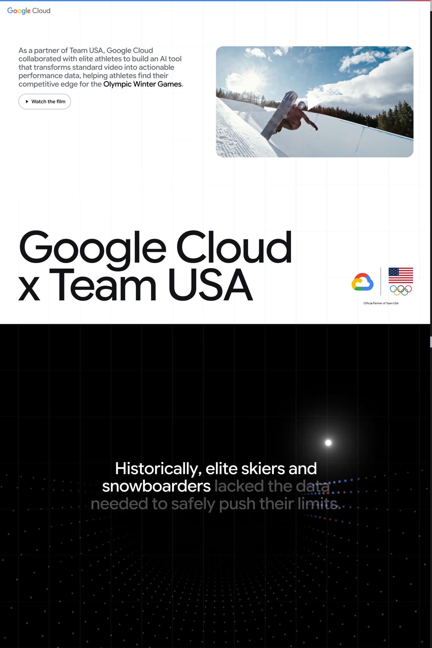
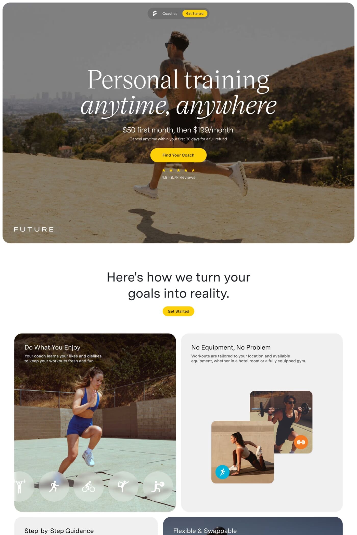
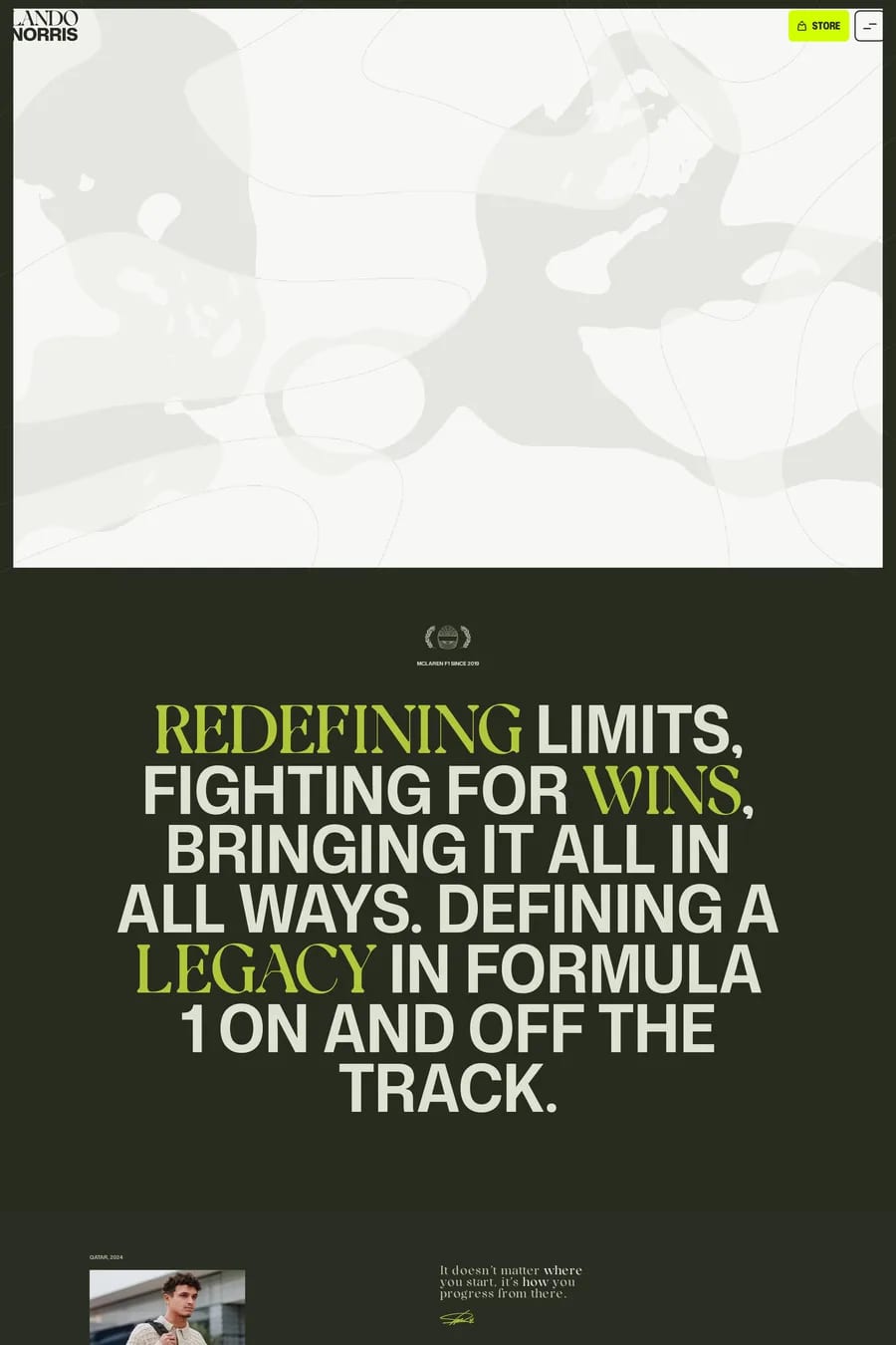
Condensed, heavy sans-serifs at large sizes. Italics for speed. Extended faces for power. Set headlines big enough that they act as the visual. Most of the sites here use one display face for headlines and a plain sans-serif for everything else. Browse the big type collection for references, and the fonts directory for what the sites here actually use.
The team or brand colours, used at full strength, with black or white as the ground. One accent is enough. Sports palettes are meant to be loud, so the usual rules about restraint relax — but keep the type high-contrast so it stays readable at speed. Look at how the sites here pair one strong colour with black.
With a data feed and a layout that copes with change. Scores, fixtures and standings come from an API and update on a timer or over a WebSocket. The design has to handle a team name of four letters and one of twenty, a score of 0 and a score of 120. The sites here with live data keep those components simple and let the hero do the visual work.
Who they are in one line, the latest news or result, sponsors, social links and a shop if they sell merchandise. That’s most of it. Athlete sites are personal brands and the good ones keep it simple: a strong hero image, big type, one page. Fans go to social for daily updates; the site is the official home.
Action, cropped tight. Motion blur, sweat, the moment of contact. Graded hard — high contrast, deep shadows, punchy colour. Video if you have it. Avoid posed team photos and stock; they drain the energy the type is trying to create. The sites here treat every image like a poster.