Updated
Curated inspiration sent every Tuesday
Unsubscribe at any time
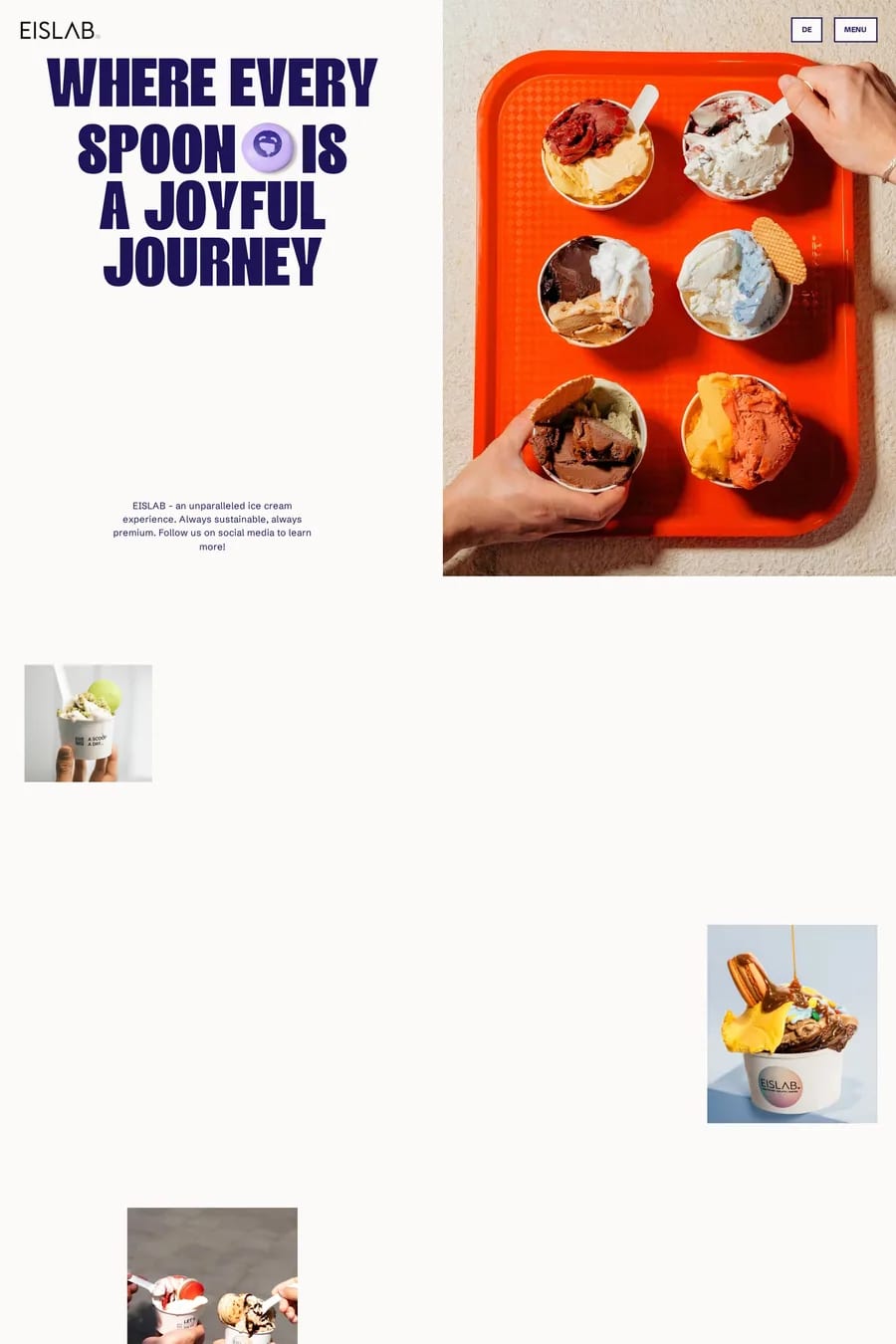
Your own, shot consistently. Overhead flat-lays for menus and ranges, tight close-ups for texture, and one or two lifestyle shots with people in them so the product has a context. Warm, natural light. The same grade across every image so the site reads as one brand. Stock photography is the fastest way to make a food site look like every other food site.
As real text on the page. Not a PDF, not an image. Text is searchable, readable on a phone, translatable and indexable by Google — a PDF menu is none of those. Group by course, show prices, mark dietary information. Keep it current; an out-of-date menu costs more trust than no menu. Put the booking button next to it.
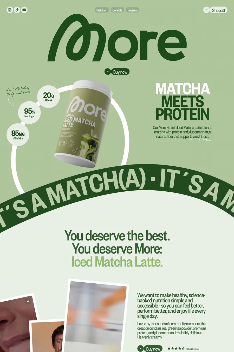
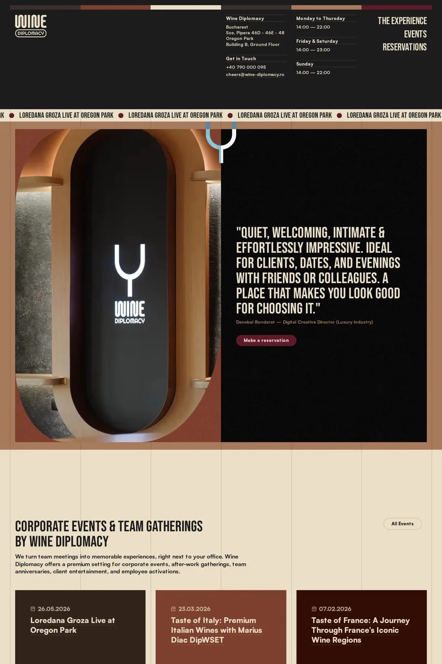
The product’s own. Wine reds, coffee browns, produce greens, citrus yellows. Then warm neutrals for the ground — cream, sand, terracotta — rather than pure white, which makes food look like a lab. The sites here rarely use cool colours unless the product is cool: ice, seafood, spirits.
Shopify if you’re selling online — it handles subscriptions, stockists and inventory without custom work. Webflow or Framer for a restaurant, café or brand site that’s mostly content and bookings. Squarespace is common for single-location restaurants and fine for that. The platform matters less than the photography.
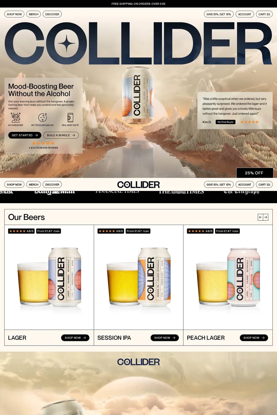
The one action you want, above the fold. Book, buy, find us. The sites here that work put it in the nav, in the hero and at the bottom of every section. Everything else — story, sourcing, team — supports that. If a visitor has to hunt for how to get the product, the photography was wasted.