
Updated
Curated inspiration sent every Tuesday
Unsubscribe at any time
A thesis — what you invest in, at what stage, and why — in plain words. A portfolio with real logos that link out. A page per partner with a real photo and what they focus on. Contact or a pitch route. Optionally, writing. The sites here that work keep this to five or six pages. Founders are checking whether you’re relevant and whether you’re real; nothing else needs to be there.
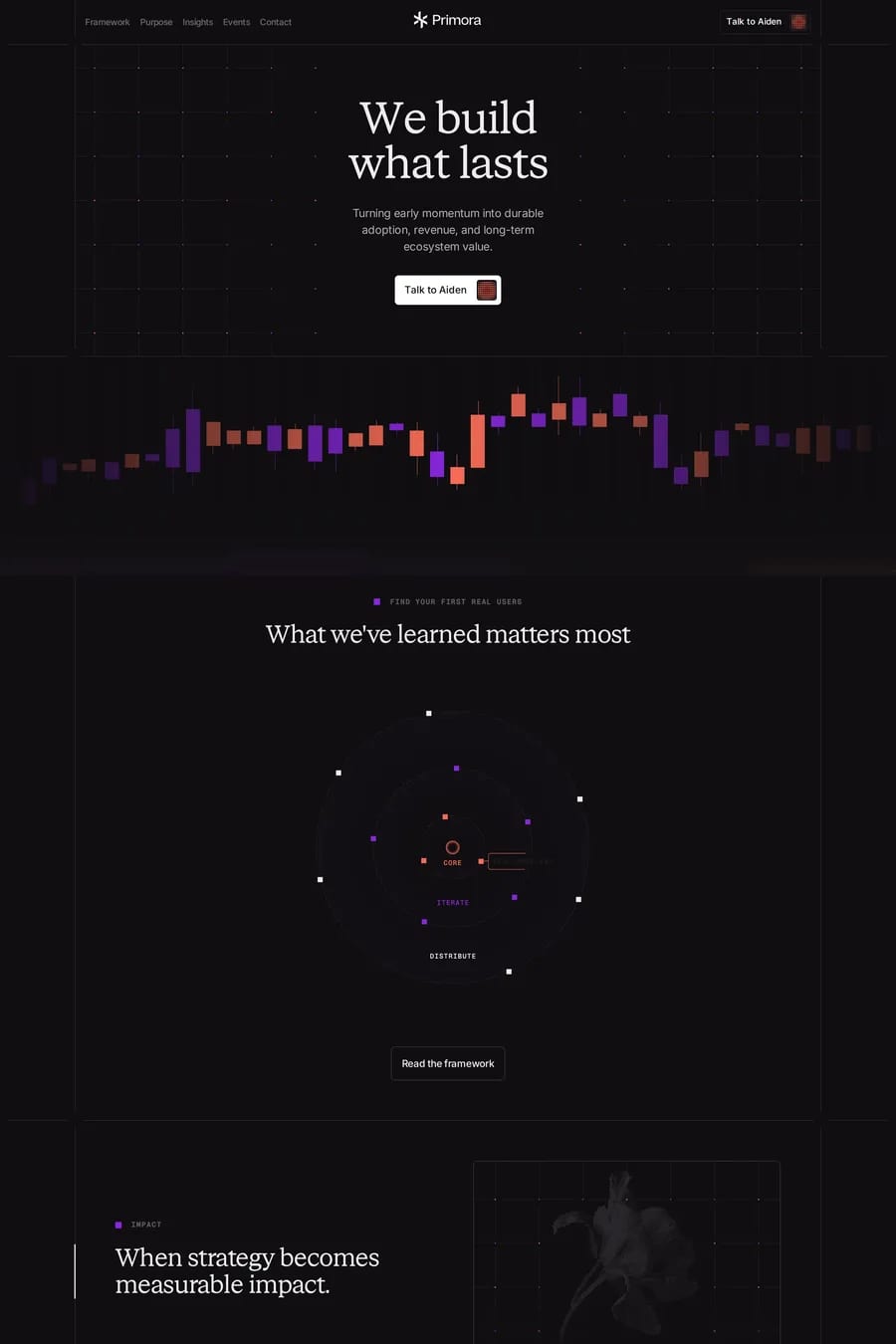
Because the firm isn’t selling to the general public. The audience is founders and limited partners who already know what a VC is. Minimalism signals selectiveness and confidence — the firm doesn’t need to shout. It’s also easier: with no product and no imagery, type and space are all there is. The risk is that every firm ends up looking the same, which is now the case.
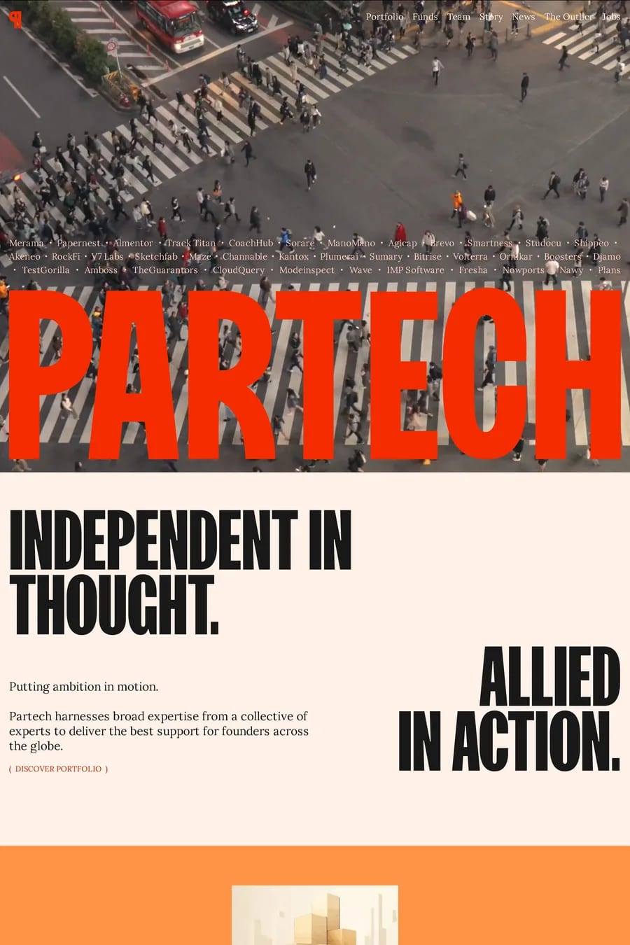
Voice, mostly. A thesis written like a person wrote it. Partner bios that say what they’re actually interested in rather than listing boards. Writing that has an opinion. Visually, a few of the sites here have broken from the template with illustration, colour or a distinctive typeface, and they’re memorable for it. Founders see dozens of VC sites; the one they remember is the one with a point of view.
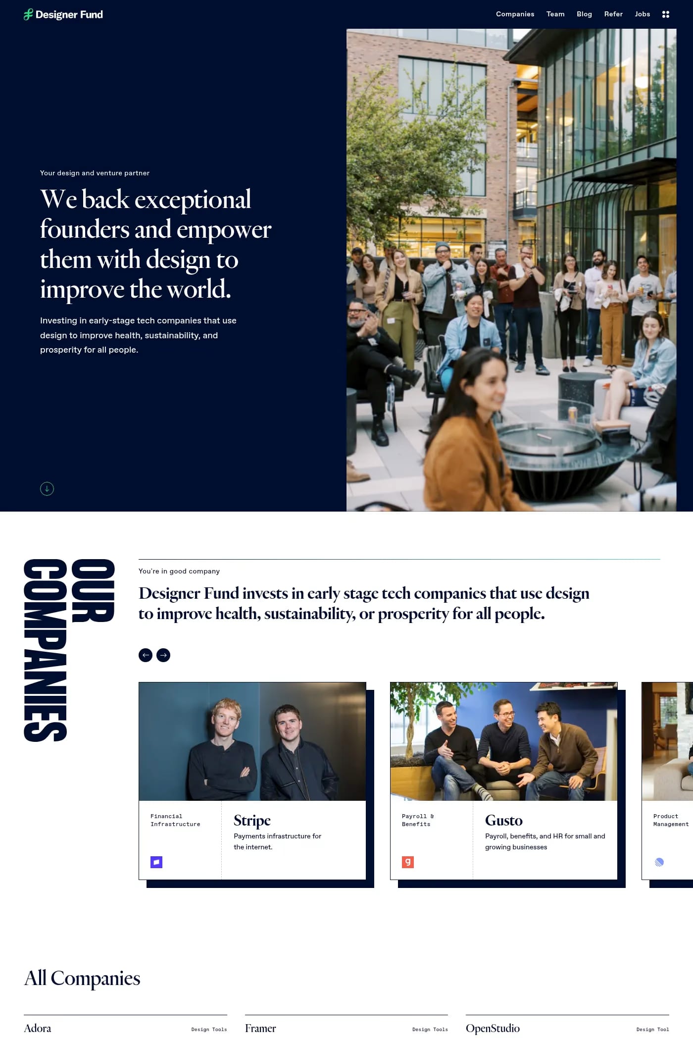
A serif for the display type if you want established and thoughtful — most of the firms here use one. A grotesque sans-serif if you want modern and operator-led. Either way, large sizes and wide margins, because type is the only visual on the page. Browse the serif and typographic collections for references.
Only if the partners will write. A blog with two posts from 2023 is worse than none. The firms whose writing works — essays on their thesis, breakdowns of what they look for, honest post-mortems — use it as the main way founders discover them. If nobody has time to write, link to the partners’ own newsletters or social instead.