New A1 Pro: unlimited saves, priority submissions and more →

43 pastel landing page examples

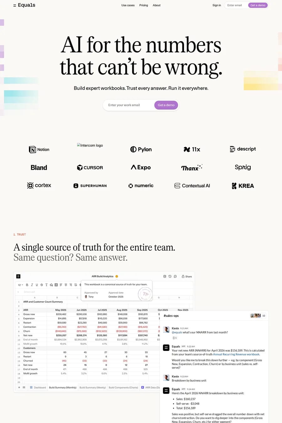
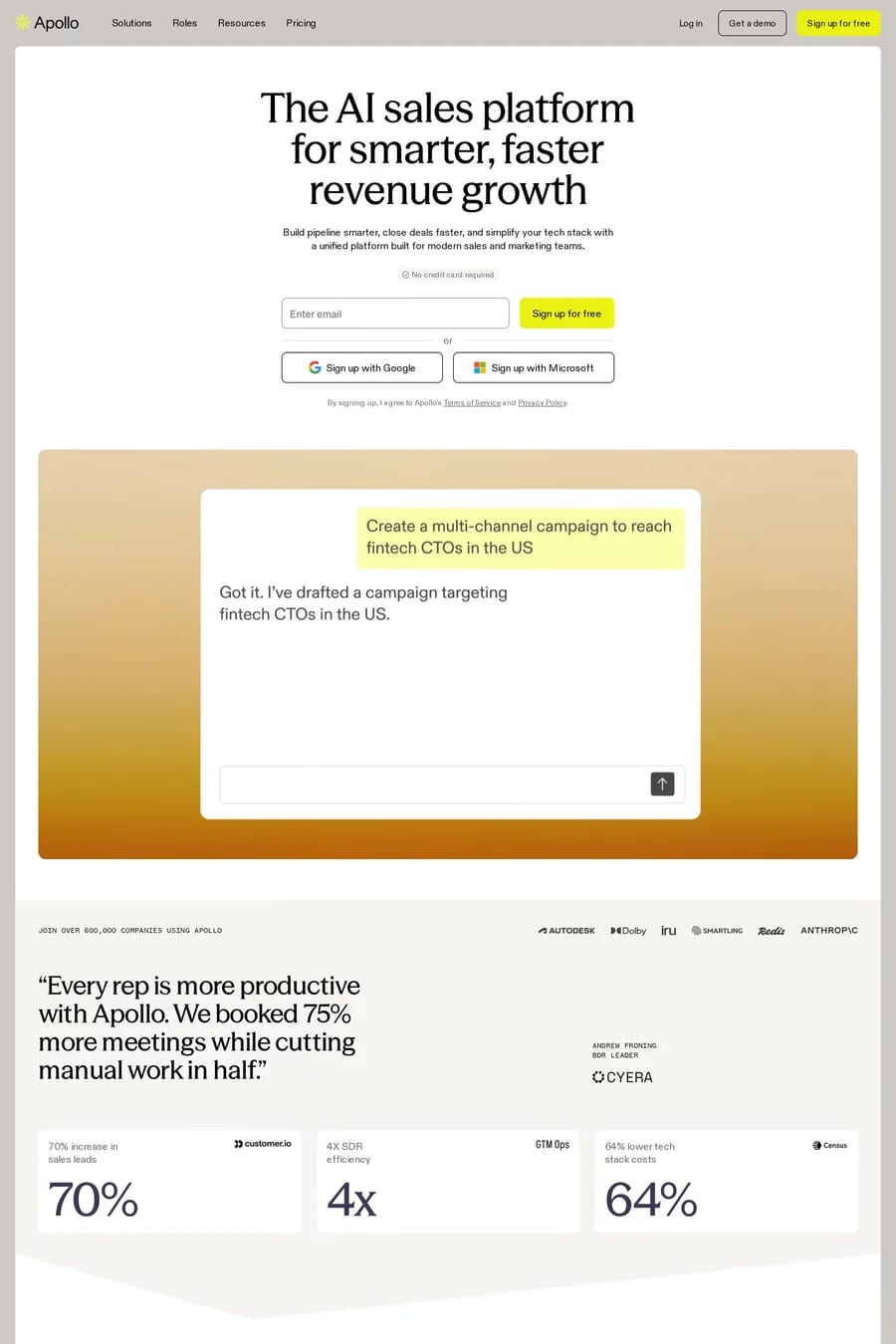
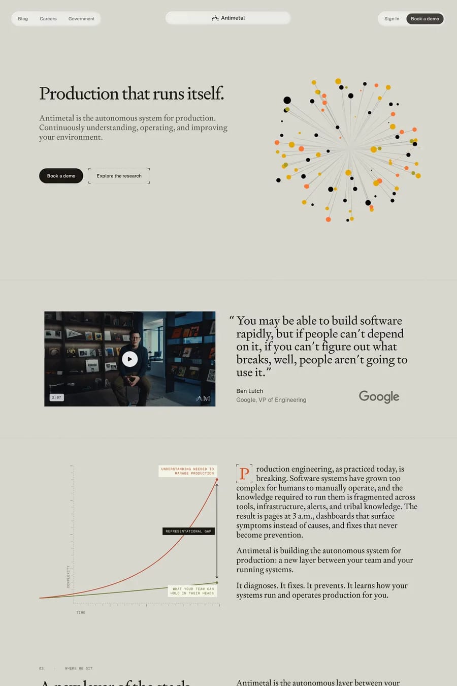
Pastel colour palettes create a soft, approachable feel that works well for wellness brands, consumer apps, and creative tools. These landing pages use muted colours to feel inviting without being loud. The gentler aesthetic stands out in markets dominated by high-contrast designs.

Get the best pastel landing websites each week

Curated inspiration sent every Tuesday

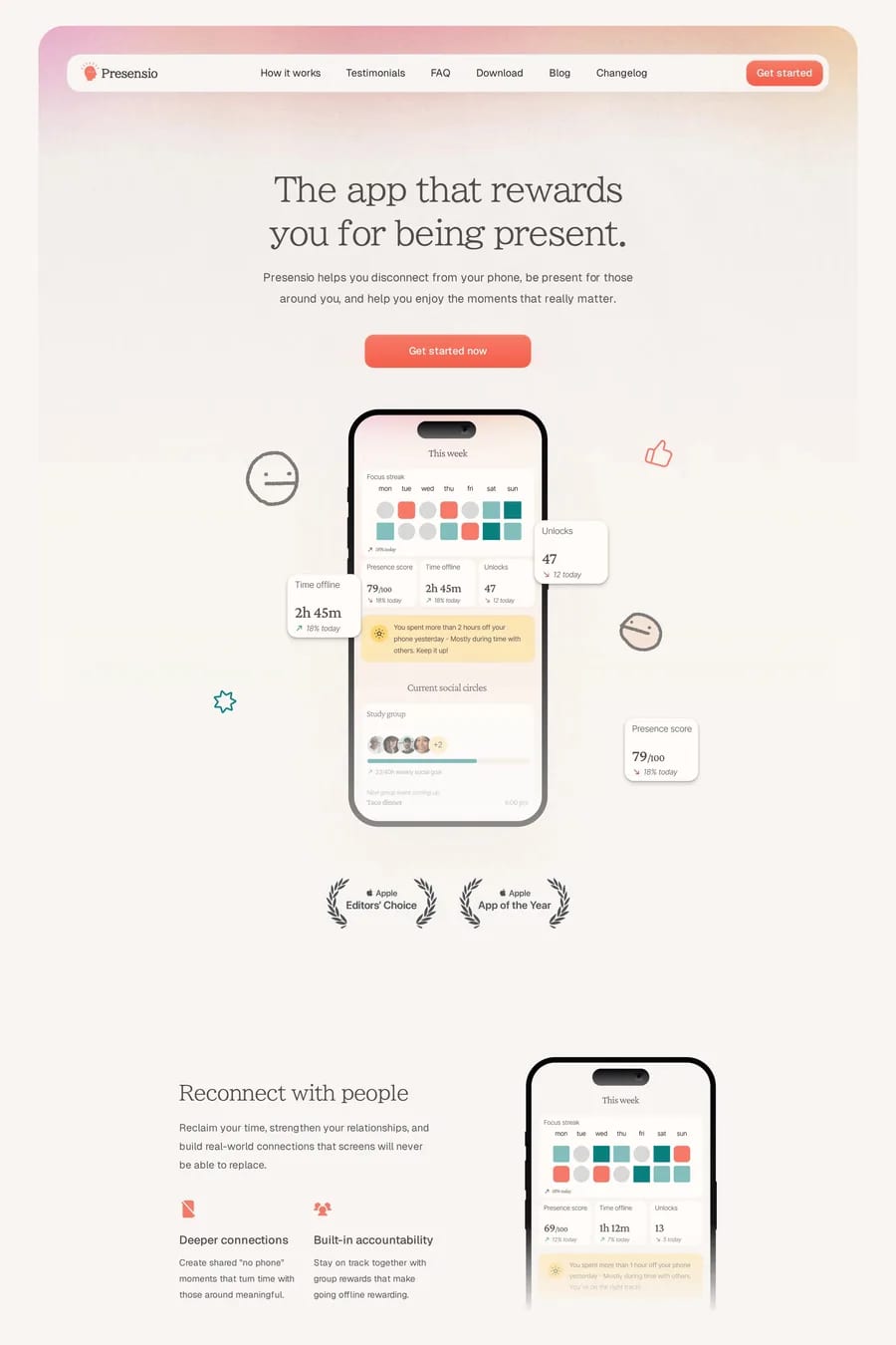
Presensio
Bevel
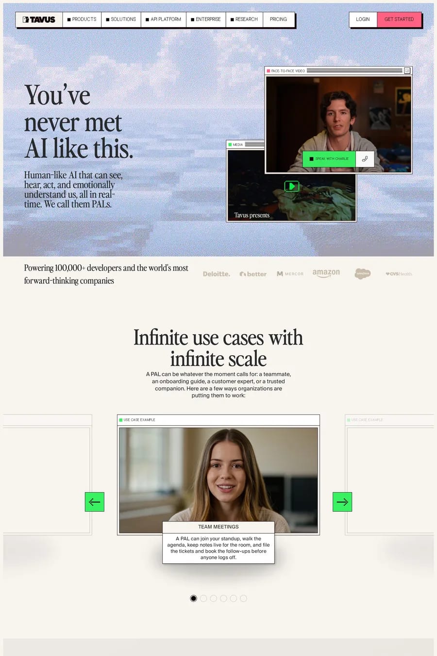
Tavus

Pastel landing FAQs

When the brand is friendly, calm, or consumer-focused. Wellness, productivity, and lifestyle products often benefit from pastel palettes that feel welcoming rather than aggressive.

Darker text on light pastel backgrounds, strategic use of deeper accent colours for calls-to-action, and careful testing of colour combinations for accessibility compliance.

Notable examples include Presensio, Bevel, Tavus, Equals and Reevo. These are just a few of the 43 pastel landing websites in this collection, each selected for strong visual design and execution.

Popular platforms in this collection include Webflow, Next.js and Framer. Each brings different strengths for building pastel landing experiences.

Frequently used typefaces include Inter, Lausanne, Geist and BIZ UDP Mincho. Typography plays a key role in defining the pastel aesthetic across these landing websites.

43 Best Pastel Landing Page Examples (2026) · A1