New A1 Pro: unlimited saves, priority submissions and more →

141 gradients landing page examples

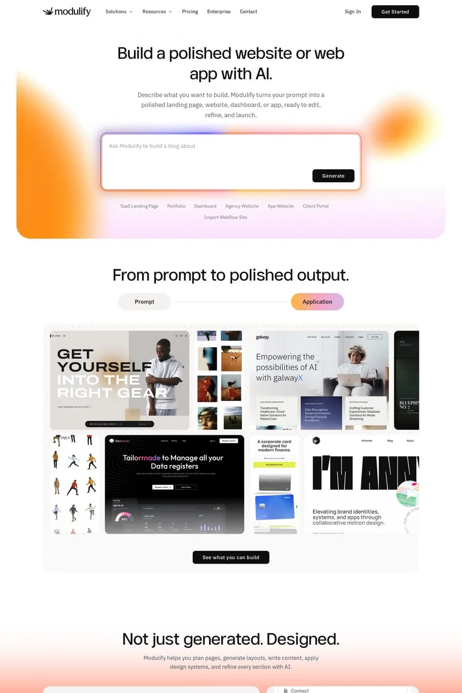
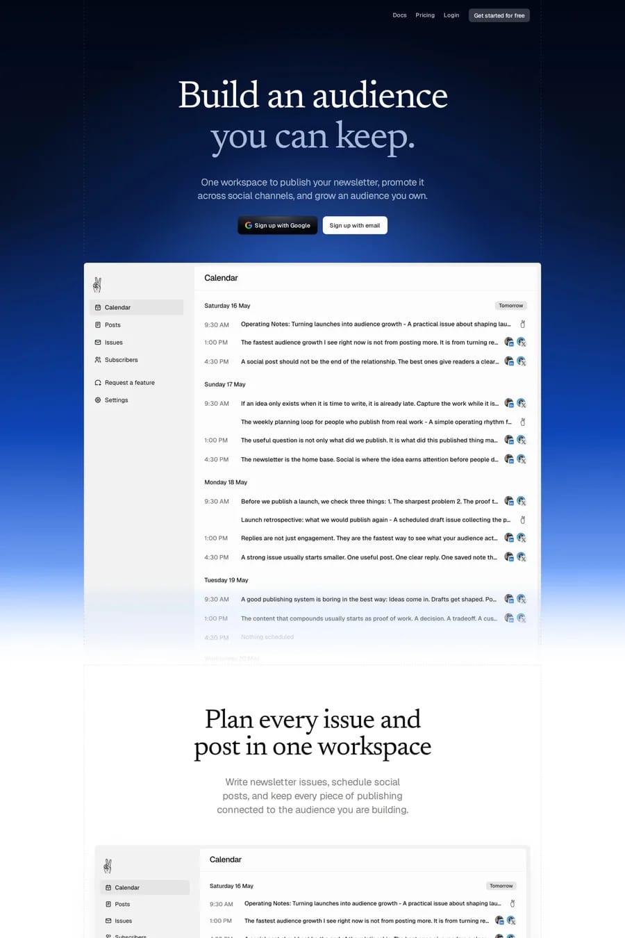
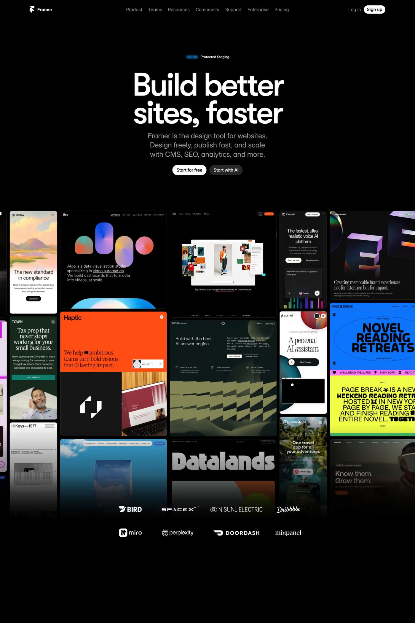
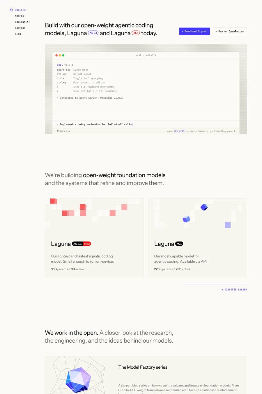
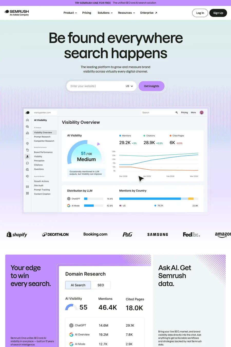
Gradient landing pages use colour transitions to create depth, energy, and modern visual appeal. Whether it's subtle background washes or vibrant hero sections, gradients add visual richness without the complexity of photography or illustration. These examples span SaaS products, creative tools, and consumer brands that use gradients to stand out. See also blurred gradients or colourful landing pages.

Get the best gradients landing websites each week

Curated inspiration sent every Tuesday

Kaiko
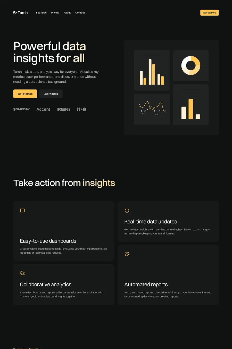
Torch
Wedge

Gradients landing FAQs

Gradients add visual richness without the complexity of imagery. They create depth, draw attention to key areas, and can be easily adapted for different contexts. Modern CSS makes them performant and highly customisable.

Start with analogous colours for subtle transitions or complementary colours for vibrant effects. Consider how the gradient will work with text overlay and test on different screens, as gradients can appear differently across displays.

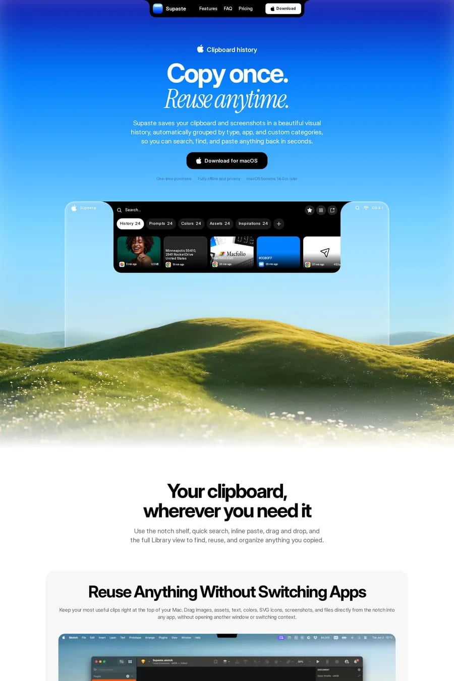
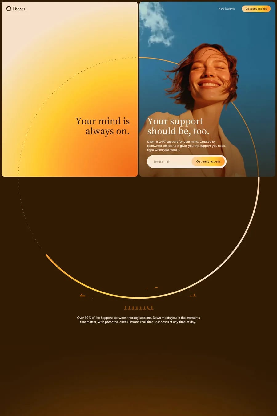
Notable examples include Kaiko, Torch, Wedge, Supaste and Dawn. These are just a few of the 141 gradients landing websites in this collection, each selected for strong visual design and execution.

Popular platforms in this collection include Framer, Webflow, Next.js and Shopify. Each brings different strengths for building gradients landing experiences.

Frequently used typefaces include Inter, Geist, Helvetica® Now and Space Grotesk. Typography plays a key role in defining the gradients aesthetic across these landing websites.