51 blurred gradients landing page examples
Updated
Updated
Curated inspiration sent every Tuesday
Unsubscribe at any time

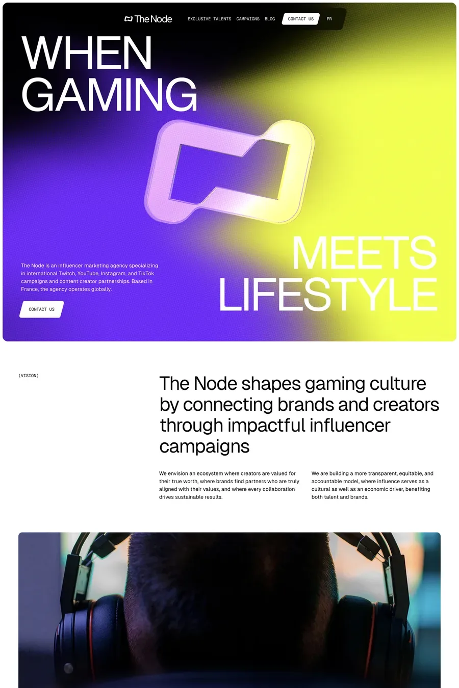
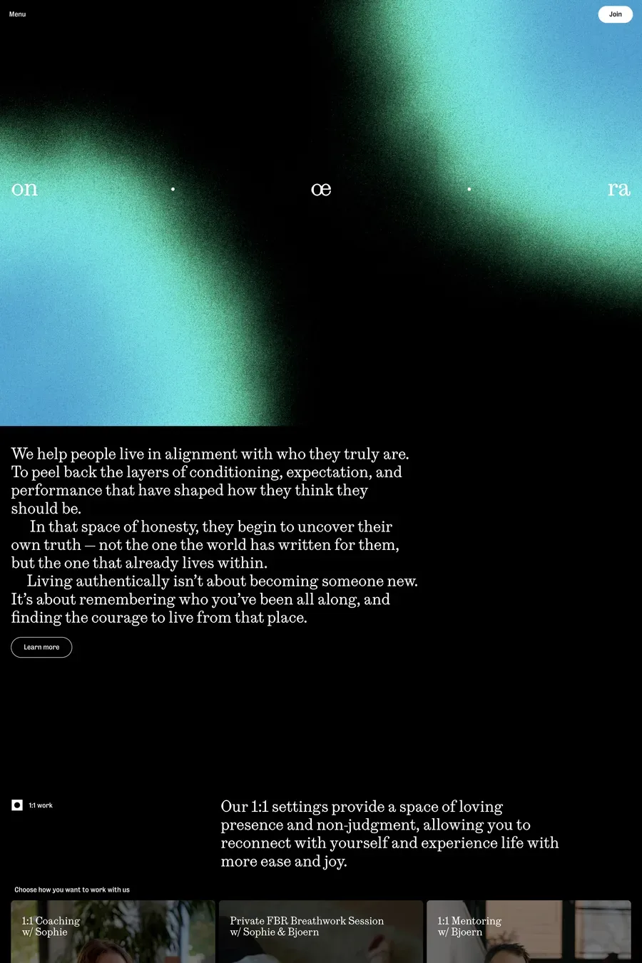
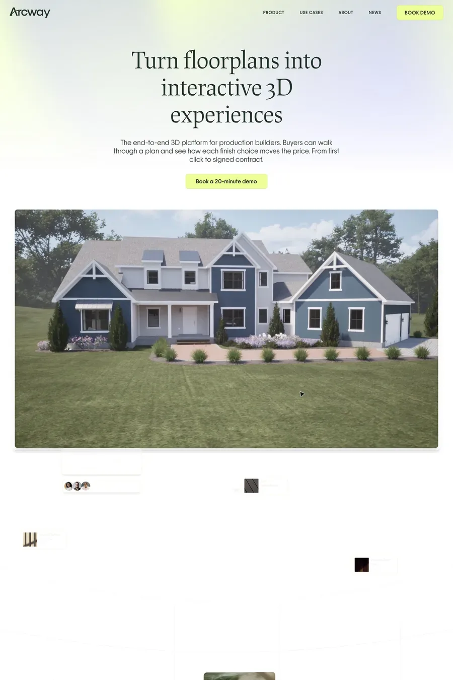
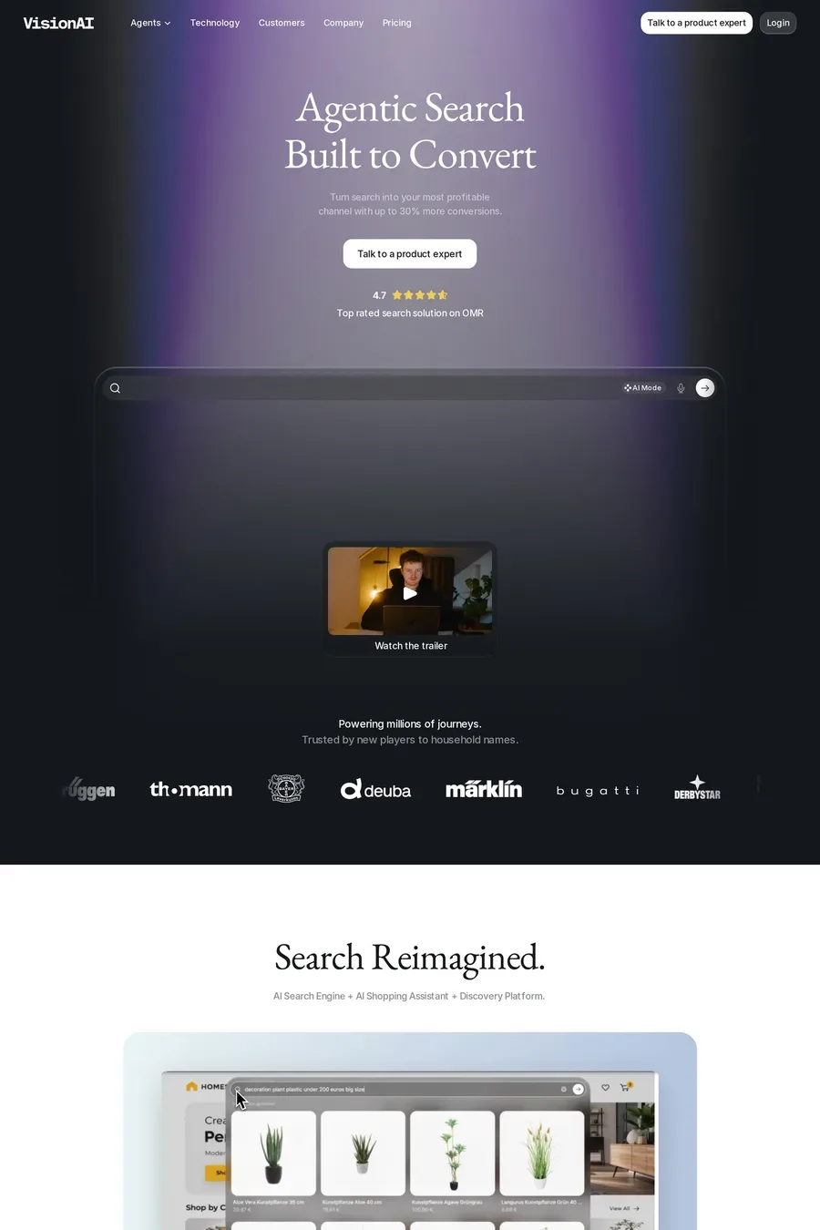
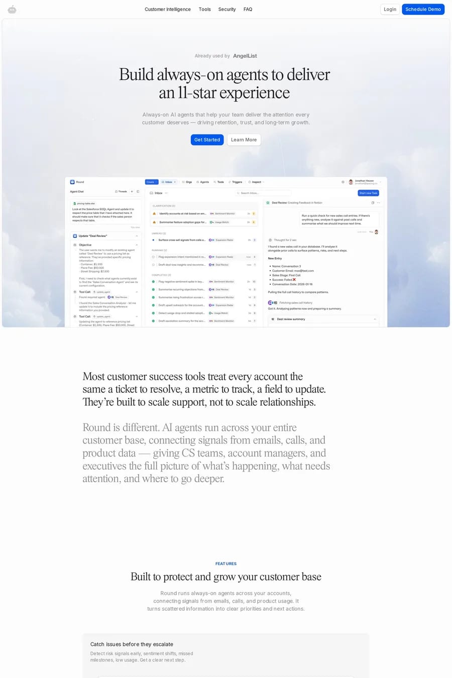
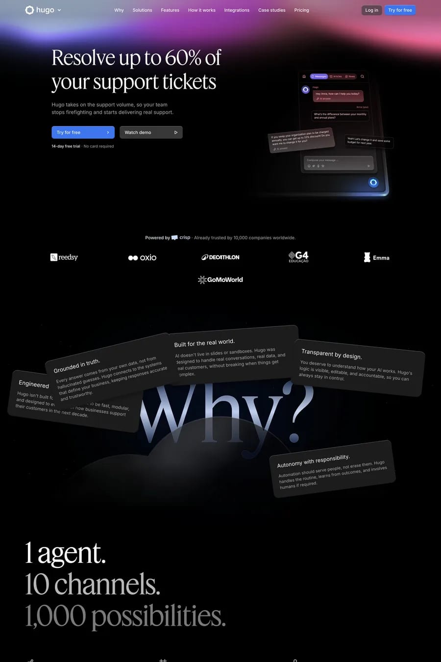
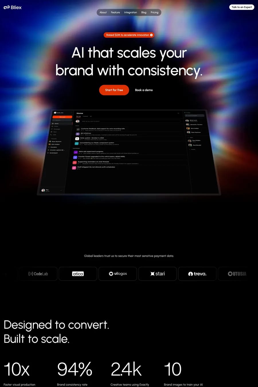
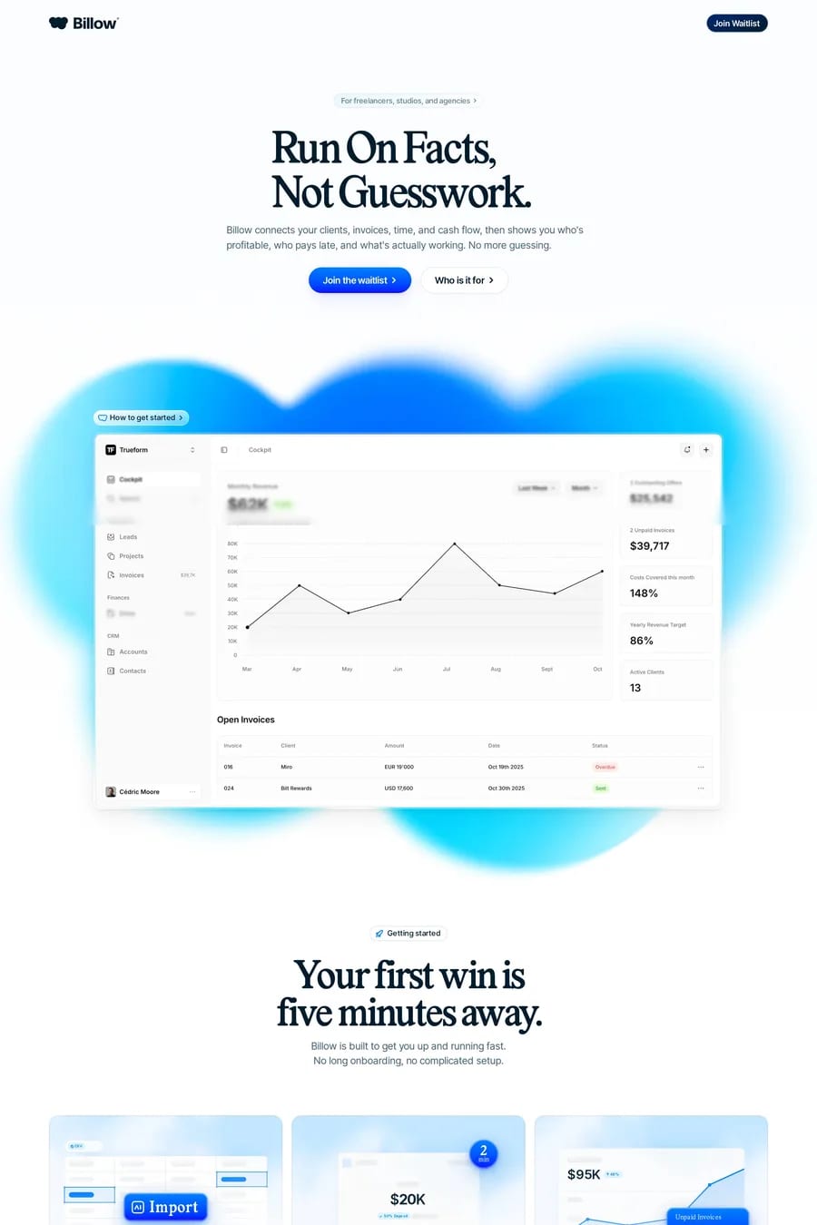
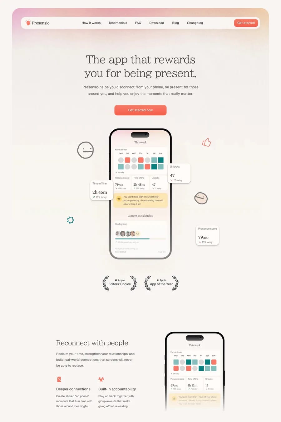
Blurred gradients use large, soft-edged colour blobs rather than smooth linear or radial transitions. The effect feels more organic and ambient, like light diffused through glass.
CSS blur filters on positioned colour elements, SVG filters, or pre-rendered images. The CSS approach is most flexible and performant for simple blobs. Complex effects may need SVG or canvas.
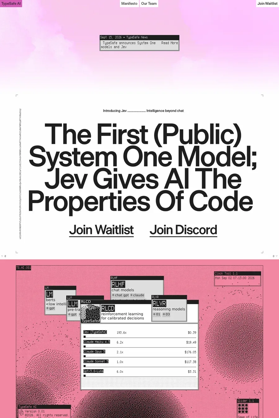
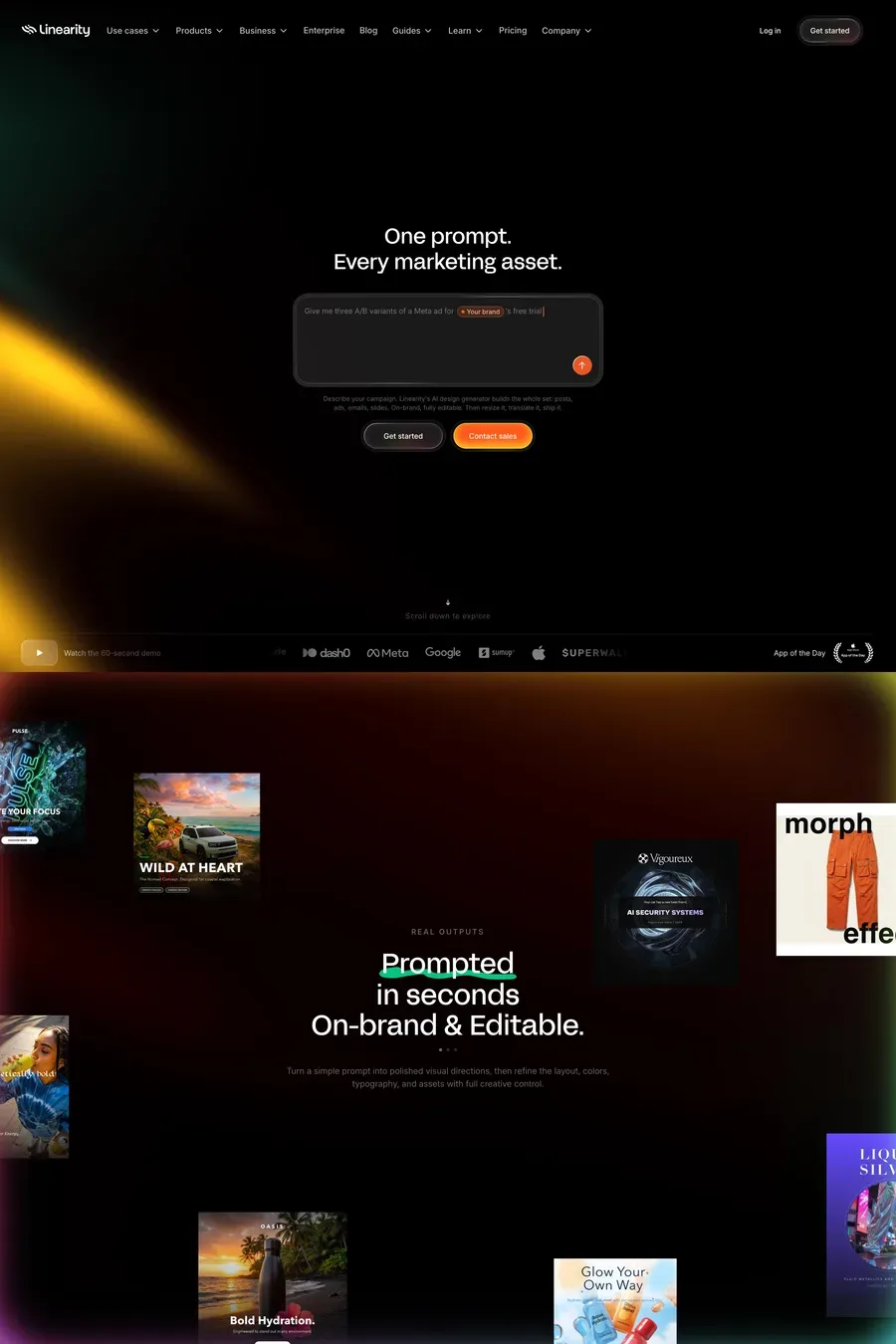
Notable examples include Pools, The Node, Onoera, TypeSafe AI and Linearity. These are just a few of the 51 blurred gradients landing websites in this collection, each selected for strong visual design and execution.
Frequently used typefaces include Inter, Geist, JetBrains Mono and Geist Mono. Typography plays a key role in defining the blurred gradients aesthetic across these landing websites.