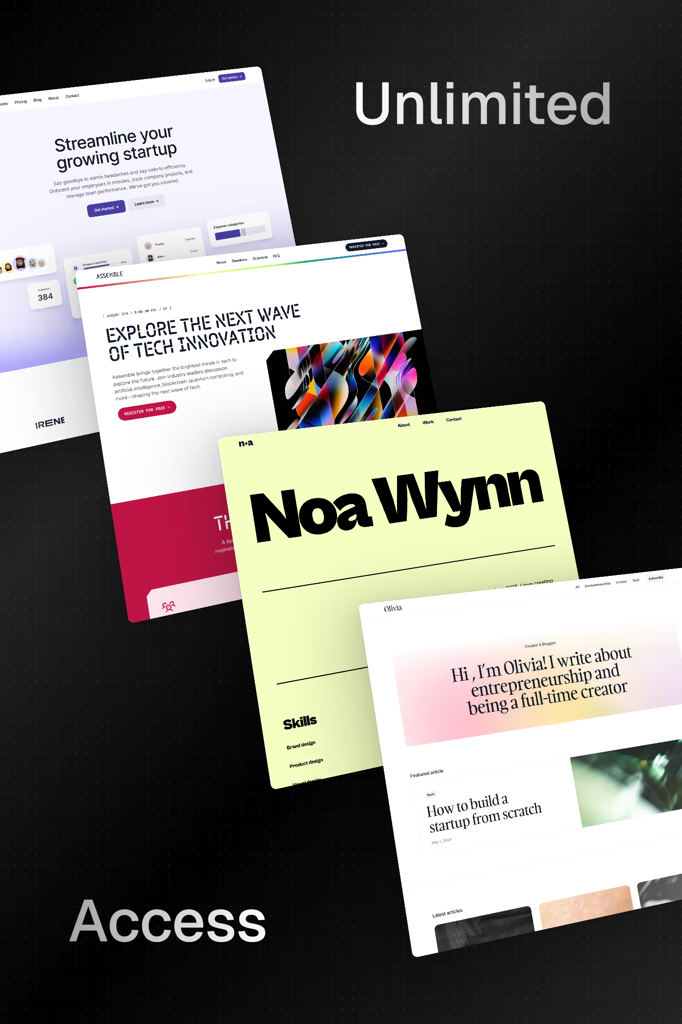
Blurred gradient design features soft, diffused colour fields that blend seamlessly into one another, creating an ethereal and atmospheric backdrop. These gradients often use large blur radii on coloured shapes or mesh gradients to achieve a luminous, organic quality.
Curated inspiration sent every Tuesday
Unsubscribe at any time
The most common technique places absolutely positioned coloured divs with large border-radius and blur filter values, letting them overlap to form soft colour transitions. CSS mesh gradients and SVG filters offer more precise control for complex multi-colour blends.
Analogous colours — those adjacent on the colour wheel — blend most naturally, producing smooth transitions. Complementary pairs can create vibrant energy but need careful handling to avoid muddy midpoints. Limiting the palette to two or three hues keeps the result cohesive.