32 gradients design website examples
Updated

Updated
Curated inspiration sent every Tuesday
Unsubscribe at any time

By tying them to the brand palette and using them consistently. A gradient that's part of the studio's visual identity feels intentional. Random or excessive gradients feel like they're chasing a trend.
Subtle, desaturated gradients for a sophisticated feel. Vibrant ones for creative energy. Mesh gradients for depth and complexity. The choice should match the studio's positioning.
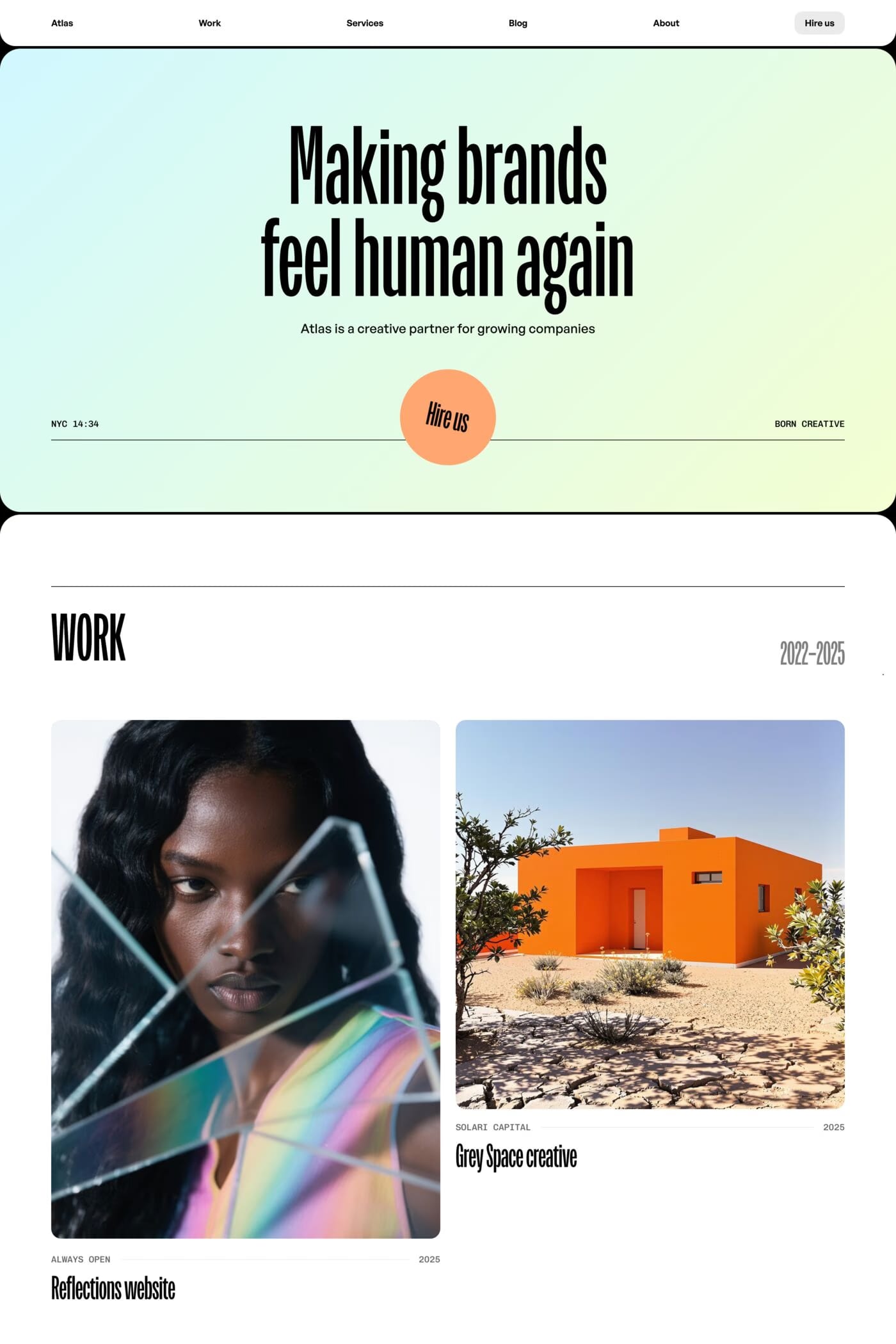
Notable examples include Atlas Studio, Jonas, Driftime®, Last Studio and Trivvo. These are just a few of the 32 gradients design websites in this collection, each selected for strong visual design and execution.
Frequently used typefaces include Inter, Aspekta, Neue Montreal and New Title. Typography plays a key role in defining the gradients aesthetic across these design websites.