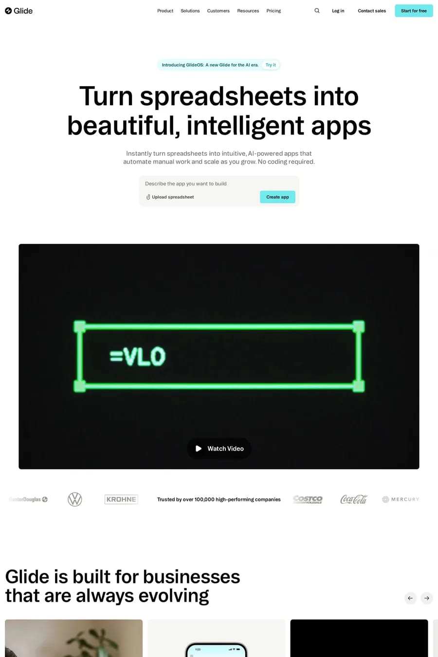
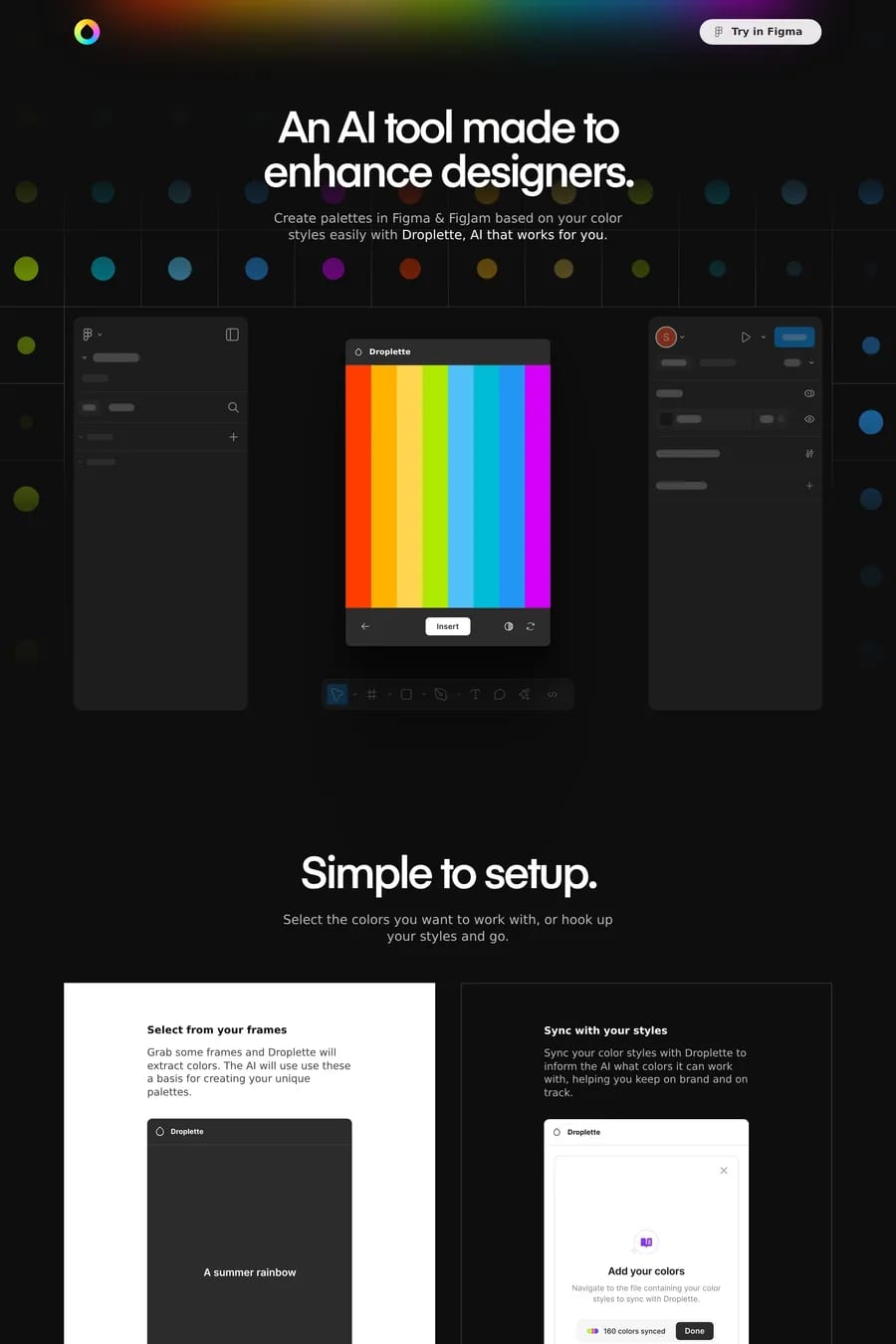
AI websites all launched in the same 18 months, and most of them look alike. Dark background, gradient glow, a mesh or particle animation, a chat-shaped demo, and a wall of logos. That’s the category default. The sites here — Clay, Legora, Heron, Etched — are the ones that did something else, or did the default well enough to stand apart. The first thing to look for is whether the site shows the product. The best AI sites lead with a real interaction: a prompt going in, a result coming out, in a recording short enough to loop. The weak ones lead with an abstract visual and a headline about the future. Visitors can’t tell what those products do. The second is trust. AI buyers are sceptical, so the strong sites put the evidence high: named customers, a benchmark, a security page, a founding team with real credentials. The third is restraint with the glow. A soft gradient behind the hero is fine. A page that shimmers on every section feels like a template, because it is one. Most of these sites are built on Next.js or Framer, almost all are dark, and a growing number are going light to stand out. See animated AI sites, dark AI sites, minimal AI sites, Next.js AI sites and Framer AI sites.