
Updated
Curated inspiration sent every Tuesday
Unsubscribe at any time
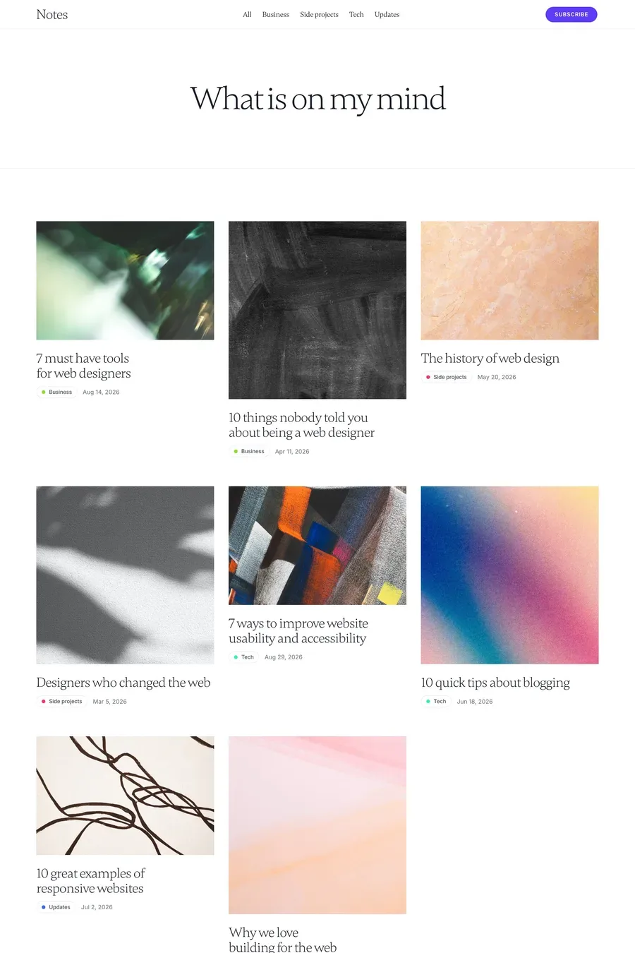

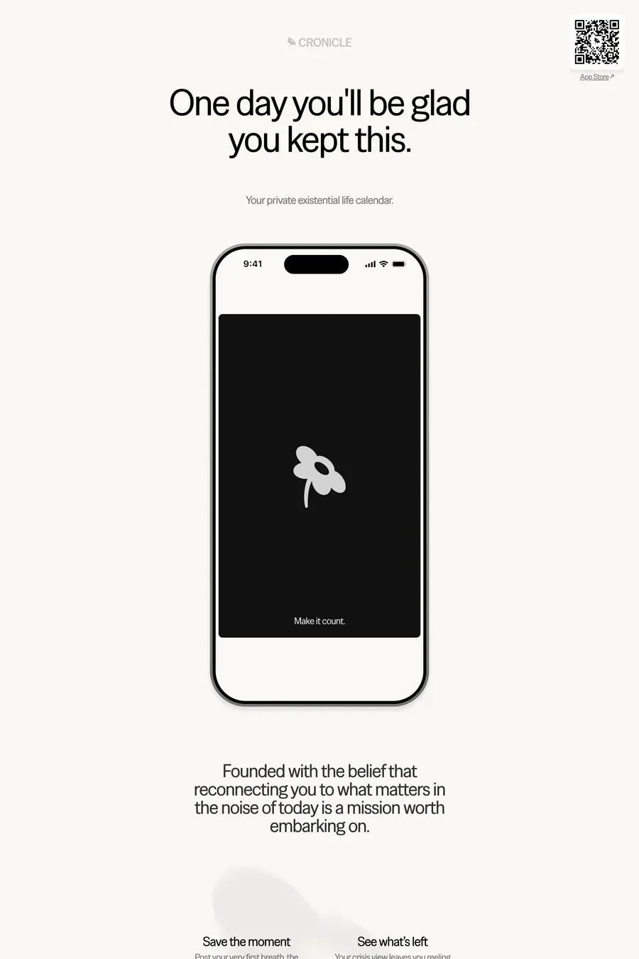
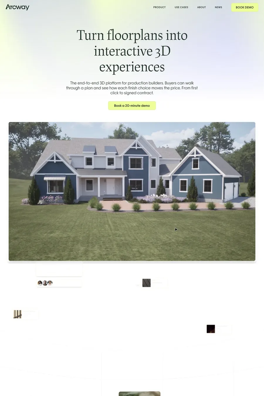
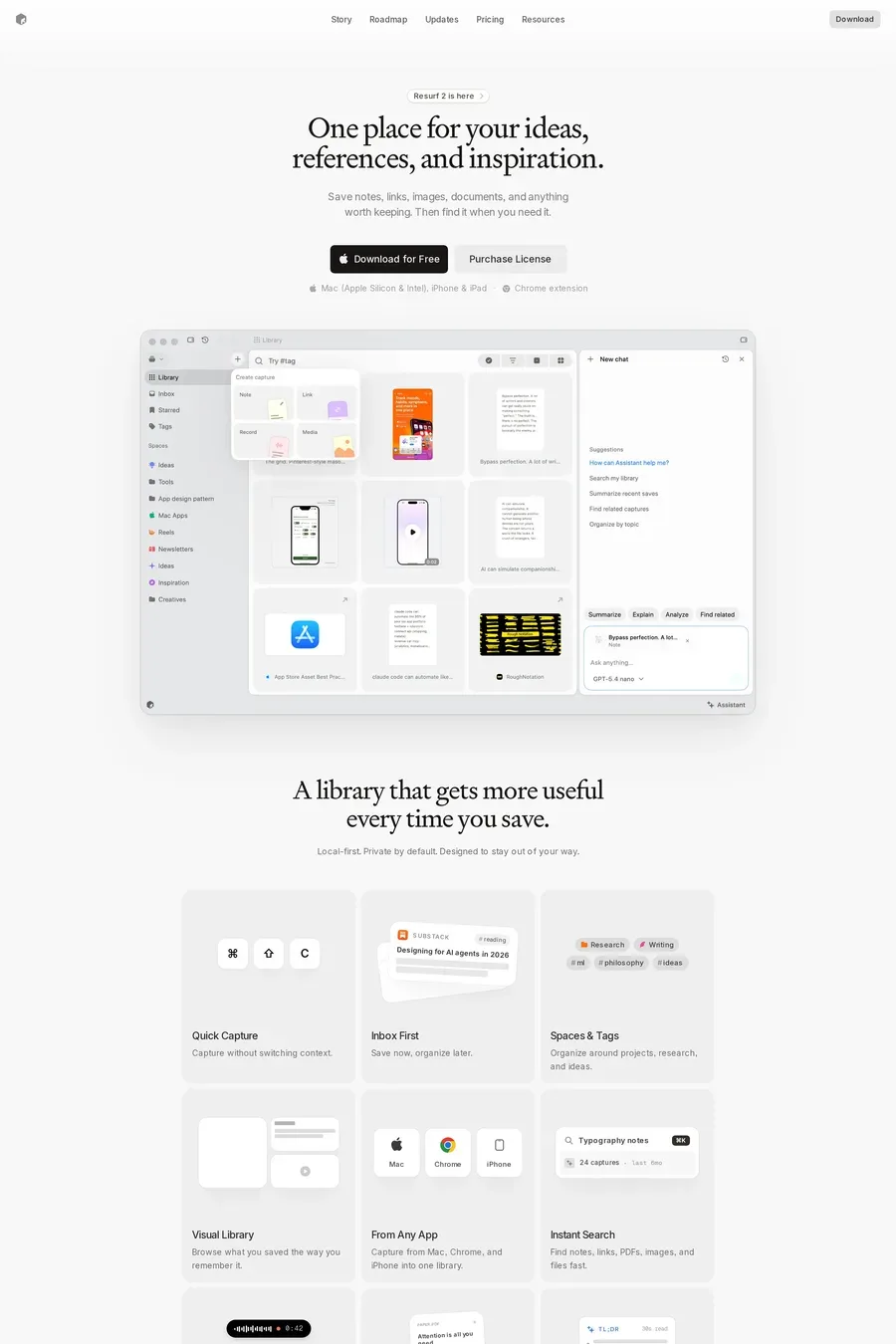
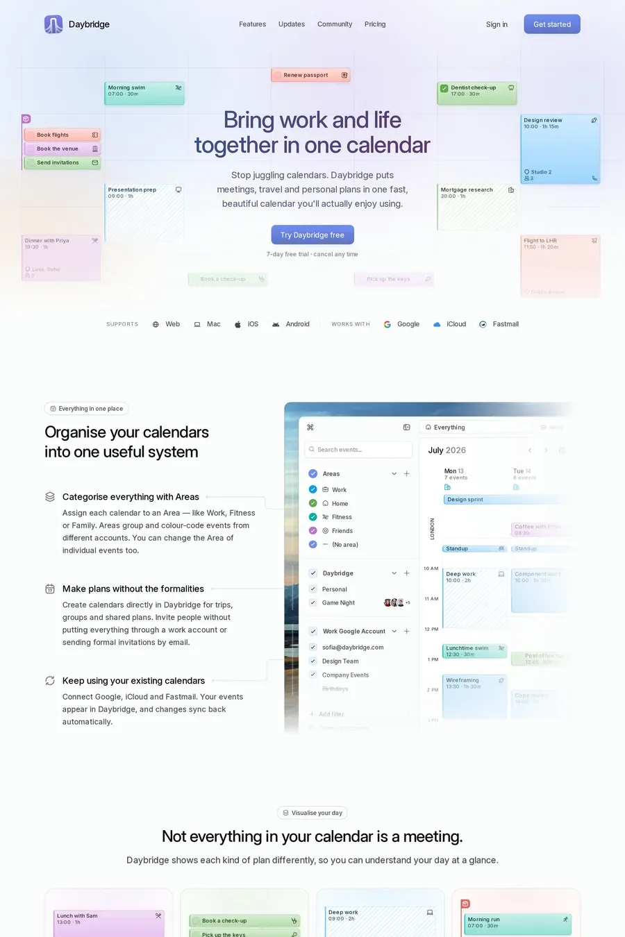
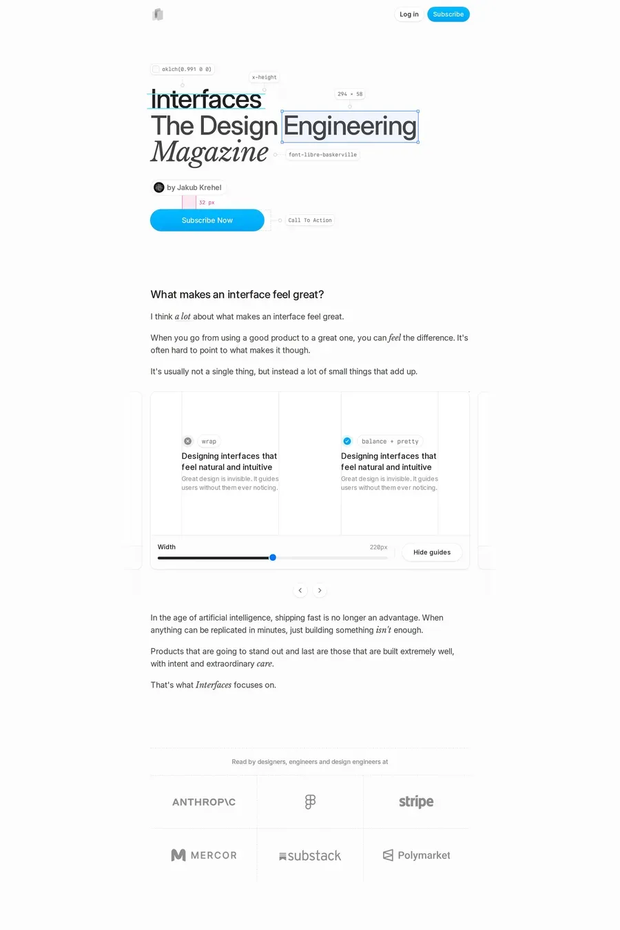
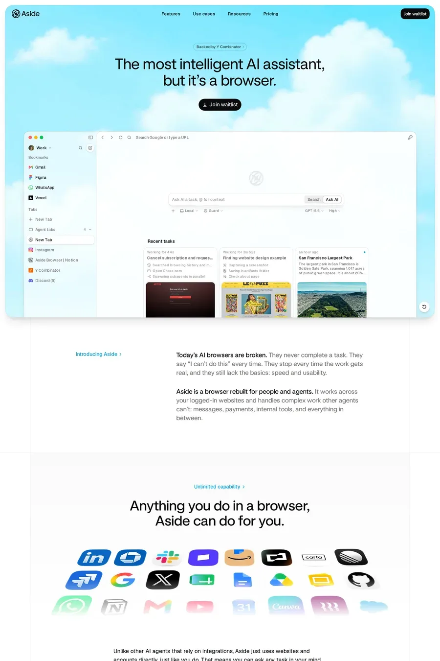
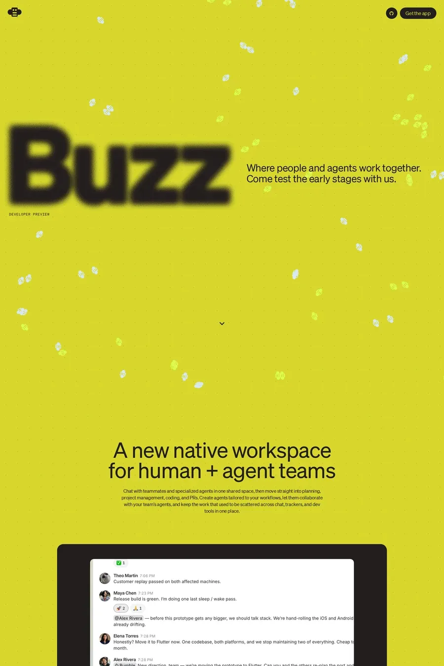
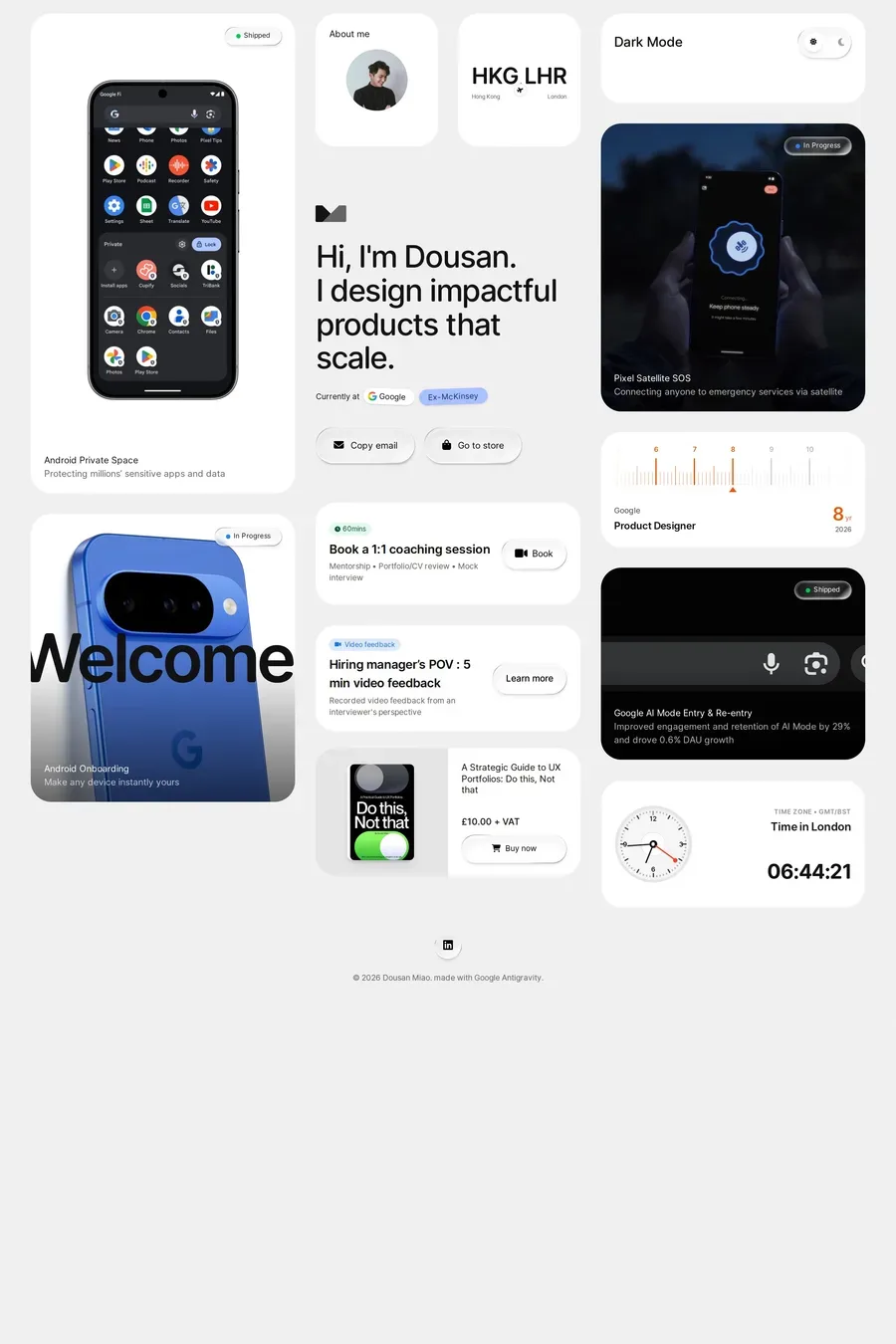
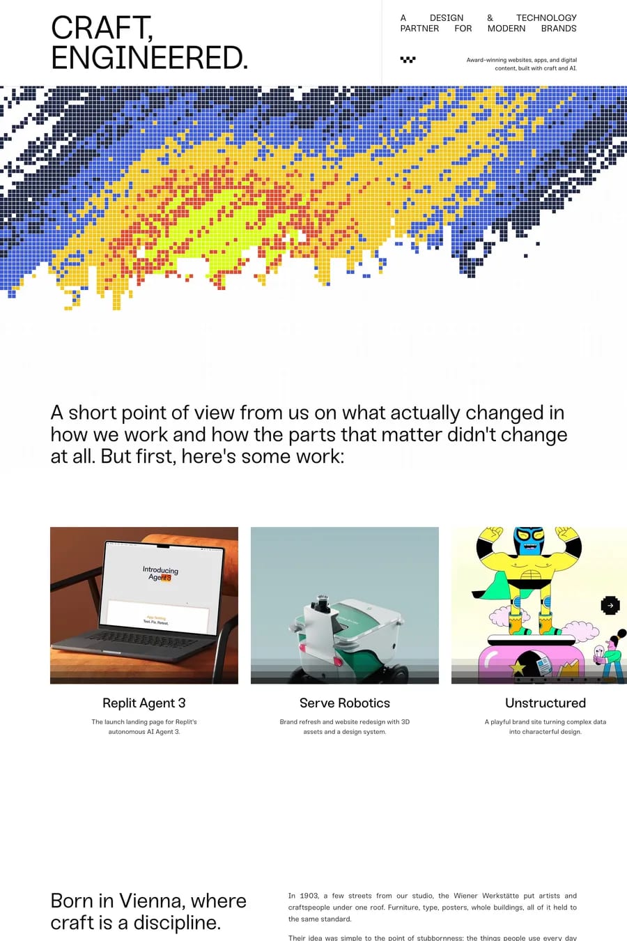
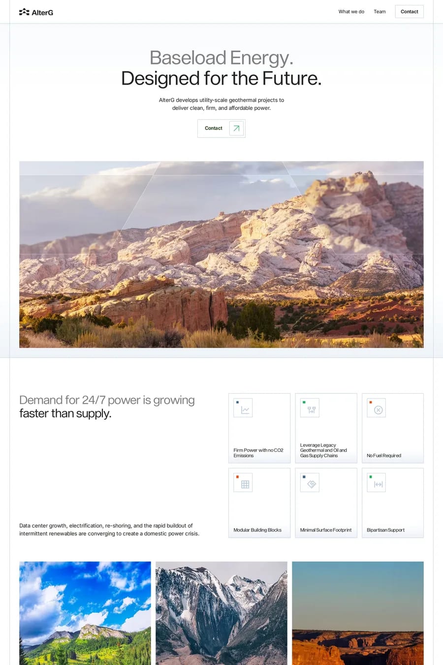
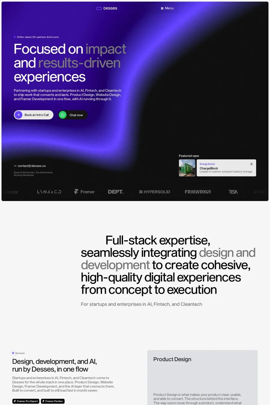
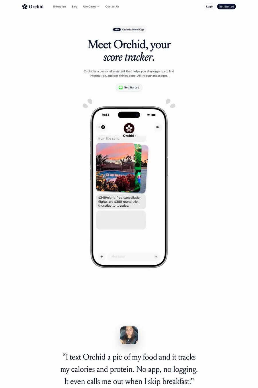
Light interfaces use subtle elevation through soft shadows, slight background tint differences between sections, careful typography weight variation, and strategic use of a single accent colour. These understated cues guide the eye without disrupting the overall brightness.
Light designs can feel washed out if contrast is insufficient, and distinguishing interactive elements from static content requires careful attention. Ensuring adequate text contrast, visible focus states, and clear button boundaries are common challenges on predominantly white layouts.