
The best green and white websites
Updated




Get the best green and white websites each week
Curated inspiration sent every Tuesday
Unsubscribe at any time


Green and white website FAQs
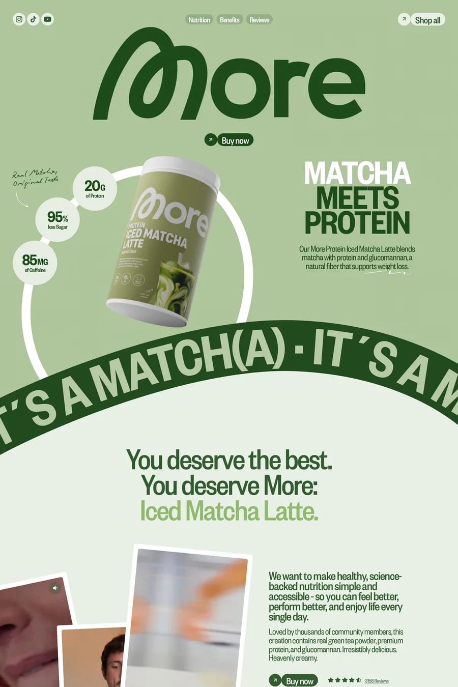
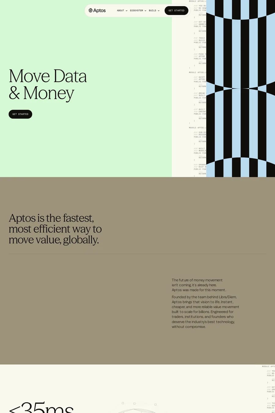
A darker, slightly muted green. Bright pure green on white is hard to read and looks dated. Forest, sage and deep teal-greens hold their contrast for text and buttons. Pale mint works as a background, not as text.
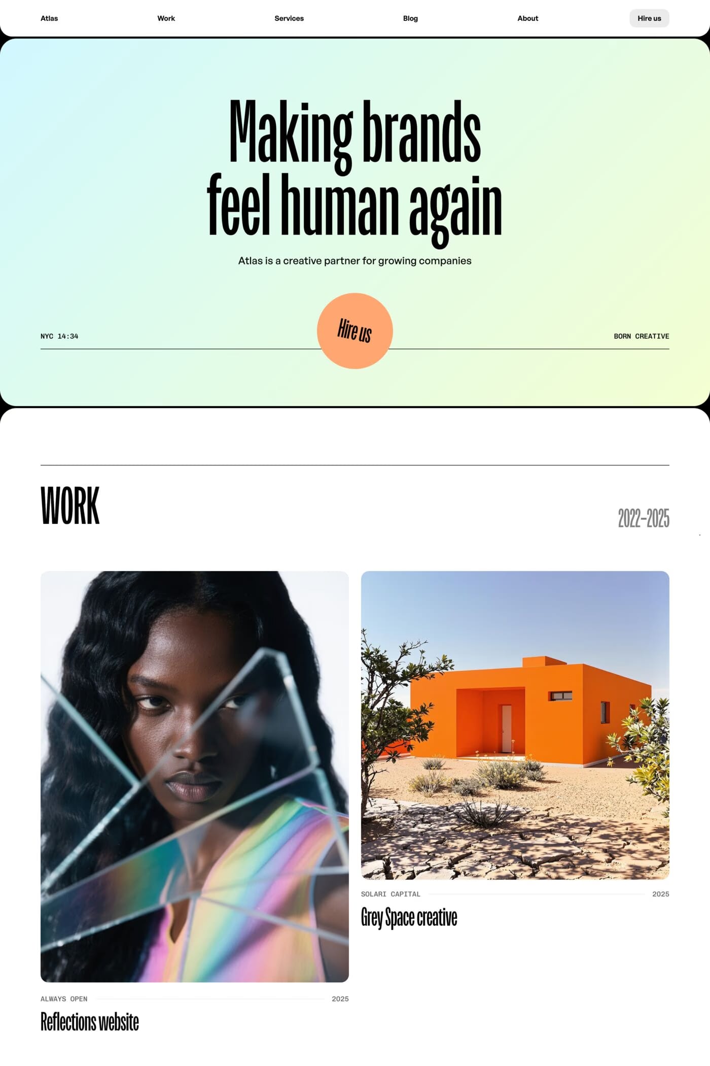
Give the green one big moment. A full-width green section, a large green headline or a green photo treatment breaks up the white. Pair it with a strong typeface — a bold serif or a tight sans-serif — so the type carries the personality the palette doesn’t.
Yes, for brands that want to feel calm and trustworthy. It suits finance, health, food and climate brands well. It struggles when a brand needs energy or urgency — add a warm third colour, like orange or yellow, if the page feels too quiet.