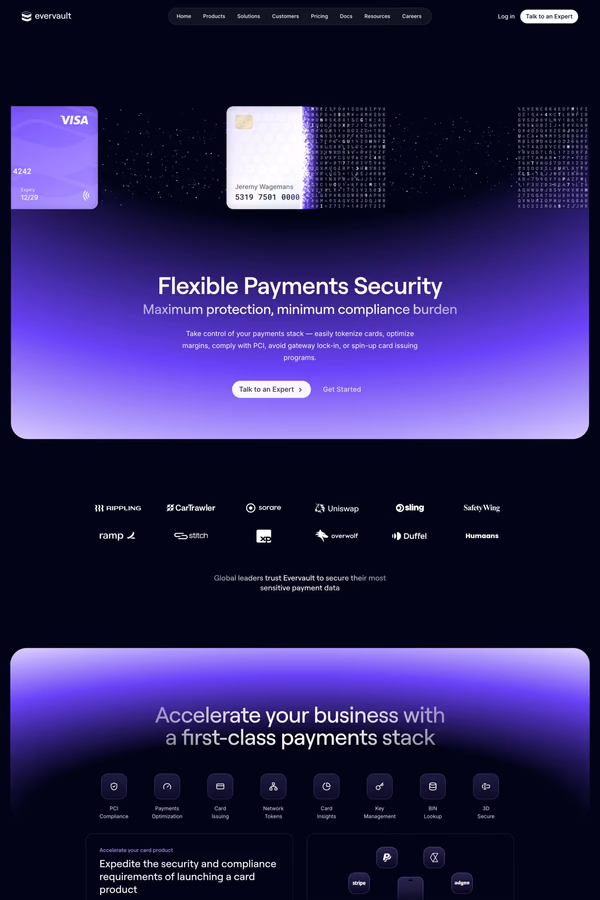
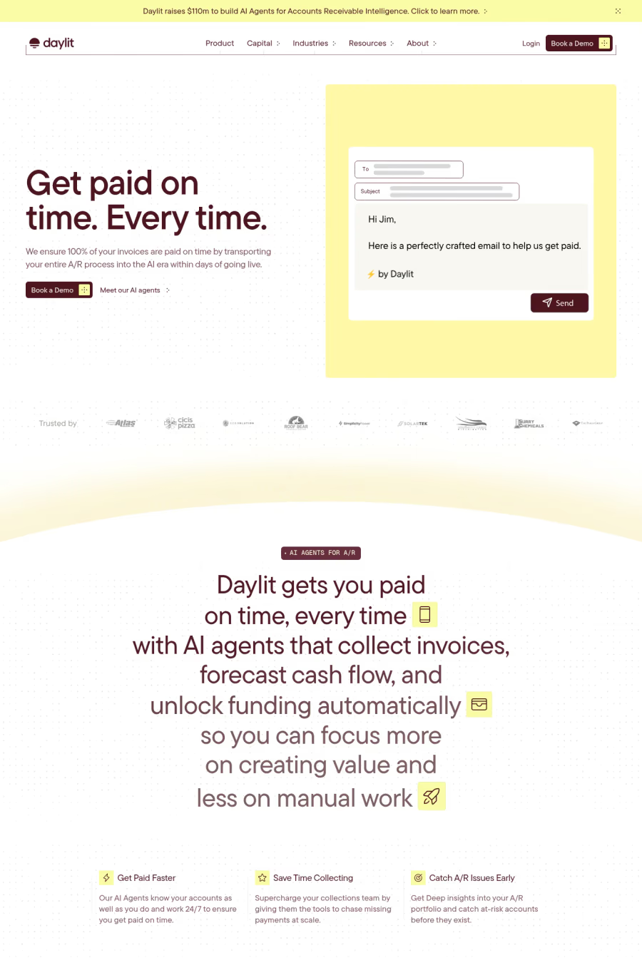
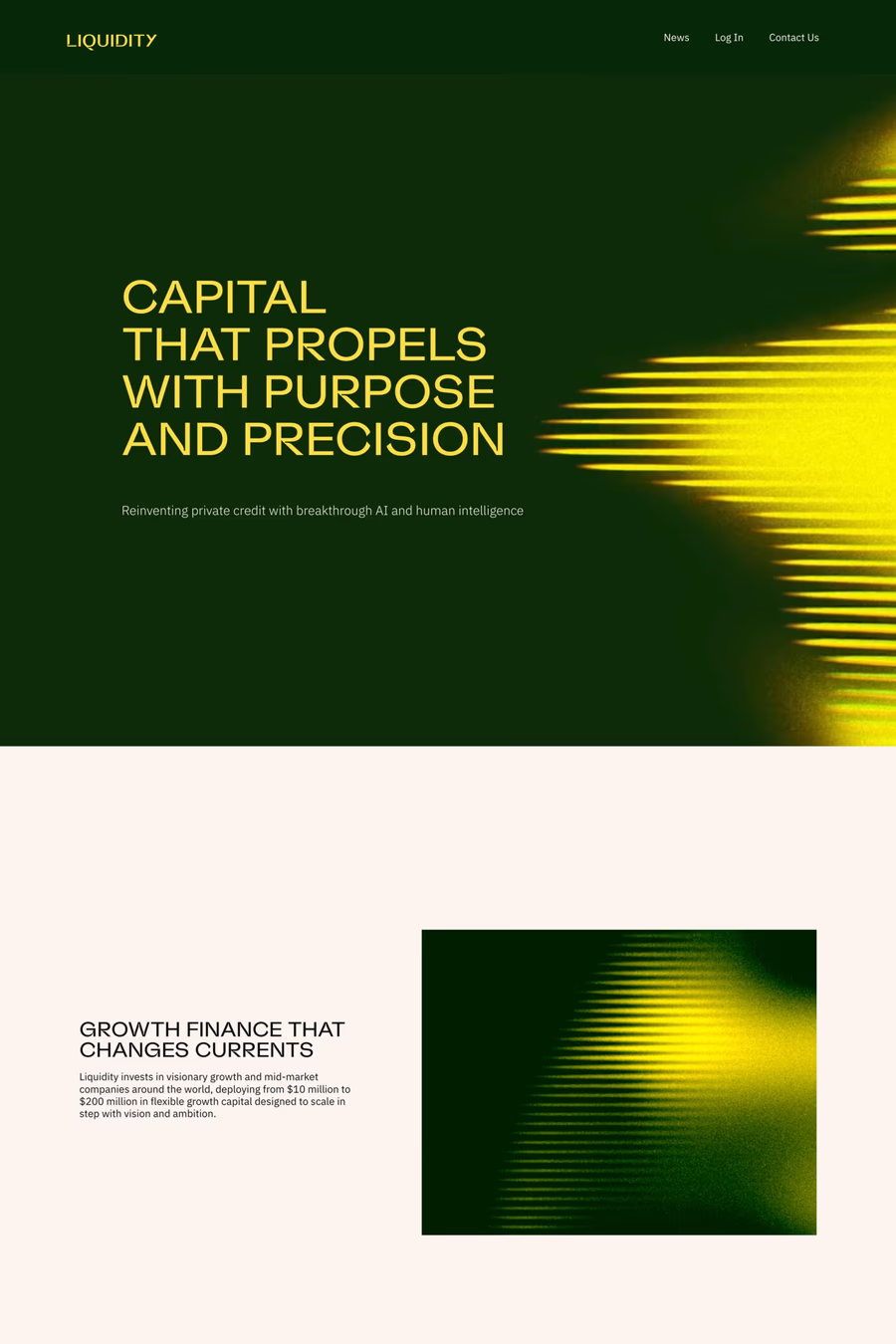
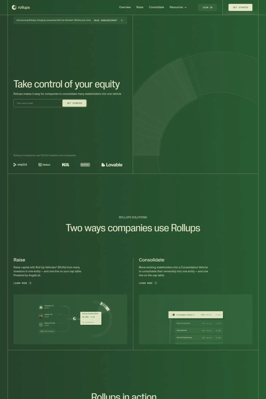
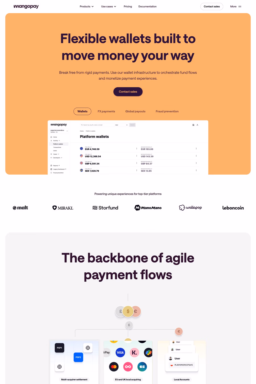
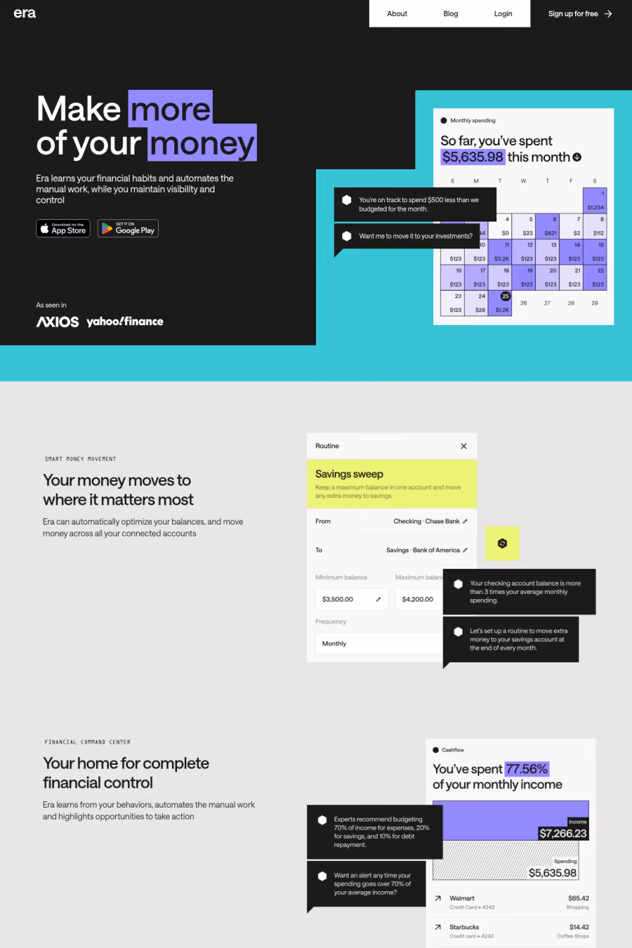
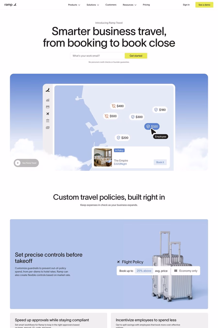
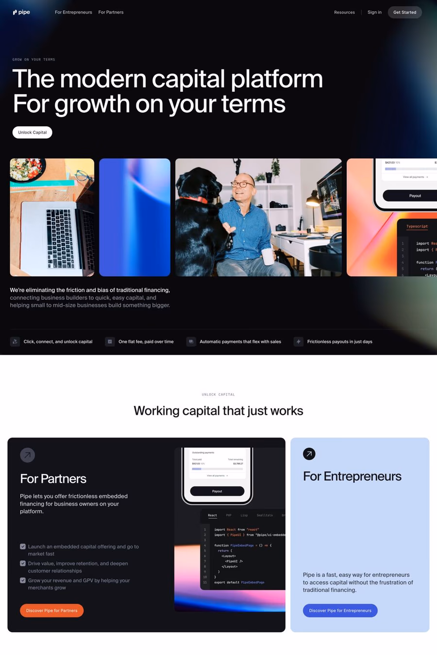
Readability and trust. Financial content involves numbers, tables, and detailed information. Sans-serifs render these clearly at all sizes and create a modern, competent impression.
Fintech sites tend to use bolder type, brighter colours, and more informal layouts. Traditional finance leans on conservative sizing and muted palettes. Both use sans-serifs but in very different ways.
Notable examples include Daylit, Tabs, FinSight, Liquidity and Capchase. These are just a few of the 20 sans-serif finance websites in this collection, each selected for strong visual design and execution.
Popular platforms in this collection include Webflow, Next.js and Framer. Each brings different strengths for building sans-serif finance experiences.
Frequently used typefaces include Geist, IBM Plex®, Suisse and Inter. Typography plays a key role in defining the sans-serif aesthetic across these finance websites.