For code samples and technical content, yes. But the main brand typography is almost always sans-serif, with monospaced fonts reserved for specific technical contexts.
Font weight, size, and spacing do the heavy lifting. A bold, tightly-set sans-serif feels very different from a light, spacious one, even if the underlying typeface is similar.
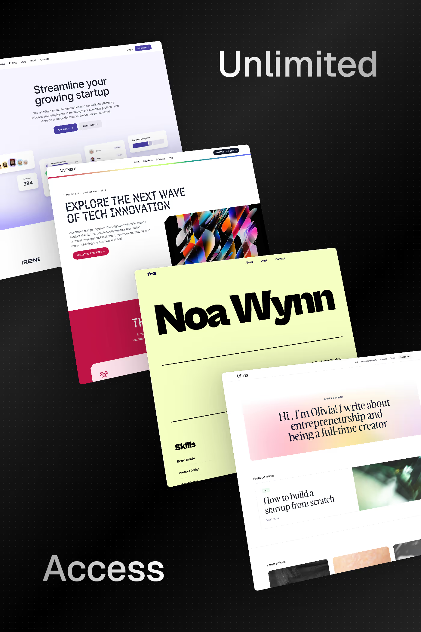
Notable examples include Detail, Annnimate, Last Studio, Blacksmith and Elliott Mangham. These are just a few of the 34 sans-serif development websites in this collection, each selected for strong visual design and execution.
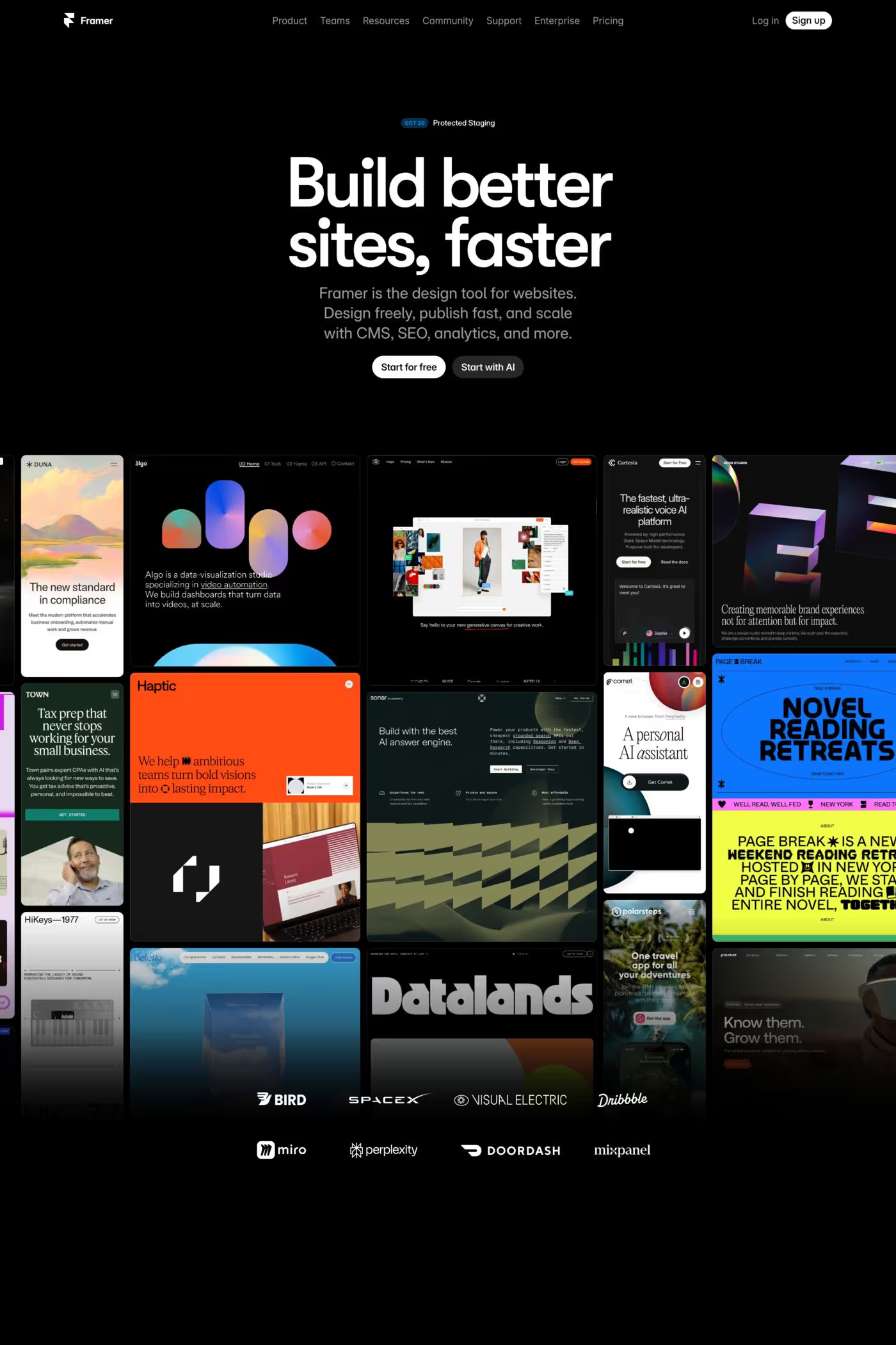
Popular platforms in this collection include Framer, Next.js, Webflow and Wordpress. Each brings different strengths for building sans-serif development experiences.
Frequently used typefaces include Inter, Geist, Neue Montreal and IBM Plex®. Typography plays a key role in defining the sans-serif aesthetic across these development websites.