New A1 Pro: unlimited saves, priority submissions and more →

225 sans-serif landing page examples

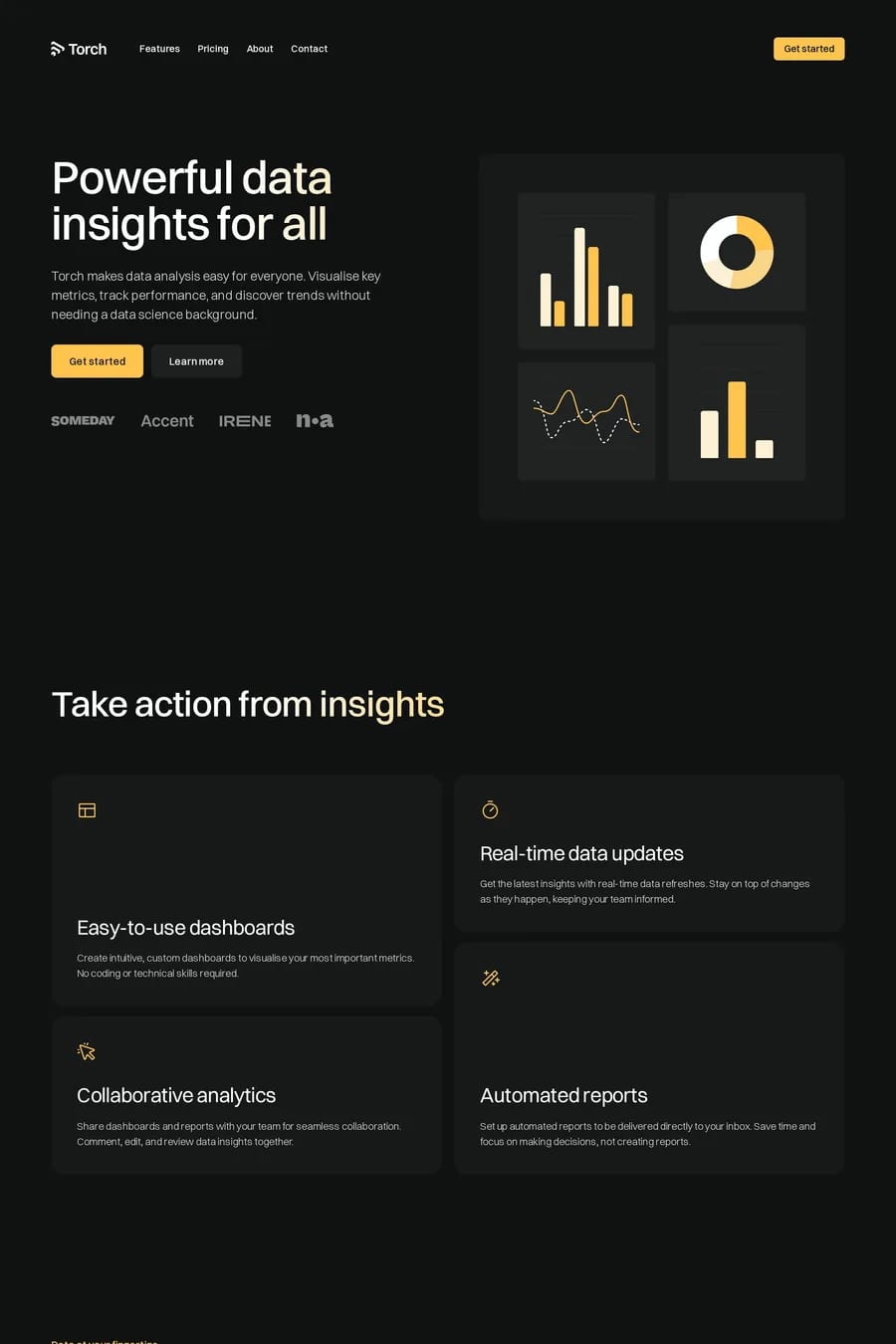
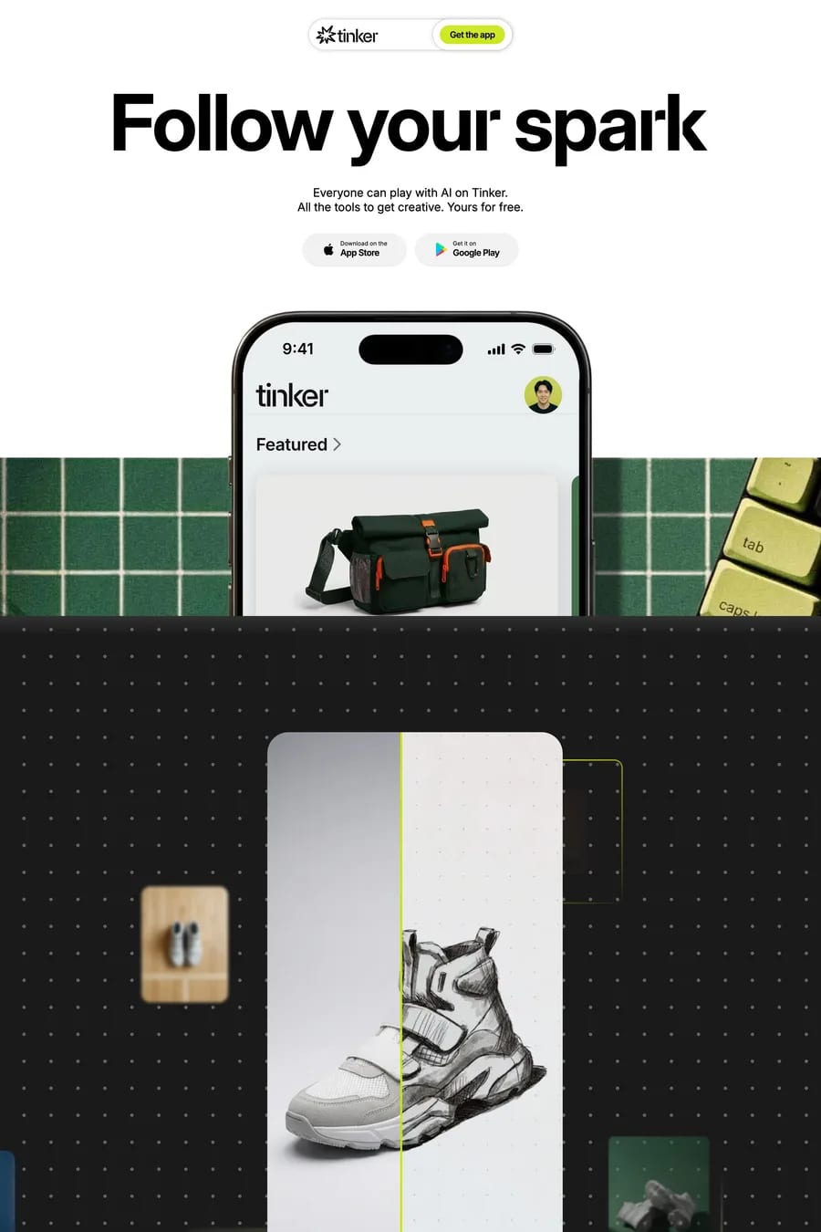
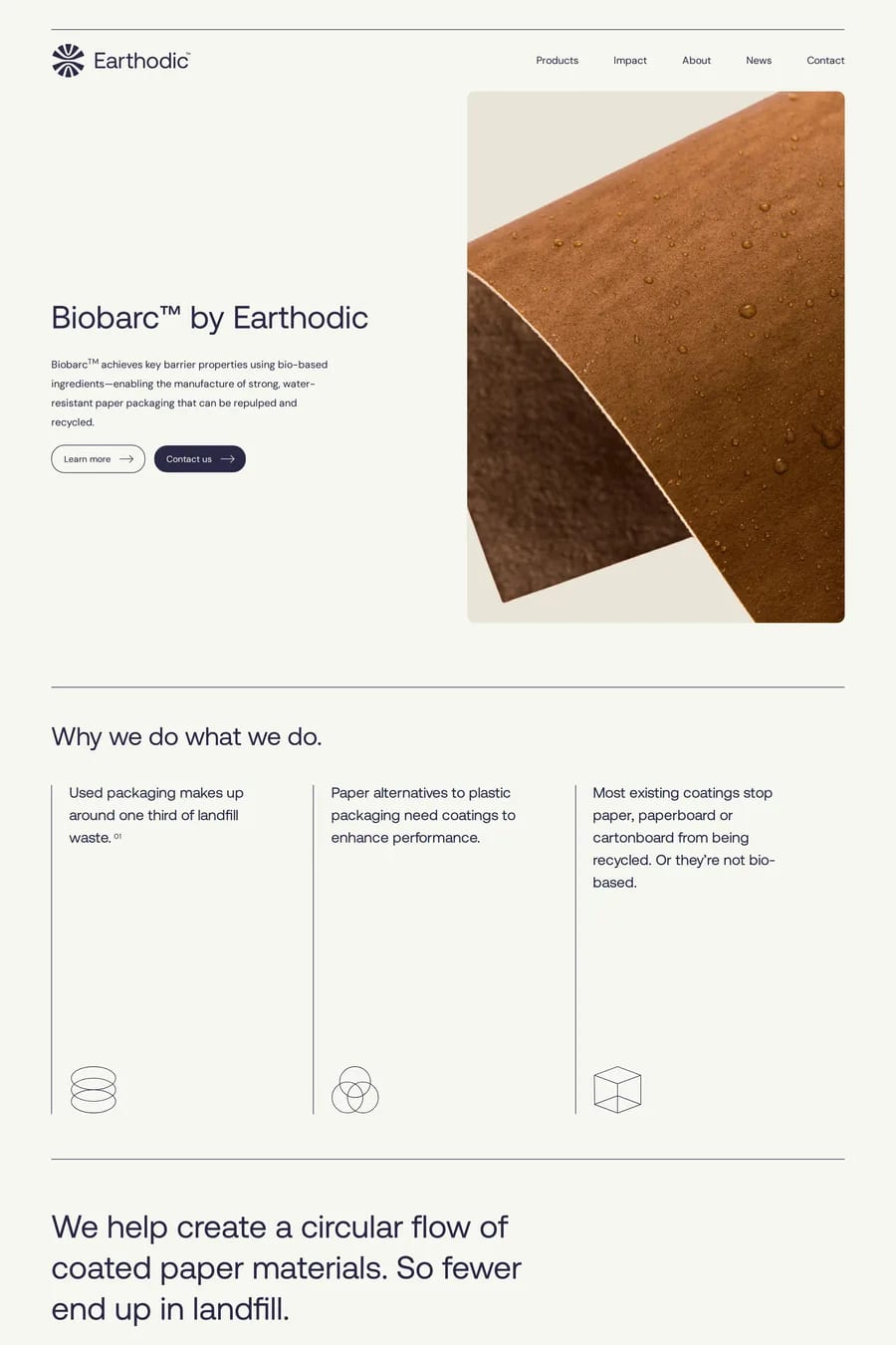
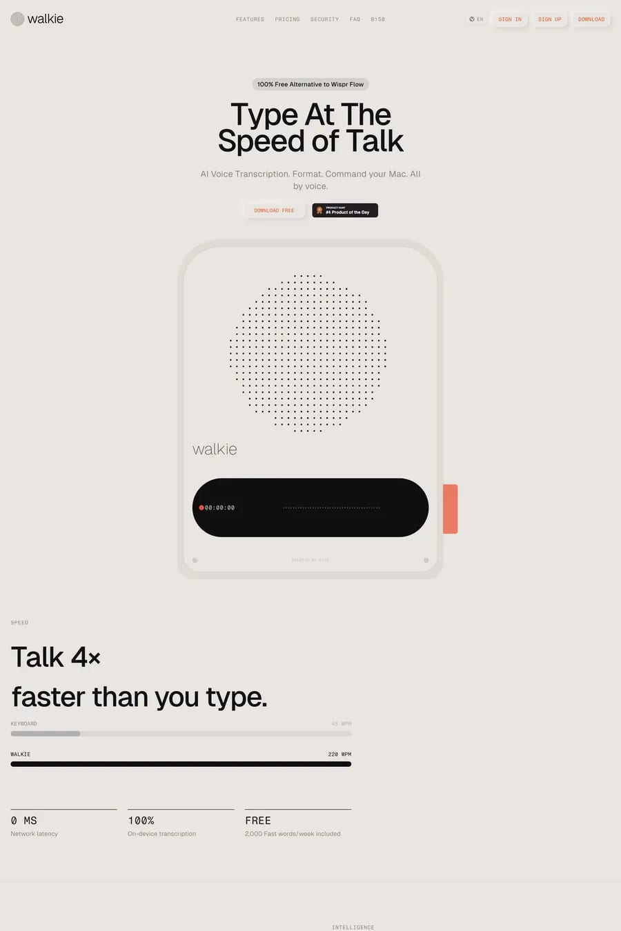
Sans-serif typography dominates modern landing pages for good reason: it's highly legible at any size and conveys a contemporary, approachable feel. From geometric typefaces like Inter to humanist fonts like Söhne, the range of sans-serif options lets brands fine-tune their tone. These landing pages showcase the versatility of sans-serif type across SaaS, e-commerce, and creative industry sites. Browse all sans-serif fonts or font pairings to find the right combination.

Get the best sans-serif landing websites each week

Curated inspiration sent every Tuesday

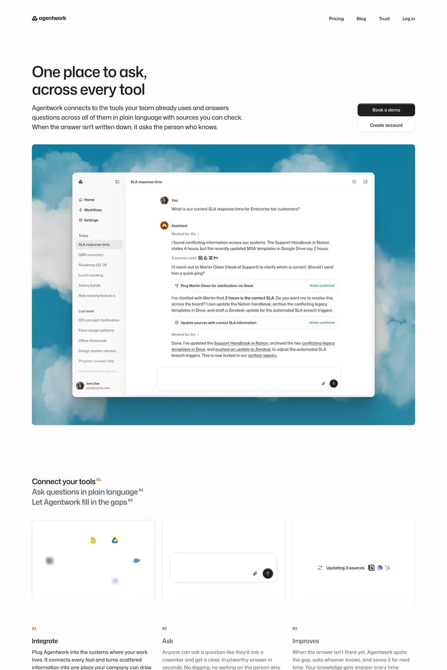
Agentwork
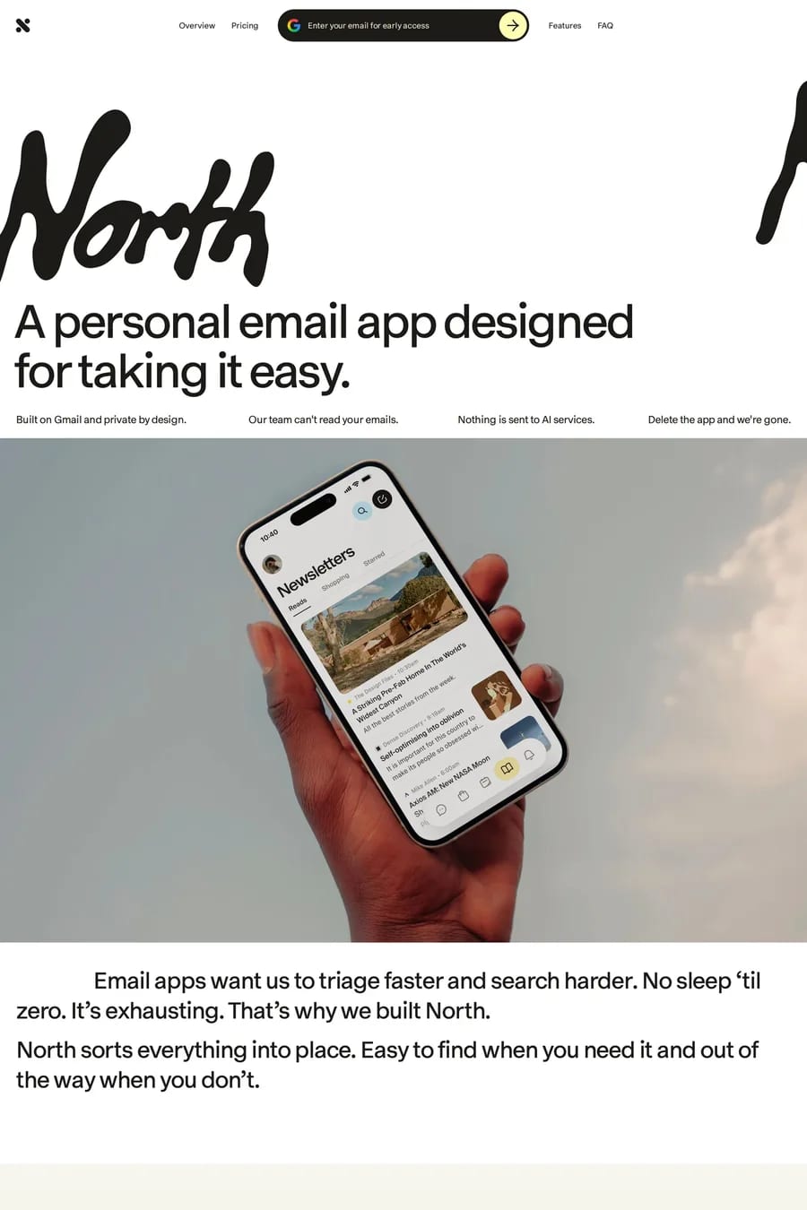
North
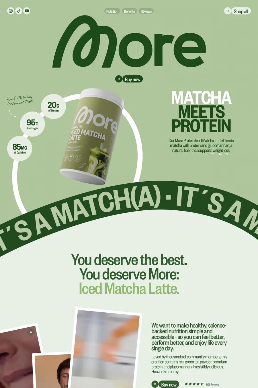
More Nutrition

Sans-serif landing FAQs

Sans-serif fonts offer excellent screen readability, especially at smaller sizes. They also carry fewer historical associations than serifs, making them versatile for brands wanting to appear modern, friendly, and accessible.

Consider your brand personality: geometric sans-serifs feel precise and modern, humanist fonts are warm and approachable, while grotesque fonts are neutral and professional. Test your choices at various sizes and weights.

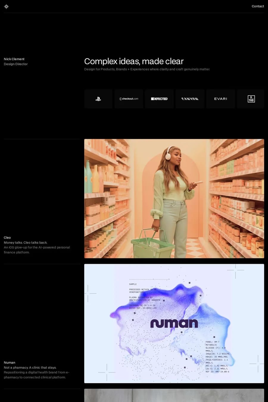
Notable examples include Agentwork, North, More Nutrition, Nick Clement and Talent Solutions. These are just a few of the 225 sans-serif landing websites in this collection, each selected for strong visual design and execution.

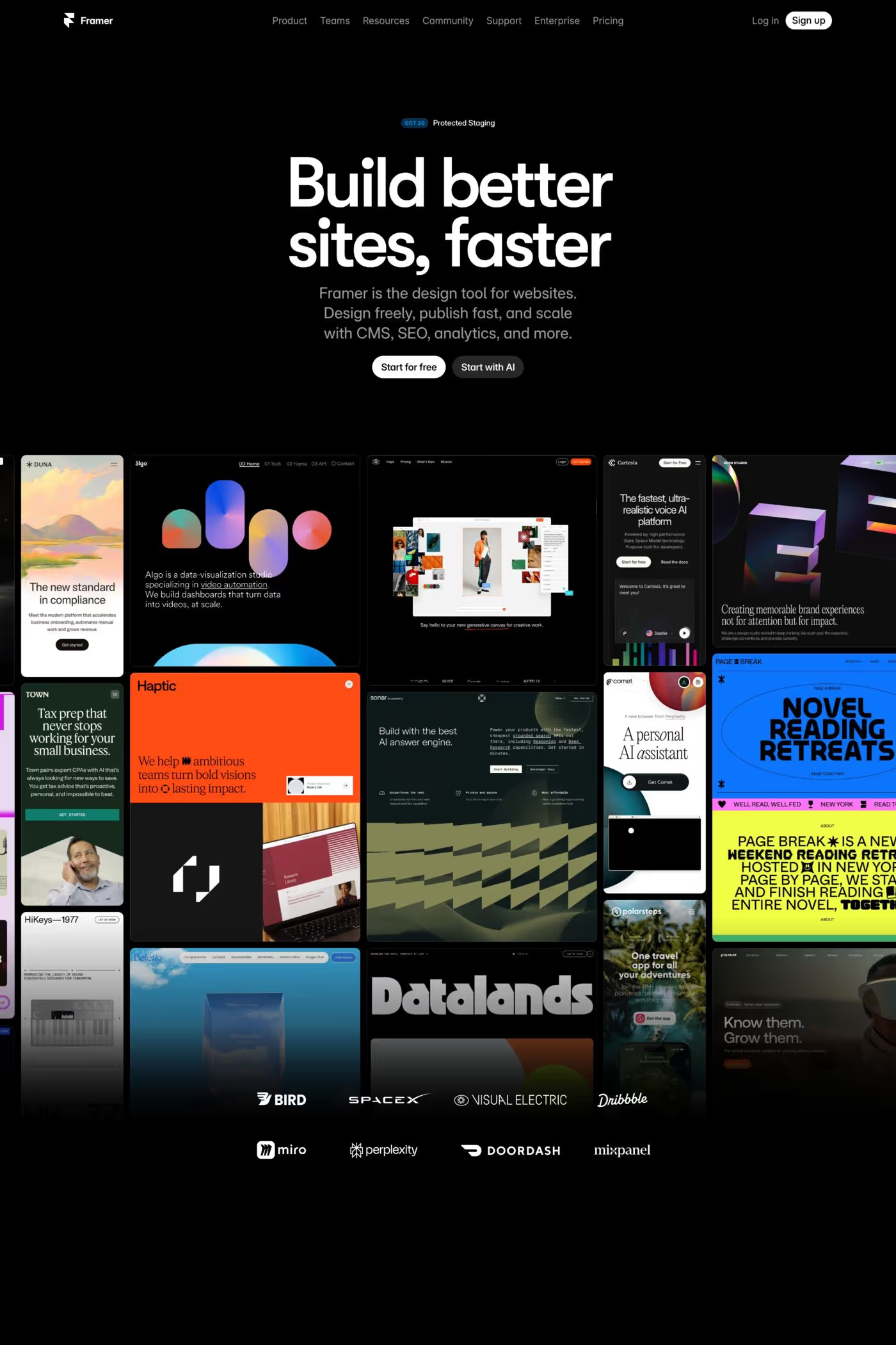
Popular platforms in this collection include Next.js, Framer, Webflow and Shopify. Each brings different strengths for building sans-serif landing experiences.

Frequently used typefaces include Inter, Geist, Geist Mono and JetBrains Mono. Typography plays a key role in defining the sans-serif aesthetic across these landing websites.

225 Best Sans-serif Landing Page Examples (2026) · A1