
225 of the best testimonial sections











Testimonial sections FAQs
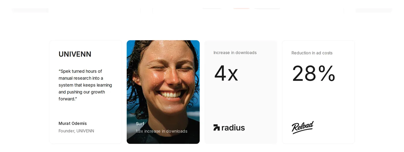
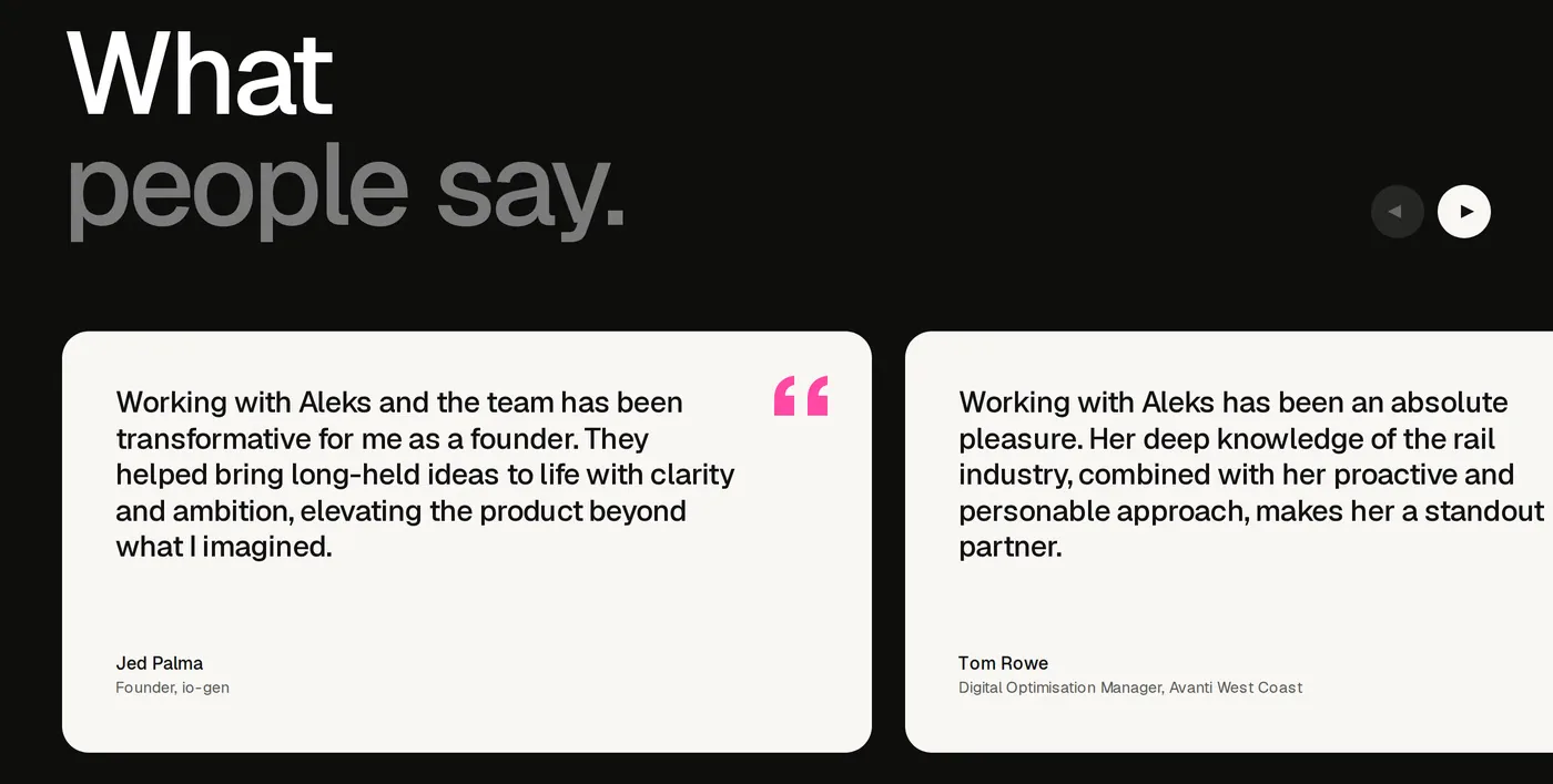
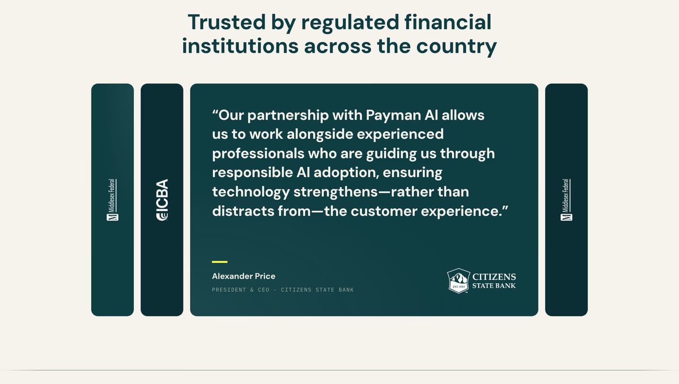
Real names, job titles, company names, and a headshot are the four signals of credibility. Any one of them missing reduces trust. A recognisable company logo adds further weight.
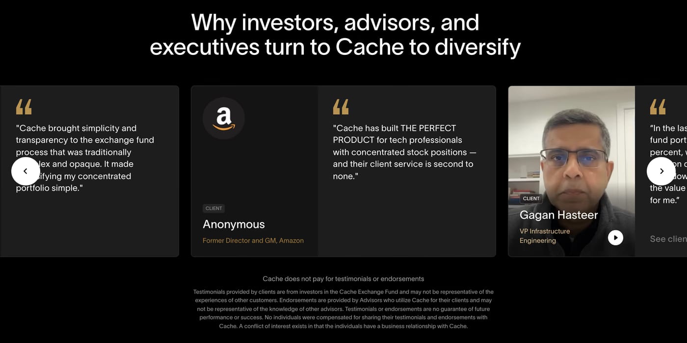
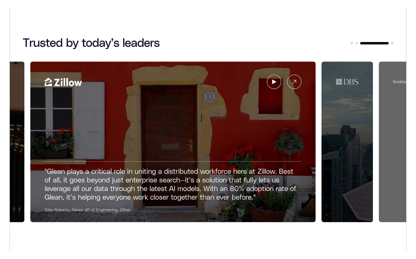
Three to five visible at once is typical for grid layouts. Carousels can hold more, but they hide content behind interaction. A large logo wall paired with a few deep quotes tends to outperform a wall of identical quote cards.
Just before the primary CTA or pricing section. Testimonials prime confidence at the moment of decision. They can also appear near the hero to establish immediate credibility for first-time visitors.