
101 of the best blog previews






Blog previews FAQs
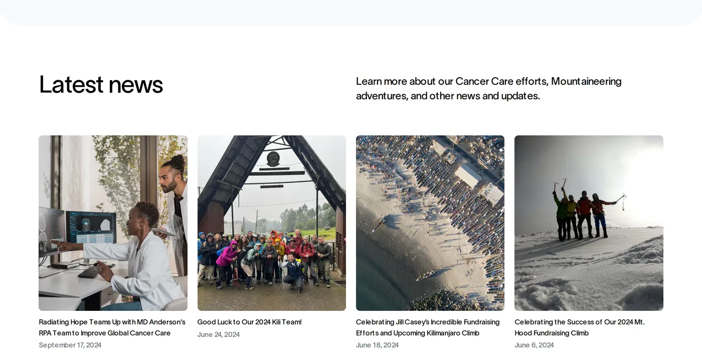
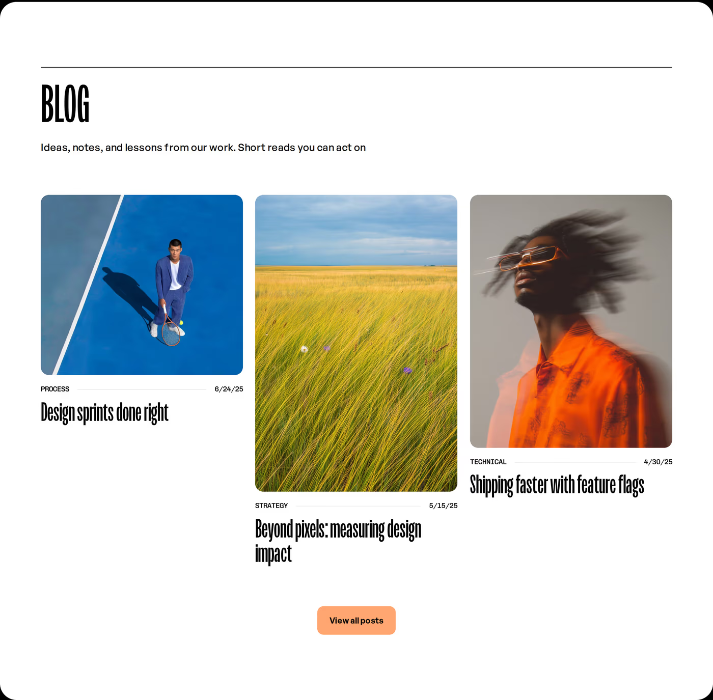
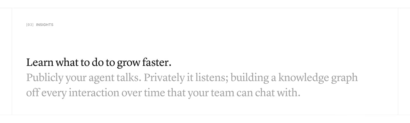
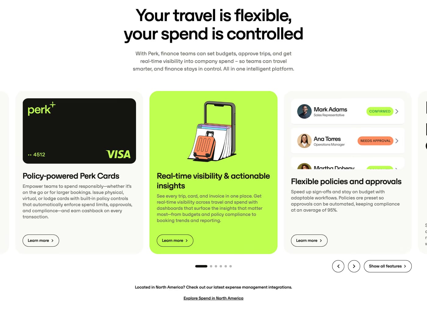
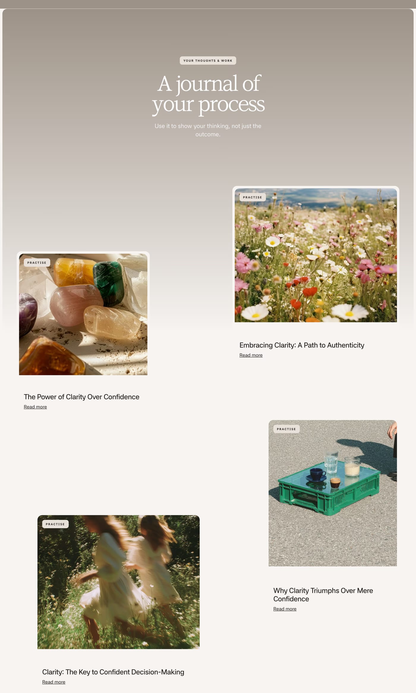
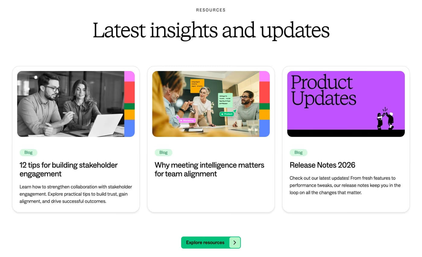
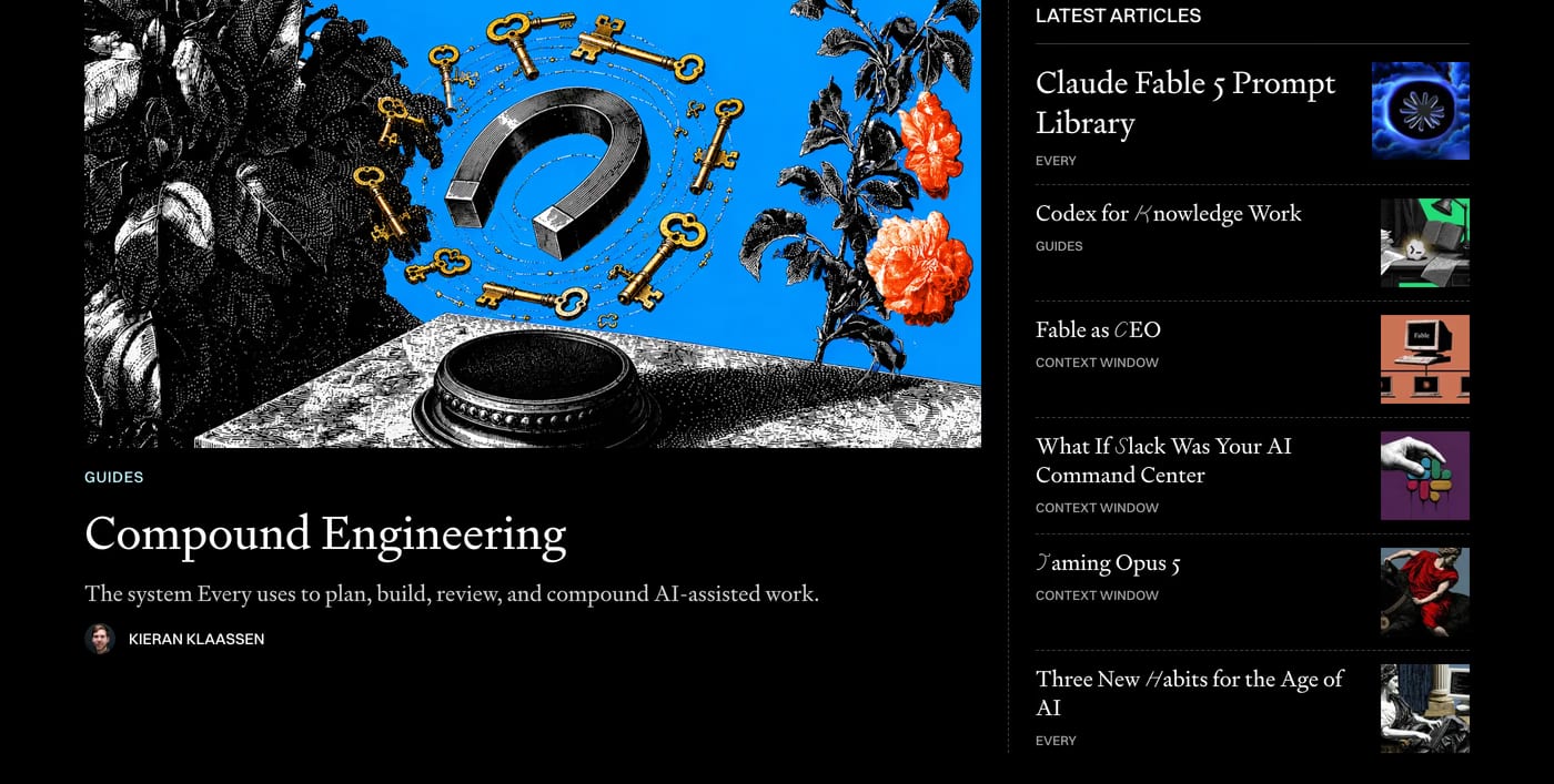
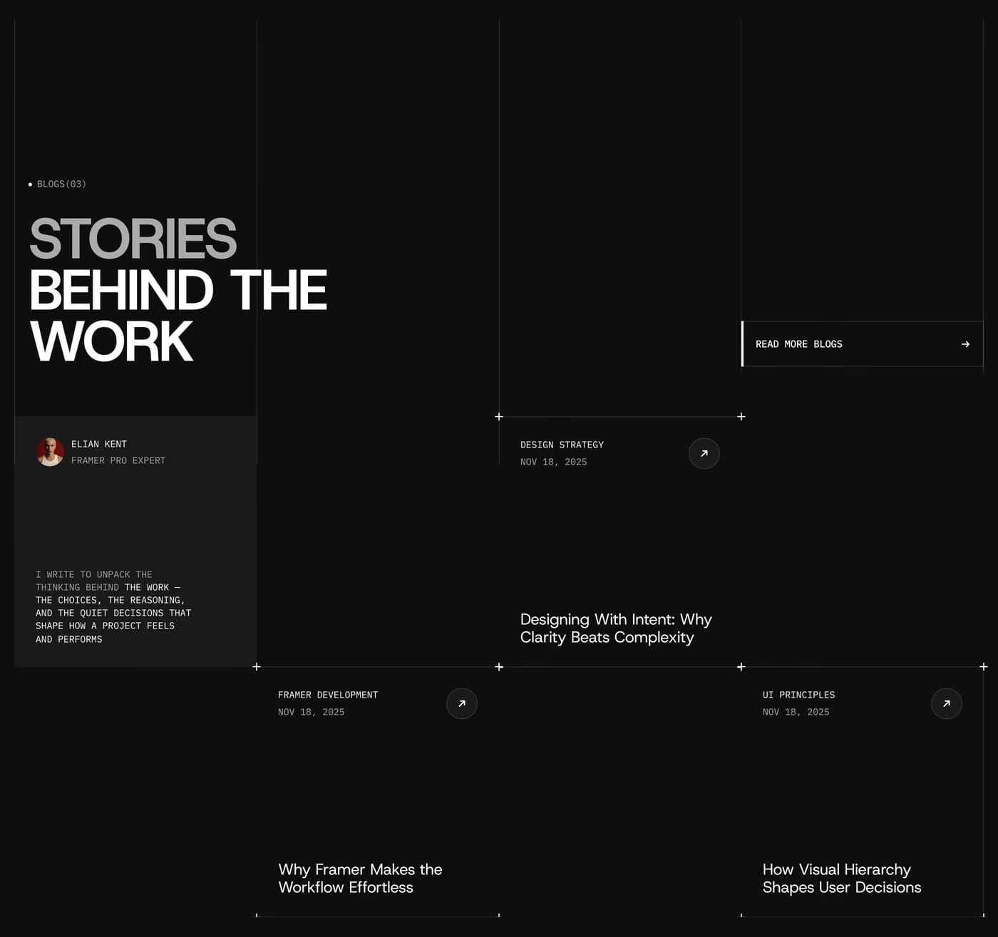
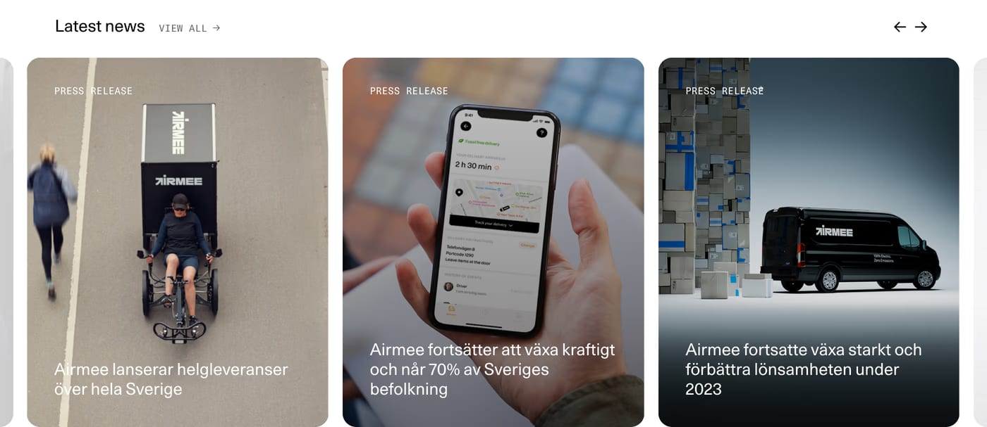
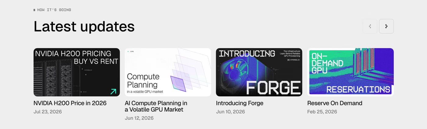
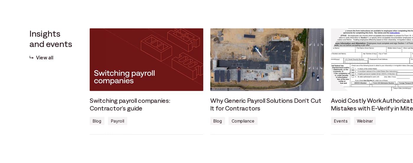
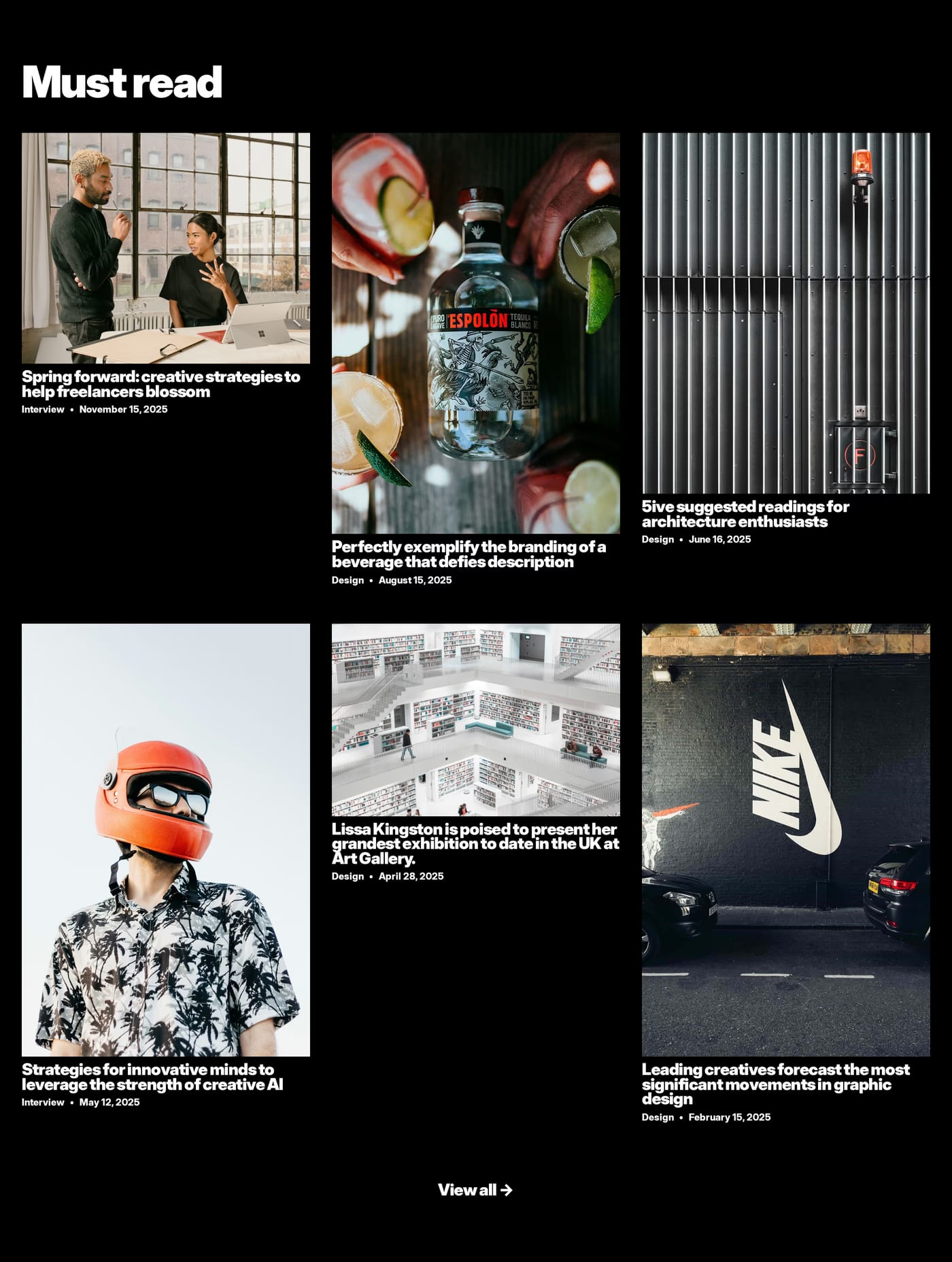
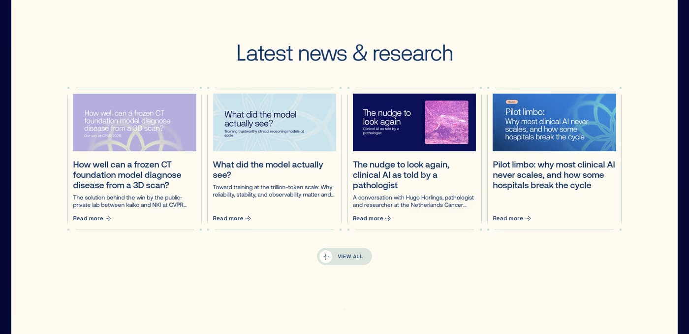
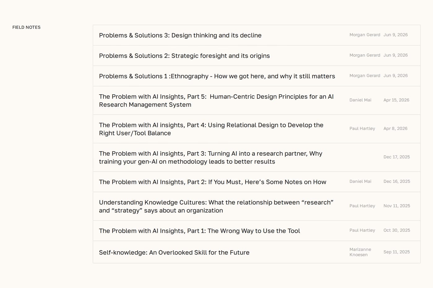
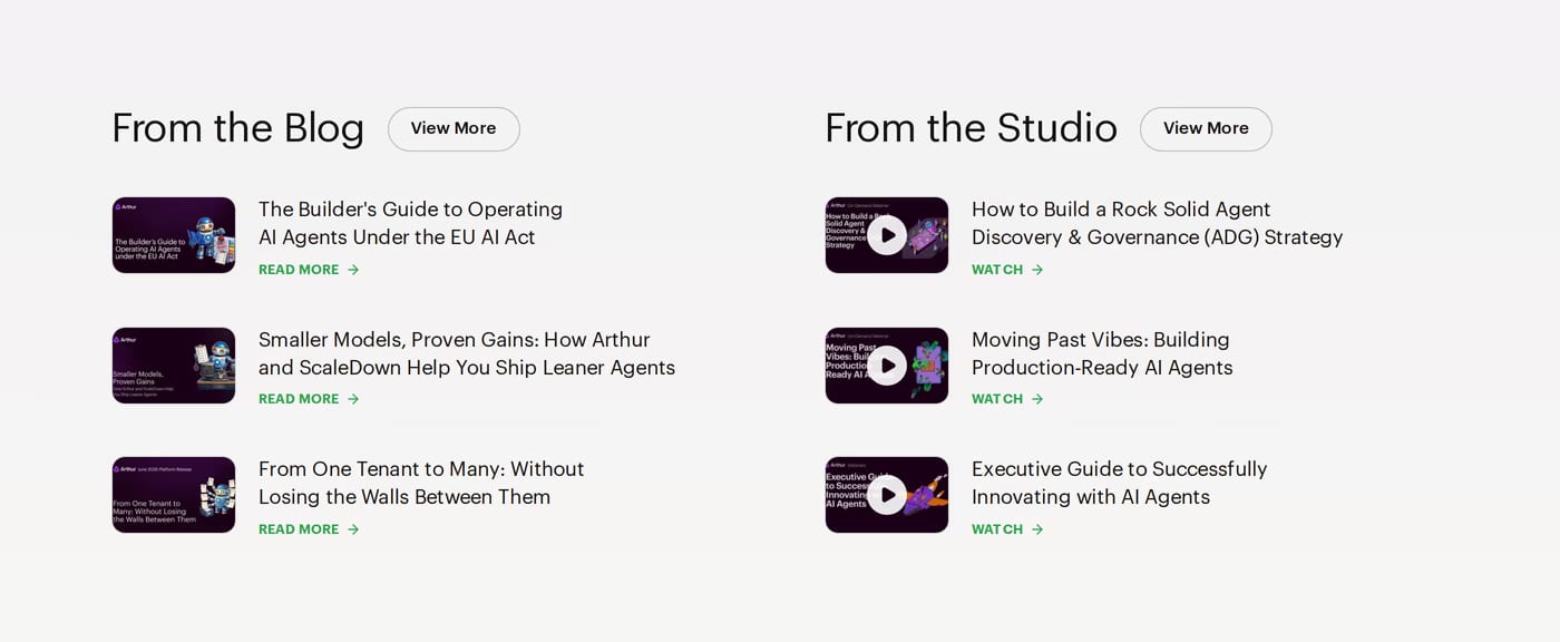
Typically 3 recent or featured posts with a title, brief excerpt, category tag, and date. The goal is to signal that the site produces fresh, valuable content — not to list every post.
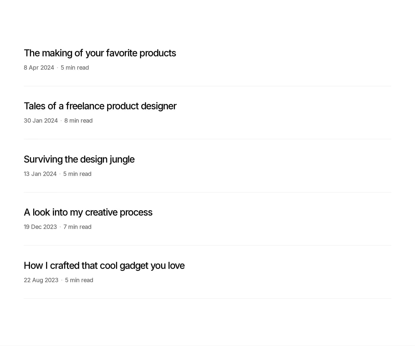
A grid (2–3 columns) works well for image-heavy posts. A list layout is more compact and works better for text-focused content. Both patterns appear in this gallery — the right choice depends on whether the featured images add signal or noise.
Indirectly. A blog preview builds authority and signals that the company is active and knowledgeable. For products with a long decision cycle (B2B, high-ticket), content credibility contributes meaningfully to trust and conversion.