
42 of the best pricing sections







Pricing sections FAQs
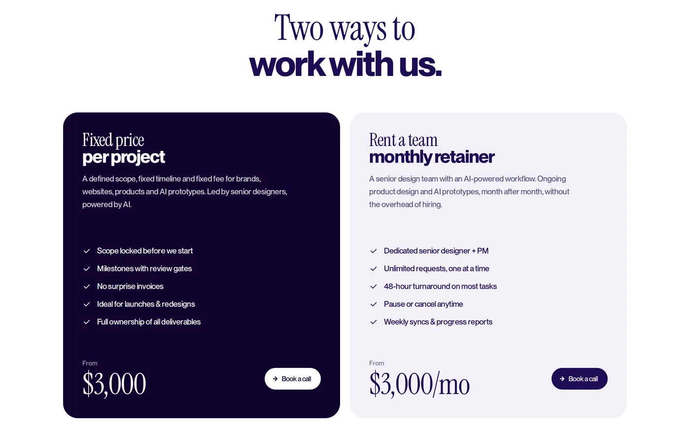
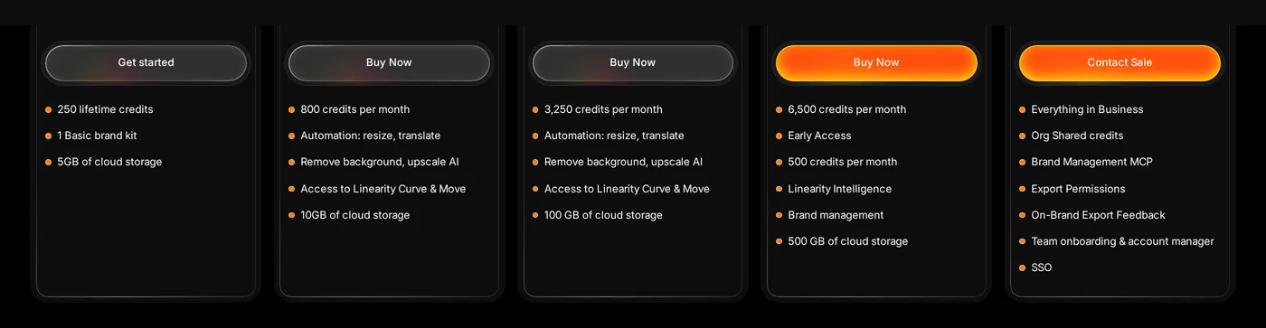
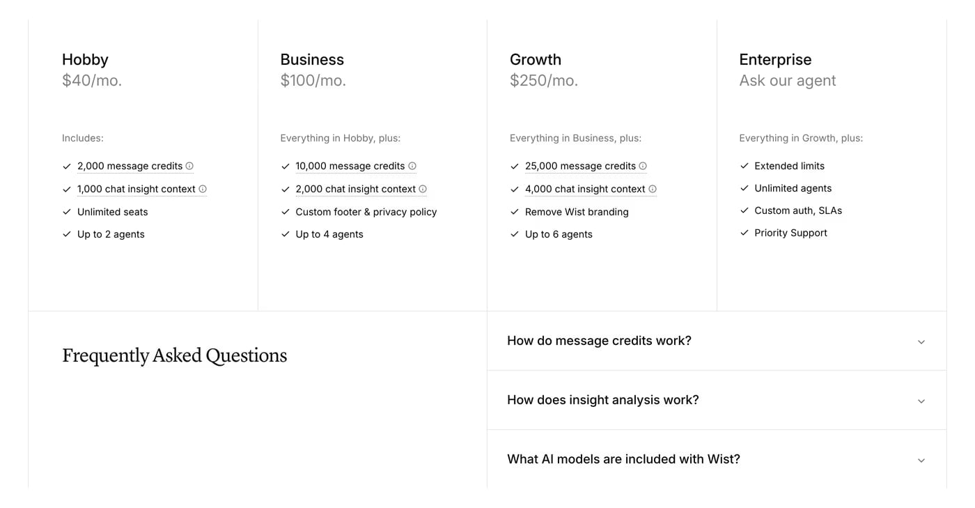
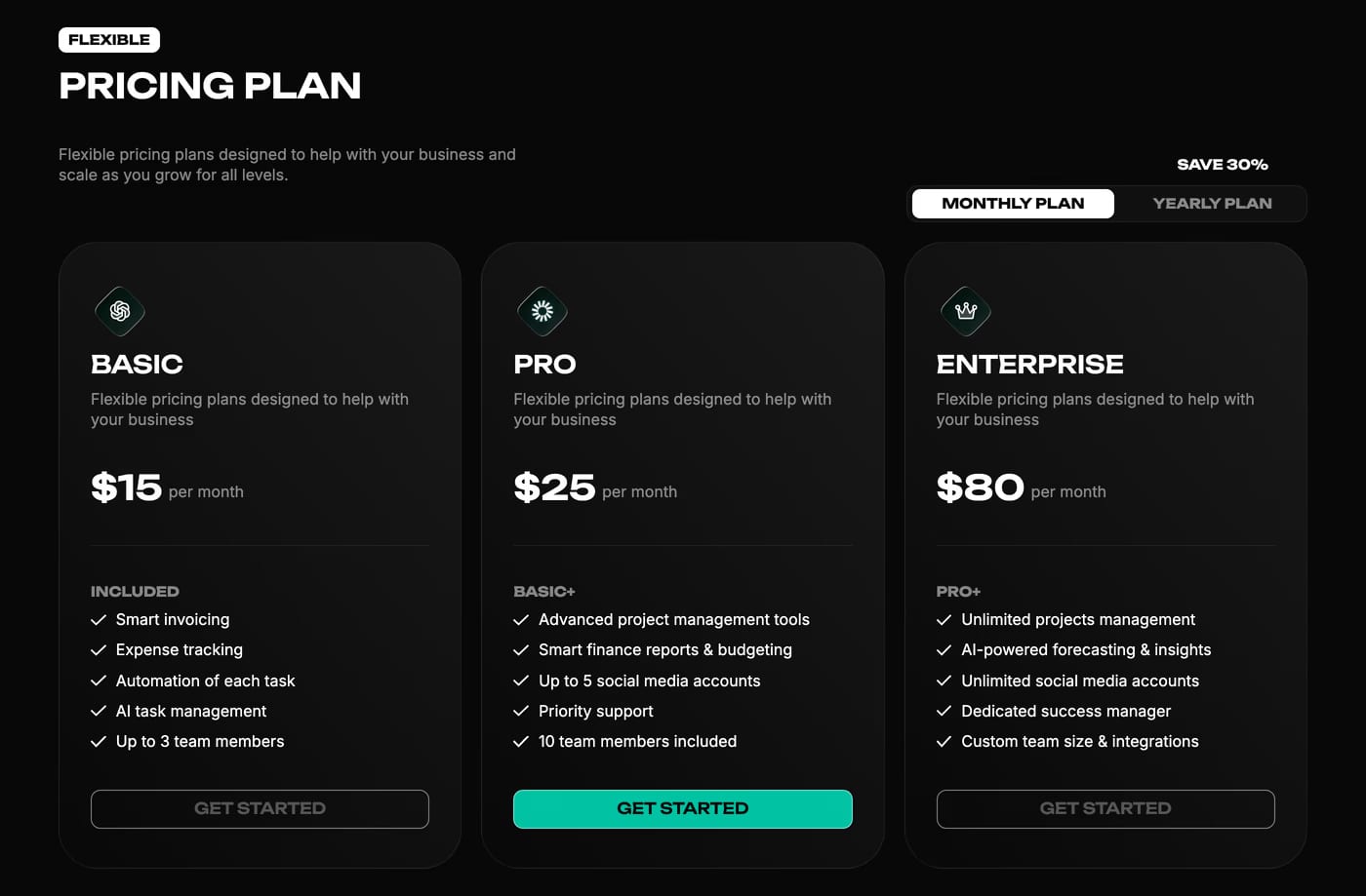
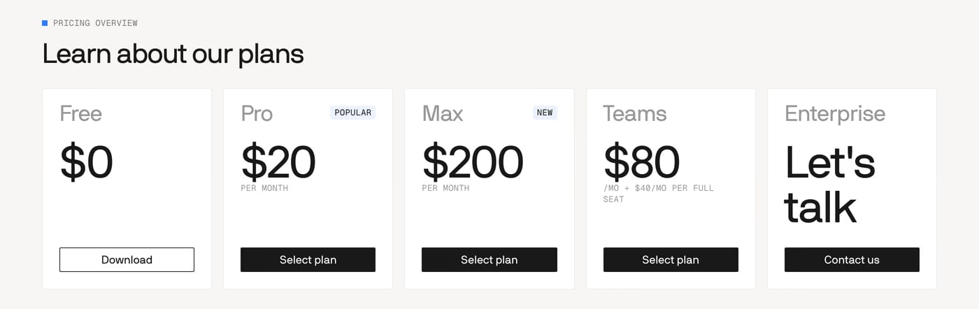
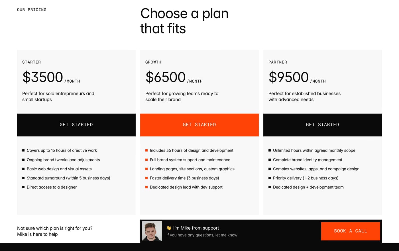
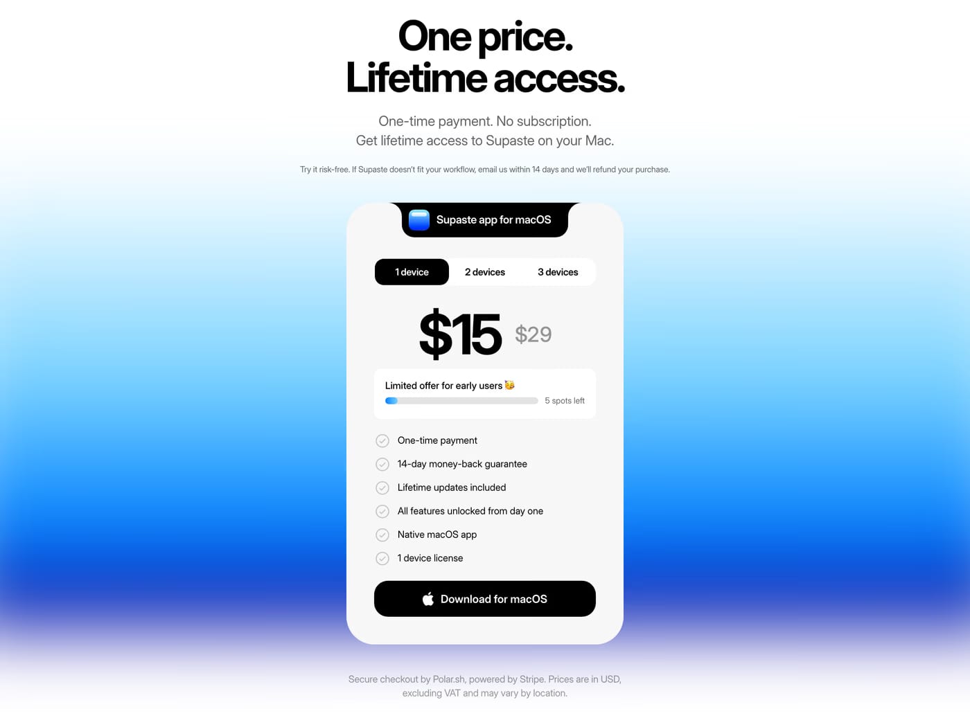
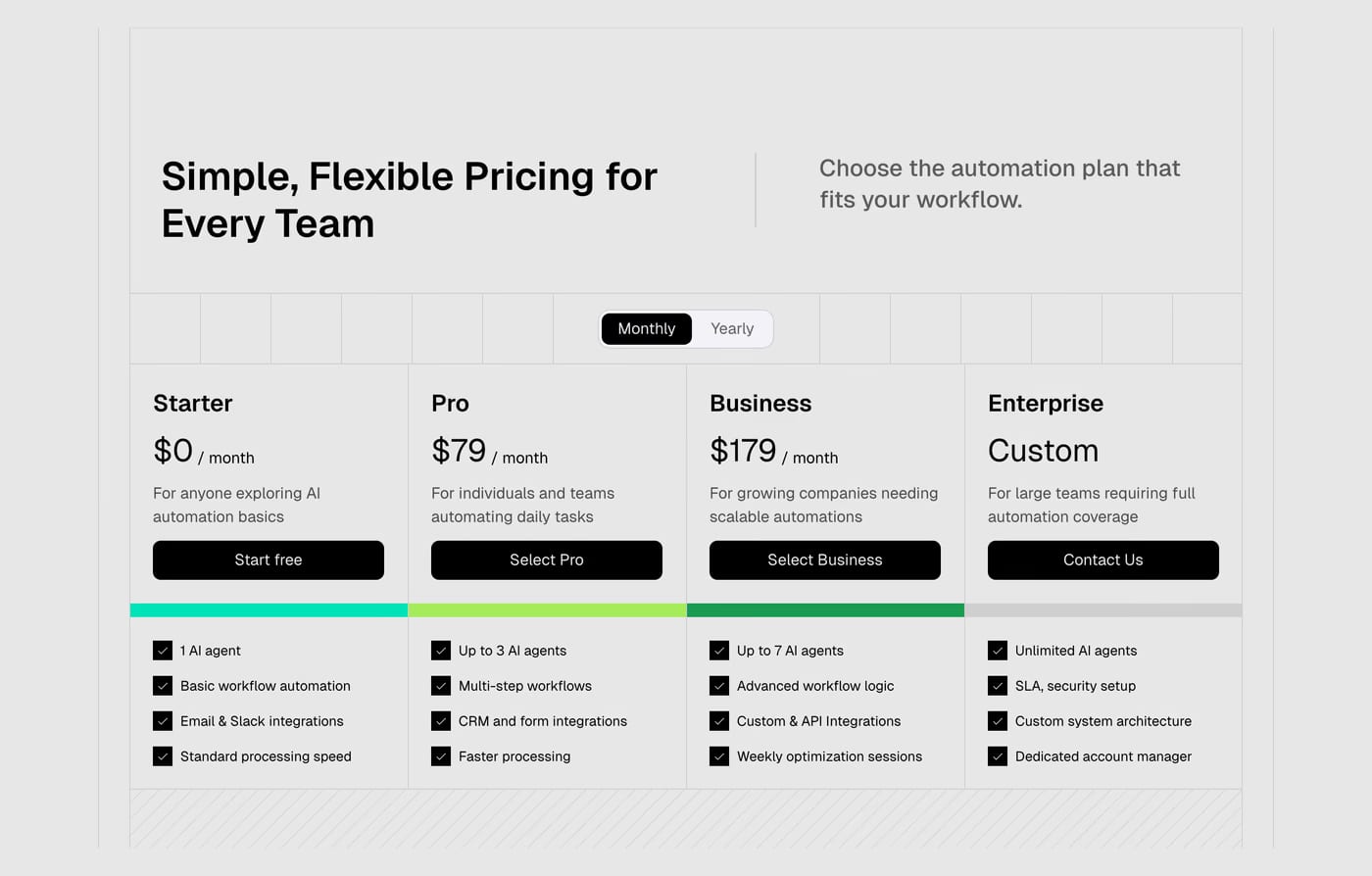
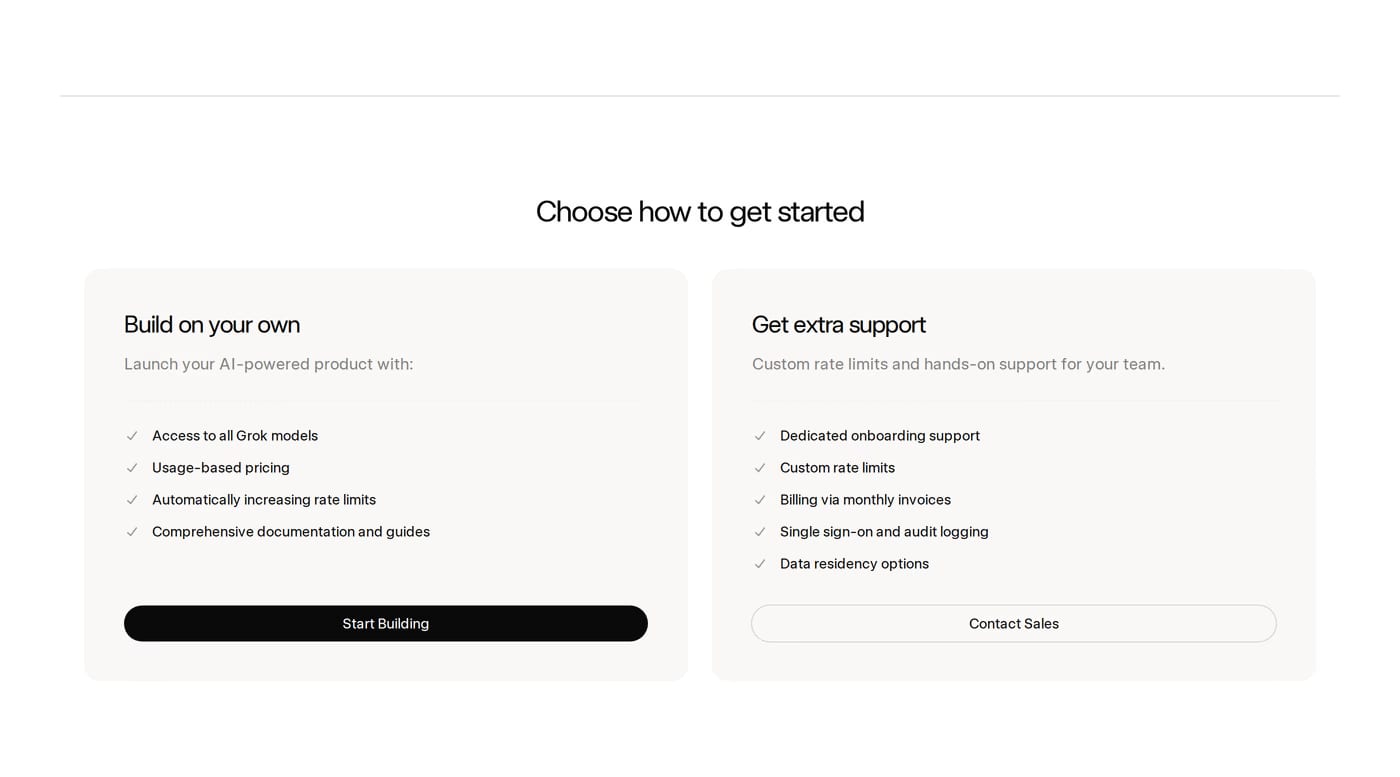
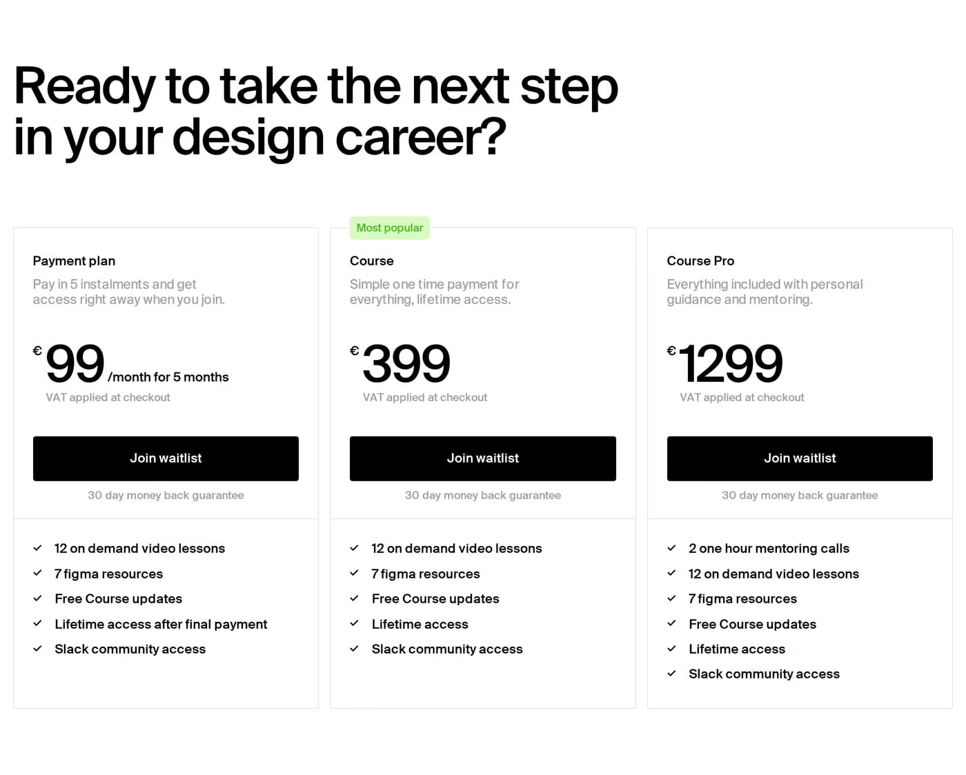
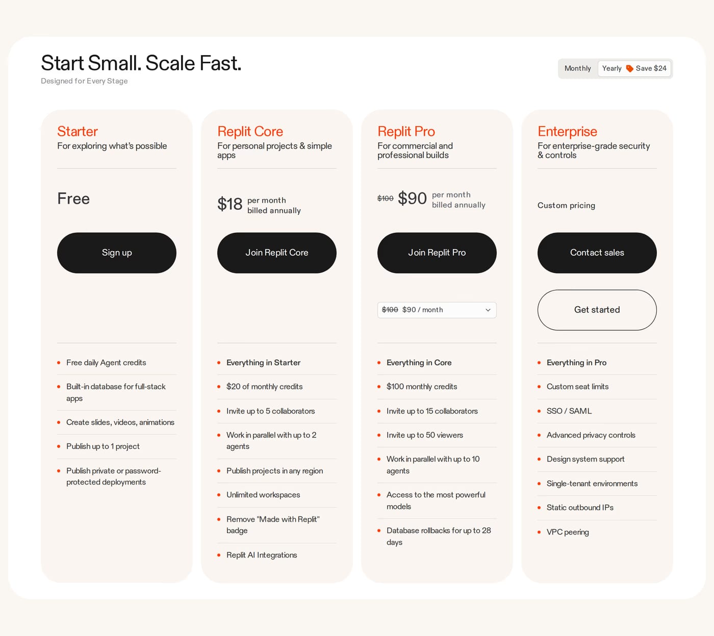
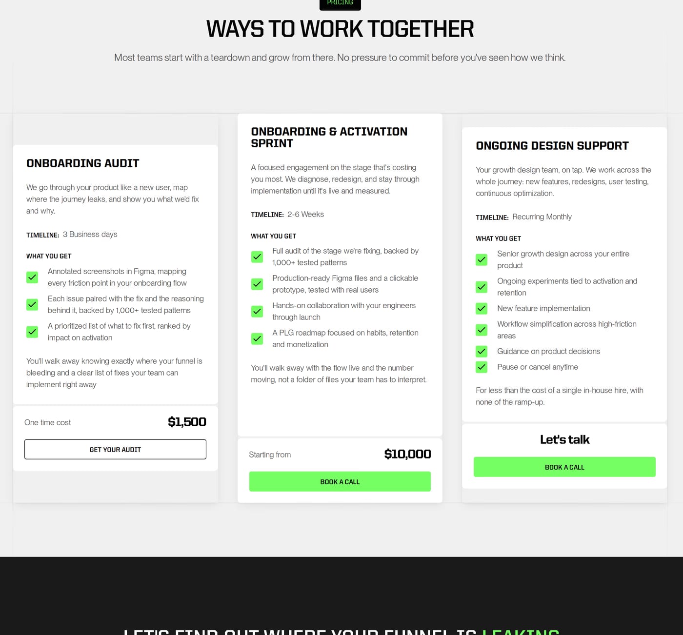
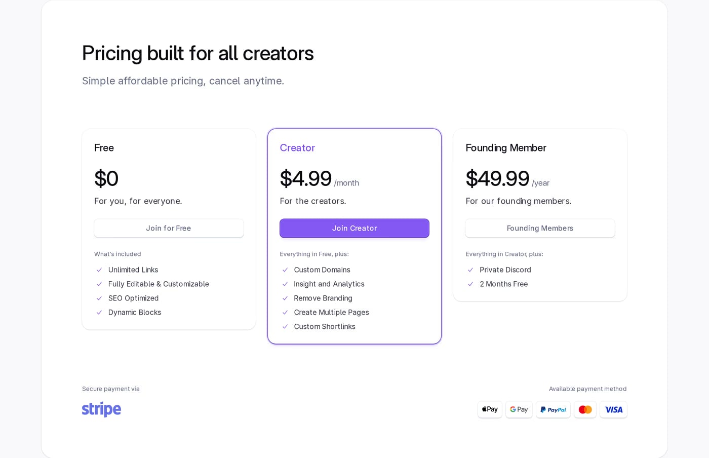
Three tiers is the most common and effective structure — a starter, a recommended mid-tier (often highlighted), and an enterprise or premium option. More than four tiers creates comparison fatigue.
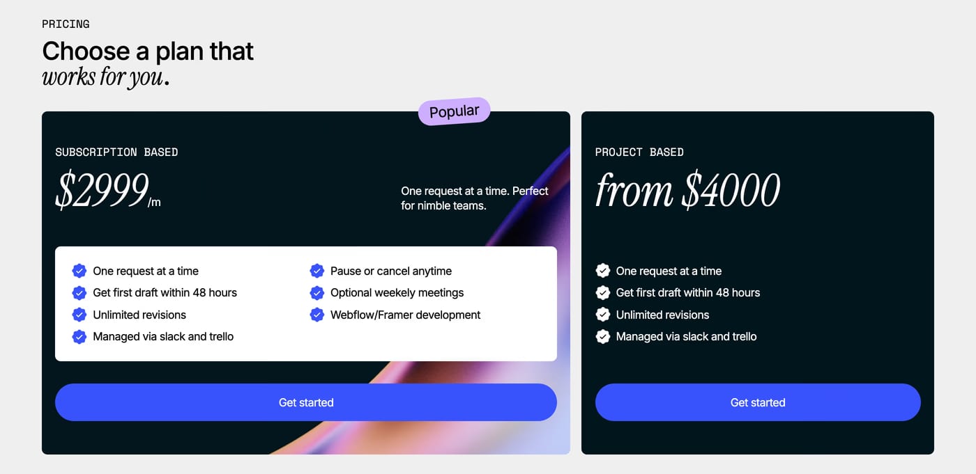
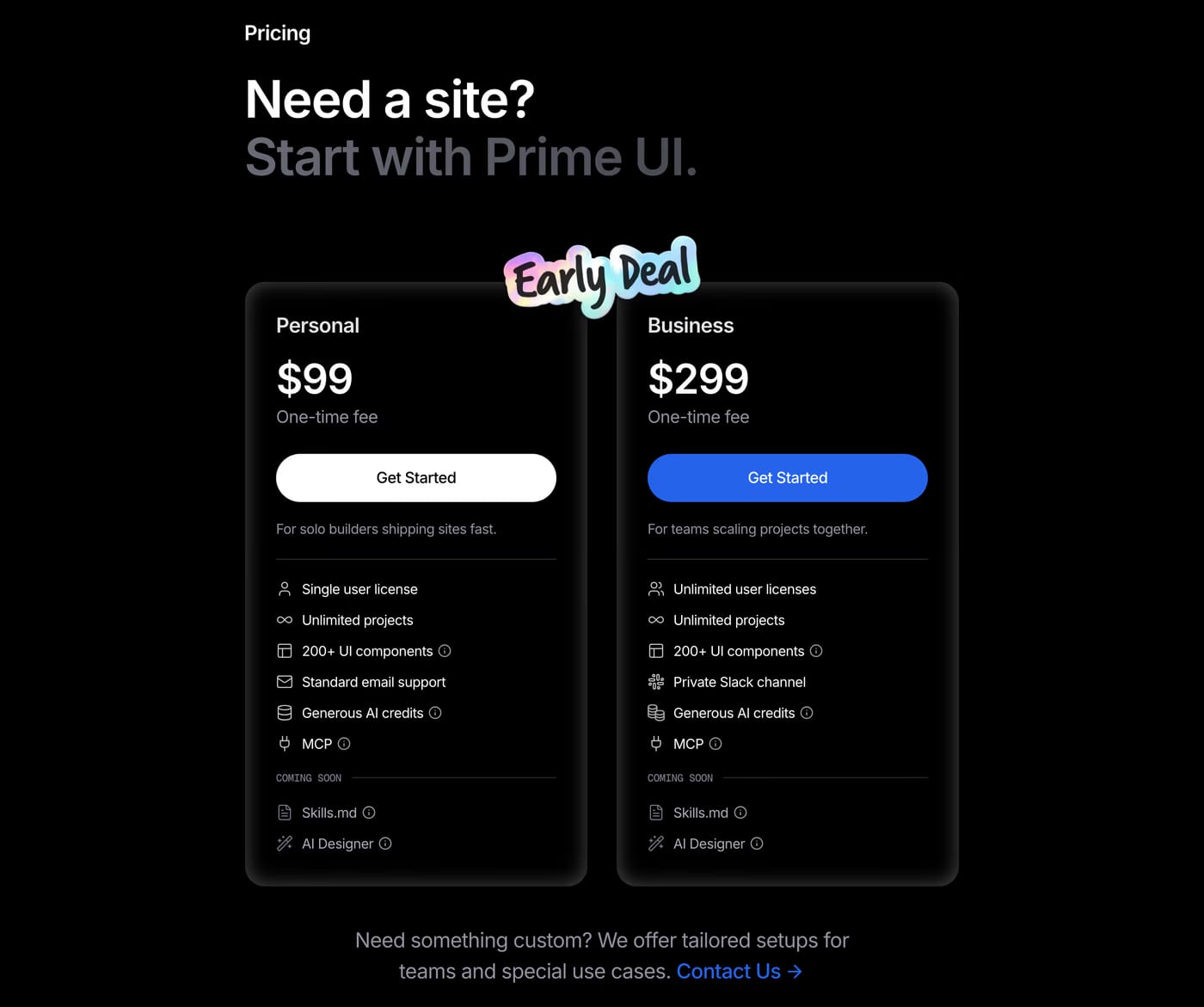
A visual distinction (border, background colour, badge), a label like "Most popular" or "Recommended", and a slightly stronger CTA. The highlight anchors the decision and nudges users toward the tier you most want them to choose.
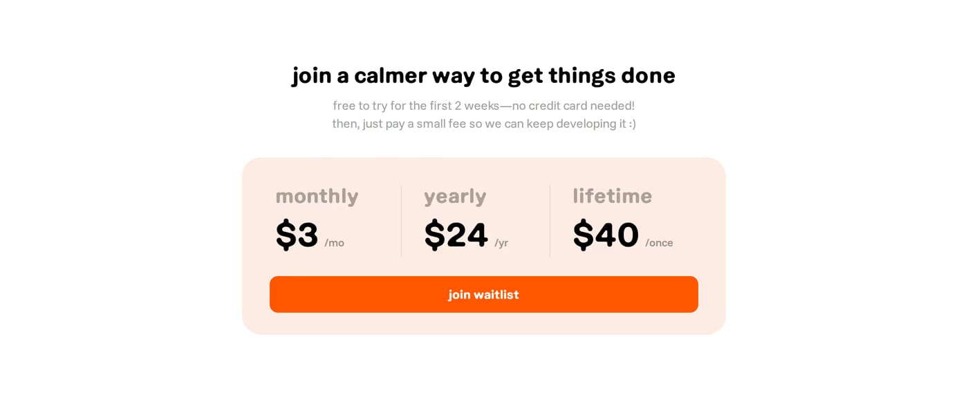
Yes, if you offer both. A toggle between billing periods is now a standard pattern and sets clear expectations. Showing the annual saving prominently ("Save 20%") encourages longer commitments.