
172 of the best call to action sections













Call to action sections FAQs
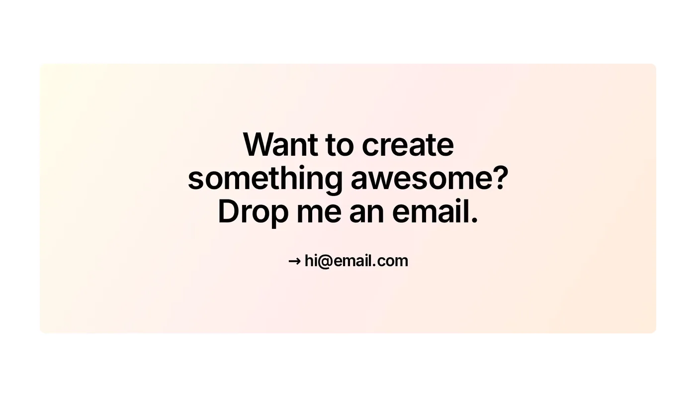
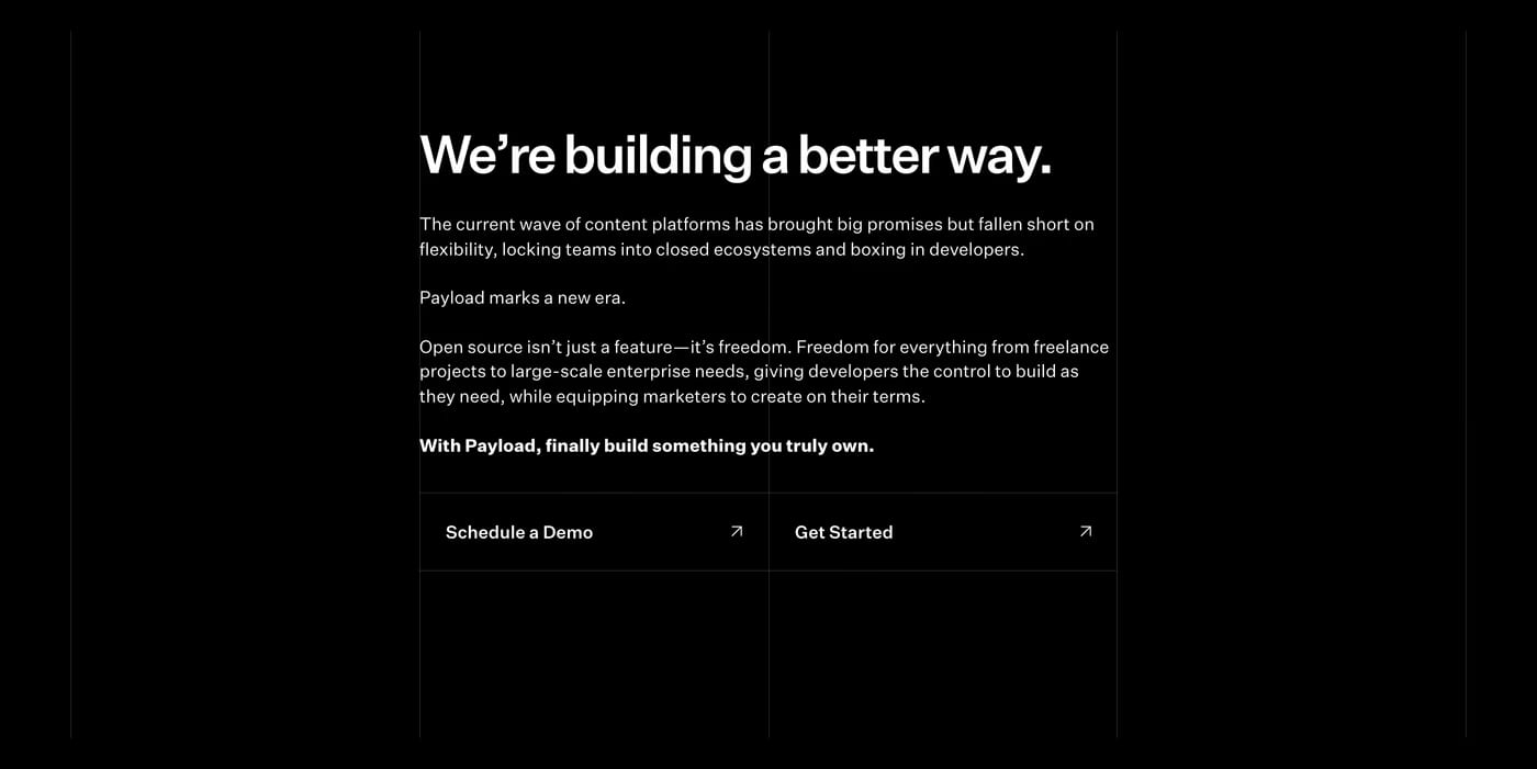
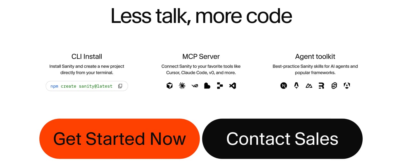
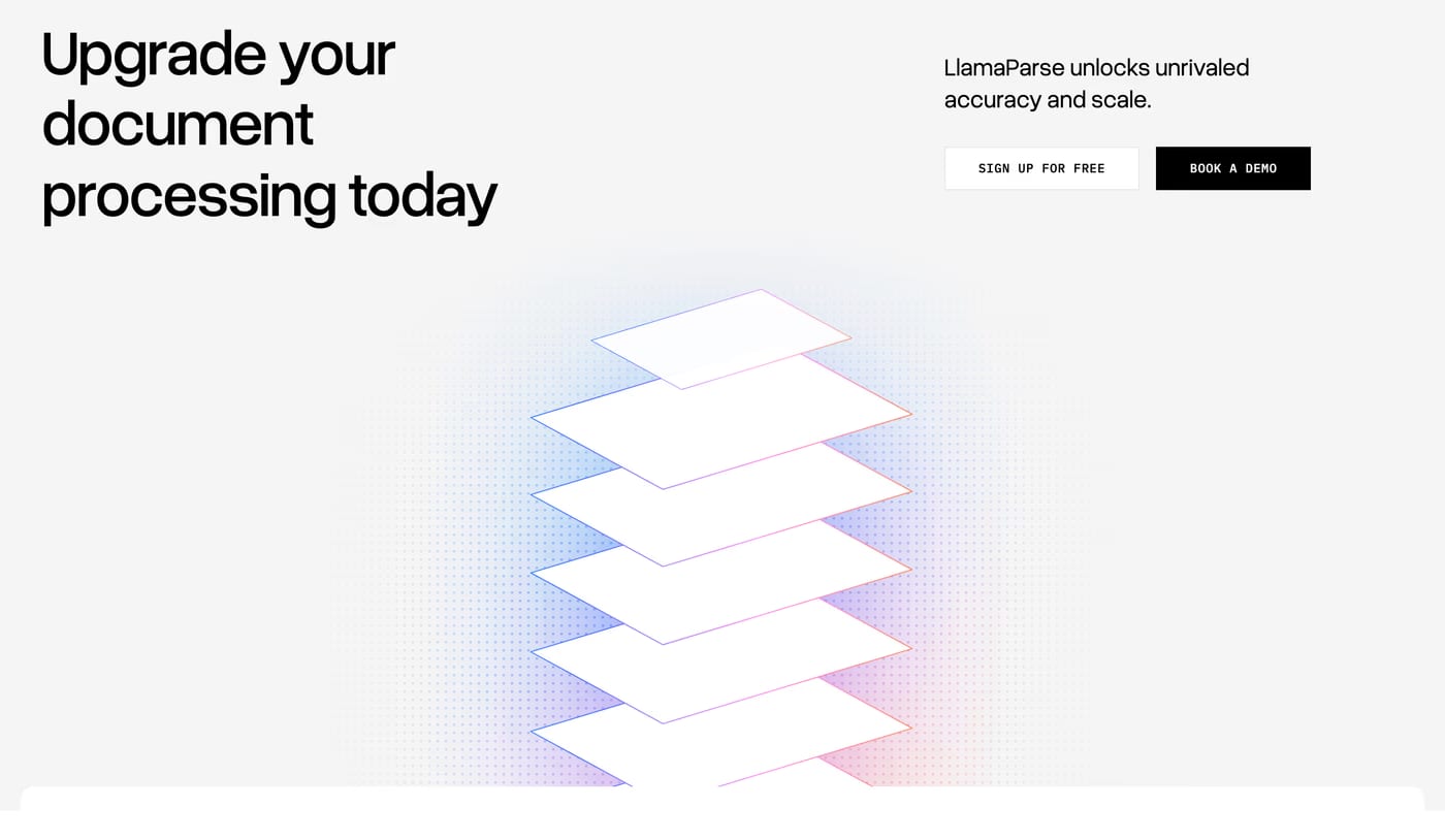
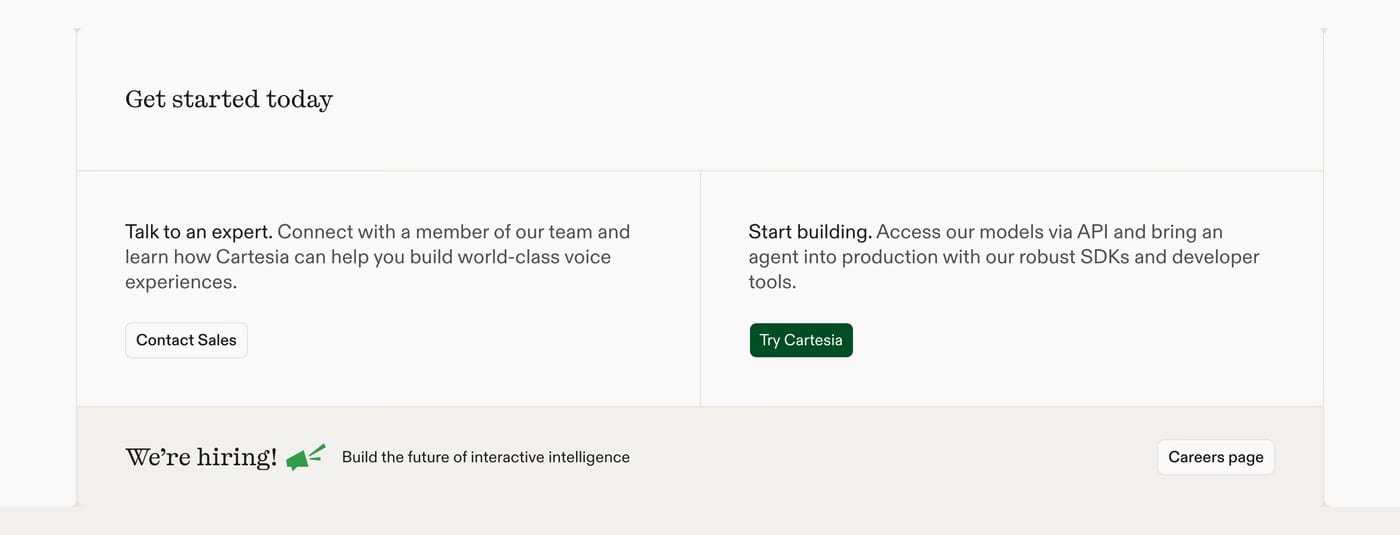
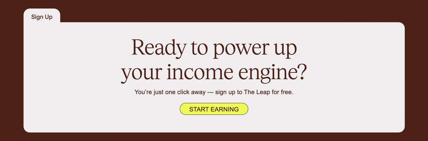
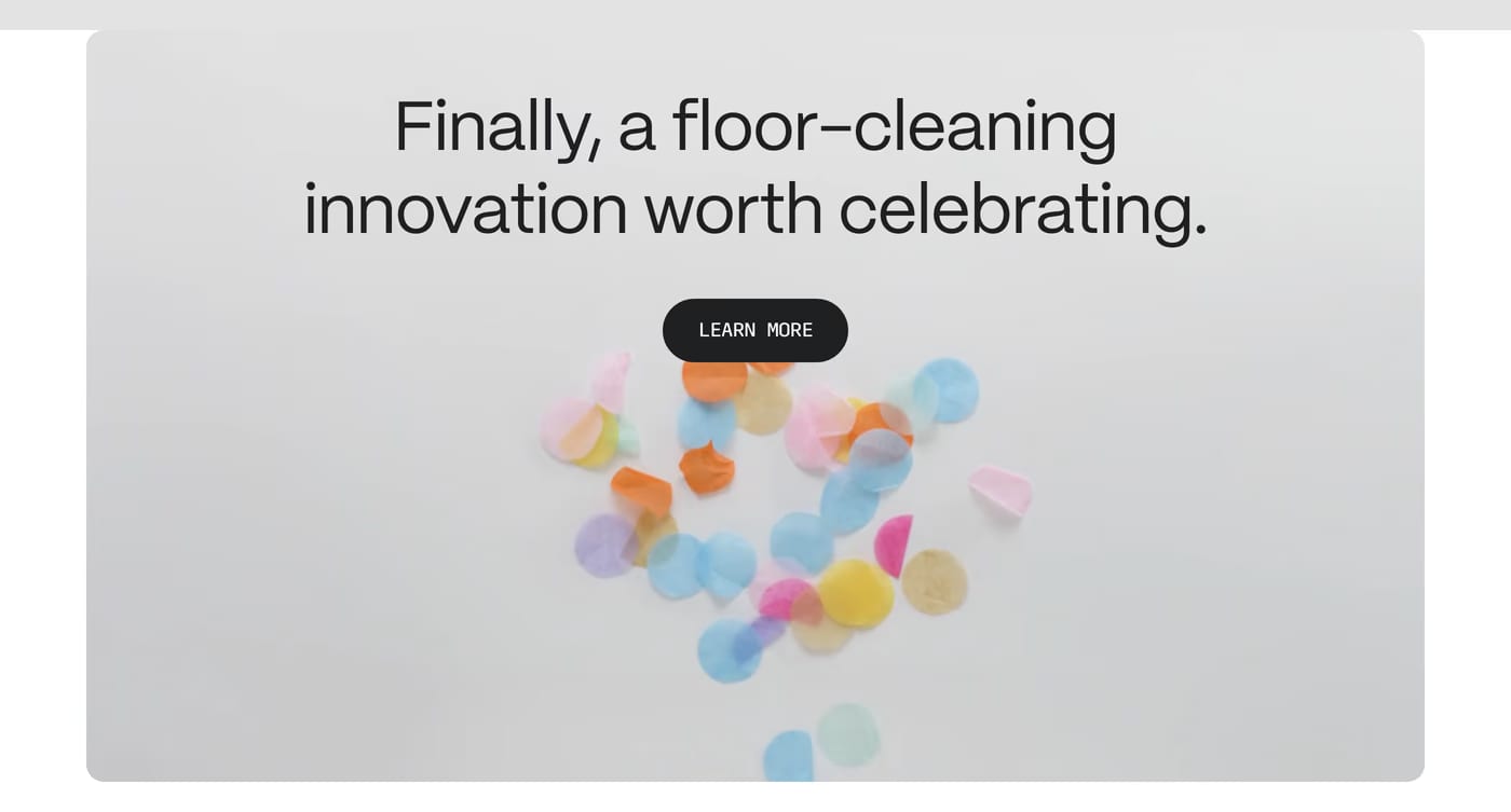
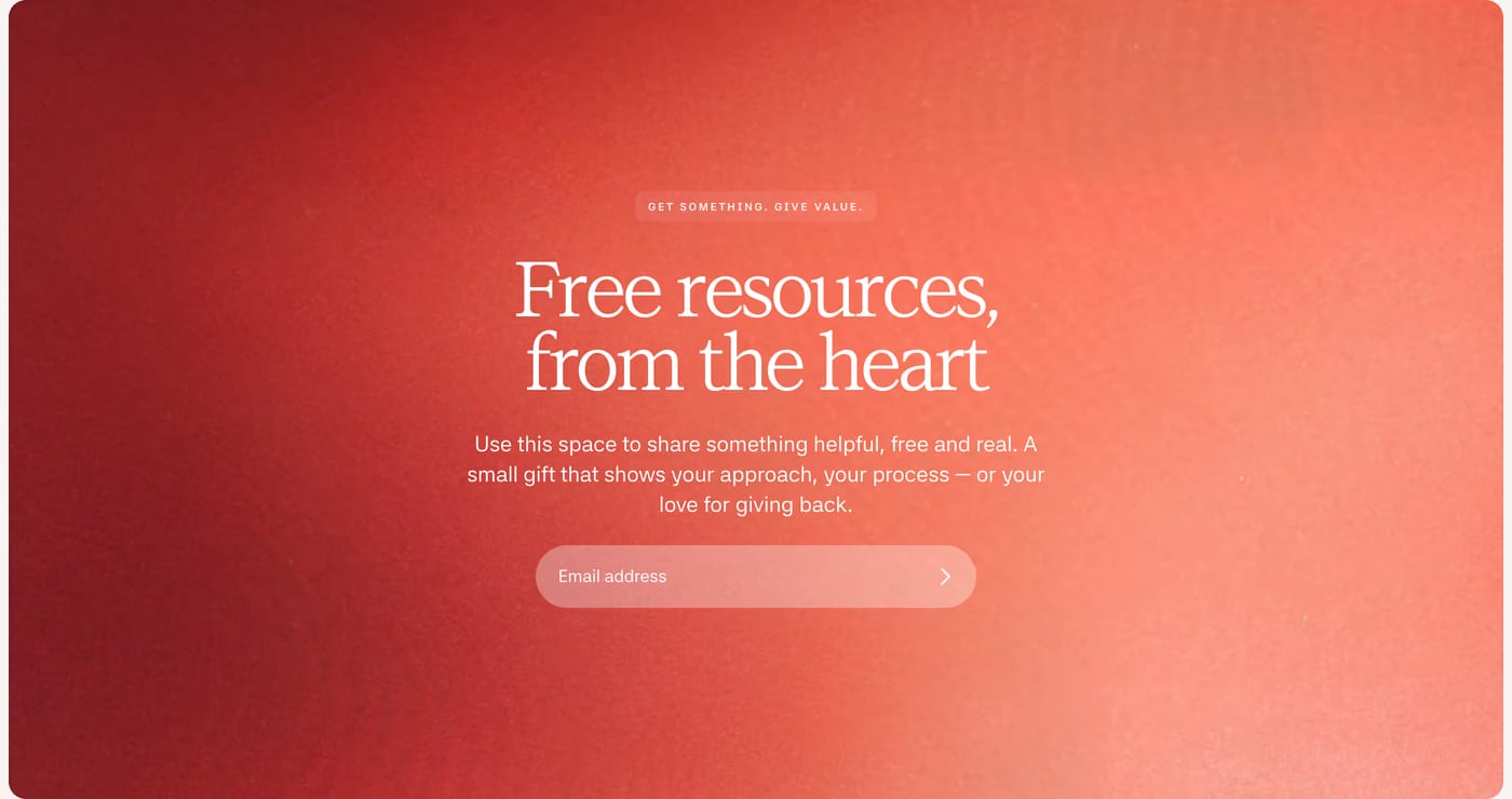
A clear headline, a single focused action, and minimal distractions. The best CTA sections remove everything that doesn't support clicking the button. Copy that emphasises benefit over feature (“Start designing faster”) outperforms generic labels.
Both. A secondary CTA in the hero, and a final full-width CTA at the page bottom, capture visitors at different stages of intent. Don't rely on a single CTA placement.
Very. The CTA button should be the highest-contrast interactive element on the page. If users have to hunt for it, conversion drops. A single high-contrast button beats two or three competing options every time.