
22 of the best events sections







Events sections FAQs
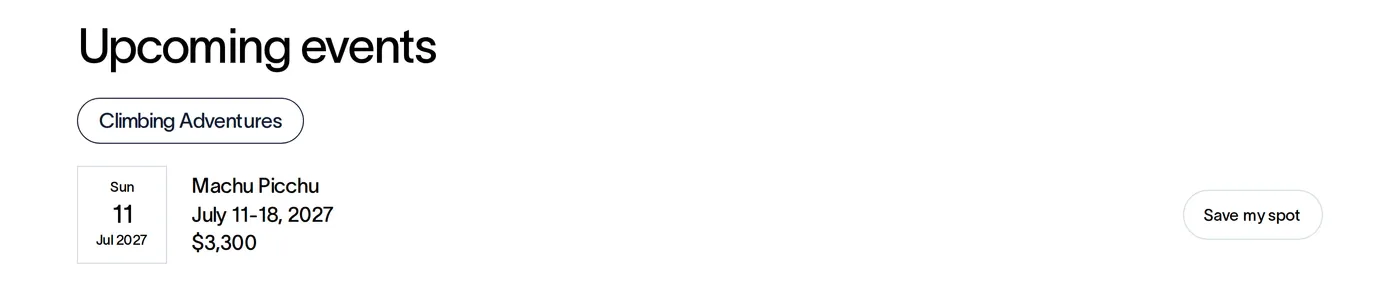
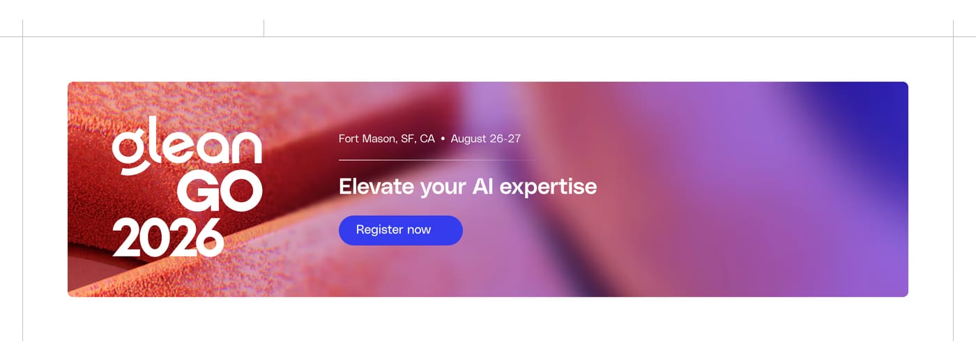
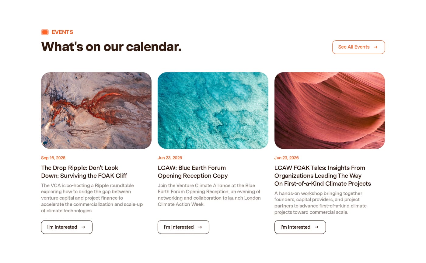
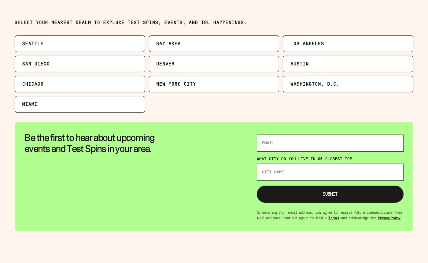
Each event needs a date, a title, a location (or "online"), and a clear action — register, get tickets, or add to calendar. A short description and an image help, but the date and the CTA do the real work.
Usually not on the main events section — lead with what is coming up. A separate "Past events" archive can hold recordings or recaps for people who want proof the series is established, but the primary section should always point forward.
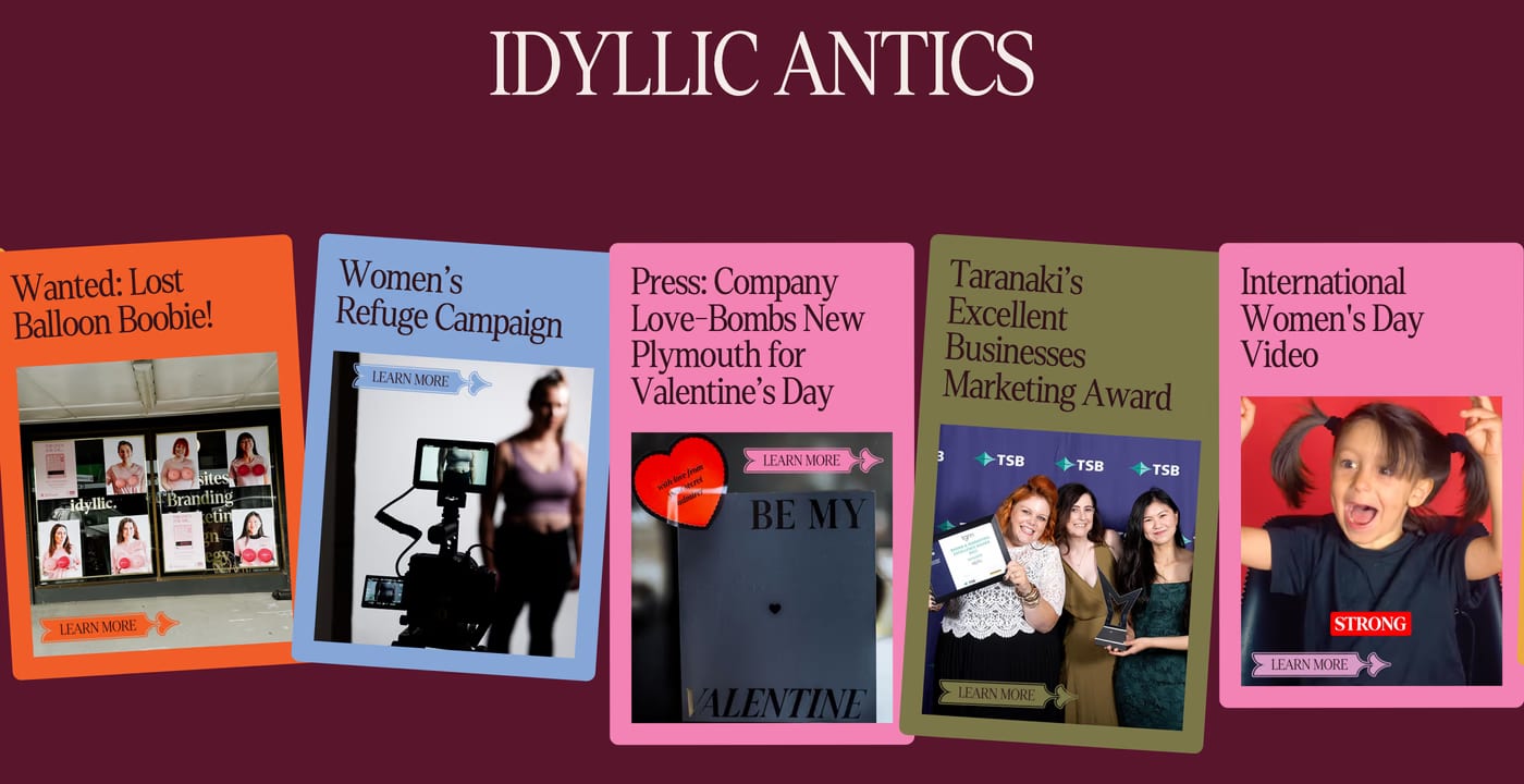
A vertical list works well when dates are the primary scan path, while a card grid suits image-led events like conferences or launches. Either way, order by date and make the soonest event the most prominent.