
28 of the best contact sections






Contact sections FAQs
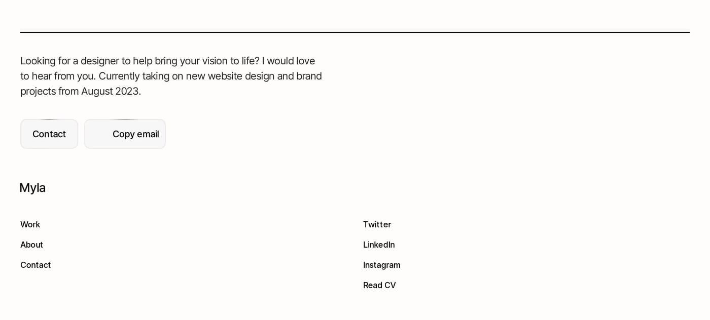
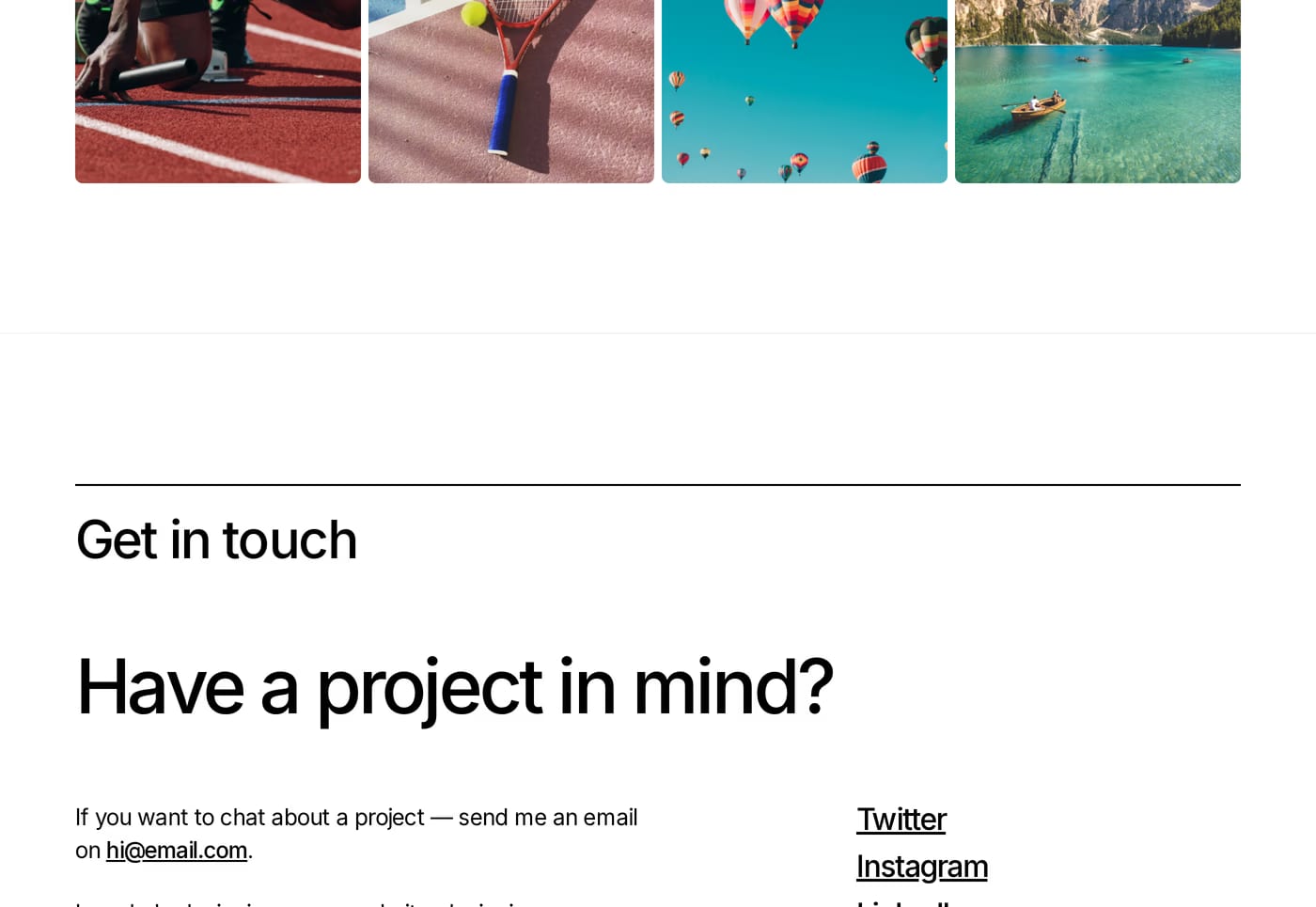
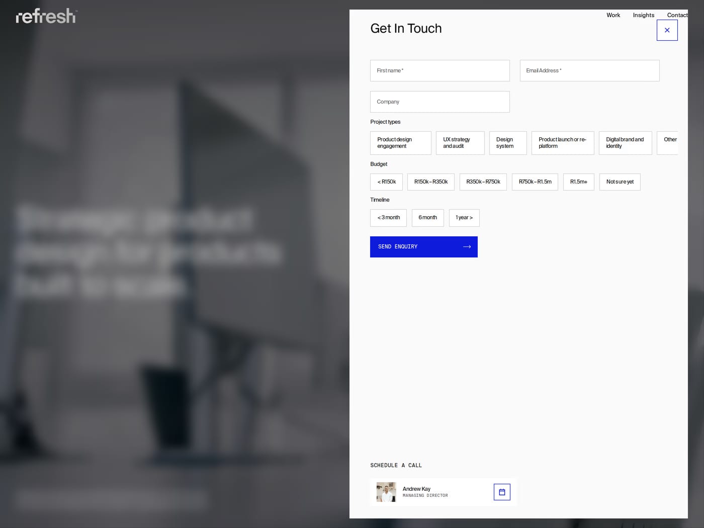
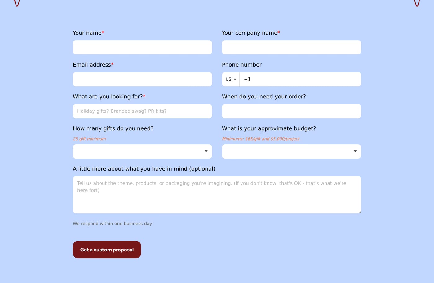
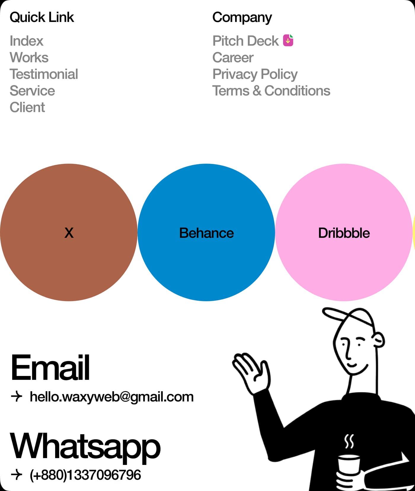
A form is the baseline. Adding a direct email address, a phone number, or a short response-time expectation ("We reply within 24 hours") reduces friction and signals that a real person will respond.
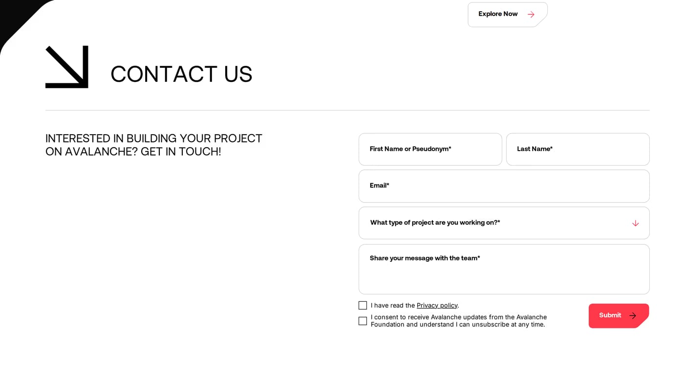
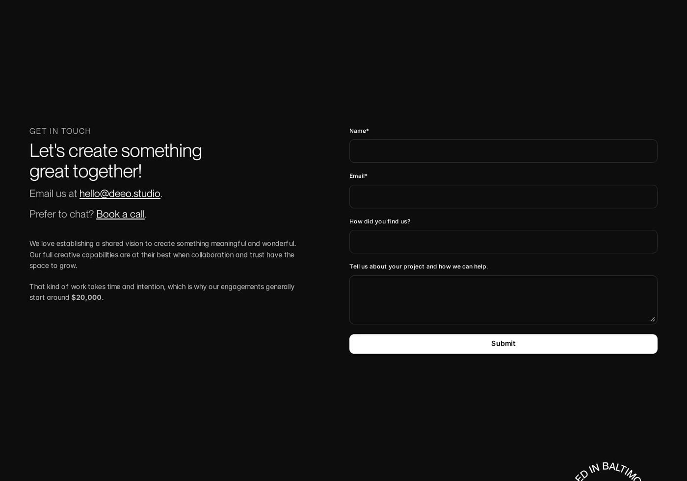
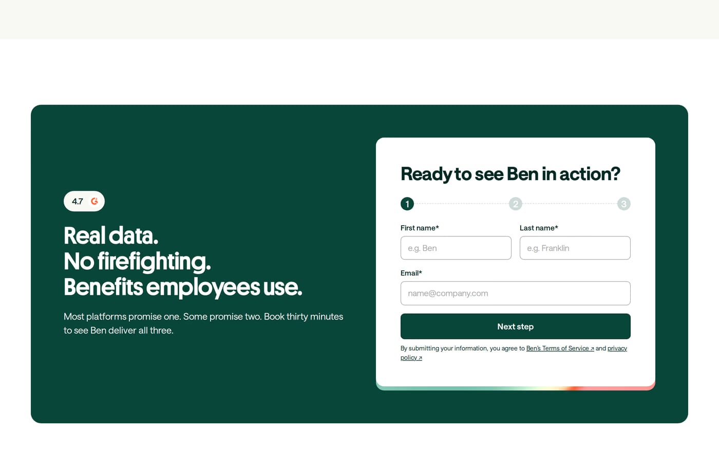
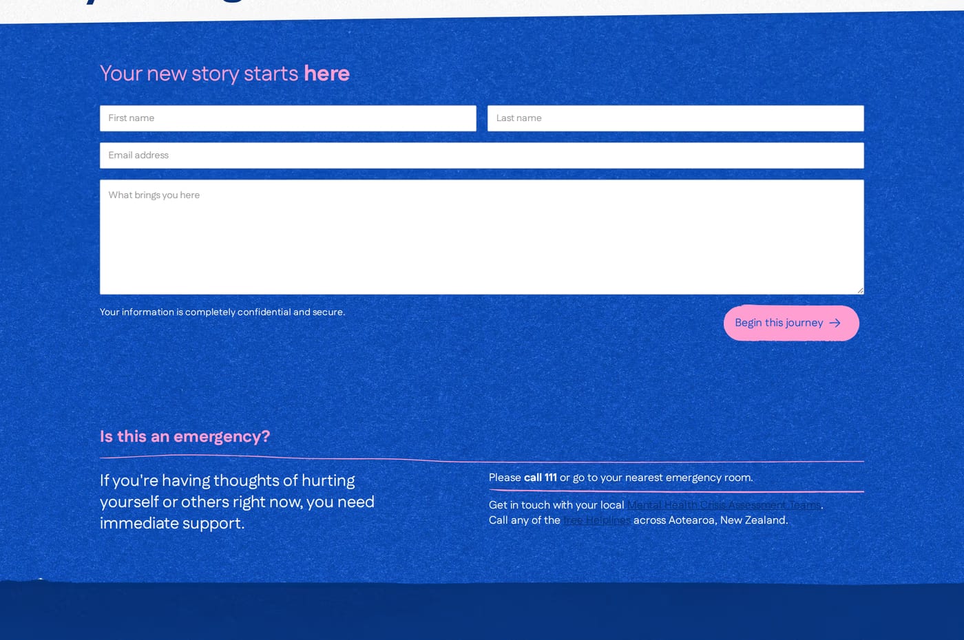
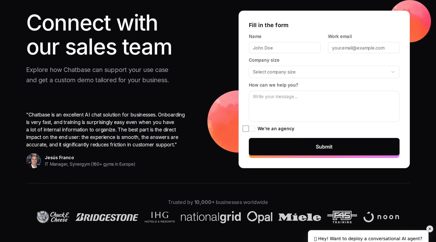
As short as possible. Name and email are almost always enough to start. Each additional field reduces completions. Ask for more detail in the first reply, not upfront.
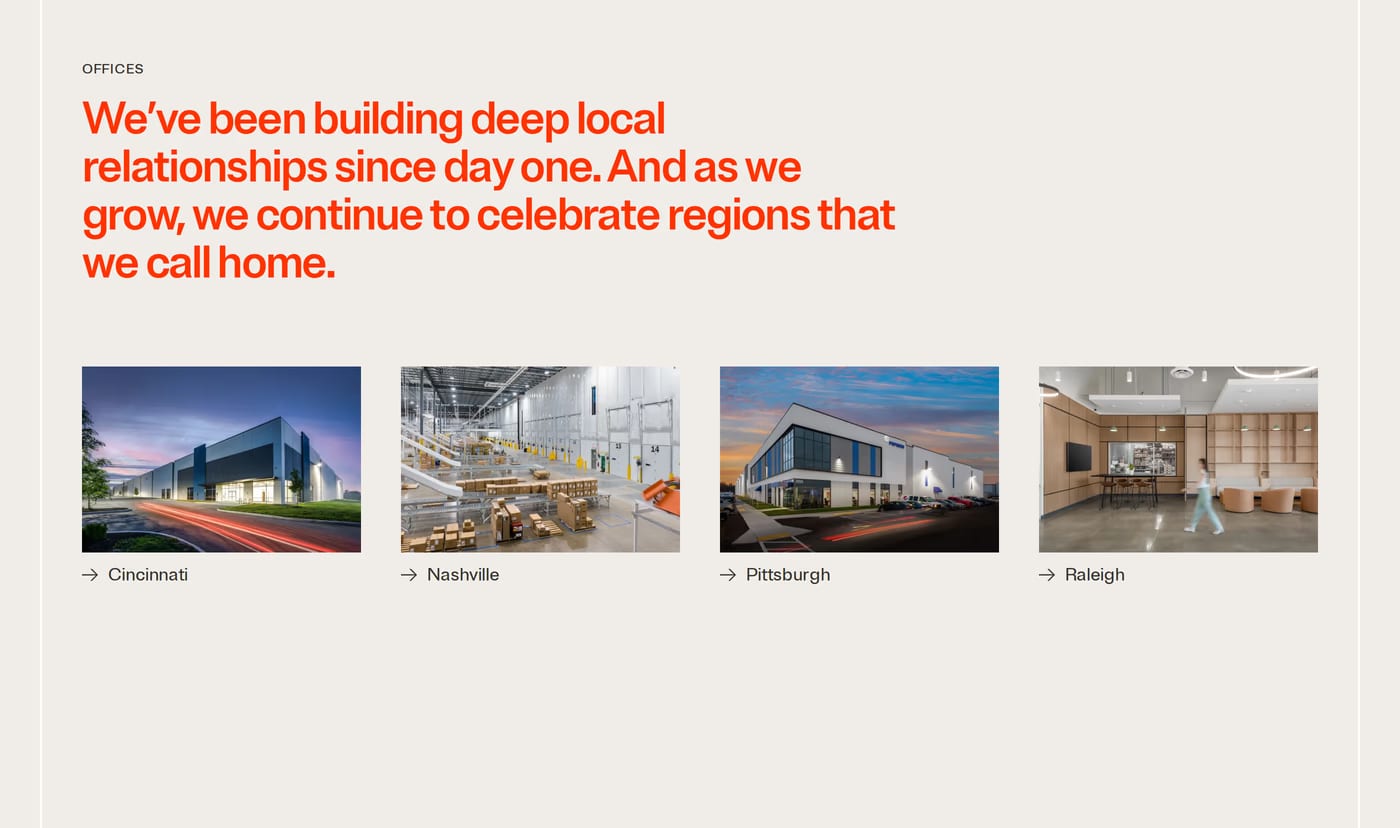
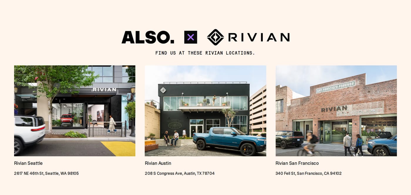
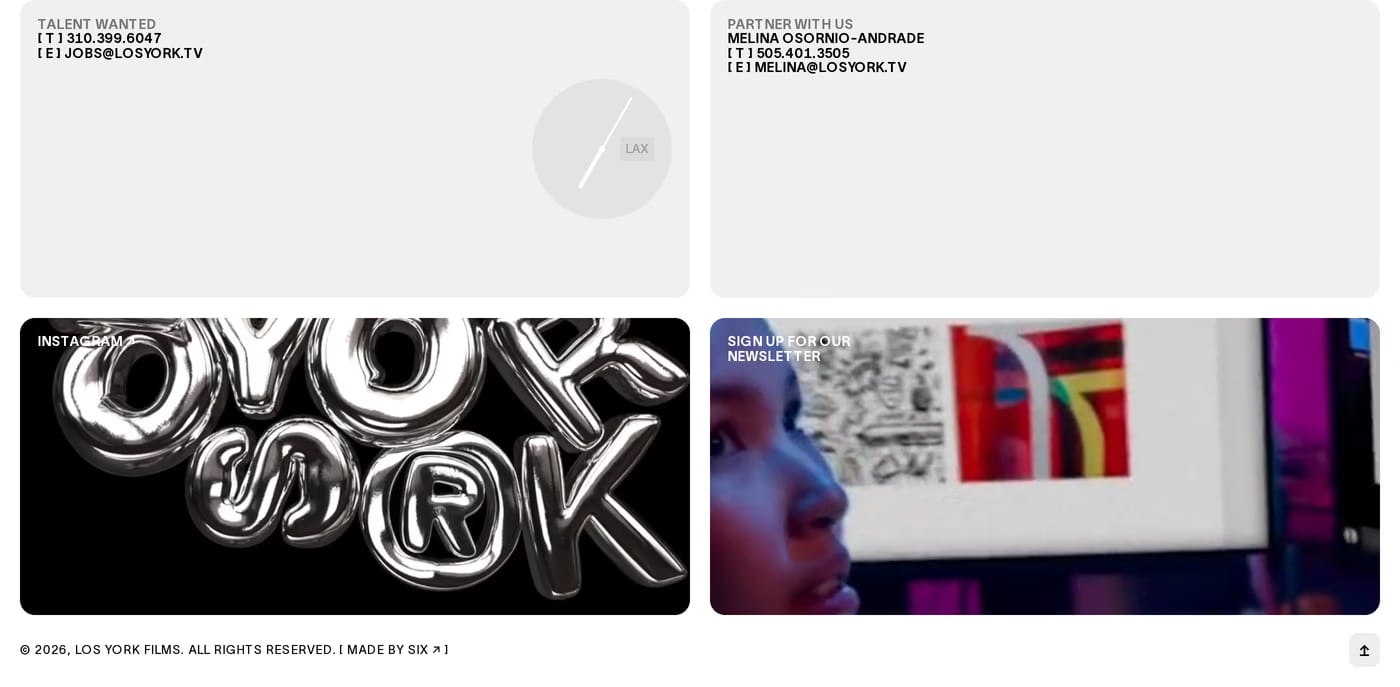
For service businesses and agencies, yes — showing a physical presence or a face adds credibility. For purely digital products, it can feel unnecessary. The gallery here shows both approaches working at different scales.