
518 of the best hero sections



Hero sections FAQs
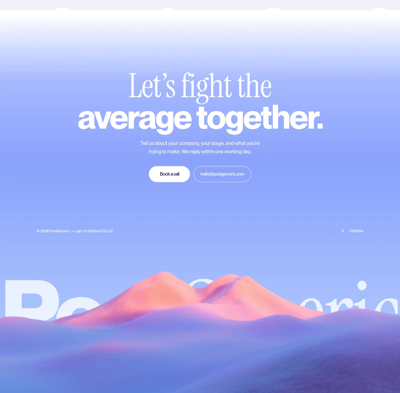
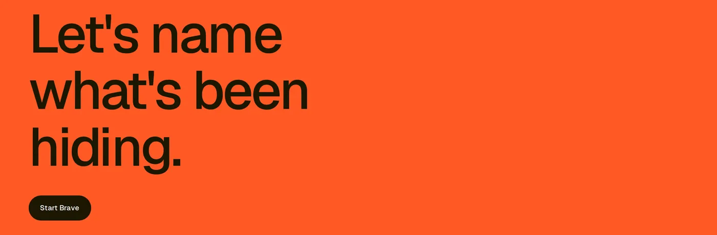
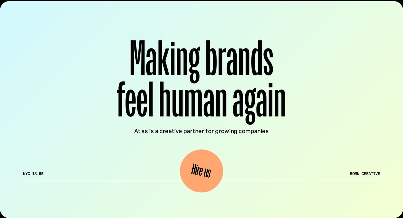
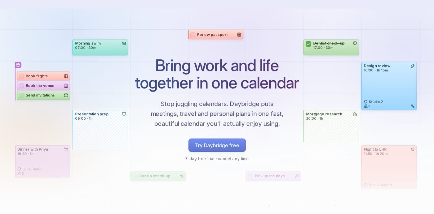
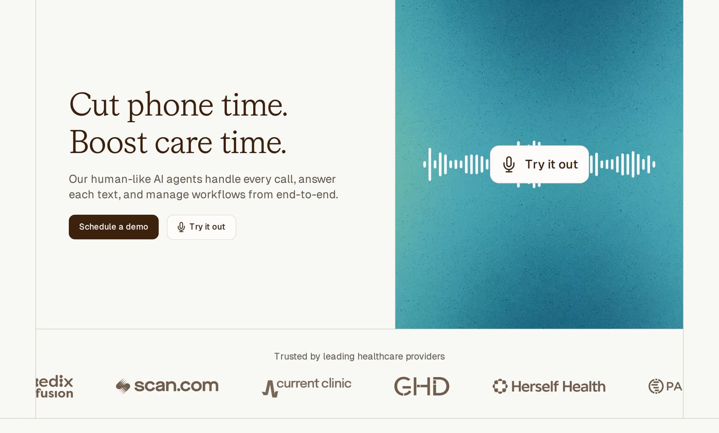
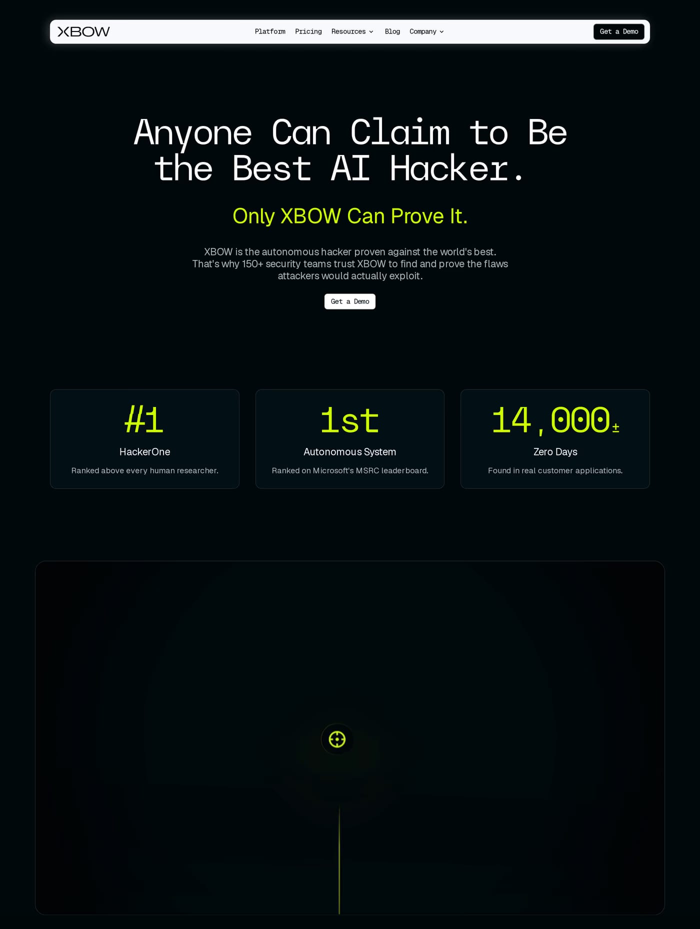
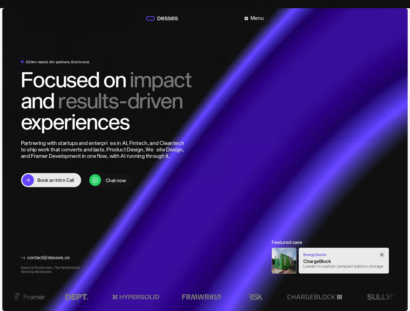
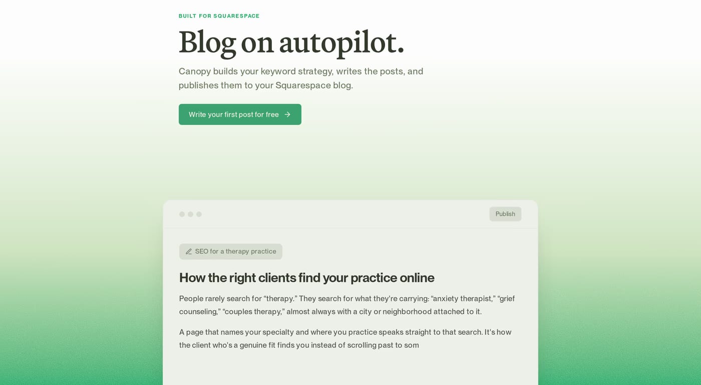
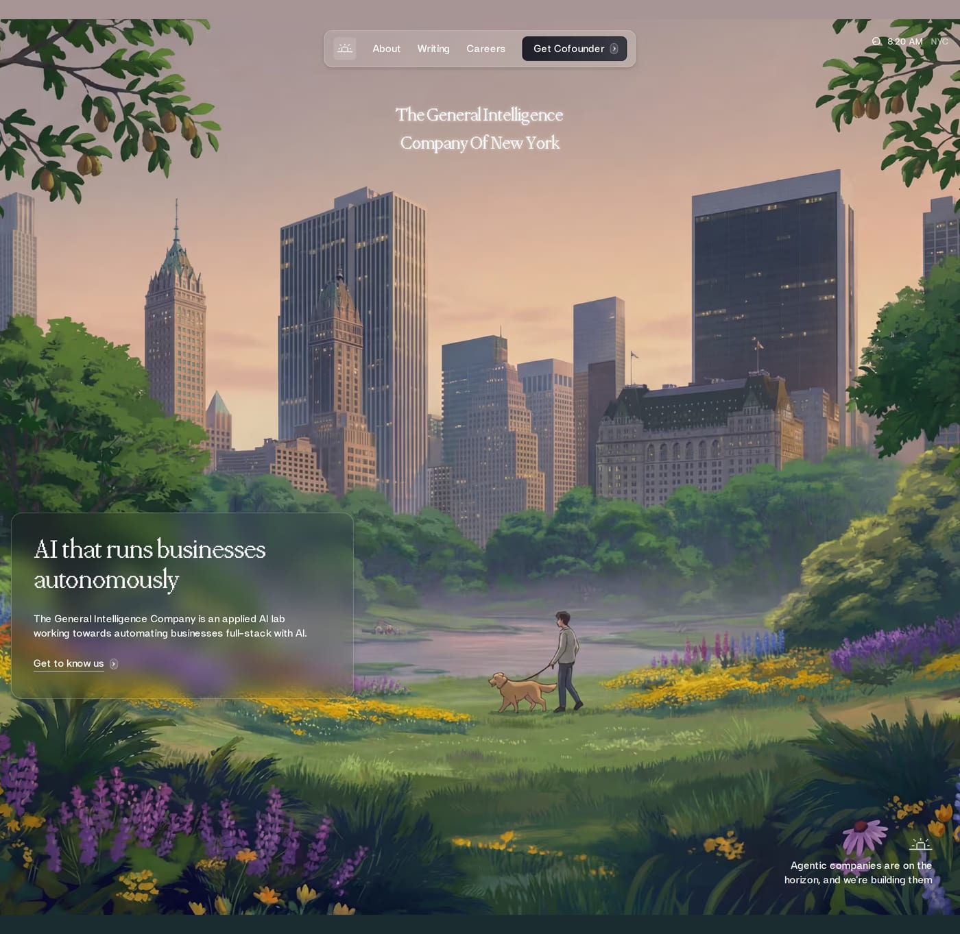
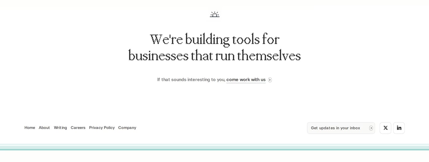
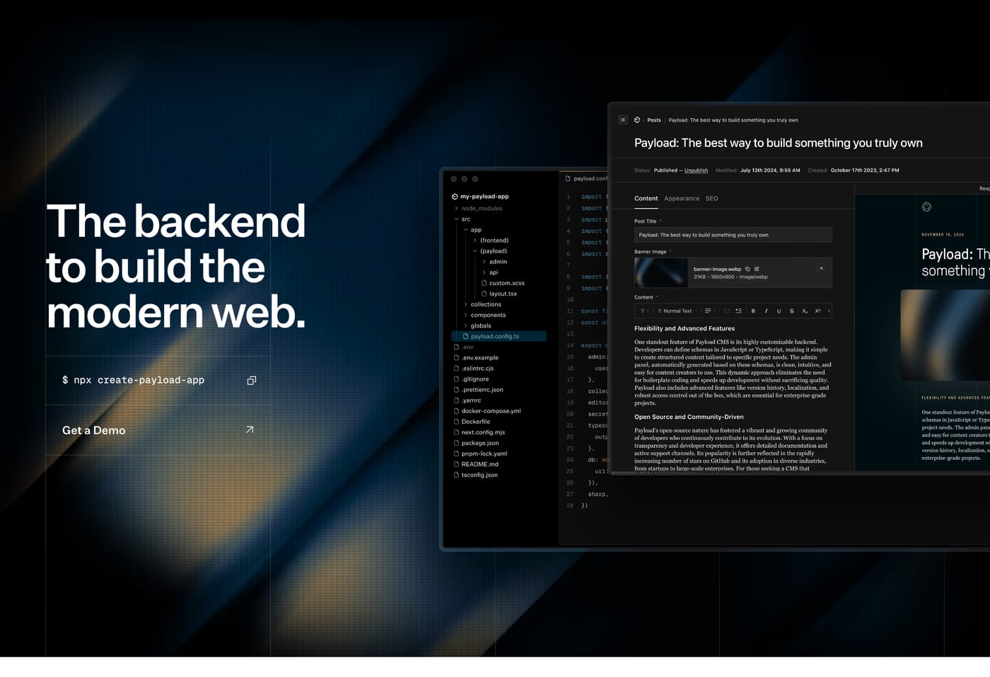
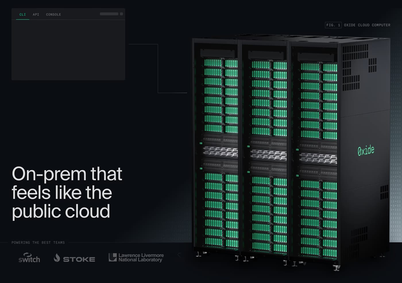
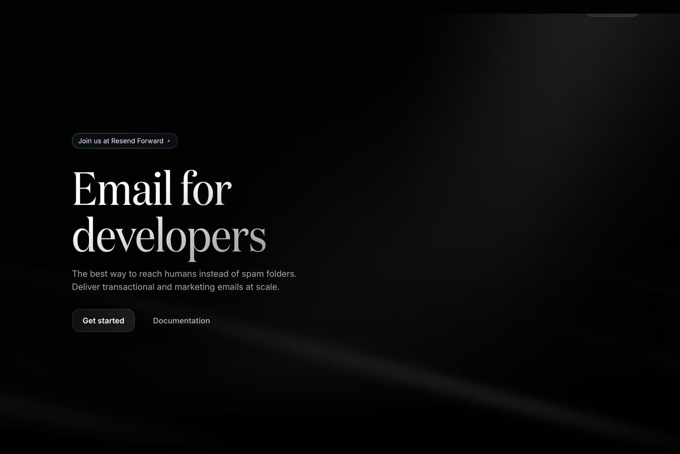
The best hero sections communicate the core value of a product or service immediately. Strong typography, a focused headline, and a clear call to action are the foundations — with visual hierarchy that guides the eye downward.
Most effective hero sections are designed to fill or near-fill the viewport. This ensures the primary message is seen before scrolling. That said, shorter heroes can work well when the content below is strong enough to pull users down.
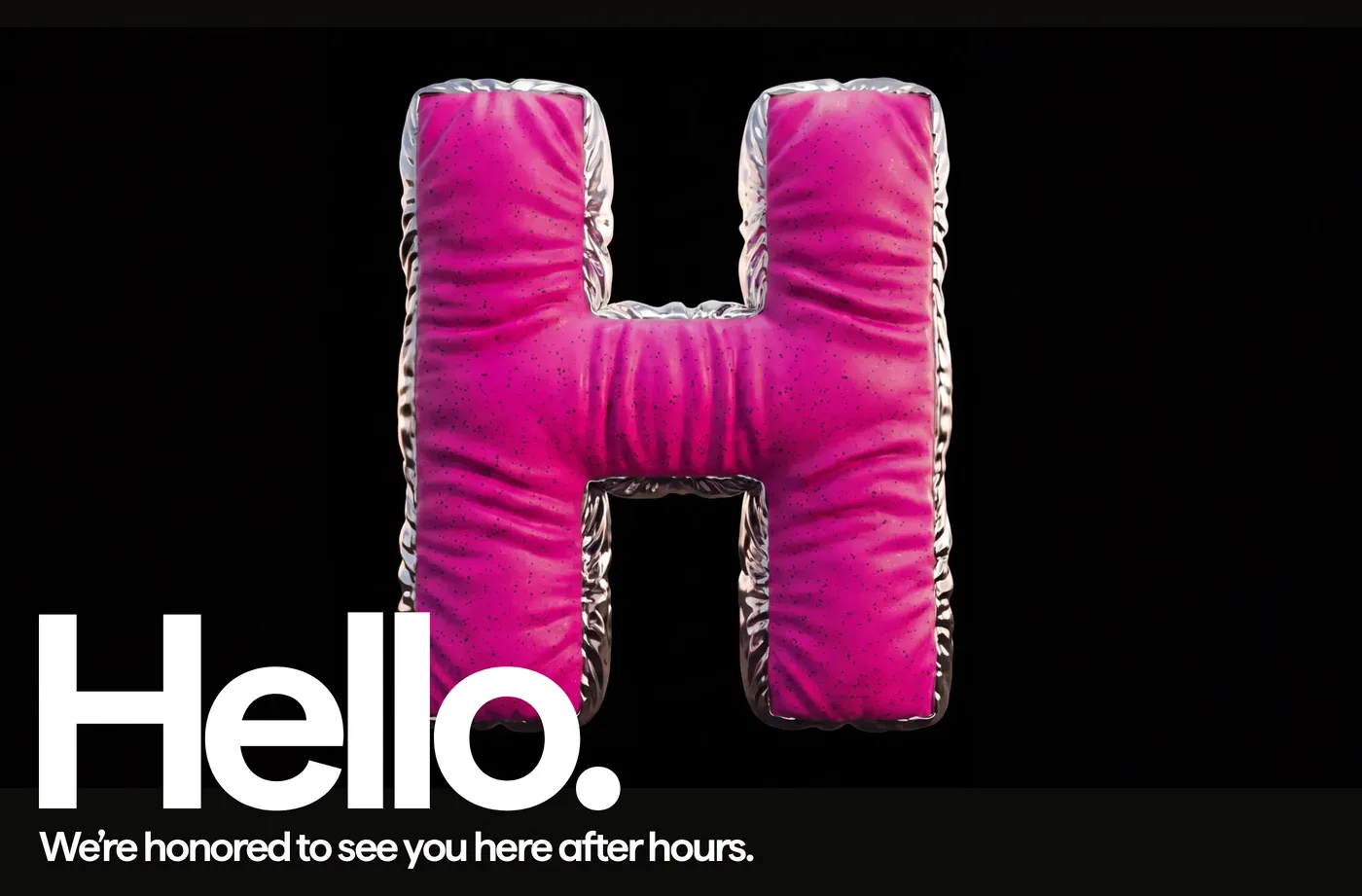
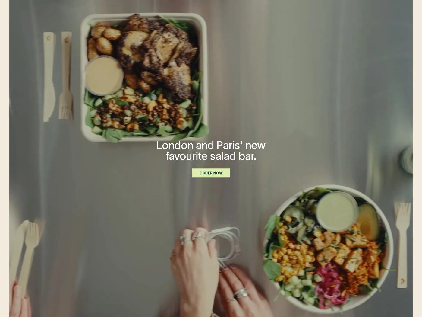
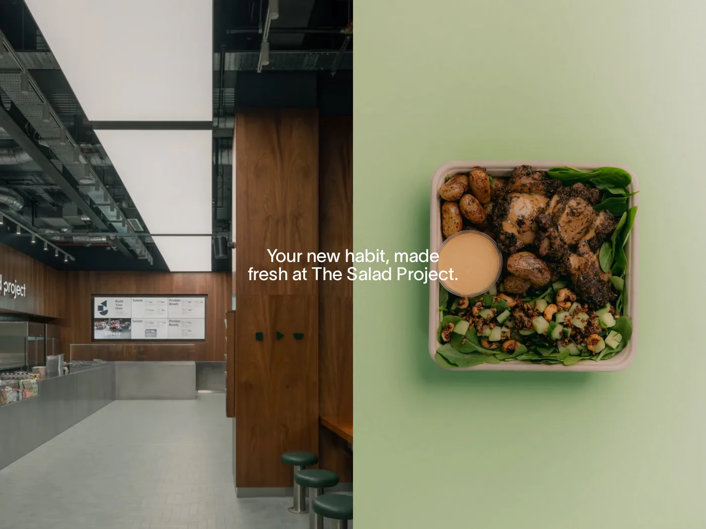
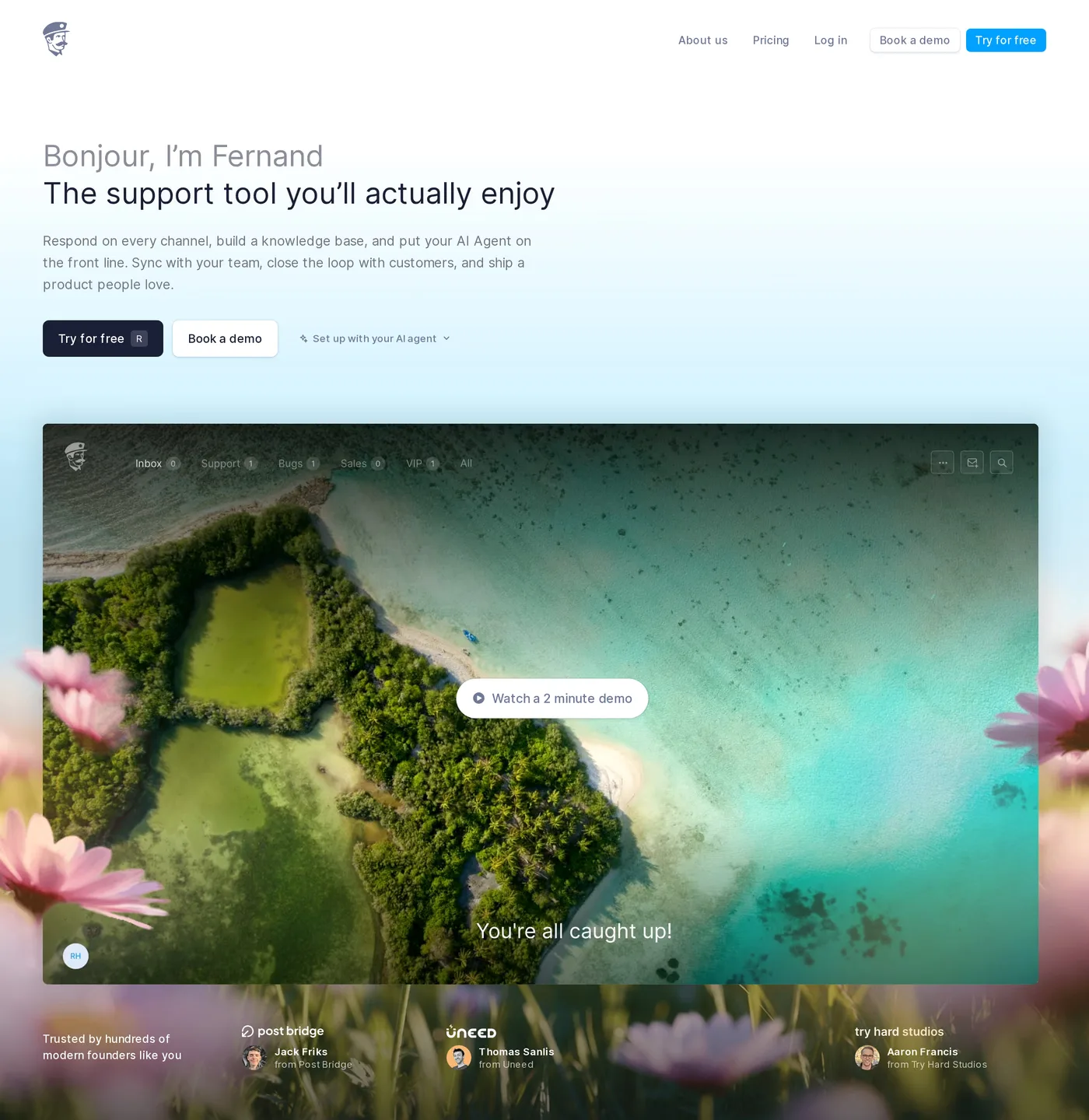
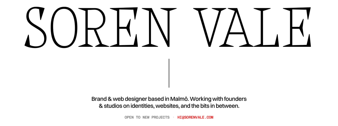
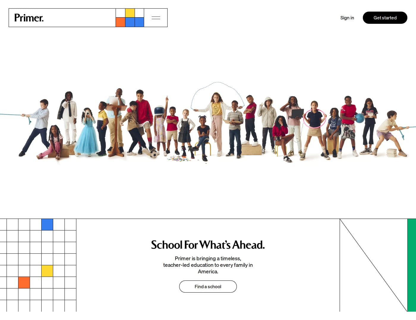
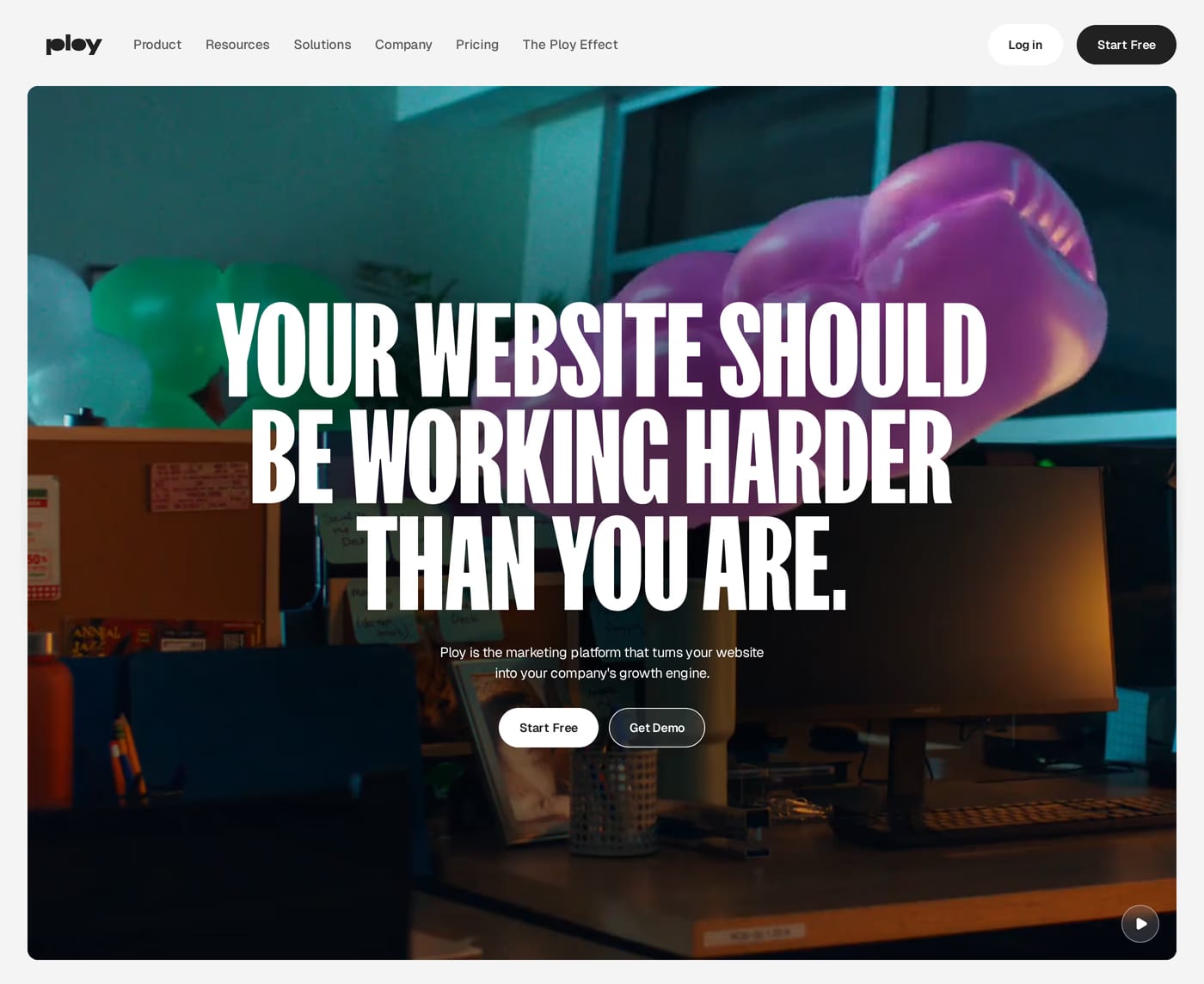
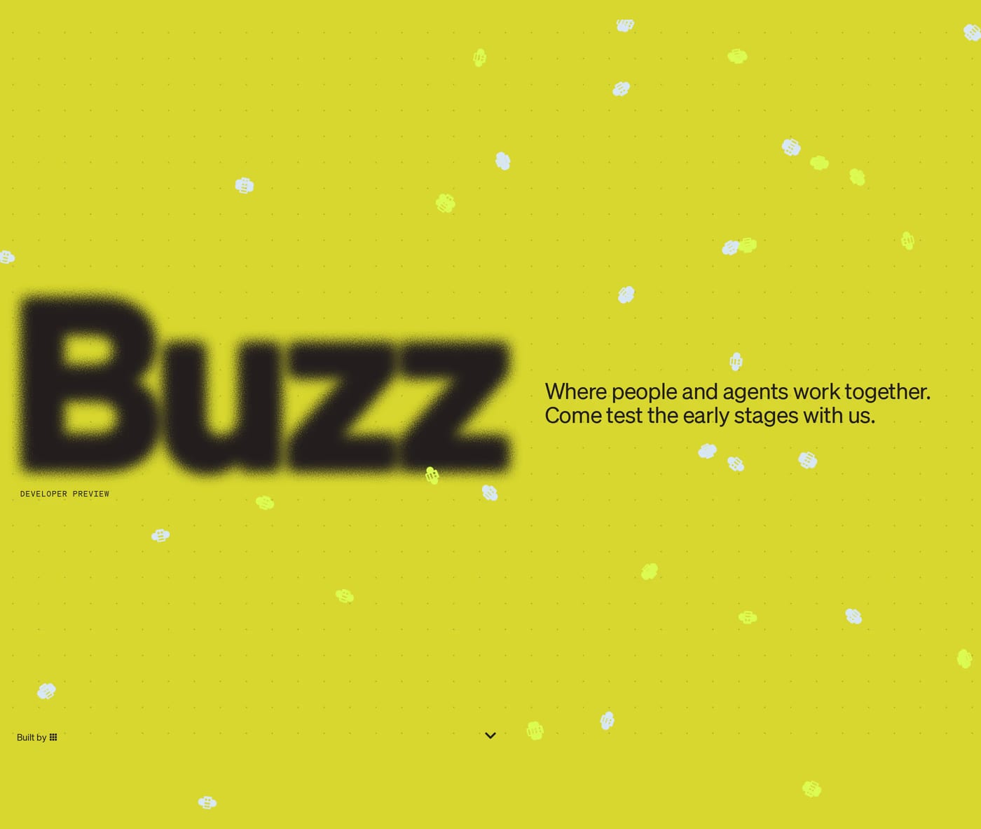
It depends on the product. SaaS companies often show UI screenshots or abstract graphics. Agencies use bold photography or motion. The examples in this gallery show a wide range — from video backgrounds to pure typographic layouts.
Critical. The CTA button should be the most visually prominent action on the page. Contrast, size, and copy all matter — vague labels like "Get started" still outperform no CTA, but specificity ("Start free trial") tends to convert better.