
137 of the best portfolio sections










Portfolio sections FAQs
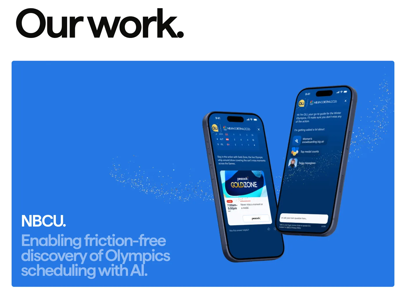
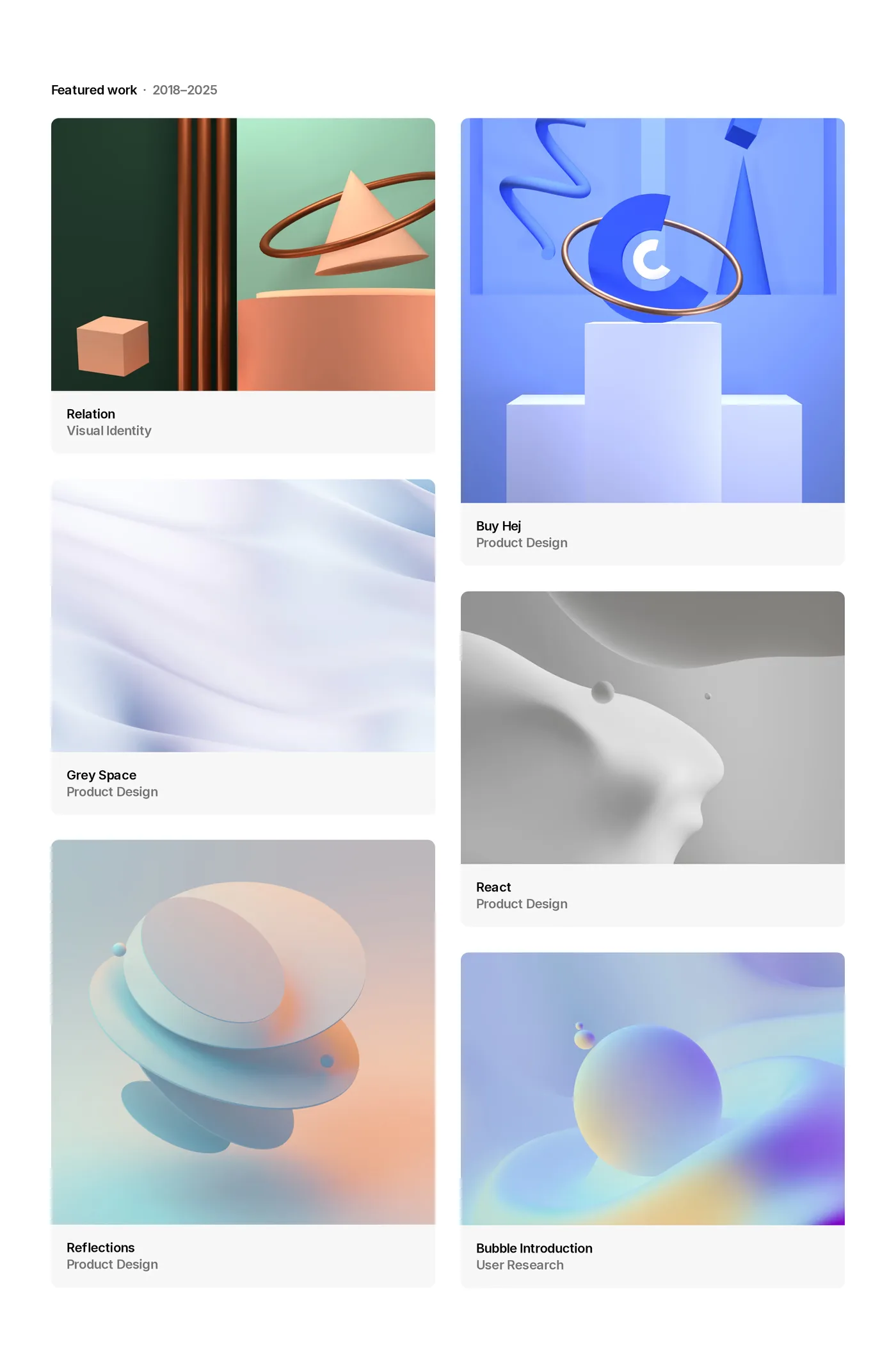
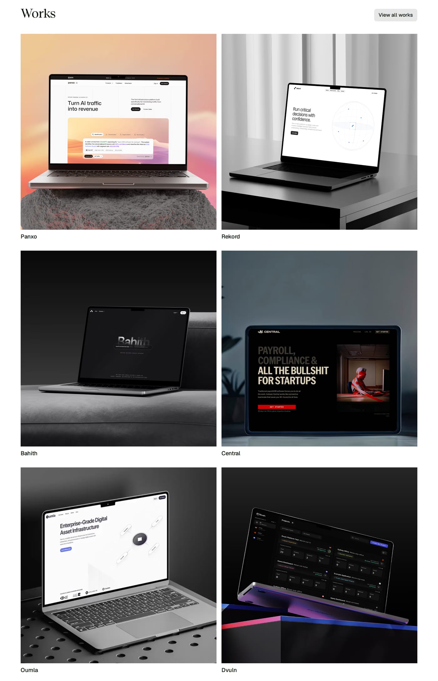
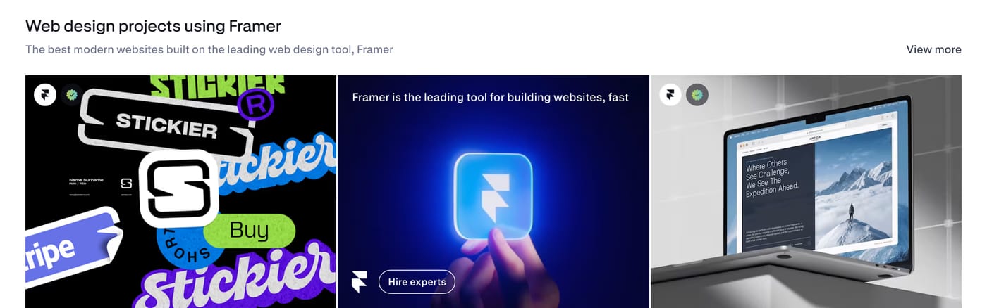
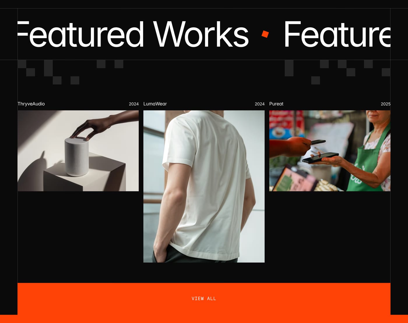
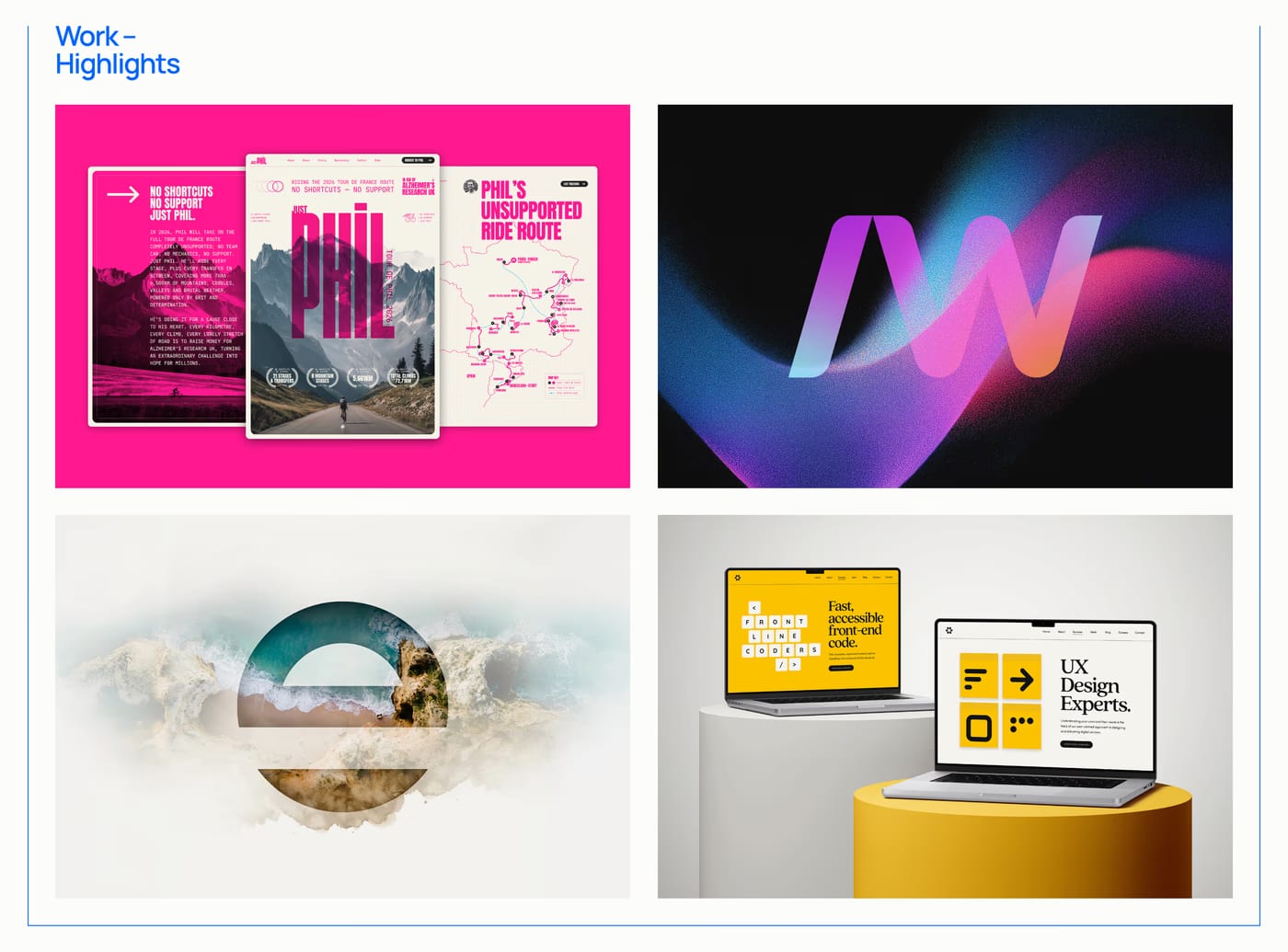
Three to six is the sweet spot for a homepage or services page. Enough to show range, few enough to stay curated. A "View all work" link can surface the full archive without overwhelming the section.
A project title and one-line context (client, industry, or deliverable) is usually enough. Long descriptions belong on the case study page, not the grid. The image should carry most of the weight.
Only if the portfolio is large and genuinely spans distinct categories a visitor would want to narrow. Filters on a six-item portfolio feel like unnecessary UI. On a 30-item archive with clear disciplines, they help.