
462 of the best features sections










Features sections FAQs
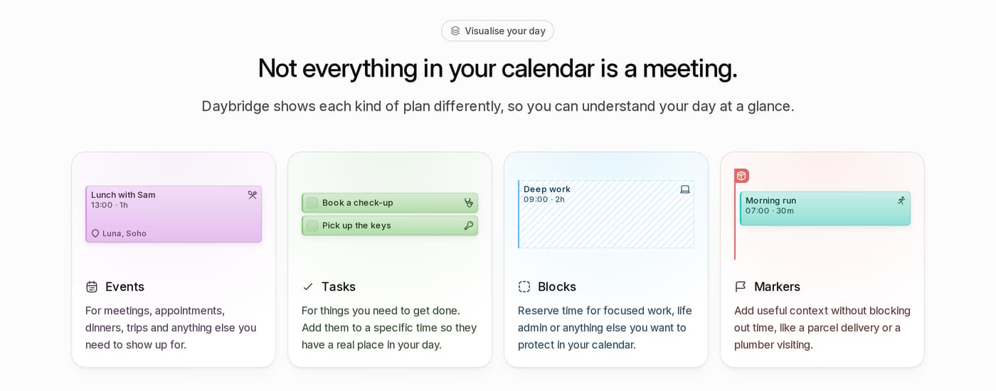
Three to six is the sweet spot for most products. Fewer forces prioritisation and reads more confidently. More than eight risks cognitive overload. If you have more, group them into categories.
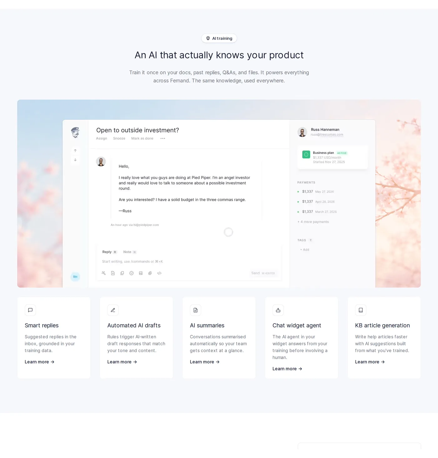
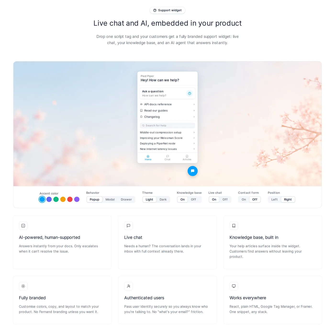
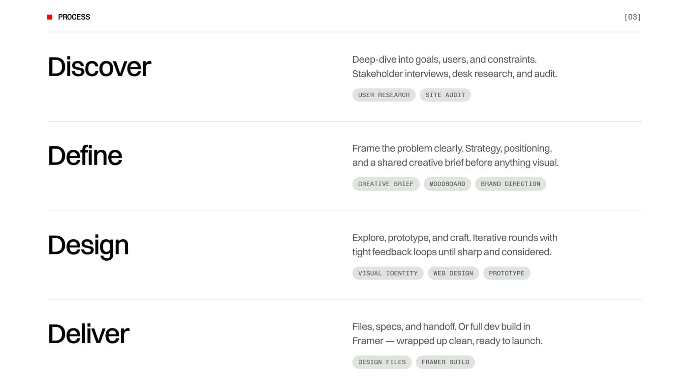
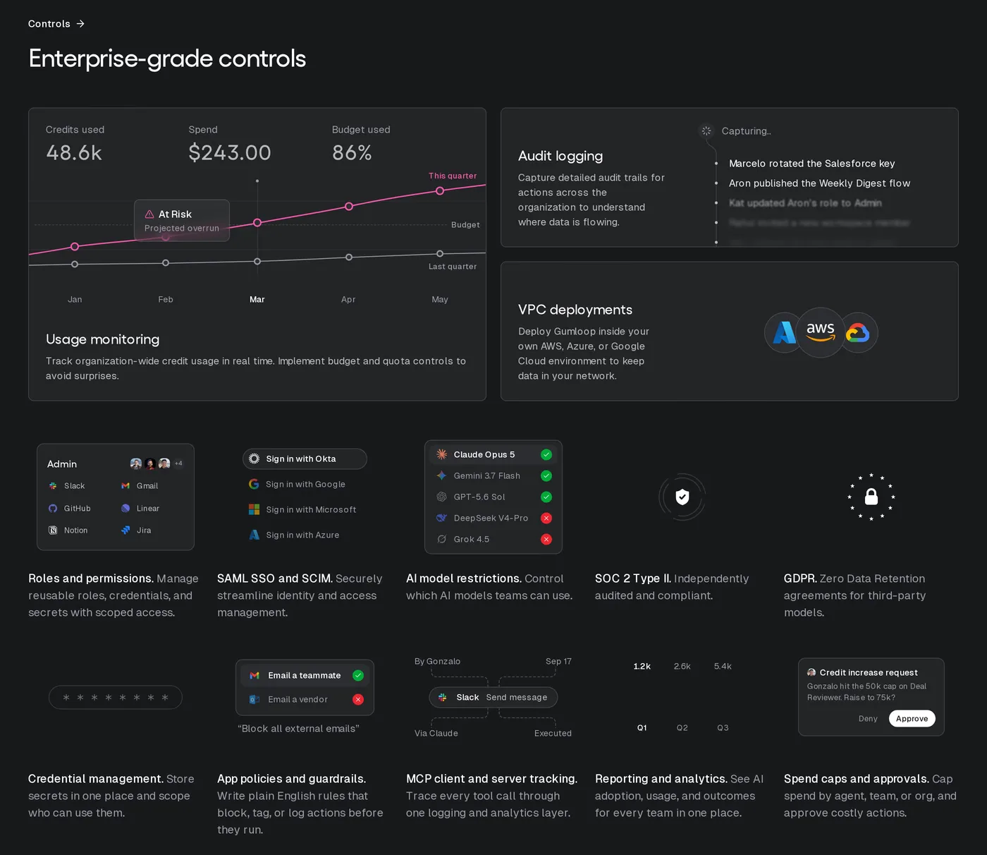
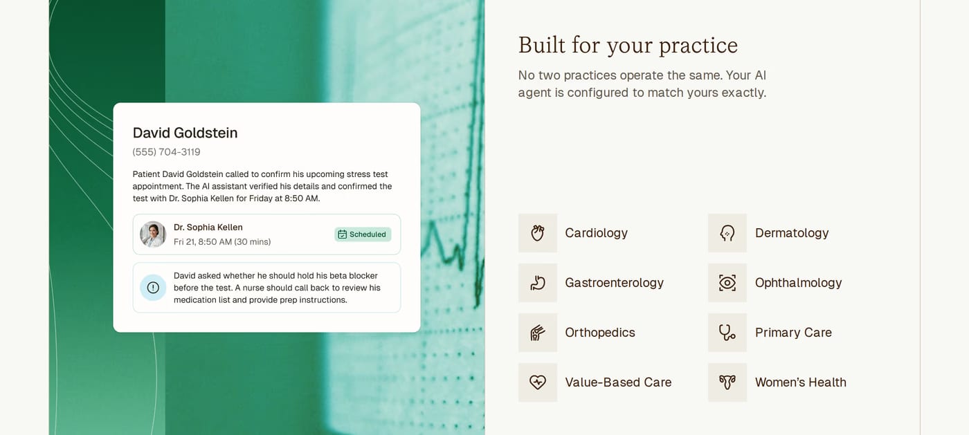
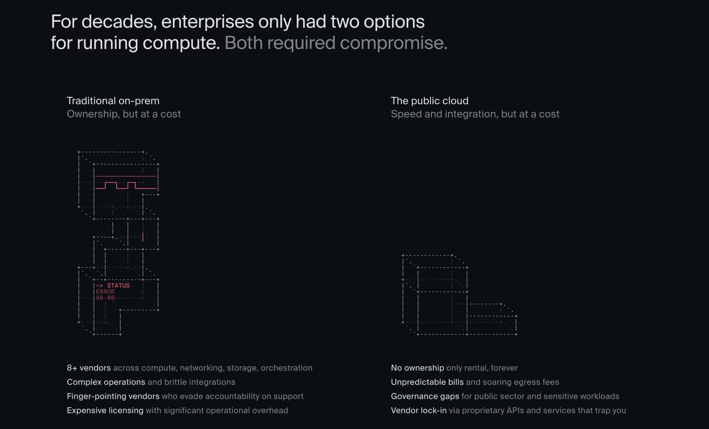
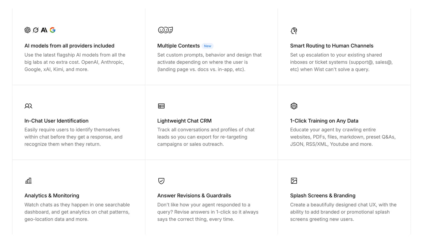
Three-column grids, alternating image-text rows, and icon lists are all common. The right choice depends on how complex each feature is — icon grids work for simple benefits, while alternating rows give room for longer explanations or screenshots.
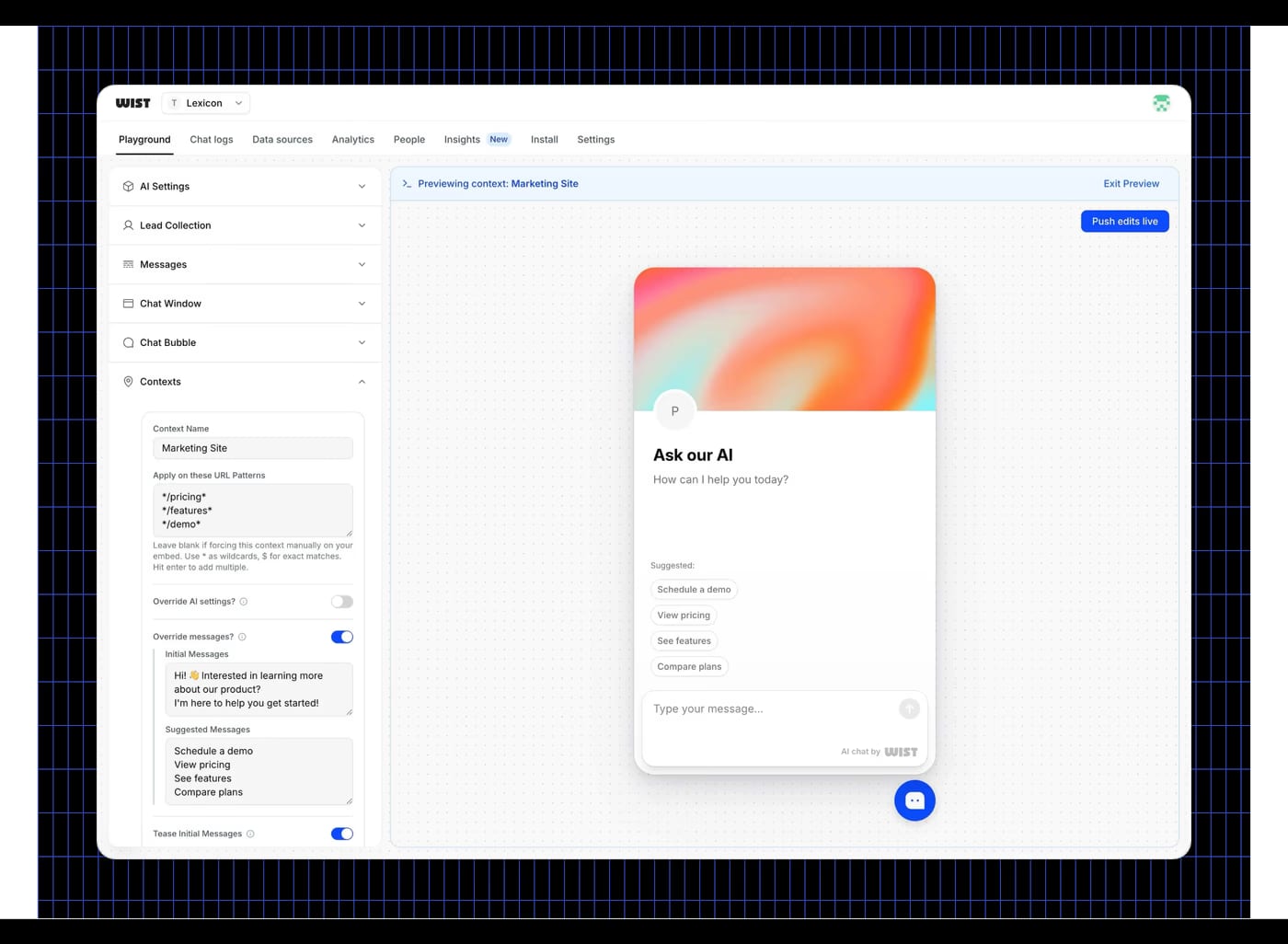
Both work. Icons are faster to scan and give a modern feel. Product screenshots show real value immediately, especially for tool-based products. The most compelling examples in this gallery often combine both.