
381 of the best footer sections








Footer sections FAQs
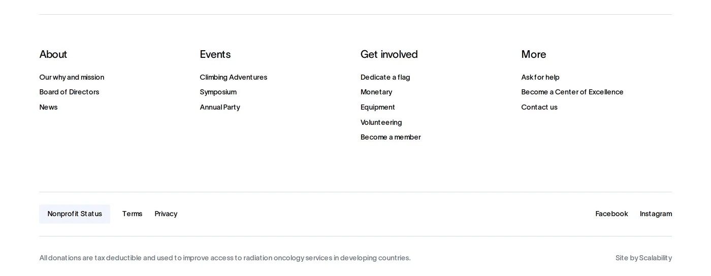
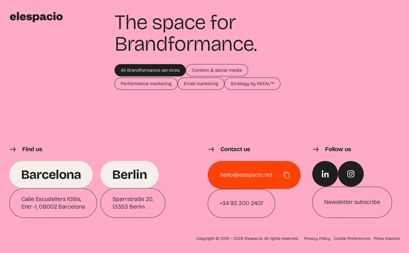
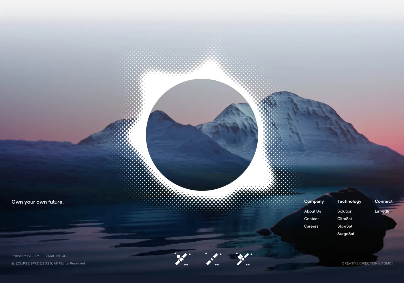
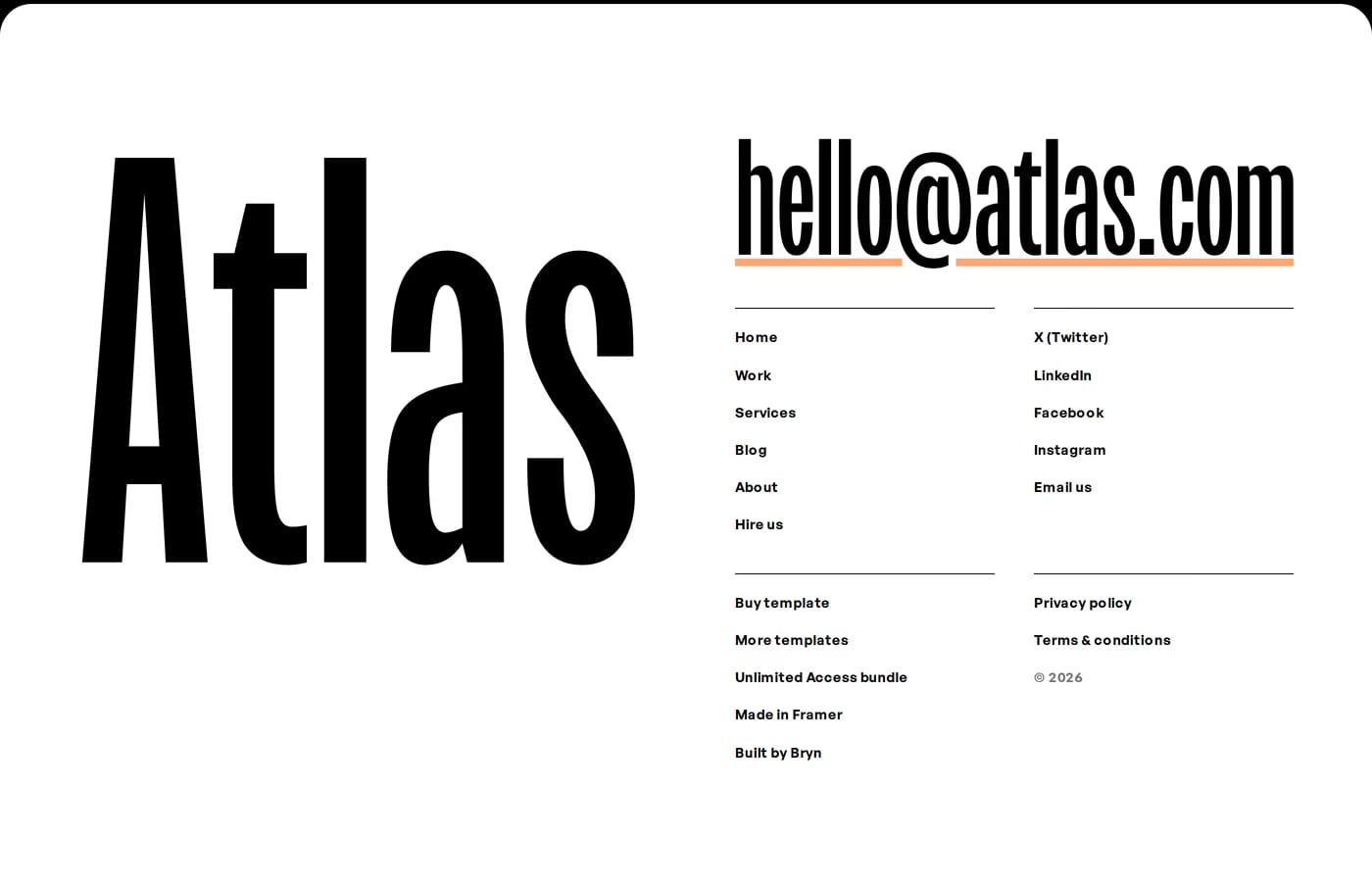
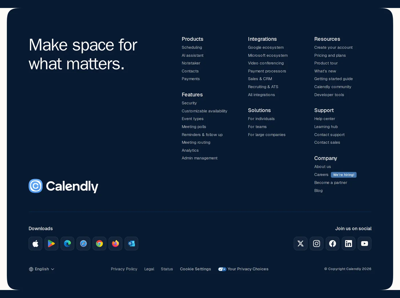
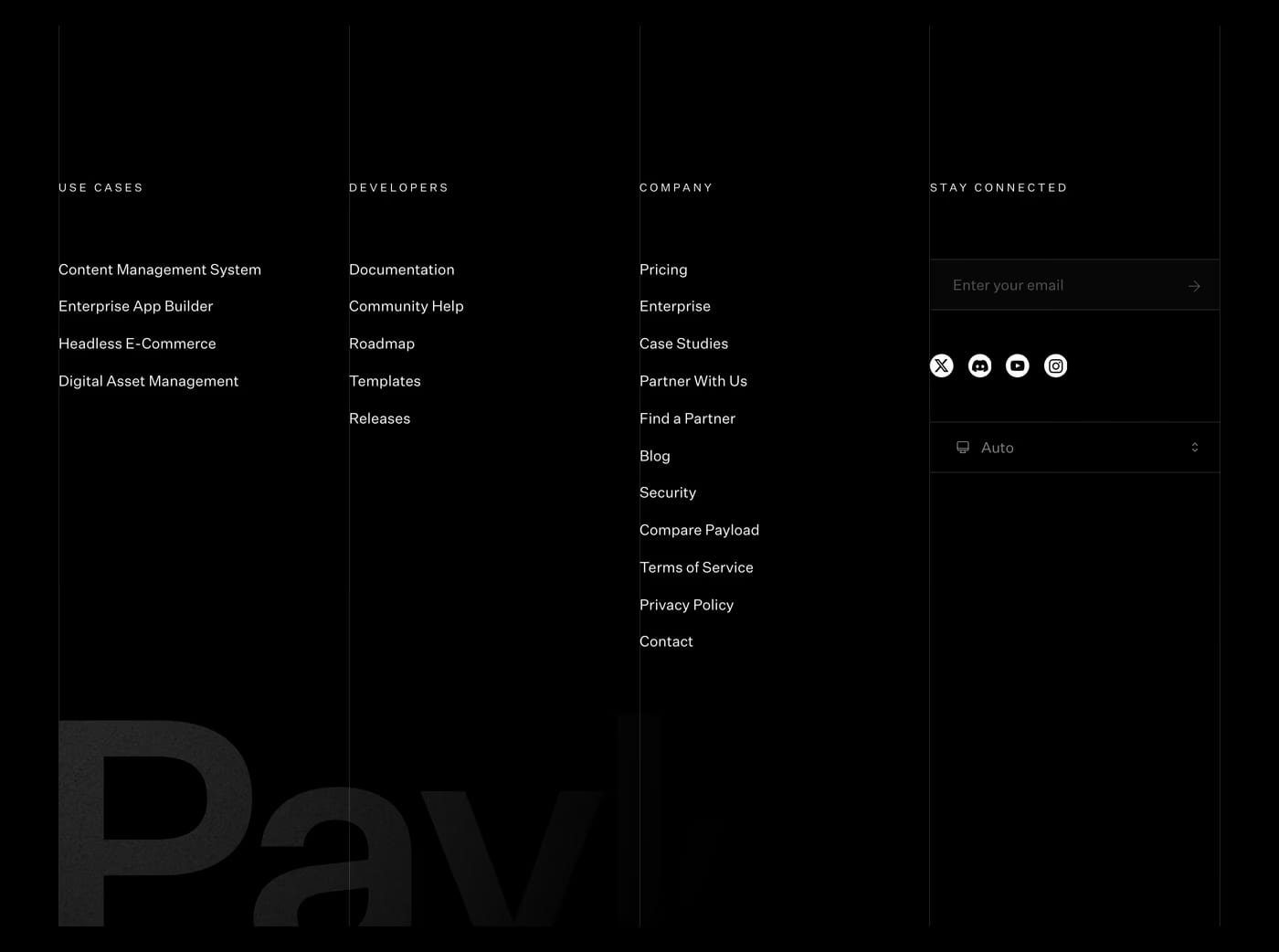
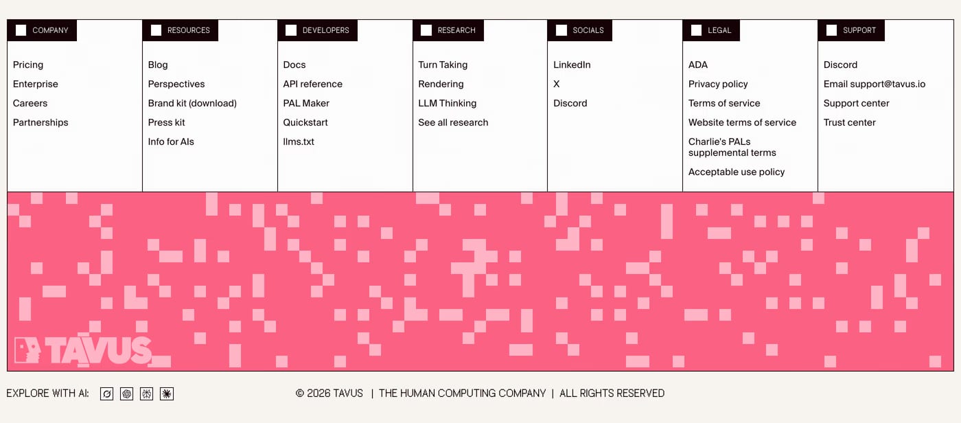
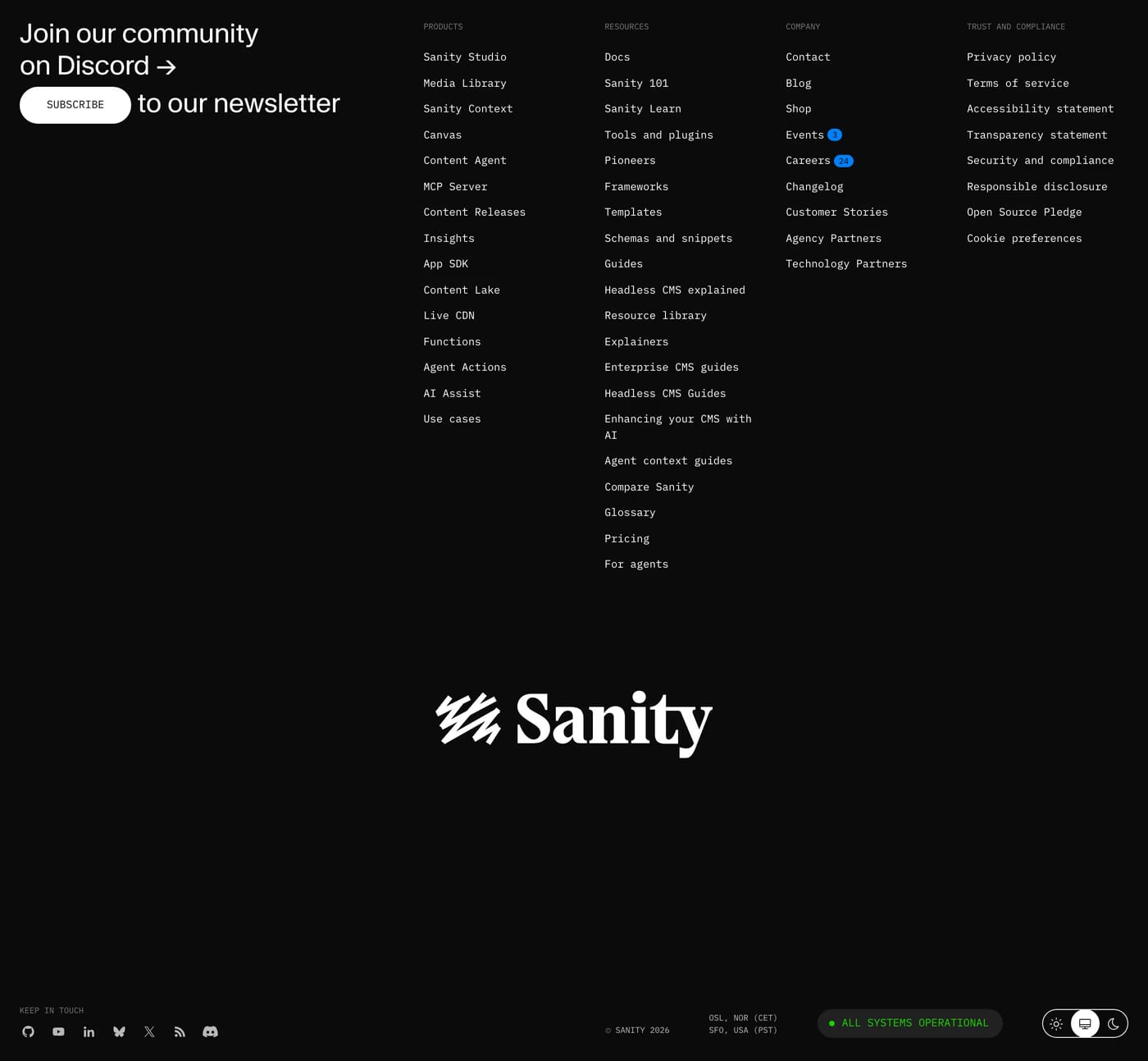
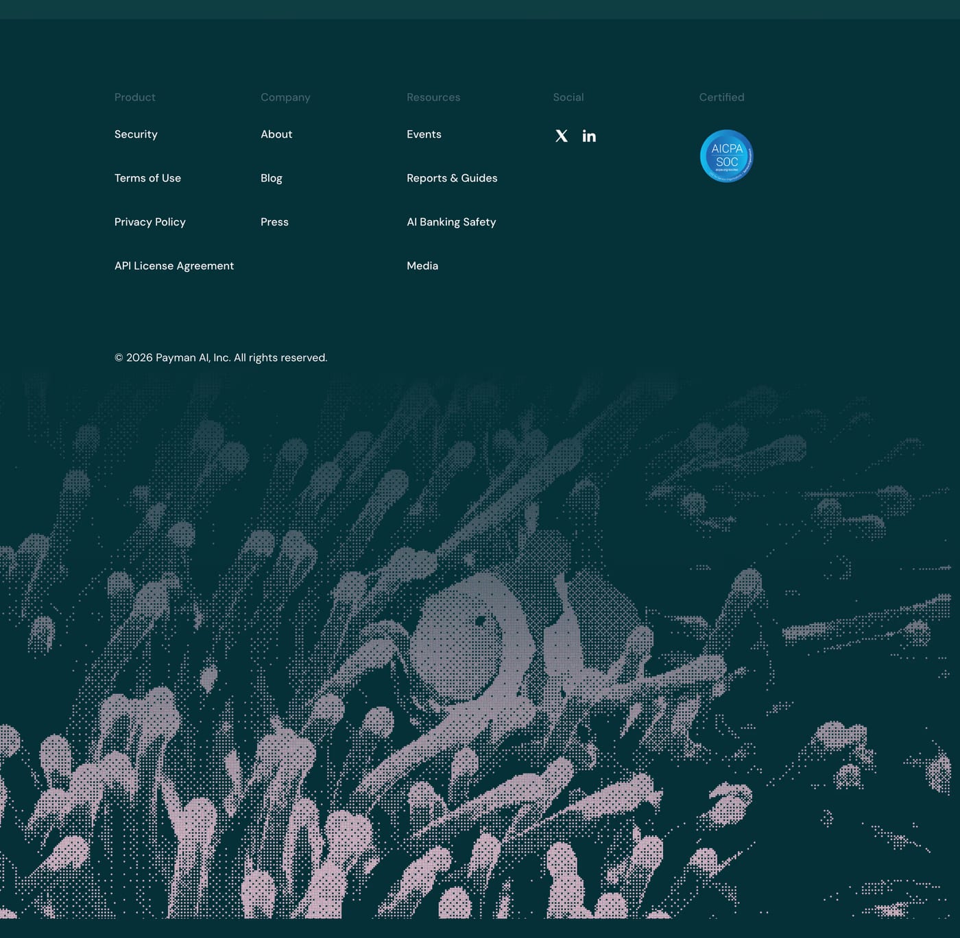
At minimum: company name/logo, a short nav, legal links (Privacy, Terms), and copyright. Contact details or a social media row are also common. The footer is often the last thing a user reads before deciding to get in touch.
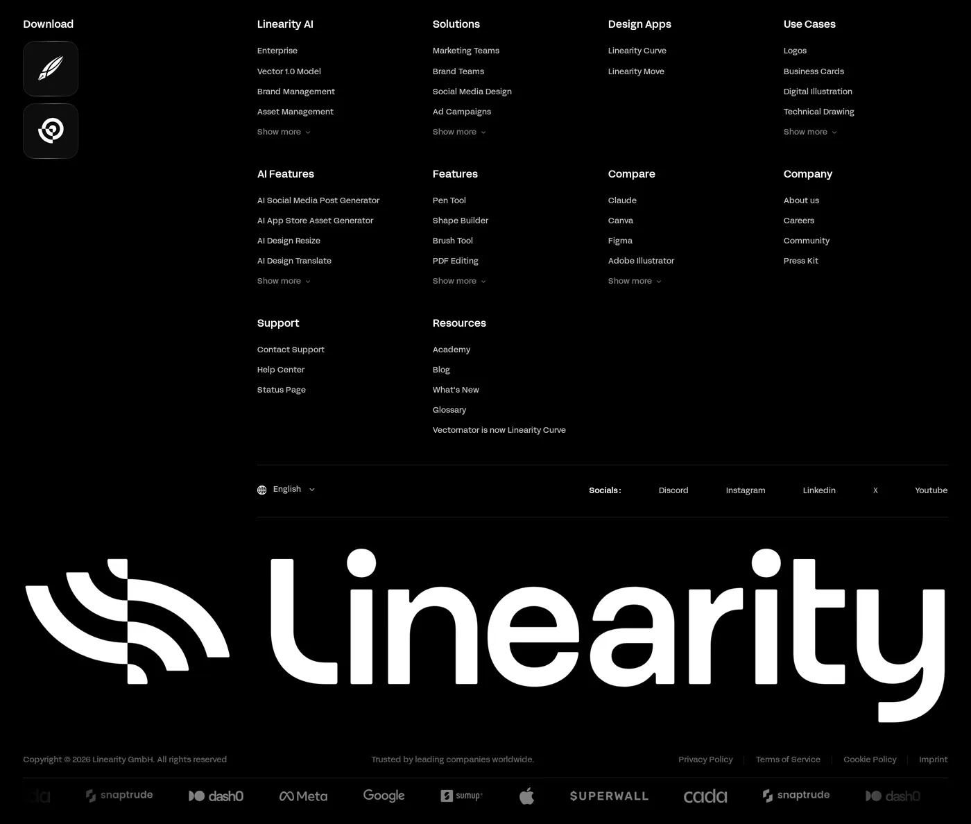
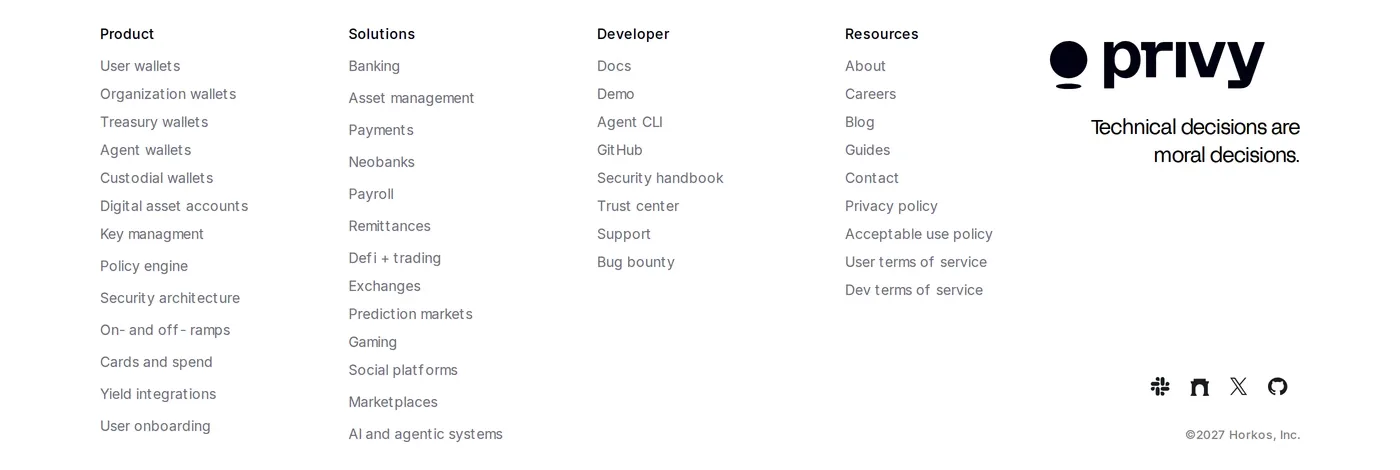
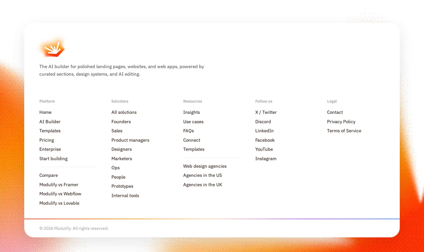
It depends on the site scale. Single-product landing pages work best with minimal footers — 3–4 links and a brief tagline. Multi-product or content-heavy sites benefit from a multi-column footer with categorised links.
Yes, if email is a growth channel. Footer signups capture visitors who read the full page but weren't ready to sign up earlier. The friction is low and the placement doesn't interrupt the primary experience.