New A1 Pro: unlimited saves, priority submissions and more →

51 gradients software website examples

Software companies use gradients to add visual warmth and modernity to marketing pages. Gradient backgrounds break up content sections and create depth without adding complexity. These examples show how colour transitions can elevate a straightforward product page.

Get the best gradients software websites each week

Curated inspiration sent every Tuesday

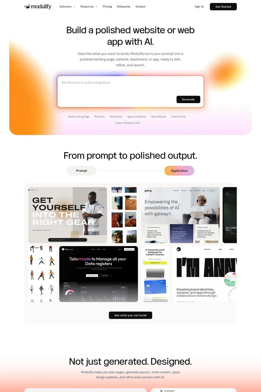
Modulify
Kaiko
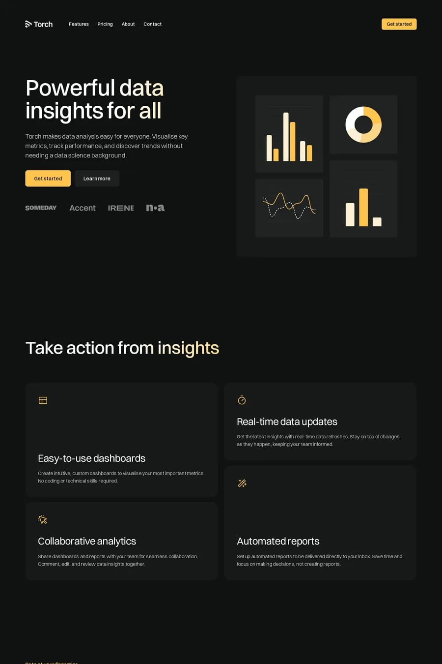
Torch

Gradients software FAQs

As supporting elements rather than the main event. Background washes behind feature sections, subtle card treatments, and hero accents work well. Gradients should enhance the content, not overwhelm it.

Blues and purples feel technical and trustworthy. Warmer gradients suit consumer products. The gradient should connect to the brand palette and feel like an extension of the product's colour system.

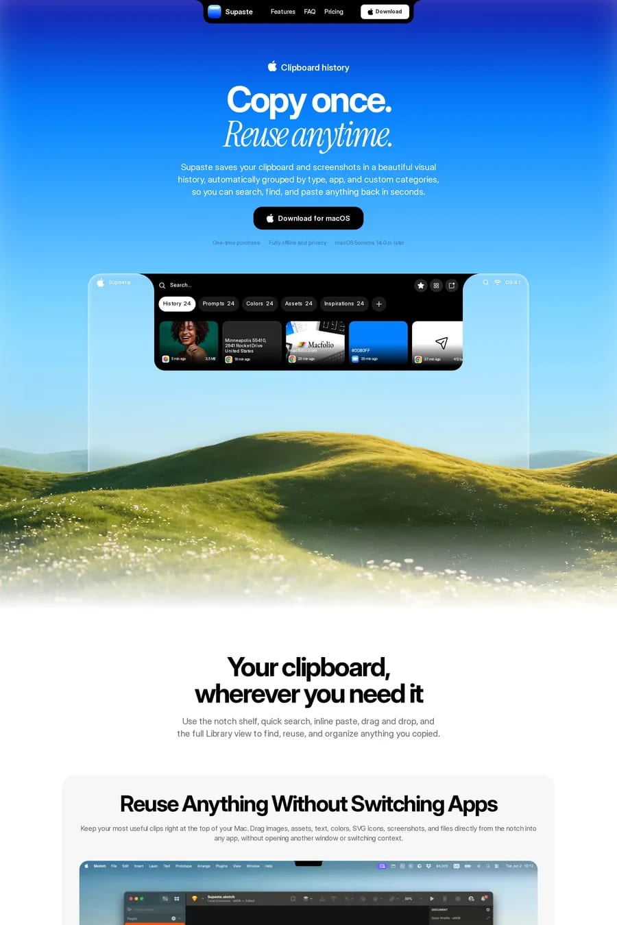
Notable examples include Modulify, Kaiko, Torch, Wedge and Supaste. These are just a few of the 51 gradients software websites in this collection, each selected for strong visual design and execution.

Popular platforms in this collection include Framer, Next.js, Webflow and Shopify. Each brings different strengths for building gradients software experiences.

Frequently used typefaces include Inter, Aeonik, JetBrains Mono and Lausanne. Typography plays a key role in defining the gradients aesthetic across these software websites.

51 Best Gradients Software Website Examples (2026) · A1