New A1 Pro: unlimited saves, priority submissions and more →

111 lines landing page examples

Line-based designs use strokes, borders, and linear elements to create structure and visual interest. The approach appeals to architecture firms, fintech products, and design studios that value precision and order. These landing pages demonstrate how simple lines can define space, guide attention, and build distinctive aesthetics without heavy graphical elements. Explore the collection to see how leading brands use line work to create clean, architectural web experiences.

Get the best lines landing websites each week

Curated inspiration sent every Tuesday

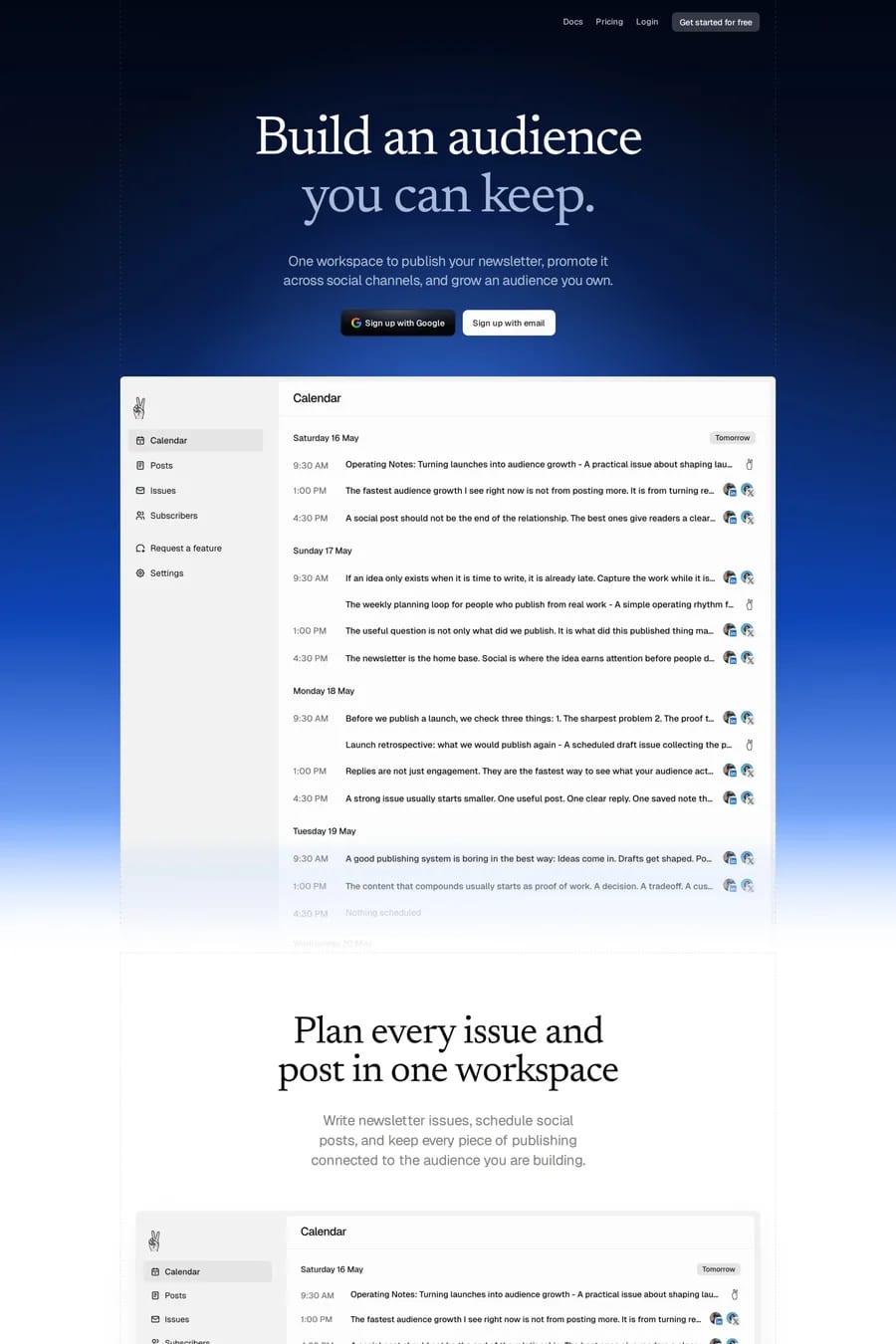
Kaiko
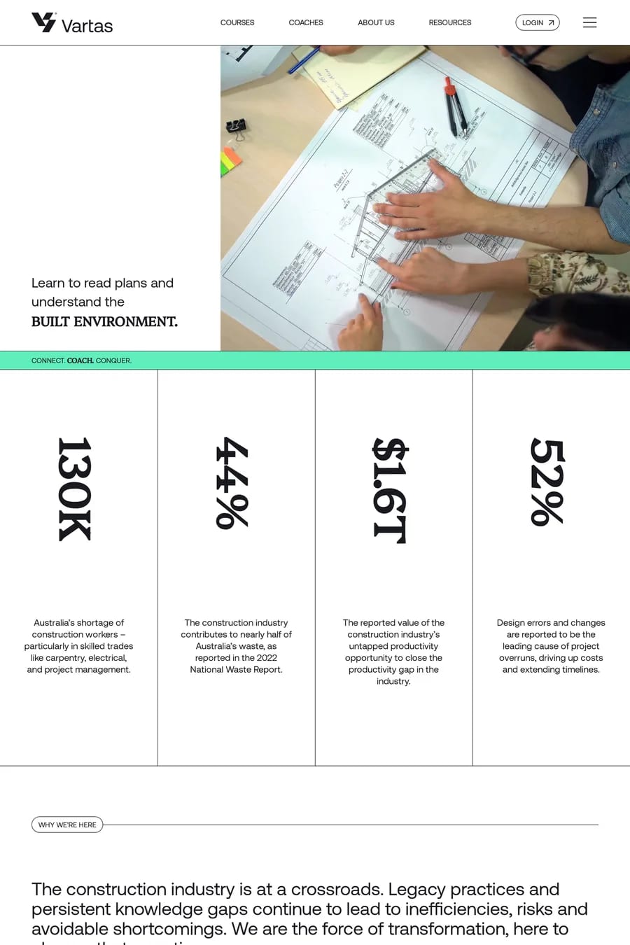
Customer.io
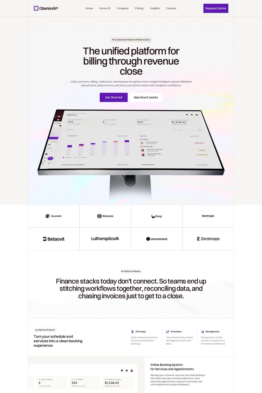
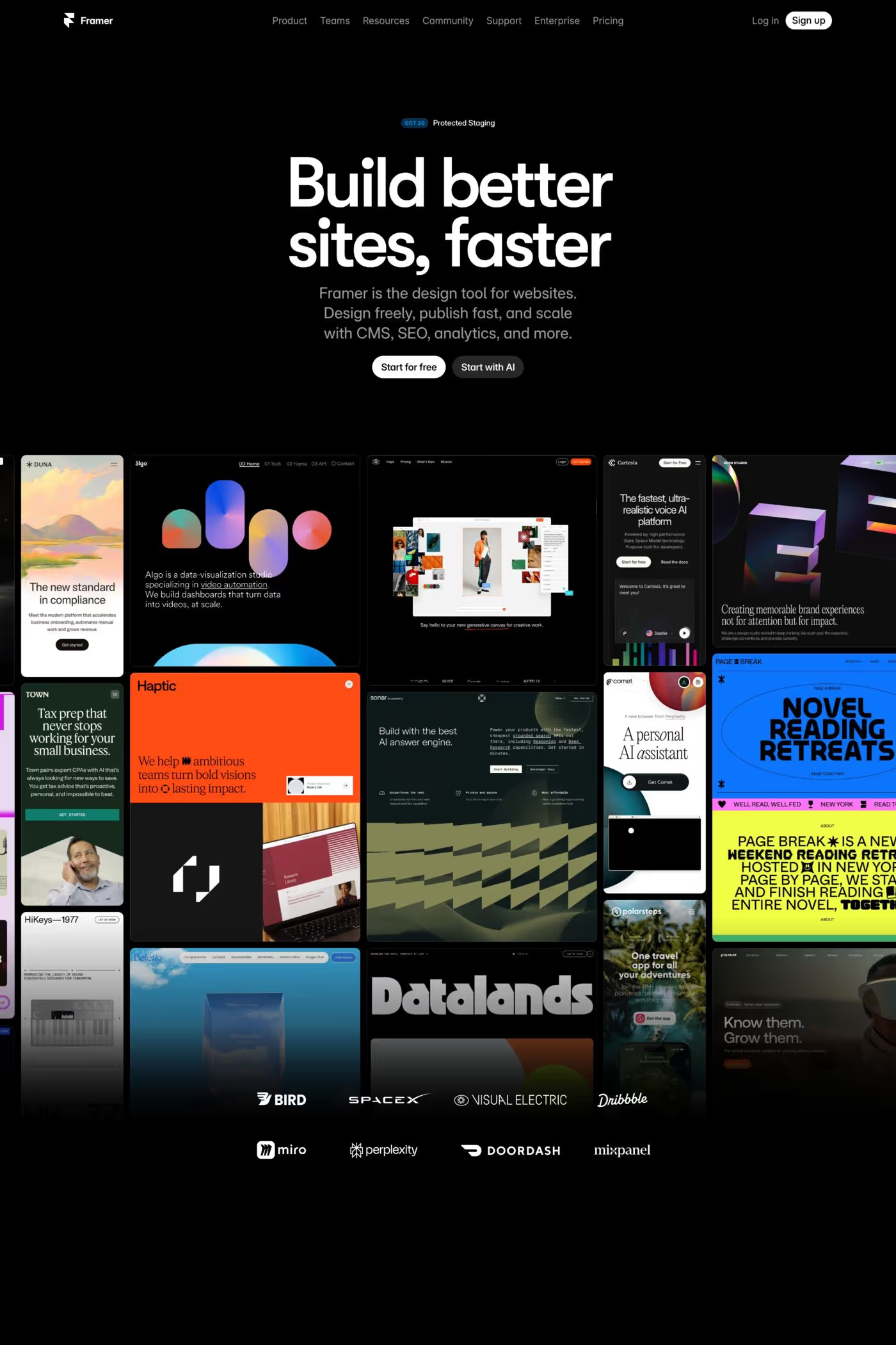
Oberion

Lines landing FAQs

Lines create visual structure without heavy elements, define sections, guide eye movement, and add sophistication through restraint. They're particularly effective for creating clean, architectural feels.

Fine hairlines feel elegant and minimal, while heavier strokes create bold graphic impact. Consistency matters; establish a line weight system and apply it throughout the design for cohesion.

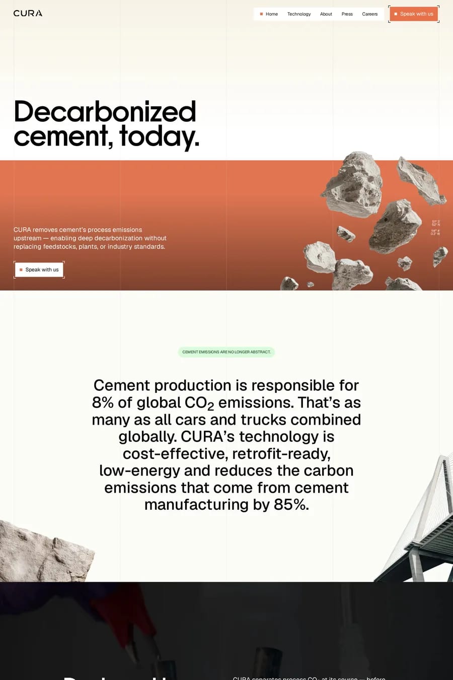
Notable examples include Kaiko, Customer.io, Oberion, Turno and CURA Climate. These are just a few of the 111 lines landing websites in this collection, each selected for strong visual design and execution.

Popular platforms in this collection include Webflow, Next.js, Framer and Wordpress. Each brings different strengths for building lines landing experiences.

Frequently used typefaces include Inter, Geist, Aeonik and Lausanne. Typography plays a key role in defining the lines aesthetic across these landing websites.

111 Best Lines Landing Page Examples (2026) · A1