22 detailed development website examples
Updated

Updated
Curated inspiration sent every Tuesday
Unsubscribe at any time
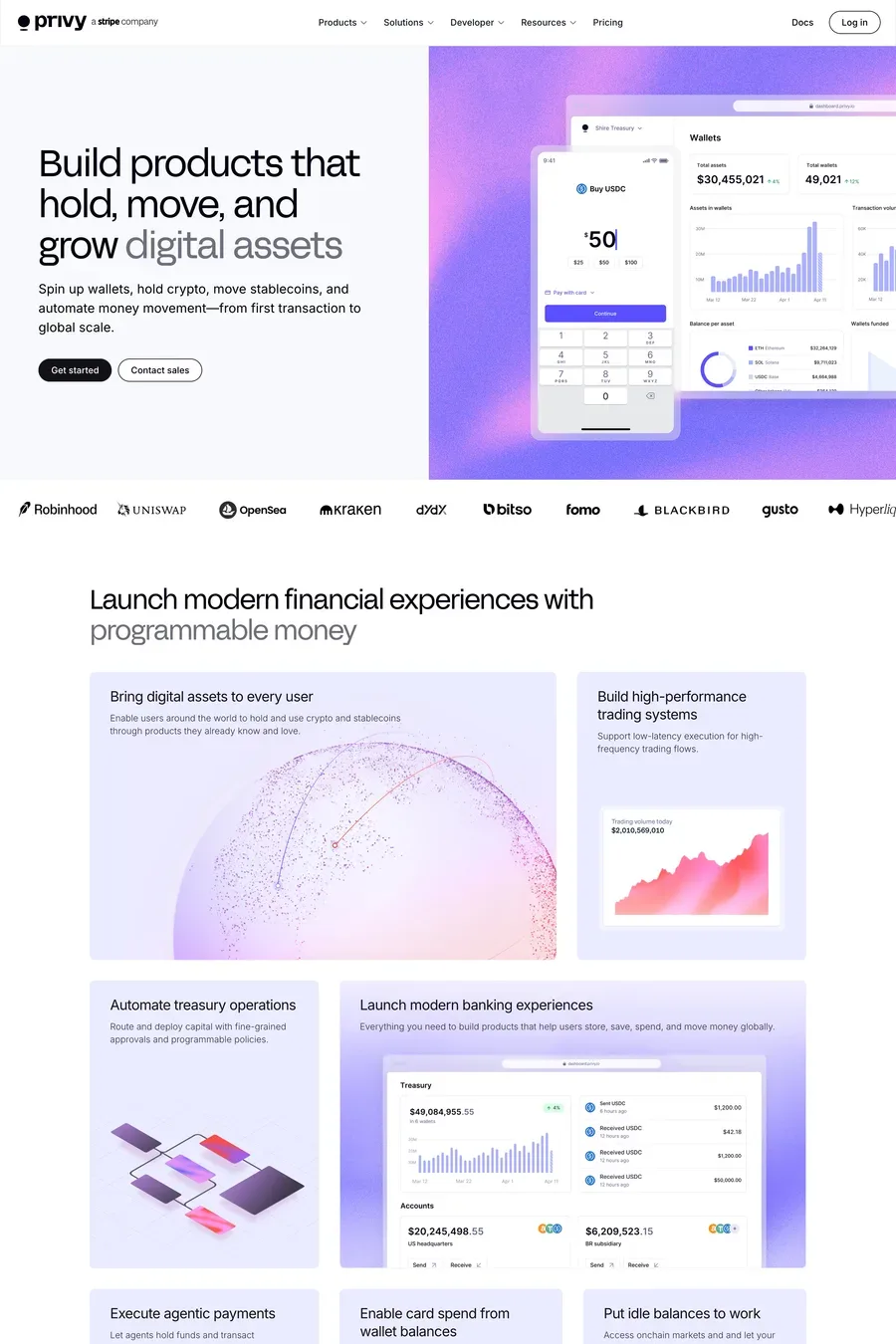
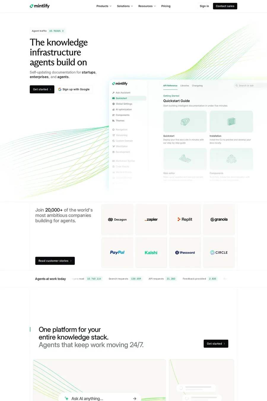
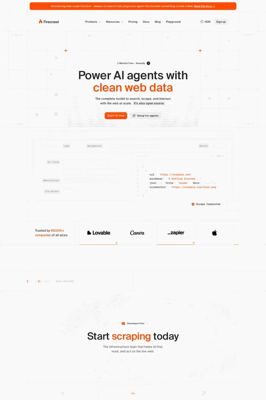
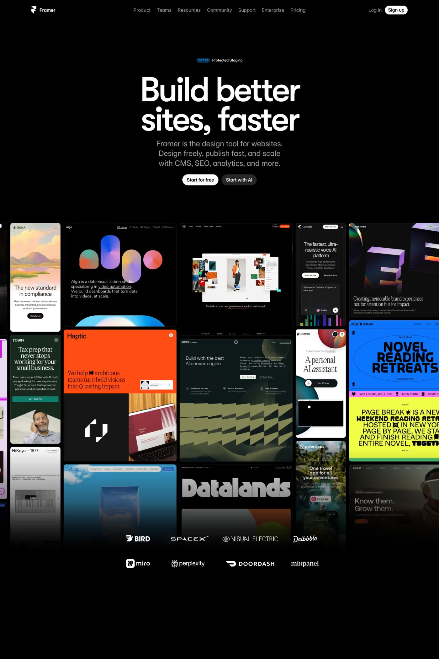
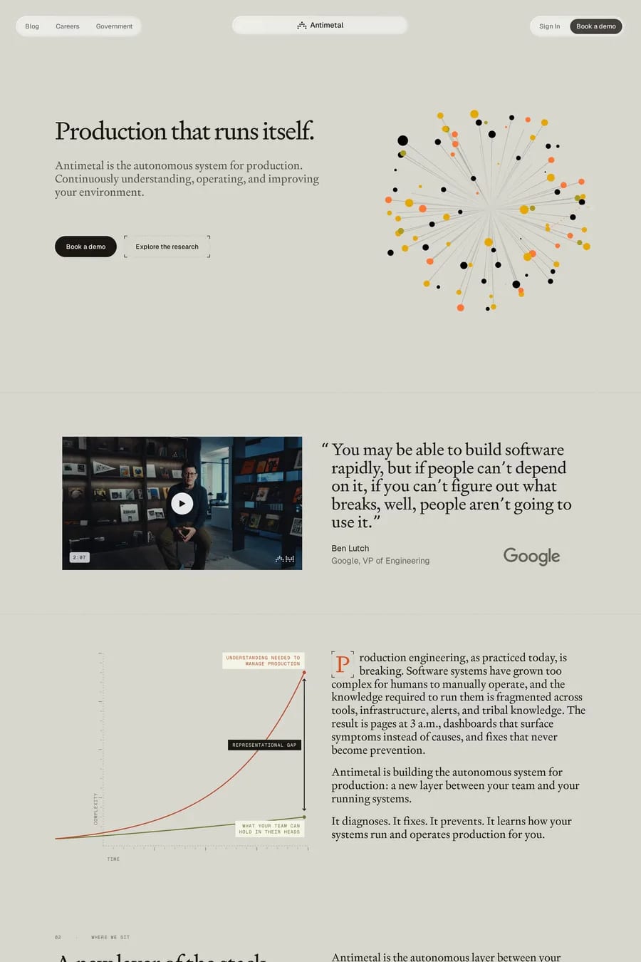
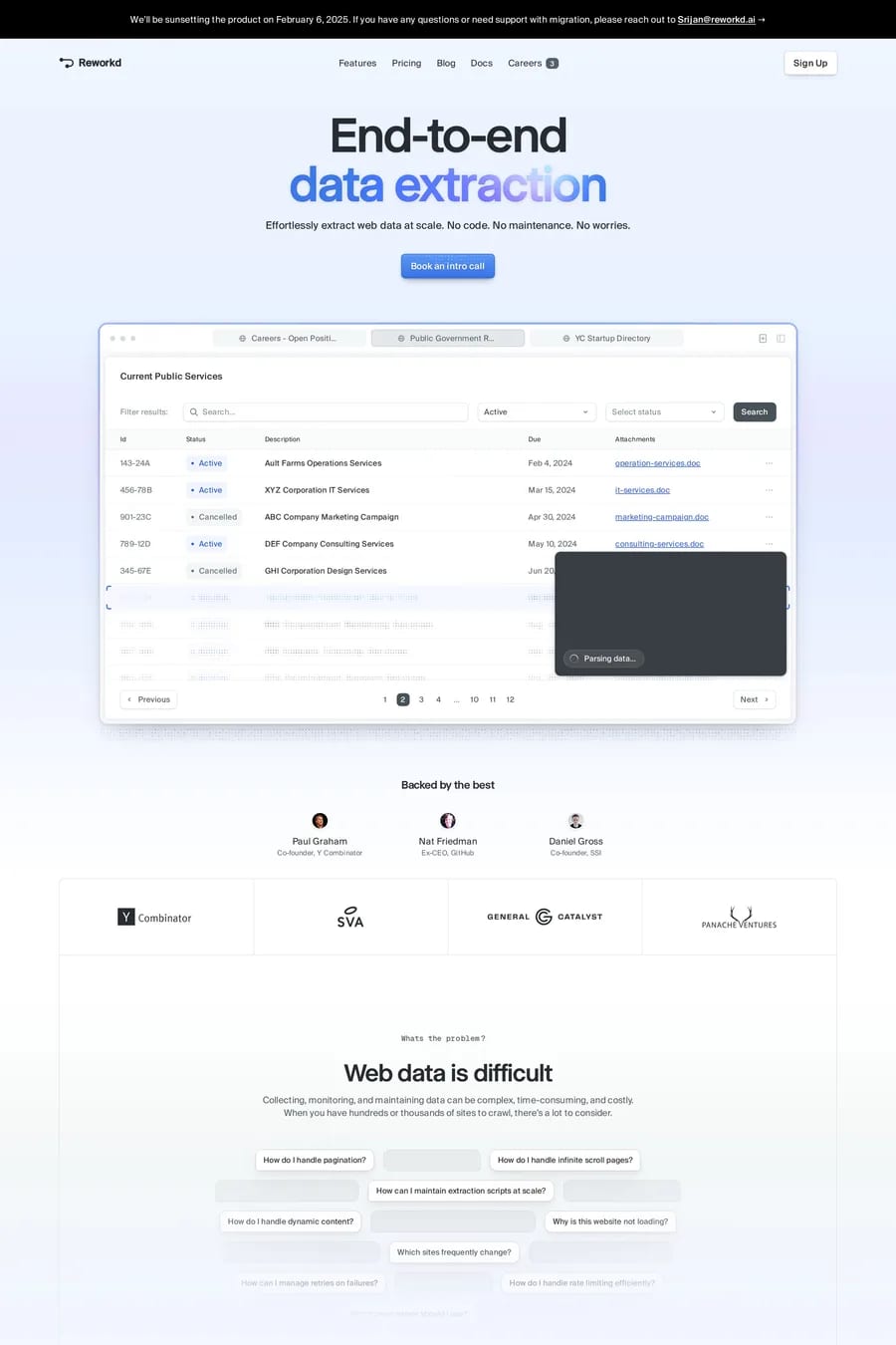
The audience is technical and reads. A CTO evaluating an agency wants stack details and architecture, not three words and a photograph.
Hierarchy does the work. Tight spacing is fine when heading levels are unmistakable and the eye can find the next entry point without hunting.
Frequently used typefaces include Inter, Geist Mono, Geist and Aeonik. Typography plays a key role in defining the detailed aesthetic across these development websites.