New A1 Pro: unlimited saves, priority submissions and more →

93 bento landing page examples

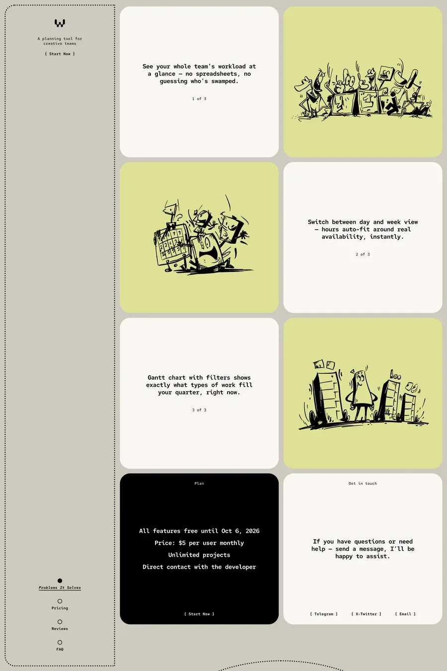
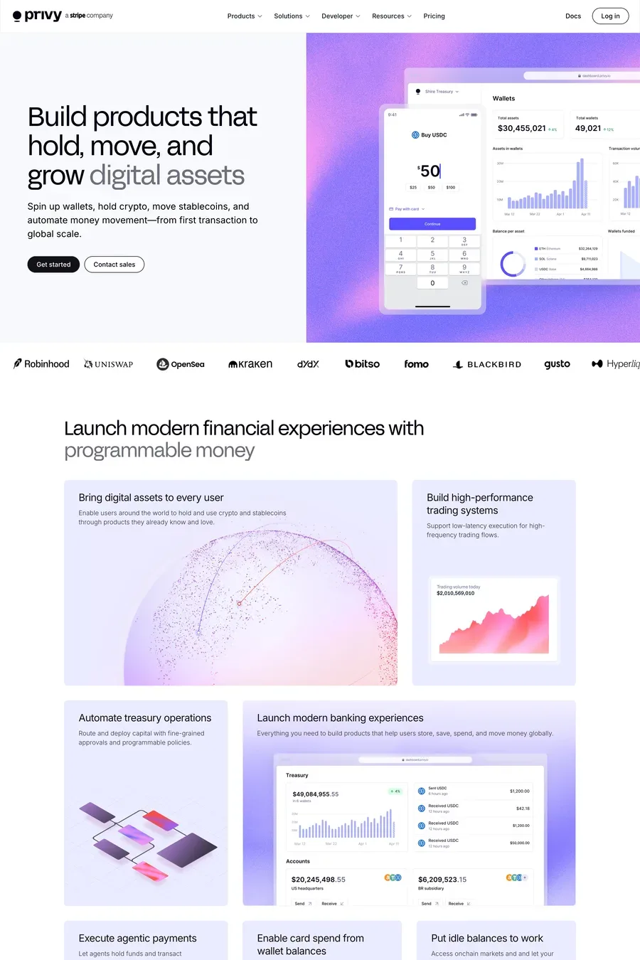
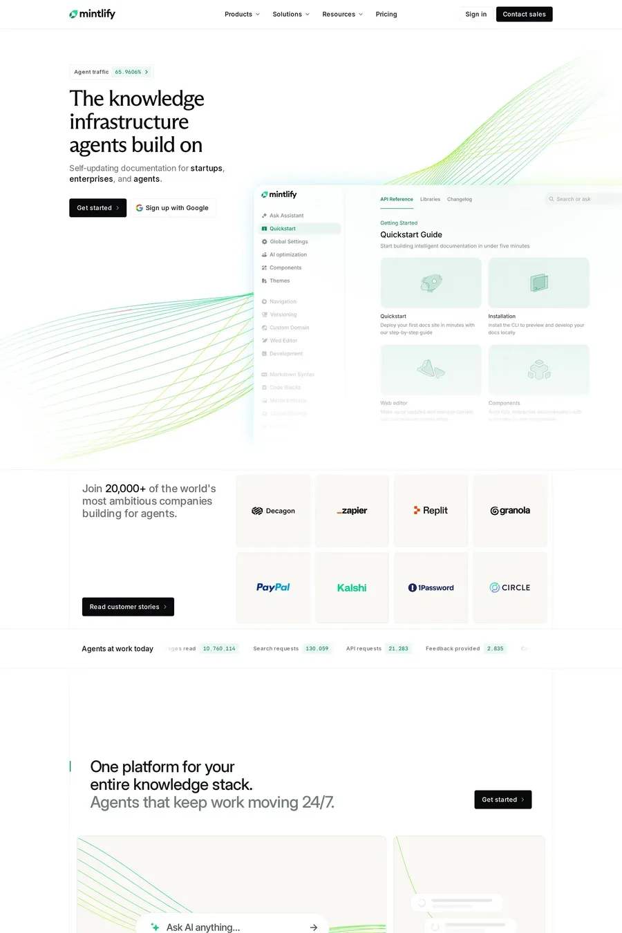
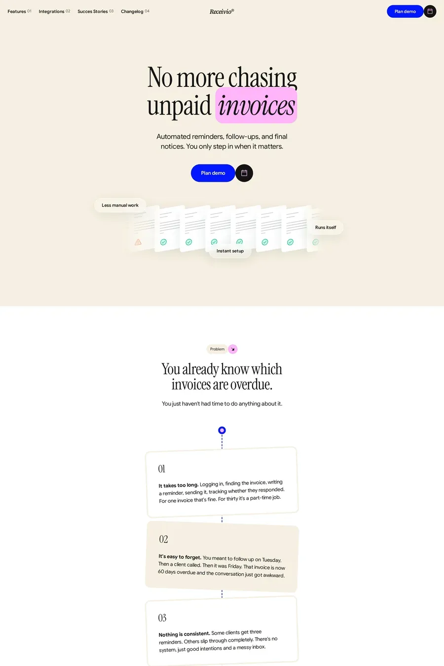
Bento grid layouts organise complex information into digestible, visually balanced sections. Popularised by Apple and widely adopted across tech and SaaS marketing, the bento approach lets brands highlight multiple features without overwhelming visitors. These landing pages use modular design to create scannable content with clear visual hierarchy. See also bento design portfolios, bento software sites, and detailed landing pages.

Get the best bento landing websites each week

Curated inspiration sent every Tuesday

Heynds
Bevel
Midlands

Bento landing FAQs

Bento grids allow dense information display without overwhelming visitors. Each cell can highlight a different feature or benefit, creating scannable content that accommodates different visitor interests.

Vary cell sizes strategically to create hierarchy, maintain consistent spacing between cells, and ensure each cell has a clear focus. The overall composition should feel balanced while guiding the eye through key content.

Notable examples include Heynds, Bevel, Midlands, Inertia.js and Playground. These are just a few of the 93 bento landing websites in this collection, each selected for strong visual design and execution.

Popular platforms in this collection include Next.js, Framer, Webflow and Gatsby. Each brings different strengths for building bento landing experiences.

Frequently used typefaces include Inter, Geist, JetBrains Mono and System UI. Typography plays a key role in defining the bento aesthetic across these landing websites.

93 Best Bento Landing Page Examples (2026) · A1