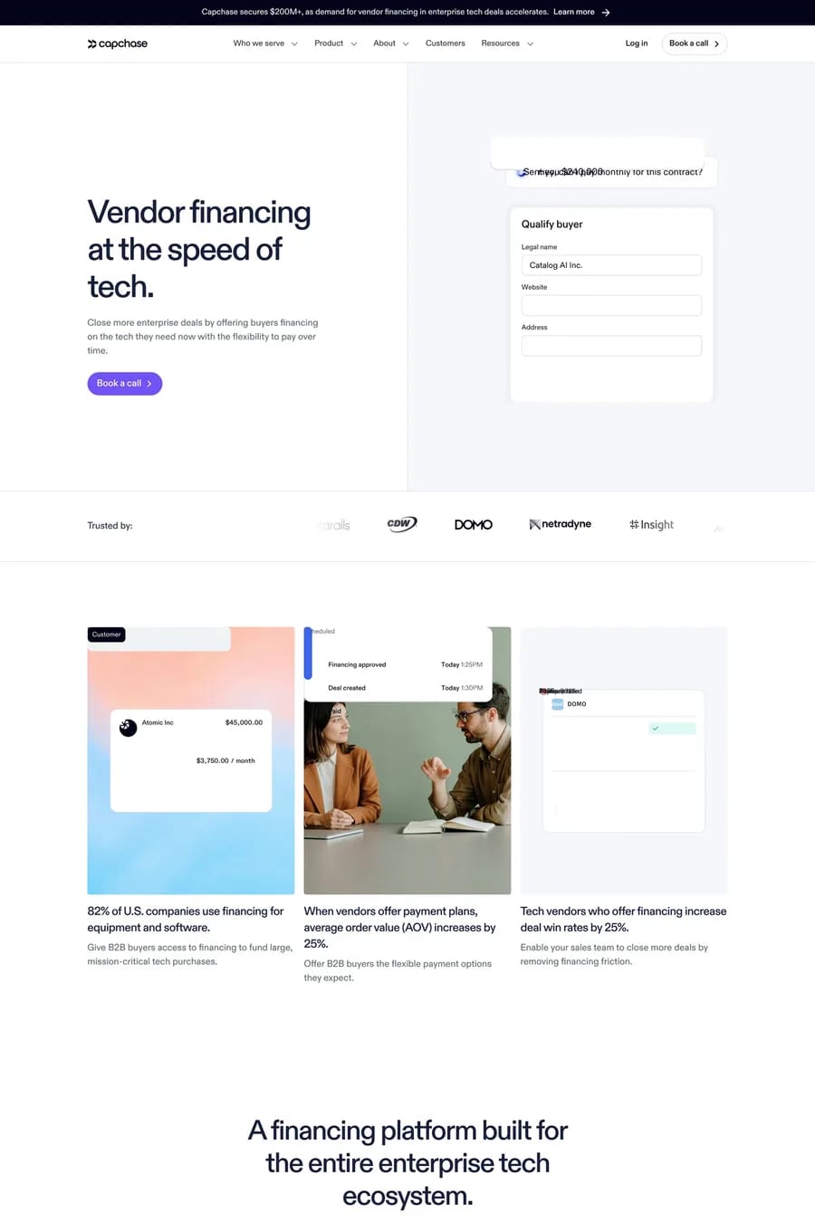
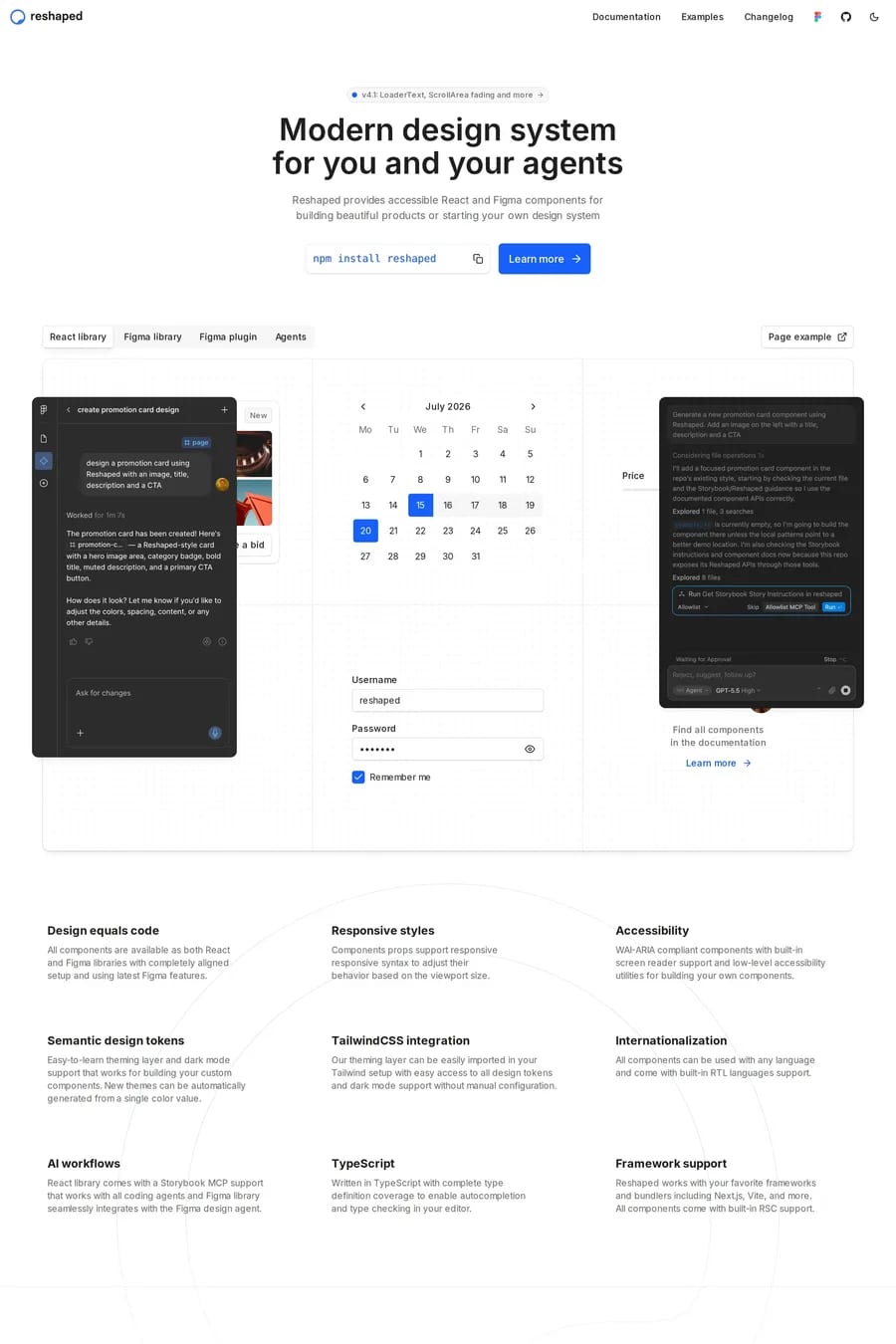
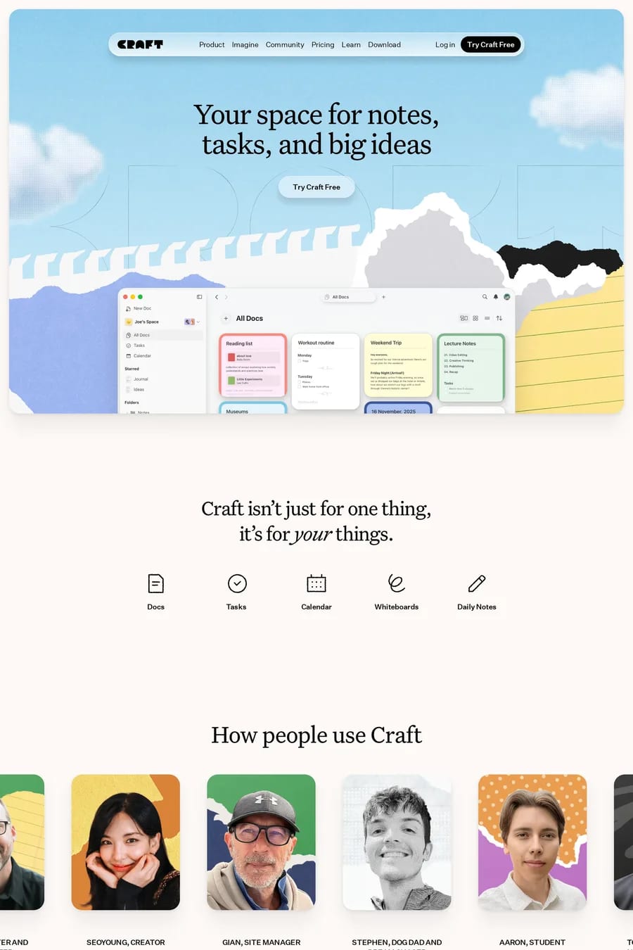
31 bento software website examples
Updated

Updated
Curated inspiration sent every Tuesday
Unsubscribe at any time
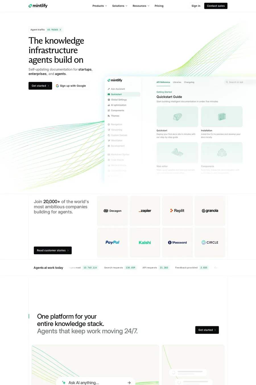
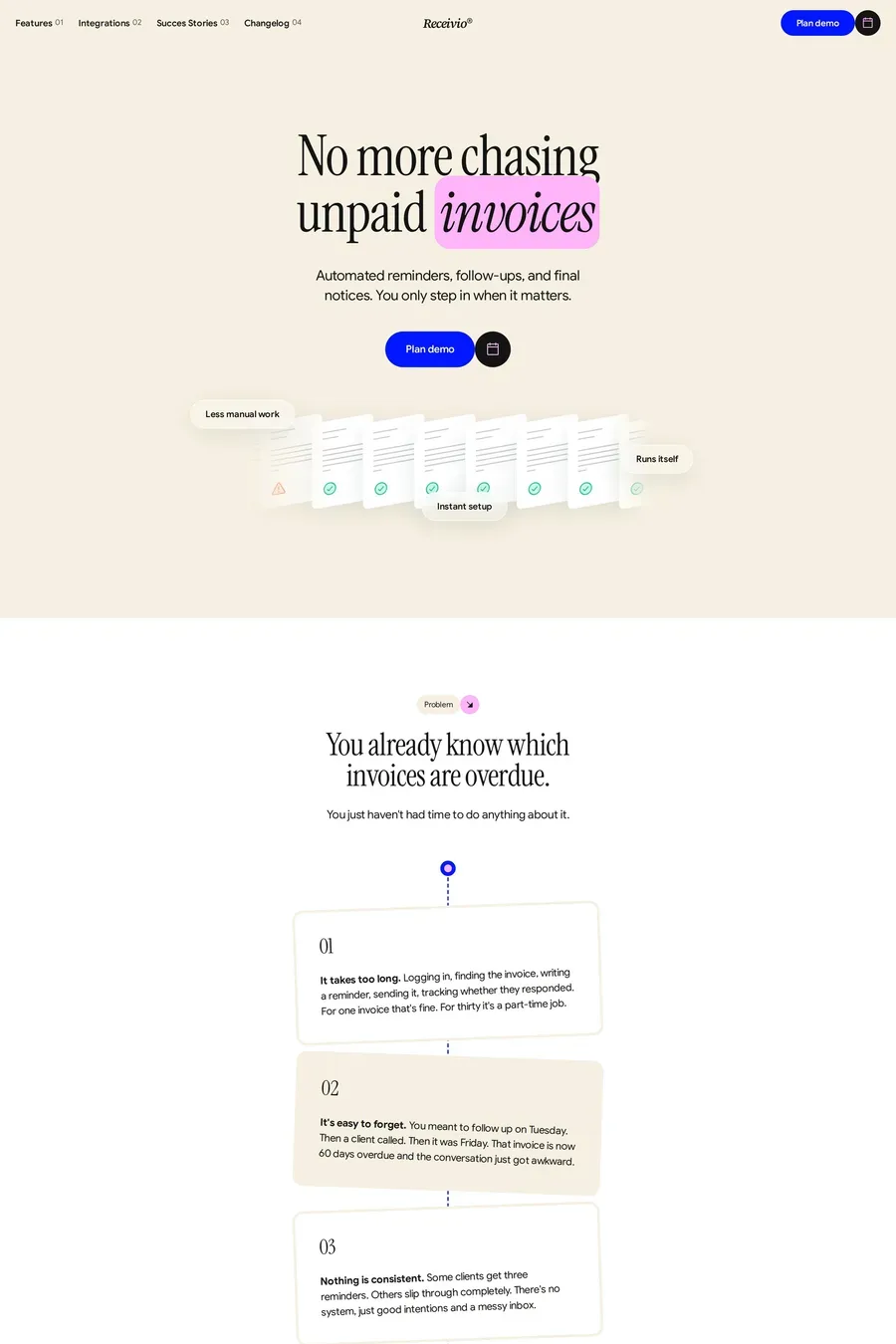
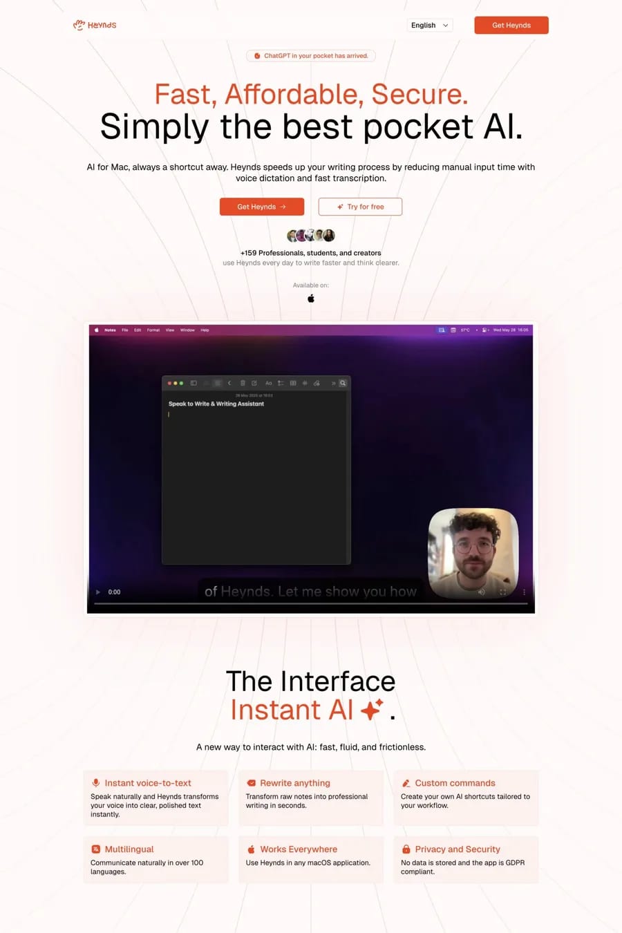
One feature per cell, with the most important features in larger cells. Visual demonstrations or product screenshots work better than text-only descriptions. The grid creates a visual menu of capabilities.
Product screenshots, feature demonstrations, metrics, and short benefit statements. Each cell should be self-contained and quickly understandable. Avoid requiring visitors to read all cells to understand the product.
Notable examples include Mintlify, Receivio, Heynds, Playground and Huddlekit. These are just a few of the 31 bento software websites in this collection, each selected for strong visual design and execution.
Frequently used typefaces include Inter, Geist, Geist Mono and Arizona. Typography plays a key role in defining the bento aesthetic across these software websites.